This post is a continuation of a series suggested by a friend, detailing the rationale and process of selecting lighting for my wife’s and my new rehabbed home. In this post, I’ll discuss the lighting of the dining room.
In the past two posts about lighting in our new/rehabbed home, lighting was much more a functional element of a successful space. Dining rooms are softer places for gathering and conversation. Occasionally, they become temporary work places when the benefit of a large flat surface is needed. Usually, they are centrally located in a residence, so the need for a cohesive aesthetic is crucial. While important, a dining room does not succeed or fail because of illuminance measurements. They work when we are sensitive to light that highlights the area, compliments the aesthetics and flatters the diners.
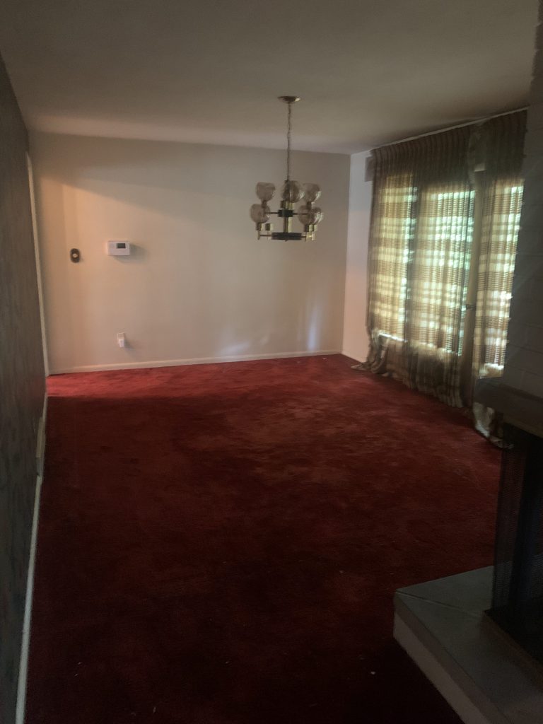
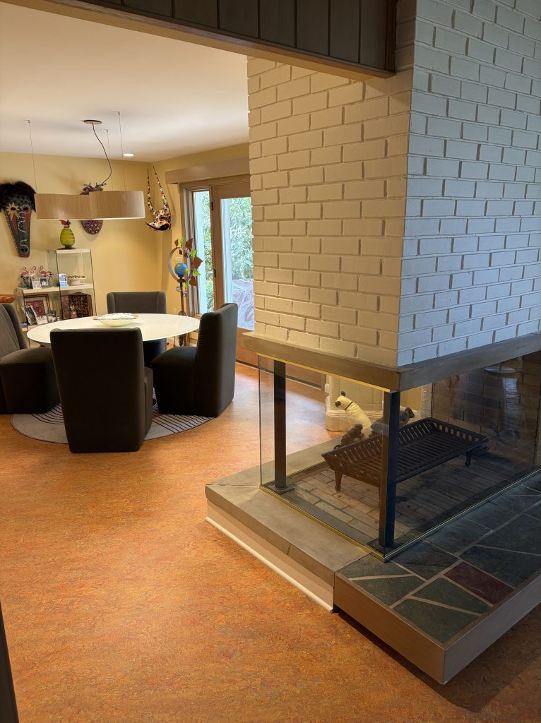
As compared to the rest of the building, very little was required in the new dining room. A mangled 1980s era chandelier was (barely) hanging in the center and one of two recessed cans that washed the fireplace functioned. The original grass wallpaper was probably replaced with a bold gilt laden option at the same time as the chandelier. The ubiquitous red-orange shag carpet extend into this room as well. There were very few historic constraints in this room.
Lighting
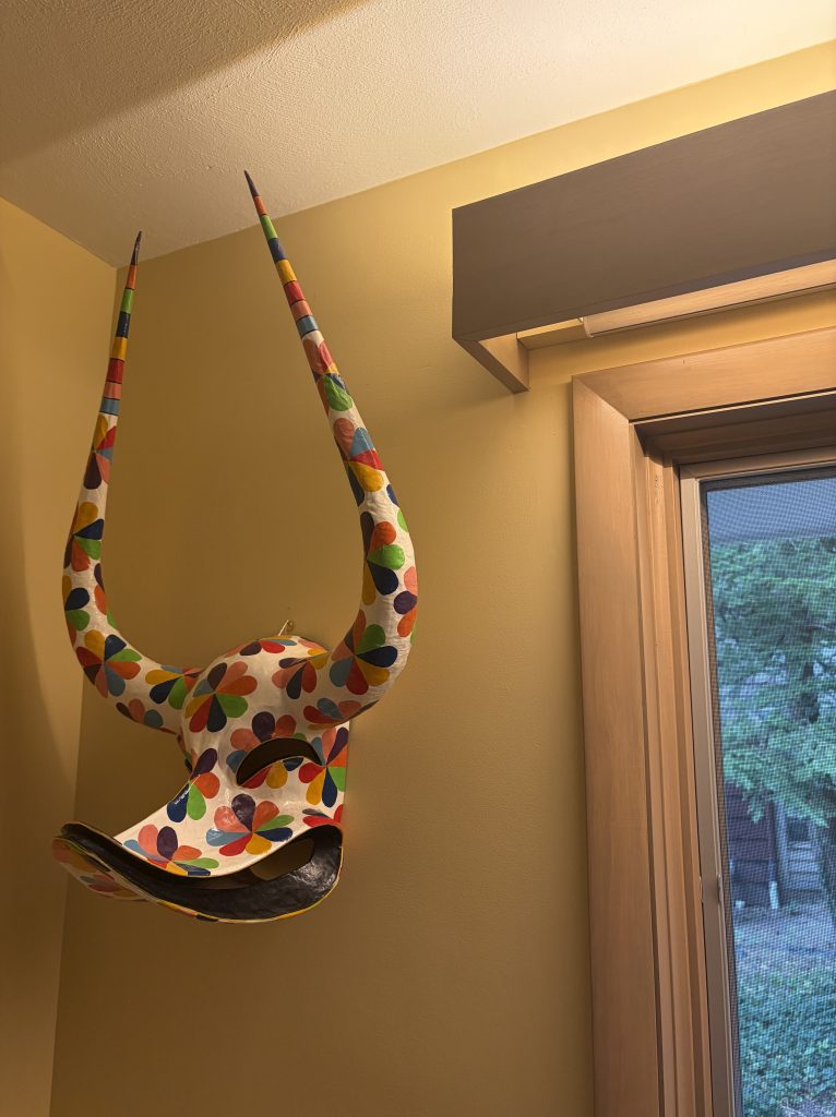
To hide the automated shades, we knew we wanted to replicate the valances that were original to living room. Because of the shorter ceiling heights, we decided to reduce the profile. The LED Tape we used in the living room valences would be copied here.
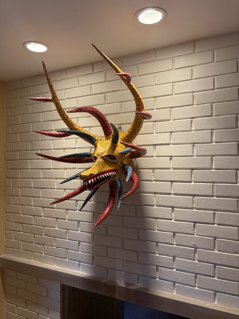
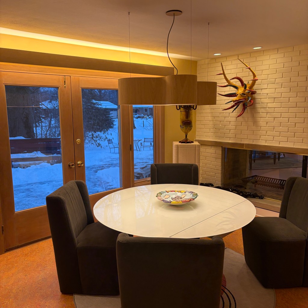
We’ve always had a lot of art in the dining room and while we shed ourselves of some pieces, the favorites came along in the move. We purchased a vejigante mask in Ponce, Puerto Rico, many years ago and it has always been a favorite. A photo of the mask was featured in the Cleveland newspaper (The Plain Dealer June 23, 2005) when our previous home was included in the Forest Hill Historic Preservation Society Home and Garden Tour. We knew the mask had to be mounted prominently over the dining room side of the fireplace. The dead and dying existing recessed lighting could easily be replaced with wall wash versions of the Nora Sapphire III we installed everywhere else in the house. To complete the perimeter definition of the room, we added three standard cans, one in each of the other corners.
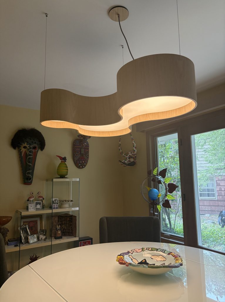
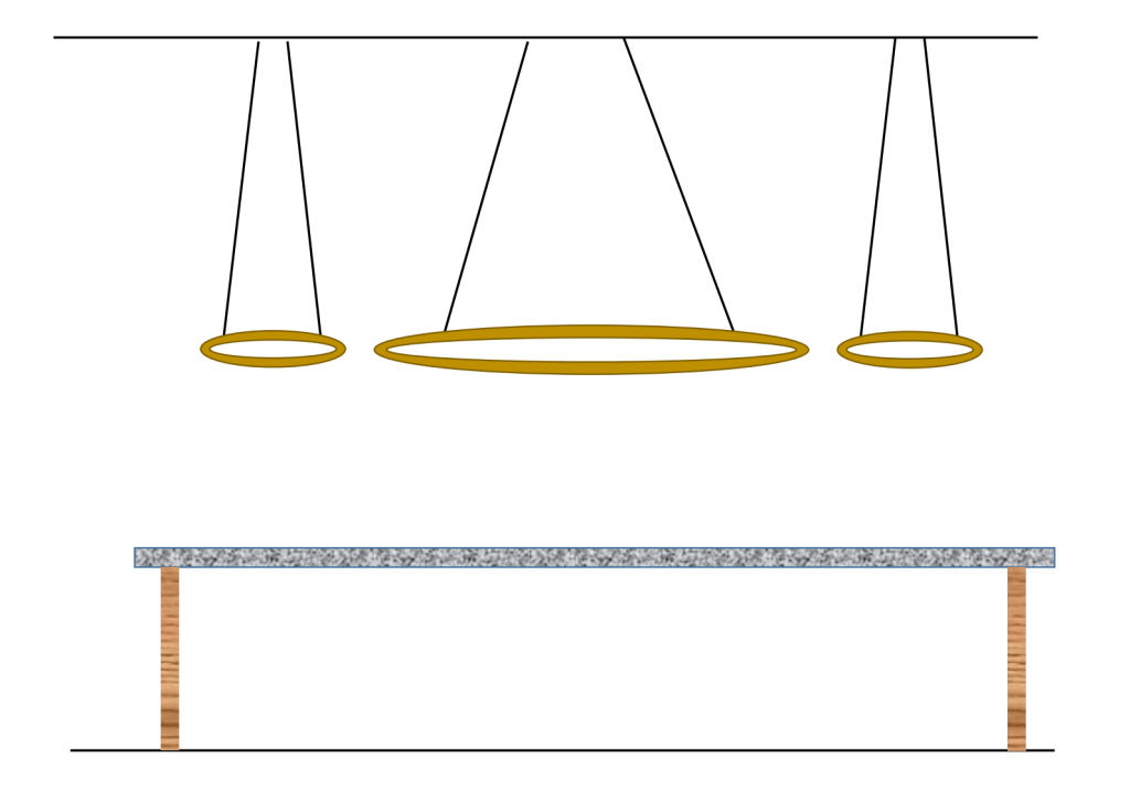
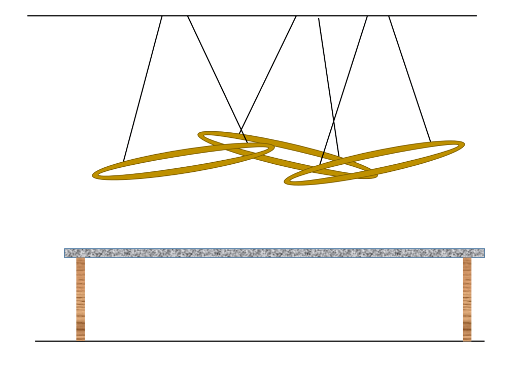
The absolute last lighting fixture we selected for the entire house was the chandelier. In one of our decision-making bargains, I agreed to allow my wife to make ALL decisions in the dining room, if I could select something else. (I really don’t remember what I got in the bargain, but it must have been important at the time!) I curated a list of dozens of options for her. She snubbed her nose at most and said an absolute, “No!” to the others. One of the great benefits of having an excellent showroom in your neighborhood is an up close viewing of a lot of options. While I was working with them on the functional lighting, my wife wandered the showroom, noting all the pieces she liked. She came back to the counter and told me she found two pieces she liked. One was a Visual Comfort fabric shaded vertical pendant. It had just the right amount of “MCM” and uniqueness. I told her, my only worry was the height. The house has 8’-0” ceilings and I thought it might look too constricting. We took dimension and went back to the house. It was too tall, I could only have used a single link of chain. We agreed, it was proportionally wrong for the space.
Her other choice proved to be the winner. Brazilian company, Accord makes a collection of bend-wood pendants that are beautiful, with just the right amount of kooky for us. We just needed to decide on the size (three were available) and color (a dozen? 18?) Luckily, the showroom had a finish swatch ring and they allowed us to take it home. We found an almost exact match to the original wood paneling and valance stain. We think it is perfect, but almost as important; it does not emit glare. The sides are wood, so all of the light is driven down onto the tabletop.
With the splashed orange Marmoleum floor, the wood valance and double door & windows leading out to the patio, plus a golden paint tone, 2700K light was an easy choice. Unfortunately, the lowest color temperature available from the Brazilian company was 3000K (we could have had 3500K or 4000K too!) I was worried it would it would really fight the warm tones we used across the room. Working in our favor was a white glass table. I believe, because all of the light is directed onto this white disc, the severity of the white-white 3000K is somewhat ameliorated. Would I prefer 2700K? Of course. For a manufacturer that produces such a broad collection of wood-based designs, I’m surprised they haven’t gotten more pushback. Then again, South American consumers are much more comfortable with cooler-harsher light after generations of florescent light used to combat outrageous electric rates (typically two to four times greater than the US.)
Controls
The wall controls we now have in this room are excessive. Despite my attempts at reason with the electrical inspector, I still believe more than a reasonable amount of switches are required here.
There are three light sources in the dining room, a central chandelier, perimeter recessed and the valance lighting. Exterior eave lighting over the double door is also controlled within the room. I ended up with SEVEN switches for an 11’-0” x 15’-0” space! The outdoor light and the valance lighting are by themselves and both tied into the Control 4 home automation system. The chandelier is also solo on a dimmer. The perimeter recessed are on a 4-way control, the inspector reasoning that someone enter the home from the outdoor patio must have access to a light switch. Why the valance light right over the door was not enough, I’m not sure. The switch is right next to it. He also felt we needed a switch if we entered the dining room from the living room. The most egregious requirement was a switch in the dining room to control the light in the 3’-6” x 8’-0” hallway between the dining room and the kitchen. The main switch for that light is 6’-0” away from the threshold. It is also a programmed Control 4 switch, so I needed to buy a costly “dummy” switch that I will NEVER use.
Periodically, my wife will ask, “What are all these switches for?” Indeed. For someone who believes light switches could easily disappear in the next 30 years, these requirements are a tough nut to swallow.
From a functional point, the dimmer switch at the chandelier was a good decision. During dinner, a reduced level of light is preferred. If we use the table for some function, other than eating, we can crank up the output to a very effective level.
Illuminance Measurements
| Type of Light | Illuminance Measurement |
| Dusk via Window at center of dining room table | 0.35 fc |
| Chandelier Only – at center of dining room table | 176.0 fc |
| Perimeter Lighting Only – at center of dining room table | 4.1 fc |
| Valance Lighting Only – at center of dining room table | 21.2 fc |
| ALL Lighting – at center of dining room table | 199.1 fc |
| Chandelier Only – at seated eye level | 93.0 fc |
| Perimeter Lighting Only – at seated eye level | 3.0 fc |
| Valance Lighting Only – at seated eye level | 4.2 fc |
| ALL Lighting – at seated eye level | 126.5 fc |
| Light at artwork on fireplace face | 46.1 fc |
A quick look at these measurements might make one step back. The chandelier delivers a ton of light, perhaps far more than one might need in a dining room. In practice, a dimmer plays an outsized importance with chandeliers. When we use the room for eating, the light is dimmed to somewhere around 25% of capacity. The valance lighting which washes the window-door wall is usually dimmed for dining, as well. Like almost everyone, the dining room table takes on other tasks in a home. The extra output is put to good use when my wife blocks a recently knit item or when we need to spread a large amount of things over a flat surface.
The light at artwork should typically be three to four times more than the general lighting in the space. From the points of measurement here, it would appear to be low. This is because the chandelier delivers such a large level of light onto the table. As you move away from the table surface, light levels are much closer to normal. There is a nice level of contrast between the room and the art.
Final Thoughts
I made a mistake specifying the housings for the Nora Sapphire III units. The dining room was one of only three ceilings that were not demolished. I ordered remodel housings. After the insulation was added to the attic, one of the cans began to cycle. I thought it was a bad fixture, but I swapped the unit with one that was not acting up. You can guess what happened. The recessed product was doing exactly what it is supposed to do when heat is in excess. I forgot to order the IC Rated housing. I went back to the website to find the correct housing and to determine how I made the mistake. I found a note in 6pt type in the footnotes that this unit was NOT IC rated, but could not find the correct part number. I asked the distributor to call and ask what I am missing. “They don’t make one.”
ARRRGGGGHHHHH! I wanted all of the recessed units to look alike, but they don’t manufacturer an IC remodel, so I would have had to order a completely different product for two rooms. (The living room ceiling does not have recessed lighting, only the foyer and dining room.) Why not? This was a point I just can’t fathom. Yes, it was my mistake. I missed to 6pt disclaimer in the footnote, but why isn’t it made? How do you maintain aesthetic continuity?
This should make everyone feel comfortable. Even a guy who has spent over 50 years in lighting can specify the wrong product. Even if a trip to the attic for a little fiberglass rearrangement can solve the issue, it is still annoying, despite the excellent results.