This post is a continuation of a series suggested by a friend, detailing the rationale and process of selecting lighting for my wife’s and my new rehabbed home. In this post, I’ll discuss the lighting of the living room.
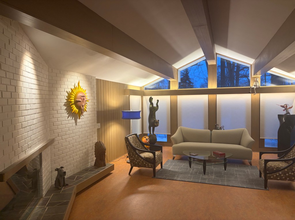
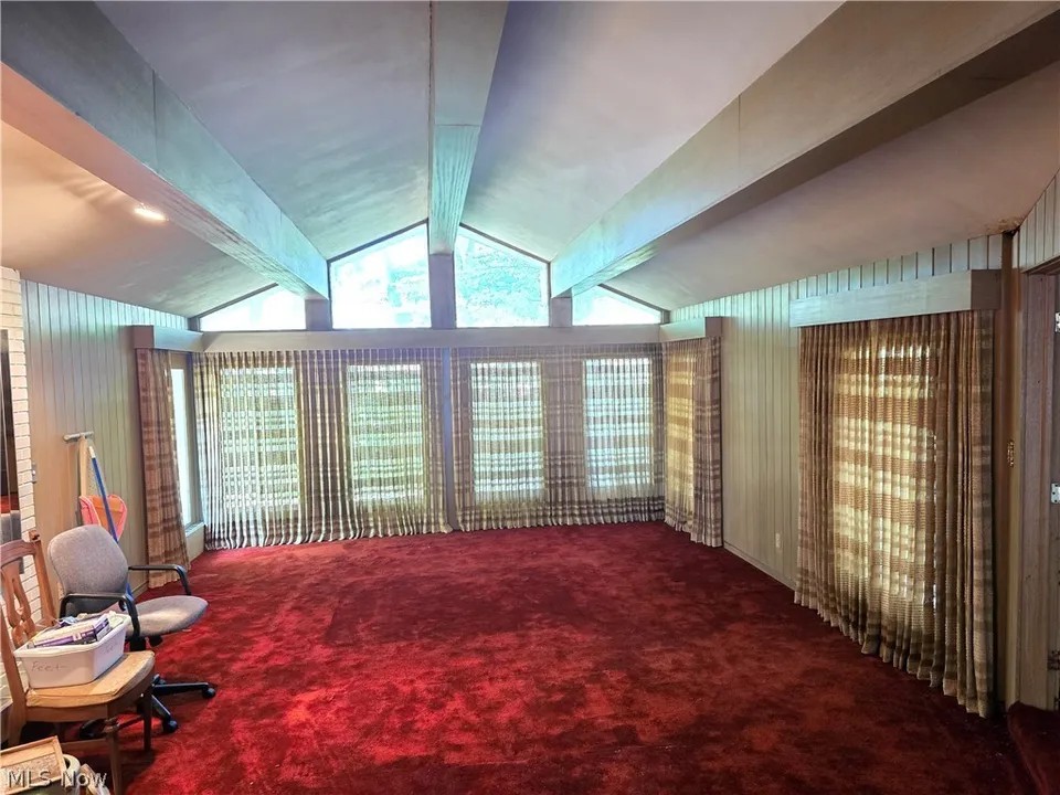
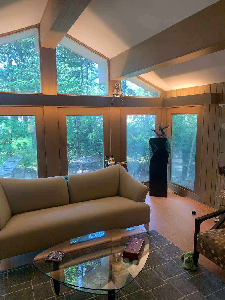
When I first walked into this house, the living room sold me. From the low-ceilinged foyer, you step into an open-beam ceilinged room with a wall of glass at the far end, overlooking a wooded outdoor expanse, unexpected in this inner-ring suburb. My wife says I was blinded by the space. I could see beyond the red shag carpet and ancient drapery that was moments away from shearing on account of its own weight and age. It is an impressive space.
The bad part about buying a neglected house is that nothing has been cared for…for a long time. The good part is, no one has removed any of the original elements of the building. That was the case here. Original hardwood paneling lined the foyer, living room and what we are calling the TV Room. The color was light and fit the home perfectly. The angled fireplace that separated the living room from the adjoining dining room was painted brick. After acquiring a copy of the original blueprints, we affirmed that the wood stain, brick paint and their colors were original to the 1957 construction.
The painter matched the existing stain color. (Actually, he said there were about five colors, certain areas, no doubt victim of UV deterioration. He arrived on an average of the quintet.) We replaced the red shag carpet (don’t shed a tear!) with an orange-toned Marmoleum. Initially, we had planned on a long “S” shaped sofa placed through the center of the room, but with the many cost overruns, we decided to use our existing furniture, at least for a while. We think the room is a welcoming center to our new home.
Indirect Valance Lighting
An original valance was suspended above all of the windows. A flip of the switch ignited about half of the old T12 fluorescent luminaires hidden behind. The second switch lit one of two spots that grazed the face of the fireplace. The options for added lighting beyond portables were limited. I could add a sconce, but I’d need to disturb the original wood paneling. I decided to be as inconspicuous as possible.
The room is 17’-0” x 25’-0”. (Adjoining rooms cut in at a 30° angle at the foyer end.) I knew I’d need to fill the valance with plenty of light to properly illuminate the area. I asked the contractor to install 1” angle iron across the full backside of the valance, once the old florescent units were removed. I opted for LED Tape across 26’-0” linear feet of valance. I used the American Lighting tape that delivers over 1000 lumens per foot. 26,000 lumen is a LOT of light, even if it indirect, so I decided to use a dimmer. (Yes, I know. Jeff used a dimmer?) While we have come to hate fluorescent light, those old linear units pushed out a ton of light. The T12 emitted approximately 800-900 lumens per foot, so I felt I was on the right track.
We’re not really big fans of drapery and can think of only a handful of rooms in the past, where we’ve used it. Almost simultaneously, we knew we’d be using shades to cover these walls of windows. During the day, they could roll up and disappear behind the valance. At night, when rolled down, I knew that they could pop by grazing the surface with light, aimed downward, from behind the valance. When the GC understood my lighting plan and our desire for shades, he suggested a second run of angle iron at the lower section of the valance. That way, the shade wires could be affixed to the back of the valance between the two “L” shaped brackets that held the lighting. A side benefit was the lack of shadows. This was a great suggestion. I quickly agreed.
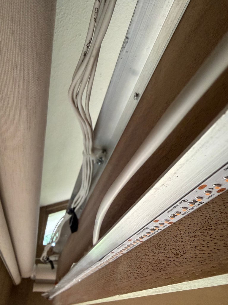
I decided to use a lower output for the grazing and selected an American Lighting LED Tape that delivered 310 lumens per foot. I did not run this light the full length of the valance, instead centering sections the width of the shade. A total of approximately 18’-0” was used. 5580 lumens were added. In total, I reached 31,580 lumens of indirect light.
Because of the warm wood paneling, earthy-orange flooring, off-white shades and the bisque paint on the fireplace brick, I knew I needed to use 2700K LED Tape.
Spots
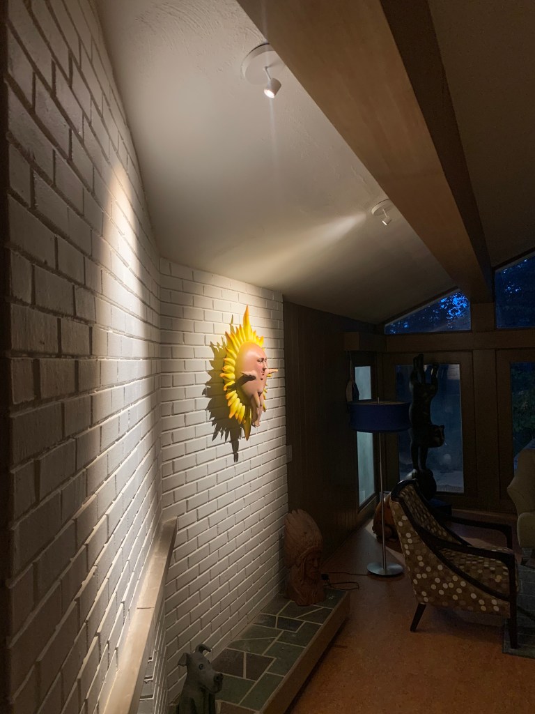
The old reflector lamp spots hidden behind one of the ceiling beams had seen better days. They of course needed to be replaced. They were however perfectly positioned to drive light onto the brick face of the fireplace wall. I asked the electrician to keep the outlet boxes (he still needed to rewire) and selected the tiny WAC Stealth Silo monopoint spots with integrated driver and an adjustable beam angle output. This is a powerful little guy and places the perfect level of light on the first piece of art we have installed in this location. (We still haven’t agree on the second piece!) Like the rest of the room, we used 2700K color temperature to compliment the warm tones of the art, to say nothing of the room and other finishes.
Controls
When we purchased the house, there was a hole in the roof that dumped water into a corner of the living room. Neighbors report that the previous owner kept a bucket at that location to collect the rainwater. That was also the location of the switches for half of the room. After they repaired the roof, the contractor found the support beam at that location was rotted from the constant deluge. They needed to replace and sister all around the area. The switches could not be re-installed at that location. We made the tough decision to cut a slightly larger hole in the original paneling, where the other switch was located. Now, all of the lighting is controlled from one spot.
The Control 4 home automation system drives the valance lighting, in addition to a floor lamp. When we are not using the area, the lamp turns on at dusk and off at 11:30PM. When entertaining a “scene” has been established with the valance lighting at 50%. This is a perfect level of light for a casual, relaxing evening.
Illuminance Measurements
Unlike a kitchen or bathroom, the living area of a home has fewer requirements for tasks, so a relaxed atmosphere is desired. With most of the light delivered by indirect light, that is assured here.
I took these measurements at dusk. The sky was clear, the sun had just set, but it wasn’t yet dark, so there is a bit of light coming from the many windows. (See first line of data.) I averaged measurements from five locations around the sitting area to arrive at number stated here. Measurement at the artwork was in the center.
| Type of Light | Illuminance Measurement |
| Dusk via Windows | 3.5 fc |
| Floor Lamp Only | 7.0 fc (spot closest to lamp eliminated) |
| Valance at 50% | 8.6 fc |
| Valance at 100% | 17.0 fc |
| Valance at 50% and Floor Lamp | 15.8 fc |
| 100% Valance, Artwork Spot & Lamp | 24.8 fc |
| At Fireplace Artwork | 68 fc |
The IES recommends light levels of between 10fc and 20fc in living areas/social gathering spots. The “entertaining” scene delivers over 15fc. Should we need more, it can be raised to almost 25fc of very comfortable light.
In general, light at artwork should be about three times greater than the surrounding space. We are a bit over this calculation during entertainment, but is on target when the valance lighting is fully engaged. As a result, the art presents well.
Statistically, the numbers are good, but more importantly, it is a great space to sit, relax and enjoy the company of others.
Final Thoughts
When the electrician first looked at this room, he didn’t know how he was going to rewire it. There was no access to the ceiling and the original paneling faced all the walls. What wasn’t wood was brick. The GC suggested all the wiring would need to travel outside and under the eaves, until heading back “inside” in the appropriate spots. Only one small section, near the ceiling spot lights required removal. Power supplies for the LED Tape are in the crawl space and wires take a circuitous route to their final destination. We’re glad so much care was taken. The results are nothing short of amazing. We were able to preserve every single aspect of this 1957 space, but imbed it with 2025 technology. Who says you can’t teach an old dog, new tricks?