I must admit, I have not stayed up to date on quantum dot LED technology. While I’ve read a few technical articles about them and I know they have had a big impact on flat screen color performance, I haven’t found where they will quickly appear in residential lighting.
My interest in quantum dot LED or OLED was sparked again while reading a Wired Magazine article on passwords. Like quantum dots, quantum computing is on the precipice of impacting that industry. If quantum computing comes to fruition, passwords as we know them will become obsolete. Regardless how many numbers, how many capital letters and how many special characters we use, passwords will be unearthed in seconds because of the unimaginable processing speed of quantum computing.
Of course, now that lighting is part of the “tech” sector (remember, LED are simply semiconductors) rapid change is an inevitability. No one in the computer industry is suggesting quantum computing will not happen just as I’m not denying quantum dot LED will show up in residential lighting…eventually. Despite this coming technology, passwords, or baseline security protection is not making advances, or more succinctly put, they are not finding security protections options as fast as quantum technology normalization is advancing.
I can’t imagine a career dedicated to creating digital security options. I can only say, “Good luck!” Even though lighting has been my life for almost fifty years, I’m not sure I’m smart enough to visualize how quantum dots LED/OLED will impact residential lighting. My guess is the quantum technology will be packaged to create almost perfectly replicated natural light that easily changes throughout the day, minute by minute, season by season. Our bodies circadian demands will be full satiated and the harm done by artificial lighting up to this point will be placed in the rearview mirror, but does residential lighting have a “password issue?”
Is there something we currently enjoy with today’s LED lighting that will be changed by quantum LED/OLED? Will any of our power savings disappear? Will output suffer? The swap from incandescent light to LED forced a realignment of our perception of the color of light. Will the introduction of quantum LED cause a revisit of this issue? Does the elimination of light within the UV and infrared spectrum disappear with quantum technology? Will UV and infrared light again be a concern?
Perhaps these are being answered as I type. I plan on spending more time trying to understand the impact quantum LED/OLED might have on residential use lighting. In the meantime, I better change some computer passwords…or not.
Lighting for Tomorrow was a new product competition that sought to highlight inventive uses of energy efficient lighting. When started, fluorescent lighting was considered pedestrian and good for only the most functional of lighting chores. America installed fluorescent lighting into garages, basement workshop areas and MAYBE the laundry room. Why not other areas? The competition encouraged manufacturers to reimagine fluorescent use in decorative products.
As a Product Manager of a luminaire manufacturer at the time, I readily accepted this opportunity. I asked the talented design staff to create products that would ameliorate the undesirable aspects of fluorescent light. While fluorescent lamping was the only energy efficient option, we received recognition for multiple products. Once LED entered the scene we again enjoyed awards in different categories. Our product was recognized and displayed at many trade shows, countless publications and industry events.
When the competition accomplished its goals, the adoption of energy efficient lighting across the luminaire spectrum, Lighting for Tomorrow was retired. A new goal was then established. Controls. Many consumption researchers found that the next “big” reduction in energy could be achieved through the use of intelligent controls. The most far reaching predictions were an additional 25% savings of electric consumption simply by better controlling light use.
At the same time, other areas outside lighting were going through their own efforts to reduce energy consumption. What if all of this were combined? When people leave their home they shut off lights, reduce the heat, turn on a security system, lock a door, close a garage and start a car. Electric power is plentiful throughout the night, why not run the dishwasher, clothes washer and dryer when demand is at its lowest? Lighting for Tomorrow was transitioned into the Integrated Home Competition.
The Integrated Home Competition seeks to find high efficiency products that easily integrate with home control systems and other like-minded products, are well built, easy to install and set up and provide the consumer with perceived value and security. Among the categories is lighting.
Manufacturers
Do you have a product that, in addition to saving money on energy, also easily links with home control systems (Alexa, Google Home, Apple Home) and perhaps, interacts with HVAC systems, security systems and/or utility data sharing apps? Is it a product that works beyond the simple wall switch control? If so, consider submitting it for consideration.
Sales Representatives and Design Practitioners
You see new products every day. Does something you’ve seen recently break new ground? Does it make installation and set-up easier? Does it facilitate easy transition between other consumers of energy in the home? Urge the manufacturer to submit the product for consideration.
Winners
I was honored to be asked to judge the submitted products entered into lighting and ceiling fan 2023 competition category. A group of us with decades of experience in lighting and controls installed, set-up, operated and tested each submitted item. We read the included instructions (I know that sounds unusual!) and watched online installation videos to determine if the product functioned as promised. We paired products with smart phones, Alexa and Google Home and tested functionality. Via conversation and a genial exchange of view, we unanimously agreed upon the products that deserved a year’s worth of recognition.
While testing and talking we wondered if there were other products that should have been submitted. We all agreed to do what we could to encourage additional submissions, hence my inclusion of this information in the blog. Every one of us will benefit from reduced energy consumption. Let’s work to recognize those who are creating products to meet that end.
In the last post I talked about the ubiquity of LED Tape and where it can be placed. Three key areas remain. First, how much light do I need? What lumen output should I select when considering the addition of LED Tape? Then, maximum run lengths must be regarded. These will be a factor when designing the system. Lastly, we’ll review color temperature recommendations. With the four areas covered, selection, design, specifying and implementing LED Tape into an interior design is easy…or can be easy, once you’ve done it a few times!
Output
Like a Ford Model “T” black-only color choice, when LED Tape was first introduced, there was a single light output available. A quick glance at almost every major manufacturer’s catalog today will result in a huge variety of lumen output options. That is in response to the varied applications in which LED Tape has found itself. Toekicks, above cabinets, inside cabinets, coves, tray ceilings, drop ceilings and under countertops. Each of these spots need different light. In addition, surrounding surface colors will impact output, so more light should be used with darker colors.
When looking at an LED Tape product catalog. You will find a key piece of information, “Lumens per Foot.” This will range from 100 to about 1000 lumens/foot. You can assume cost will be commensurate with output, so it is important for lighting professional to select the item that delivers the right amount of light; but what is right?
Here are few guidelines based on use. Remember darker surrounding colors should use the numbers at the high end of the range. Light on taller ceiling might need a bit more light than an older 8’-0” ceiling height. If the distance from the top of the cabinet to the ceiling is short, use less light, if the cabinet is small, minimal lighting is needed inside. These are lumen ranges for a reason. Categories are intentionally vague to invite design professional input.
Application
Lumens per Foot Range
Mood lighting / Light Used as a Background
100 to 300
Accent lighting / For Added Aesthetics
150 to 500
Task Lighting – Close
275 to 500
Task Lighting – Far Away (light location)
350 to 700
Indirect Lighting
375 to 575
Cove Lighting
180 to 500
Principle Lighting in a Room
400 to 1000
As a Replacement for Linear Fluorescent Lamping
500 to 950
Kitchen Under-Cabinet Lighting
175 to 550*
*see comments regarding kitchen under-cabinet use in the previous post
Remember, lighting is cumulative, if you cannot find 800 lumens per foot tape at your favorite retailer or from a preferred brand, use two rows of 400 and you will get the same output. Two low-lumen output lengths might also be less expensive than a single length that delivers twice the light. Consider all options.
When designing with light, as with any other aesthetic element, extra attention might be desired in select areas. Feel free to veer from the suggestions. Like with anything, understand the guidelines and alter them with knowing intent.
Diffusers – The use of diffusers over LED Tape will reduce the lumen output. In some places, it is necessary, such as in-wall, drywall deep designs. That should be factored into the design. Some clients prefer the clean, non-mechanical looks of a channel and diffuser even in under-cabinet or above cabinet applications, usually for cleaning purposes. When not required, consider eliminating diffusers. Better output will result.
Run Lengths
The other piece of information you will find next to every manufacturer’s product is “Maximum Run Length.” You will typically find an inverse correlation between “Lumens per Foot” and “Maximum Run Length.” Essentially, you can run tape farther with less lumen output. If large amounts of light are needed, the runs will be shorter. You will see maximums of as little as 10’-0” and I have seen some specifications that reach up to 65’-0”, but usually 32’-0” is the limit.
Maximum run lengths comprise of the actual lighted length of LED Tape, so if the start of the tape is 5’-0” from the power and wire is needed to jump from one cabinet section to another requiring 9’-0” of interconnection wire, those are NOT counted into the maximum run length.
When laying out a LED Tape system, clever power supply placement can maximize these limitations. For example, if a 10’-0” square tray ceiling is to be illuminated and 20’-0” run length maximums are selected, place the power supply in a corner and run the first 20’-0” length in one direction and the second run in the opposite direction. This will not be a contiguous 40’-0” run, but it will give the exact same appearance. A small amount of pre-planning will eliminate hours of rework or multiple power supplies.
Color
If you read this blog regularly, or if you have heard me speak at any point in the last decade, you know I regard light color in residential applications very narrowly. I believe lighting should be either 2700K or 3000K. Warmer finishes used in the home, such as beige walls, wood cabinets and earth-tone carpets will always look better with 2700K light. Homes that are “cooler” with lots of white, black, blues, greys and stainless steel will find those colors best represented using 3000K. The ONLY time I suggest or use anything different is if a client has a display case with collectable crystal or sterling silver. 4000K adds the necessary blue to allow these object to “sing!” Other designers disagree and employ a wider variety of color. Many of their opinions are well placed, but I still maintain the “A” or “B” decision is all that is required. It doesn’t have to be complicated.
While most reputable LED Tape uses diodes with a Color Rendering Index (CRI) of 90 and above, be sure to check the CRI is in this range. CRI is an important indicator of how well the colors in a room will look.
Another frequently asked question regarding color is, “Can I mix color temperatures in a room/home?” My response is always the same. “Do you mix colors in a room?” If you’ve ever painted a room with two or three different shades, you did that for a reason. A deliberate decision was made to use light blue paint on the wall, mid-range blue tiles on the floor and deep indigo on the window dressing. Apply the same logic to light. If there is a reason for 3000K light in a tray ceiling and 2700K at the counters, then mix away. Do not, however simply scatter varying colors of light pell-mell across the room. This is the design equivalent of five different fluorescent tubes in the ceiling troffers of an old office.
A Few More Things
As we have seen change in LED Tape over the last ten years, change continues today. Manufacturers introduce new “bells and whistles” every month and the popularity of the product has pushed vendors to change, update and rethink almost everything about it. Following are a few things you can buy now or will see on the horizon.
COB Tape – Some consumers have objected to the dot of LED reflecting in polished granite surfaces. One solution is placing the LED Tape inside an extrusion and adding an etched acrylic cover or diffuser. While this does ameliorate the bright spot of light, it also reduces the lumen output, sometimes considerably. Chip-on-Board (COB) Tape delivers a continuous strip of light, rather than individual dots. Some brands are offering it today. It is priced higher than traditional LED Tape, but the output is good and the run lengths are likewise acceptable. This could be a nice option when faced with this particular client pushback.
Dimming – Most every manufacturer now offers dimmable LED Tape. Remember, dimming requires a power supply with dimming capabilities and like all LED, the dimmer and the power supply MUST be compatible. Always consult the tape manufacturer’s dimmer recommendation. Before that, ask whether dimming is even required. With the wide range of lumen output, dimming might take a great lighting design and ruin the results as output is constantly in flux.
120V LED Tape – We are seeing more and more “line-voltage” LED. The elimination of a power supply is very enticing. Simply connecting the electrical wires directly to the LED is an intoxicating draw. Some are good. Many have problems. Caution should be used if 120V LED Tape is considered. The same cautions you would attribute to 120V LED bath lighting or chandeliers.
120V LED are substantially more vulnerable to flicker. This can be eliminated, but it required additional circuitry that might reduce the monetary savings achieved by removing the power supply. Ask about flicker rates or percentages, especially if clients are physiologically vulnerable to flicker.
120V LED are more difficult to dim. Again, this can be solved, but the added circuitry means more money. If dimming is necessary, be sure to investigate the approved dimmers and other requirements.
LED Life – Most 120V LED do not last as long as low-voltage LED. The functional light provided by LED Tape could easily overlap multiple room remodels. Low-life cycle LED might not be the best option in these applications.
What started as a simple four part answer turned into a two-post response. It might sound complicated, but it isn’t. Once one systems is installed, it becomes much more intuitive. Trust me.
Since its introduction about a decade ago, LED Tape has become an almost ubiquitous element of lighting design. When introduced, it was the first LED lighting product that was less expensive than the legacy product it replaced. Festoon lamp based linear lighting soon disappeared. (Good riddance! What a horrible product!) LED Tape prices continued to drop and wider varieties and options were soon added. The market is now filled with a massive array of LED Tape, such that a very frequent question is the title of this post. “How do I effectively buy or specify LED Tape?” Put as simply as possible, I recommend using four factors in the decision. Color, output, placement demand and run lengths.
I originally thought I could cram all of this into a single post, but the more I wrote, the more I realized readers might be better served if I went a bit deeper into each section. Part One will cover placement. The next post, Part Two will complete the information and discuss color, output and run lengths.
Placement Demand
Since I began this blog, I have periodically provided some suggestions for LED Tape placement. Avoiding many of the reasons and some details, I’ll quickly recap my location suggestions for a group of the most popular and emerging uses.
Above Cabinets – Place the tape 3” from the front edge of the cabinet. Follow the full perimeter edge if variations in depth are present. Place tape on the side of the cabinet, to the wall, if there is a break in the continuity of the cabinet run. (i.e. a doorway, appliance or room entrance)
Above Cabinet Alternative (installed as back-lighting or to highlight a wall) – Run a straight line of tape along the BACK of the upper cabinet 3” to 6” from the wall the full length of the upper cabinets.
Inside Cabinet WITH Front Fascia – Mount the LED Tape on the inside of the fascia faced into the cabinet on the hinge side. Tape should be run from the top to the bottom. If more light is desired, or if the cabinet is wide, mount a strip on both sides.
Inside Cabinet WITHOUT a Front Fascia – Mount the LED Tape on the hinge side wall perpendicular to the door surface. Tape should be run top to bottom. Try to avoid using a run on the handle-side of the cabinet. When the cabinet is opened, it could be too blinding. If additional light is needed in this type of cabinet design AND shelves are translucent, consider a strip along the top. While it will be seen when the door is opened, it will likely be far enough out of sight and cause only minimal glare issues.
Under Countertop – A ½” wide by 1/16” to 1/8” deep router about ½” from the front edge of the countertop will accommodate most every tape option. Surface depth of counter might need to be increased. If an ogee edge is used, fabricators have told me that the router cut must start where the full thickness of the material starts. This may require and even larger surface depth. My experience indicates that a granite, marble and quartz stone routered groove may be more problematic than Formica, Corian and concrete. Always review the need with the countertop fabricator. Don’t forget the “mouse hole” that allows the wire to enter the inside of the cabinet!
Under Countertop Alternate – If the space between top of the lower cabinet doors and the underside of the countertop is sufficient, the LED Tape can be mounted on the underside surface in a channel without a router. If this option is considered, always check the door swing clearance.
Under Island – Run the tape the full length of the island overhang installed about 9” from the chairside front edge of the island top.
Toekick – Run the LED Tape along the center of the toekick space. Remember, do not place toekick lighting in front of appliances. Instead, use an extension around the sides of the cabinet and behind the appliance opening so there will be no issue when removing the appliance for cleaning or servicing.
Cove – Mount the LED on the wall, just below the front edge of the cove material height.
Cove Alternative – Mount the LED on the front edge of the cove material aimed inward toward wall or at the bottom of the cove aimed upward to the ceiling, depending on the desired lighting effect.
Drop Ceiling – Mount the LED Tape on the end of the drop panel, about 2” from the edge, aimed up.
Tray Ceilings
There are countless versions of tray ceiling construction. Adding LED Tape here is easy, but rather than providing ten locations, let me provide a few thoughts.
Unless using an LED Tape aluminum extrusion where the visible light become a part of the design, try to avoid seeing the LED light. Place them behind barriers of forward enough so direct sign is impossible.
Be careful with corners. Linear light that intersects at boxed corners will deliver odd lines and shadows that some people like and others dislike. If you think this could be an issue, test the output prior to finished installation. One option is to cut the tape short of the corner to reduce some of the light patterns you might dislike. Mounting the tape on a different surface will also change the light/shadow patterns.
To connect LED Tape corners, a corner-connector is used. Be careful with the wire! It can also lead to odd shadows. Use electric tape and affix the connector wires to the mounting surface so it will not rise above the light.
Cove extrusions mounted inside a simple tray construction are a nice way to achieve the same effect with less complex tray framing.
Aluminum Extrusions Aided Placement
Shortly after the creation of LED Tape, installers and designer realized that new and exciting ideas could be realized with the assistance of aluminum extrusions. A row of LED Tape (or two, or three, or six, depending on the extrusion size!) is adhered to the inside of the aluminum. Most have matching diffusers. These combinations have unleashed an avalanche of exciting installation options.
Drywall deep light designs in walls and ceilings
Inside and outside (drywall) corner illumination
Wall wash ceiling perimeter lighting
Tray ceiling edge lighting (see above)
Step tread lighting
Stair rail lighting
Lighted baseboard perimeters
IP rated floor lighting installation
The combination of extrusions that accommodate various quantities of LED Tape and a little creativity has allowed these options to change interior lighting design.
LED Tape Used In Under-Cabinet Kitchen Applications
The old, self-contained under-cabinet lights used to deliver between 200 and 400 lumens per foot. Because they contain 1, 2, 3 or 4 individual lamps, they were also somewhat spotty. There is virtually no reason to use them any longer LED Tape in a simple channel or in a stylish aluminum extrusion can service the same need, deliver even light across the full length of the countertop AND save a fair amount of money. The only question that need resolution. Can the installation accommodate the required remote power supply? Perhaps it is located in the attic, at the top of the upper cabinets, in the basement or the inside of the cabinet with low-voltage wire traveling to the tape. Determine power placement as carefully as the lighting for the best results.
Once power supply location is resolved, how much light is the right amount of light? When deciding, I ask about the cooking practices of the owner. Are they a gourmet chef, “Heat-n-Serve” cook or a Door Dash practitioner? With that information known, good decision can be made.
The gourmet will need plenty of high quality light and it will be used for many hours. Specify the highest lumen per foot options (500+ lumens per foot) from the most reputable manufacturer.
The “Heat-n-Serve” cook needs light, but will be opening cans and ripping envelops to mix up a quick meal. The mid-range numbers will serve them well. Find 250 to 400 lumens per foot tape.
When countertops are only used to read online menus and find pizza delivery numbers, there is no need to invest in expensive under cabinet lighting. The low lumen output product is fine. Spend the savings on better island pendants!
Lastly, ALWAYS use an extrusion on wood, at a minimum, the low-priced plastic option, when installing LED Tape to the underside of a cabinet. The double-back tape, even the high quality 3M is no match for raw wood. The wood will pull moisture from the tape and before you know it, a sag will occur.
Occasional Demand Use
The client wants to light an area that is used only on birthdays, Halloween and the end of year holidays. If this is the case, consider using some of the readily available “budget” LED Tape options on the market. They are cheap, they may not last 40,000 hours, but for the occasional use, they could be just what is needed. Again, save the money and spend it elsewhere. Conversely, this budget product might be enticing to use everywhere. Don’t do it! It is budget priced for a reason! It will likely fail to withstand the demands of continual use, might have subpar color rendering and the double-sided tape will almost certainly not last.
In two weeks, I’ll post the second half of this discussion and talk about lumen output, run lengths and color.
As a follow-up to seeing the English film, “Living” a friend allowed me to borrow his Janus Film copy of the original Akira Kurosawa masterpiece, “Ikiru.” I typically do not watch the “extra features” included in most digital packages, but the interview with the visionary director was too compelling to ignore. The talk was broken into various aspects of his approach to film. One was titled, “Lighting” so of course, I could not help but pay extra attention.
In his conversation on the importance of lighting, he mentioned that to embolden colors that appear on film, he would paint and tint reflector panels that would pick-up the set lighting and bounce additional color with light onto what was being filmed, thereby resulting in more dense, fuller tones. It is the reason why so many of his color films have such vibrant appearances. If you haven’t seen “Ran” give it a watch to understand the value this technique brought to the movie. Trust me, whatever you see on your flat-screen was better in the theater using projection. After so many years, I still remember it.
I started to think about its use in residential lighting. I knew a landscape lighting designer who used seven different gels or tinted blue filters on incandescent lamping to complement each varietal of evergreen, resulting in an otherworldly feel to the exterior spaces he lit. Perhaps the client didn’t know, but he and I suspect other designers certainly did.
Can we bring Mr. Kurosawa’s and my acquaintance’s dedication to color into the interior of a home? In fact, we may have already done that when we introduced LED to the home a few years back.
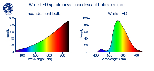
Incandescent light was VERY yellow, rendered dark blue, deep purples and browns poorly, but the amount of red did make it feel “comfortable/warm” to a large majority of the population. LED presents color in a different way because the spectral power distribution (a representation of the amount of each color in the visible electromagnetic spectrum) is different.
Don’t be frightened. The electromagnetic spectrum is easy to understand. Visible light spans from 380 nanometers to 700 nanometers. Ultraviolet light has a smaller measurement than 380nm (it appears to the left) and infrared light is larger than 700nm (it appears to the right.) The visible range begins after the ultraviolet light on the spectrum, runs from purple to blue, to green, into yellow, orange and finally red before disappearing from the human eye’s visible range into infrared light.
In this image, you can see the assortment of colors visibly represented across the horizontal, the intensity of each color is displayed vertically.
The incandescent light features a very small amount of intensity in the purple and dark blue area on the left, hence the reason it is so difficult to “see” the difference between a navy blue suit and a black suit.
All white LED starts with a blue diode that is influenced by phosphors. That blue seed is visible in the LED spectrum as the blue hump on the left, before the huge rise into light blue, green and yellow. The almost nonexistent “red” at the right is the reason humans feel that LED is somewhat cold, or less comforting than the “warm” old incandescent.
The good thing about LED is that the spectral curve CAN and HAS changed since the first LED were introduced into the market. The incandescent curve hasn’t changed since Thomas Edison. That means we have options today that were unimaginable yesterday. A 3000K output will increase the “hump” of blue slightly resulting in better rendering on purple, blues, blacks and even white. With the 2700K white light as illustrated here, the blue is marginally suppressed and the red is increased a bit allowing for better color rendering of warmer colors like beige, yellow, orange, wood and eathtones. Red is a VERY dominant color, so even with substantially lower intensity, it still renders the color well.
Most lamp and luminaire manufacturers now produce 2700K and 3000K LED products, so as consumers, we are faced with a very simple choice. Do we have a “warm” or a “cool” space? If warm, we should select 2700K products, cool means buying the 3000K option.
Akira Kurosawa’s movies are complex and will be studied by film scholars for decades to come. How he achieved some of the results will continue to illicit post-screening, coffee shop conversations for as long as we have movie fans. Choosing color in a residence is decidedly easier. As long as you grasp the underlying science.
I remember this quote from about a decade back while attending a lecture. It is attributed to Chris Harrison – Future Interface Group.
If you showed Thomas Edison the Hue light bulb he’d say, “All you did in 120 years was make it change colors?”
For the next couple of weeks, we’ll see a lot of colored light. There will be trees decorated with light, homes decorated with light and even a few Santa caps will be illuminated. There is a good chance, every one of these applications will use LED. (Especially, the cap!) Unless you have one of those retro-holiday friends who scour flea markets for old school light bulbs, holidays are now made festive with LED light. We probably don’t think about it, but the energy savings is substantial. Your utility company has definitely thought about it. Power use always accelerates during our end-of-year celebrations. LED has helped to make that less daunting for the power producers.
Think about the changes in holiday light that are brought about by LED, then consider this is technology we had relegated to audio-video equipment on-off buttons and wristwatches until about fifteen years ago. Sure, it took 120 years to extract ourselves from the incandescent light bulb, but since that unhinging, I believe we’ve made up for a lot of lost time. More will occur and change will continue, but inventors and consumers deserve a pat on the back. Well done, all.
As you drive to visit family and friends this month, check out the now ubiquitous icicles hanging from gutters, the whole-home façade light displays and inflatable yard toys, all lit with LED. We all did this. Congratulations!
As for your ample-bellied Uncle wearing an oversized sweater emblazoned with a flashing red reindeer nose, I’m sorry. You know people will always find a way to mess with new technology.
Have a wonderful holiday and an even better 2024. I’ll have more to say about light in the New Year…as always, but you already know that!
Of course, my main reason for writing this blog is lighting, but shows such as BDNY offer other products beyond lighting. Likewise, New York is New York is New York. I couldn’t resist the opportunity to see the new production of “X: The Life and Times of Malcolm X” at the Metropolitan Opera. Very good, with amazing vocals provided by Leah Howard as Betty Shabazz. Even though the ending is known to all, in this telling, it was riveting. I was very interested in the retrospective of the work of Judy Chicago at The New Museum. I especially enjoyed her earlier work, but was somewhat unaware of her pieces dealing with childbirth, “The Birth Project.” The collaborative fiber/needlework pieces were stunning. I love theater. My wife and I were able to see the original production of “Sweeney Todd” MANY years ago, so I thought it would be fun to see the most recent production. It was excellent. I also saw the just opened, “Harmony” (Very Good!) The soon closing, “Here Lies Love” (some of the most inventive staging I’ve seen in years) and the hottest show on Broadway, “Merrily We Roll Along” (a mesmerizing revival of Steven Sondheim’s first theatrical failure.) Dinners at Shuka, Le Rock and Claud were uniformly excellent. Most importantly, here are a few non-lighting things I found of interest.
The Klein Kitchen & Bath showroom in the Flatiron design district showed a kitchen with tinted glass upper cabinets. We’ve moved from cabinets, to no upper cabinets, then a rebuke of that shift. Could this be the next option? I found it interesting.
I suspect I don’t think much about doors and wall systems, but the showroom for the Italian firm, Rimadesio is elegantly beautiful. As we live in a world with more “open-space” design, there is an inevitable desire to cordon ourselves for privacy or quiet. Done tastefully, a space can look right, even with the addition of such grand architectural elements.
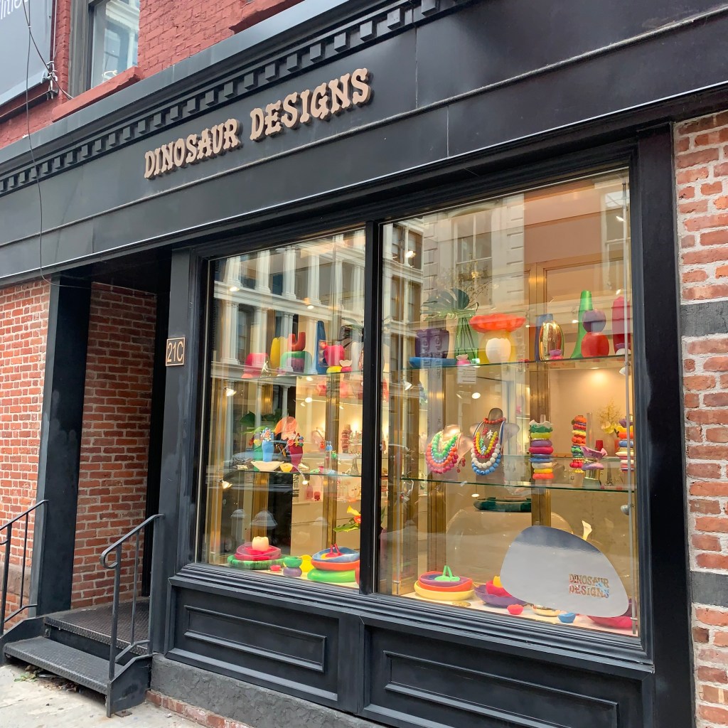
Everyone and every space needs a jolt of color. The Dinosaur Designs showroom is a reprive to a world of beige. Glass bowls, drinkware, plates, vases and equally colorful rugs allow this space to explode with possibilities. Need to differentiate a room? Check out these options!
New York 2023 – Dinosaur Design Colorful Display Window
There is a class of “full function.” smart, high-end toilets offered today by both Kohler and Toto. The Kohler Numi was perhaps the first to gain my attention. It is a beautiful piece. Their subsequent designs are equally intriguing. Toto, on the other hand is offering very pedestrian designs with the same features. They appear clunky and oversized. Smart toilets are substantially more expensive than “standard” toilets and for that reason, I believe Kohler has the right idea. Combine the higher price with higher style to make the cost more palatable. I’ve learned from friends in the plumbing business that Toto quality is superior to Kohler. I suspect that might be better debated on an episode of “Firing Line.” At this juncture, I think Kohler is approaching smart toilets correctly. As the technology becomes common, opinions might change.
This was unique. SG Tree Art Rugs showed rugs made from strips of leather shaped as a slice of a tree trunk. Yes, a niche market, but really beautiful work.
BDNY 2023 – SG Tree Art – Rugs borrowing the look of tree trunks
Ceramic Tile
There are a lot of tile showrooms in the Flatiron Design District. All were also represented at BDNY, so I had a double helping of influence.
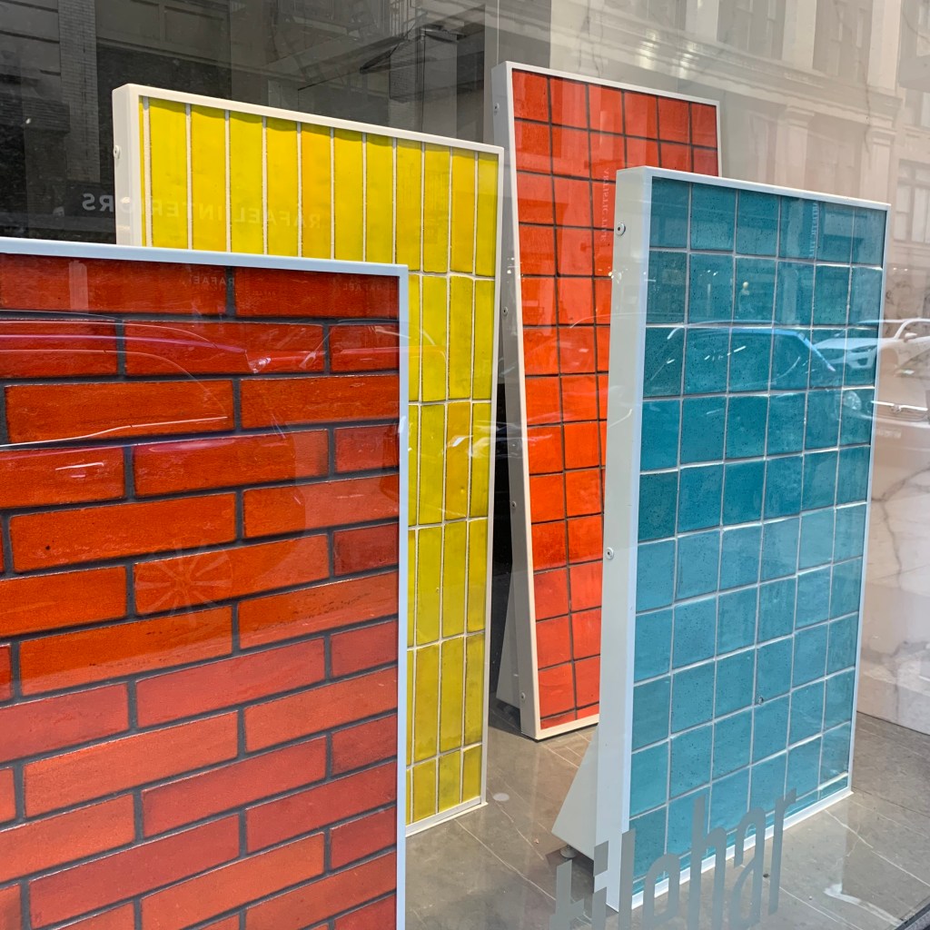
Tilebar showed their new collection of high-gloss, bold color tiles. These reminded me of the walls on my elementary school building, constructed in the late 50s. Placed pell-mell across the surface of typical brown bricks were these highly glazed, colorful anomalies. I loved it. Thinking back, I wonder if this was done to help kids realize they could be diamonds in the a field of chaff, or just some yeoman laborer trying to make mundane work more fun.
New York 2023 – Tilebar – Colorful, high gloss tiles
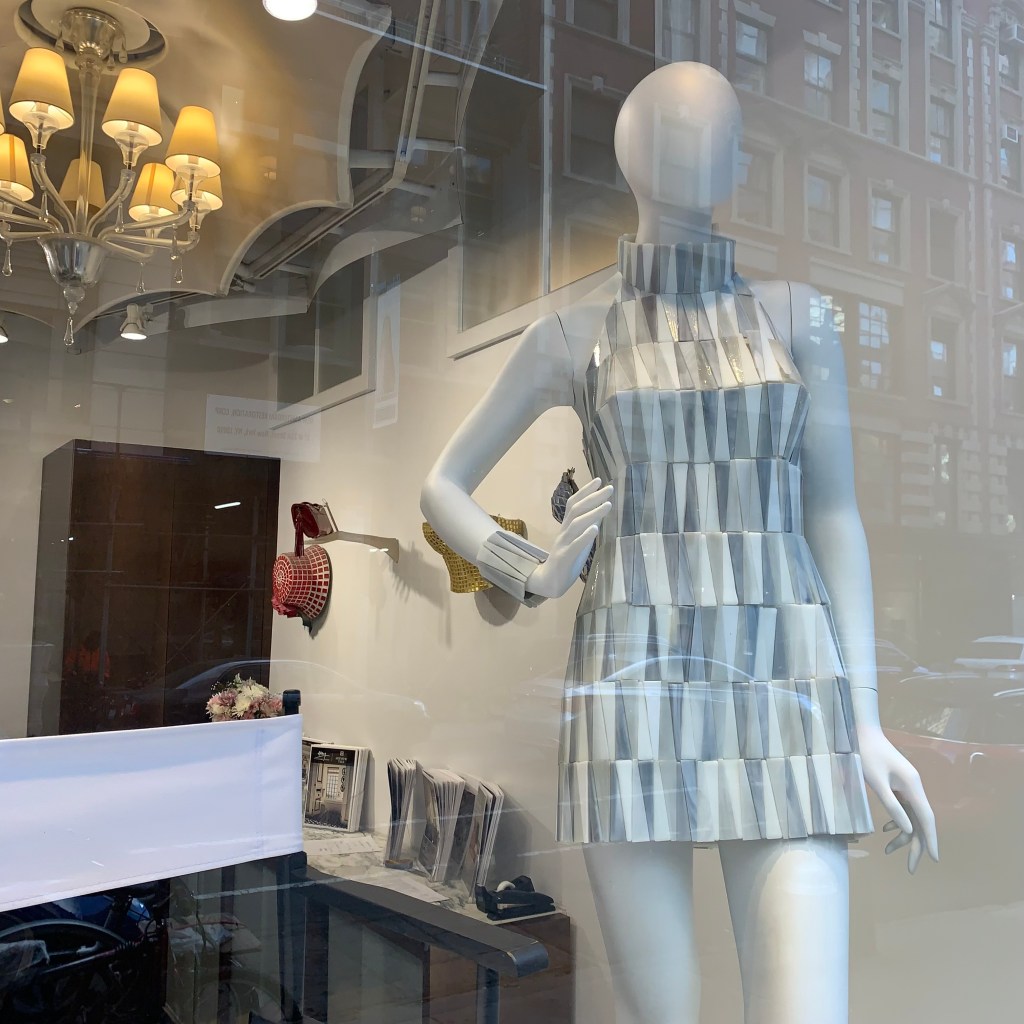
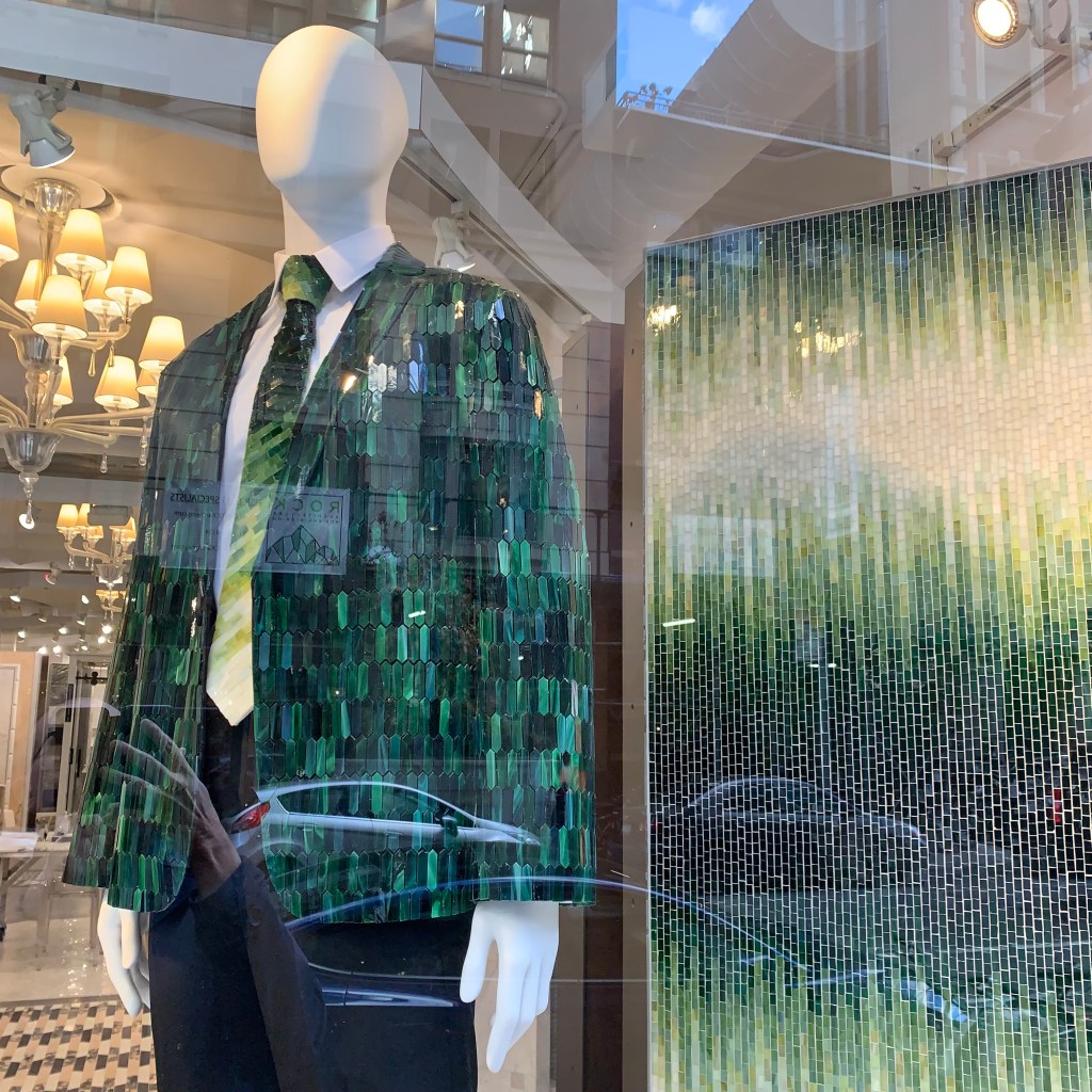
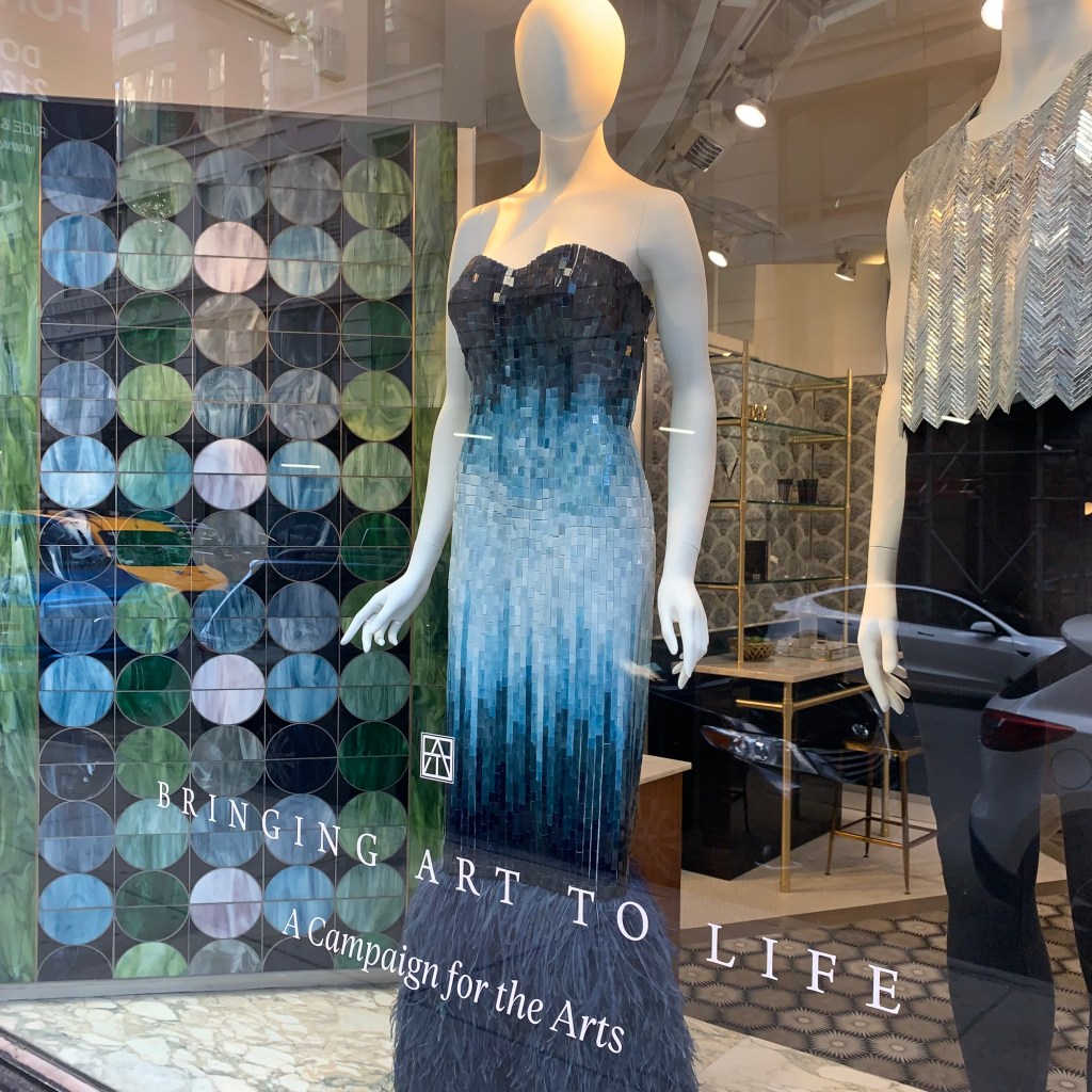
The windows of Artistic Tile were dressed with mannequins using tile and mosaic as clothing. This was a nice way to help people understand the flexibility of tile as a wall or floor covering. Tile can be a media used in places beyond those currently considered.
New York 2023 – Artistic Tile – using mannequins to show the flexibility of tile and mosaicNew York 2023 – Artistic Tile – using mannequins to show the flexibility of tile and mosaicNew York 2023 – Artistic Tile – using mannequins to show the flexibility of tile and mosaic
The new Botanicus collection designed by Allison Eden for Akdo is a colorful arrangement of glass mosaic arranged in a floral pattern. An entire wall has been completed in their showroom and it was such a bright spot, it was impossible to ignore. This would certainly enliven any residential space.
A trip to New York can be inspiring and exciting. I always come away exhausted, but replenished. I hope this short recap can help as you consider your next project, with or without lighting.
Last weekend, I attended BDNY in New York City. BDNY primarily concentrates on the material needs of the hospitality industry, but the line between their aesthetics and residential desires continues to blur. Sure, most homes have no need for security safes, temporary door locking systems and parking controls, but by digesting the relevant sections of the show floor, one can interpolate some of the aspects of trends that crossover.
Prior to the show I checked out showrooms in the Flatiron District and SOHO. I’ve combined those observations here. This blog posting will cover lighting. The next will deal with the non-lighting aspects of design I found interesting.
I always enjoy a stop at the Roll & Hill showroom. New items are typically shown on the first floor, older, but still relevant pieces are displayed in the upper floors. While there are newer contemporary pieces, I was struck by two collections of far more traditional designs then I have previously seen from this exciting manufacturer. De Playa is a collection using turned wood and ceramic diffusers. The wood brings to mind 70s turned wood luminaires (very popular!) and a somewhat “Early American” style that disappeared many years ago. The second collection, Rue Sala, by the same designer, Jessica Helgerson, uses turned brass shapes that reminded me of classic metals with an animated “Jetson’s” skyline influence. This traditional turn should be noted. When I asked the staff about the consumer response, they indicated a high degree of embrace to a point where line extensions will be forthcoming. We are seeing a shift away from hard contemporary with more emphasis on details and this is taking that direction to the natural next step.
If I were to make a single observation about all the lighting I saw during this trip, it would involve non-glass diffusers. Fabric, fiber and paper have always been part of lighting, but they move in and out of favor on suspended luminaires. They appear now to be “in.” Atelier de Troupe showed an oversized parchment pendant with heavy stitched leather lacing (Pedregal Lanterne) in their showroom front window. a-emotional light draped fine stainless mesh over linear LED light to deliver warm, comfortable illumination in the Nebra collection. I’ve mentioned Swadoh before, but they are worth a second. Their method of draping fabric over and around light creates beautiful, feminine and ethereal looks. Likewise Indo-Puri employs all types of natural materials to add organic warmth to lighting.
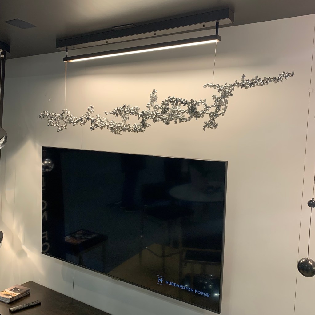
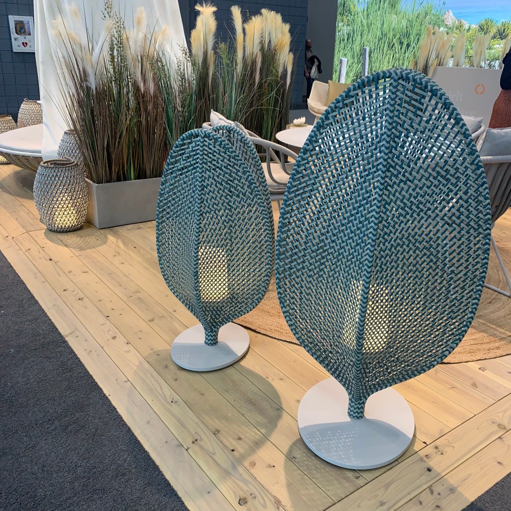
Alternate materials do not stop at fabric diffusers. I loved the ash plywood, linear pendant offered by Barcelona company, Bover. The Aluet nicely aims all the light downward and displays the beautiful wood grain to the surroundings space. Hubbardton Forge, in an effort to increase their sustainable footprint has upcycled older dies and tooling to create the Coral Pendant. Because of the nature of creation, each unit has some degree of uniqueness and the LED light is driven from the canopy overhead onto the organic-looking linear string. Also of note here is the ability to custom finish the aluminum coral. Need coral colored coral? They apparently can do that! Dedon is well known for their outdoor furnishings. Using that resin weave, they have created a line of outdoor portables. New(er?) this year is Scoora available in two heights. Yet another example of the importance of high-styled exterior living products.
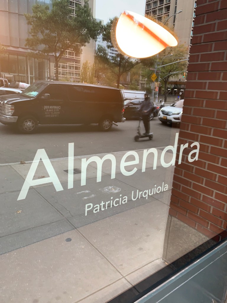
Flos displayed a great finishing technique in their SOHO showroom window. Almendra is a pendant by famed designer, Patricia Urquiola. To soften the often harsh output of the LED, she has painted the INSIDE of the shade a gradated umber near the light source, allowing a much more appealing illumination to be presented. It is a wonderful idea.
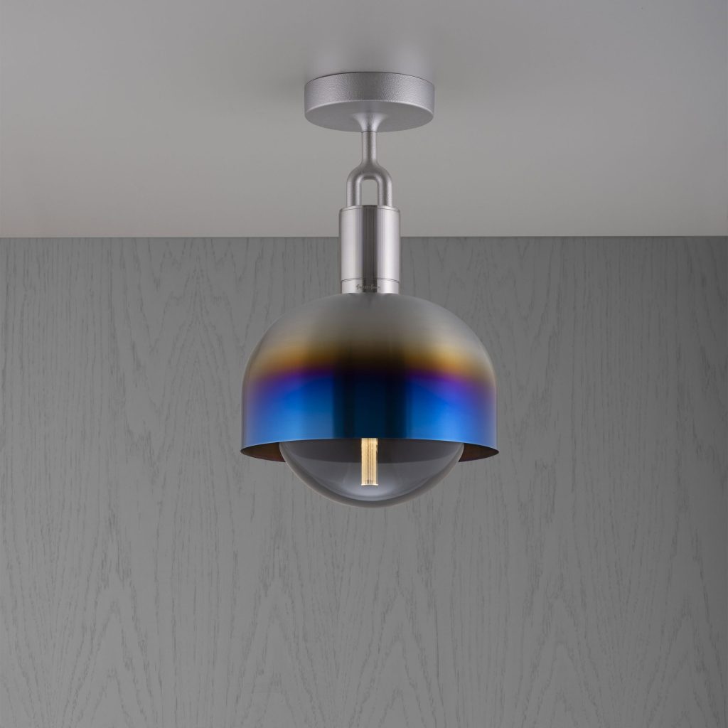
Buster + Punch has been a very influential supplier of interior accessories over the last few years. Their lighting certainly reflects the brand’s look. I was especially drawn to a finish I had not yet seen; Burnt Steel brings the fired iridescence to metal that I think could work in many applications. It is also, unquestionably different and could be the statement select interiors need.
The Chimes collection introduced by Sonneman hides the light inside an angle-cut cylinder. The cylinders are arranged in steps, like pipes used in an organ.
As we age, our eyes lose some of their keenness. Many seniors find it difficult to recognize door openings and hallway turns. Recently, there has been an increasing push for lighting that defines these areas of concern. Numera Lighting was at BDNY because they sell custom door/address number lights. In an effort to define their creativity and customization options, their show display, perhaps inadvertently, solved this growing problem. The rest of their offering is nice, too!
Numera Lighting – BDNY 2023 – Lighting flanking a door that can serve as support for those with sight irregularities
We are all aware that Natural Brass is becoming the “go to” finish for most lighting. This has transpired while home furnishings have shifted from neutral grey tones to beige tones. Brass and beige are, and have been a natural fit, so in the greater scheme of things, interiors are being well suited for the future. But what if you don’t want to change EVERYTHING in the home? The CB2 store in SOHO dressed one vignette with the new Brass and some of their grey furniture. I thought this was genius! The brass looked nice with the grey, just different enough to set the area apart. It also subtly told the shopper that they didn’t need to change everything, all at once. For those retailers trying to help people transition into the new reality, take a clue from CB2. Well played.
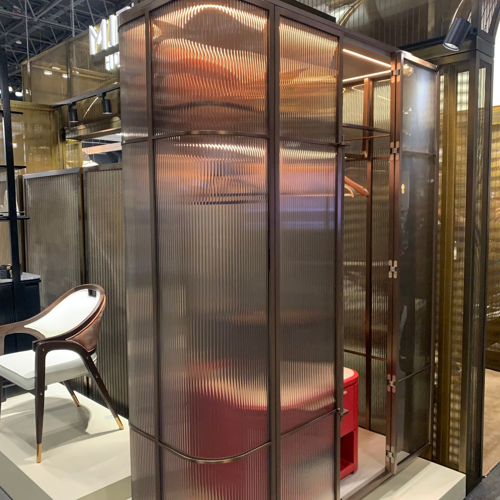
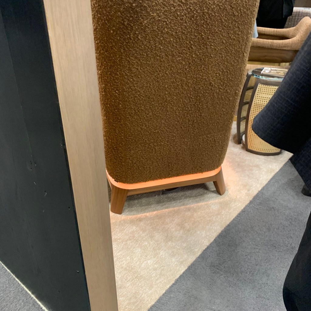
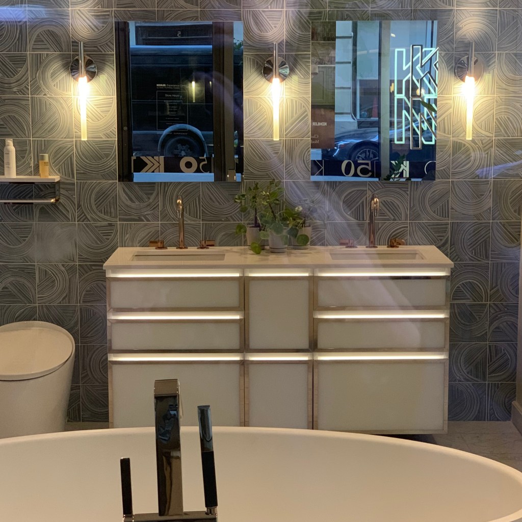
LED Tape is everywhere and it is not being sold by lighting retailers, but instead by all types of different “non-lighting” companies. Because lighting people did not provide the vision beyond what was already conceived, other home furnishings industries grabbed the reins and pushed lighting manufacturers and retailers out of the way. Mittman Hospitality showed a ribbed amber glass freestanding closet with LED Tape wrapped around the interior perimeter. What an exciting look this will provide to a room. The Kohler showroom in the Flatiron District had a vanity with LED Tape used to accent the drawer pulls. One of the furniture manufacturers (I forgot to jot down the name) imbed LED Tape into the base to visually float the chair over the floor.
Mittman Hospitality – BDNY 2023 – Light inside a stand-alone closetBDNY 2023 – LED at base of chairKohler – Light illuminating drawer pulls of a vanity
Each year, designers deliver more, new and interesting product. As we have witnessed, lighting is finding itself in new and different places. We are moving beyond the dining room chandelier to a place where light elevates furniture, plumbing, outdoor living and walls. As users, creators and retailers of light, we need to look beyond, to stay ahead. If we don’t, it is easy to see how other industries might envelop luminaires into their product line.
When LED lighting was new, the US Department of Energy began the CALiPER program. The research provided by this series of investigations (spanning 2007 to 2014) was revelatory. I devoured each of these reports as I prepared information to help people understand this new “highfalutin” technology. These were helpful, straightforward and fair reports to the consumer and industry.
The concept was easy to understand. The DOE went to a retailer and bought a dozen (or so) LED products in a similar category, reviewed the enclosed documentation, website claims and marketing promises. The product was then independently tested. The results were compared with the promise and presented in a series of reports released periodically over the seven years. No vendor names were shared. Product identification was blanketed. The intent was to distribute data on the progress of the technology.
At the time, I was working for a manufacturer and I found the information helpful in combating crazy claims by competitors. It was also comforting to see that the results we were getting, were in-line with the realistic numbers unearthed by CALiPER. As someone who helped educate users about this new technology, I could confidently warn them of irrational claims. As the technology improved, the gap between manufacturer’s claims and actual test results continued to shrink. More realistic promises were made. What LED could and could not do became clearer. Each CALiPER report was immensely helpful. When they discontinued the program, it was time. LED had become a mature product category. I would miss them, but I knew they served the industry well. I said a silent “thank you” for a meaningful bank of data.
CALiPER is now back. This time, doing the same yeoman’s work, but instead concerning Germicidal Ultra Violet (GUV) lighting. The first installment is out and I’m almost as excited! (Go ahead, make fun. “This guy gets excited by a US government data report release.” Just keep in mind. I do this so you don’t have to!!) 13 GUV products were reviewed and like the initial round of LED, product claims were wildly in excess of reality. One line from the summary says it succinctly, “This CALiPER GUV Round 1 report demonstrates the significant education and training manufacturers and vendors still require to accurately test and report the performance of their GUV products.”
The CALiPER testing does not review the germicidal efficacy and cleansing capacity, only the light measurement and performance, plus more importantly, photobiological safety when using potentially hazardous ultraviolet light.
It is important to remember that most of the light within the UV spectral range is harmful to humans. “Some” UV is considered “safe” and those same very specific wavelengths of UV have been found effective in combating germicidal pathogens. Some of the units tested claimed to be safe for use when a human is in the room (other units are intended for use when the room is empty) but those did not deliver the UV as promised, potentially causing harm to skin and eyes. Because they have fallen out of the effective spectral range, they might not be very effective killing pathogens either. (Again, those claims were not part of the testing scope.) Light distribution was also reviewed. The analysis found some had a very poor intensity distribution, so while the spectral characteristics might be correct, the light would not necessarily “hit” or reach the germicidal target unless it fell into a very tiny point in space.
The report provides a number of additional findings, including some of the unexpected testing shortcomings. Equipment needed to test UV product is rare and very specific. The agency admits that it could not adequately test some claims because testing agencies don’t have the required equipment. It does raise the question how the manufacturer can make a claim that cannot be substantiated.
This is the first of what could be hundreds of test. More will be learned and the industry will be stronger for this work. The first group of LED MR16 lamps included a product claiming to be an exact replacement for a 50W halogen version and the test showed it barely equaled a 15W halogen. Fewer and fewer of the blatant lies occurred in each subsequent testing tranche. With the increase of airborne pathogens, such as COVID-19, GUV lighting can be an effective combatant. As users, we simply need good data from reputable sources, just like LED lighting. It’s great to know the same review process is now in place.
If, like me you want to dig into the details, links to the actual reports are included below.
What’s missing from this kitchen/island design? Photo by Saviesa Home on Pexels.com
Time and again, the building industry makes long range predictions about new single-family home size shrinking and in almost every instance, they miscalculate or over-promise, but it is hard to say they are definitively wrong. In other words, it’s complicated.
The logic behind smaller homes makes perfect sense. Homes are getting more expensive, wages are for the most part stagnant or in decline, land costs are increasing, import duties for products have been raised, creating a de facto price increase for many home goods and inflation has ripped through much of the building trade supplies. The solution seems obvious. Reduce the size of the home, the cost will go down and people can afford the newly configured home. Easy.
Unfortunately, that is not what happens. While there is reduction in single family home size of minimal square-footage, the average cost has increased year over year. That means new home construction is being limited to a narrower and narrower group of wealthier and wealthier customers. Average buyers are increasingly being pushed out of the new home market. That does not mean people with an average income are homeless. It simply means an adjustment.
For the last thirteen years, the quantity of townhomes built has increased. Townhomes occupy a smaller slice of land, walls are shared and costs are reduced thereby making the home much more affordable. As has been reported so often since the pandemic started, existing home sales have risen to record levels. While cooling slightly mid-2023, the sale of real estate remains high. It has also been reported that Millennial buyers are buying older homes in mature neighborhoods that more equitably match their income. The fact is, people are buying home, but many are smaller than they might have desired.
All of these buying trends leave the consumer with a challenge. Smaller townhomes, smaller single-family new construction for those lucky enough to match income, cost and availability and smaller, pre-existing homes, means smaller living area that needs to be maximized. Couple this housing size direction with the universal understanding that the kitchen is the center of the home and the challenge is pretty clear.
When home size was increasing year-over-year, pre housing crisis 2008-09, kitchens were illuminated with “average” looking lighting. The dining room grabbed all the glory and almost all of the lighting budget money. Post housing crisis, dining rooms, even in luxury homes shrank and kitchens grew. As a matter of fact, the one room in the home where consumers will NOT make concessions in size is the kitchen. Size in-fact, continues to grow. With all that in play, as lighting people, we must elevate this space with good lighting.
If the centerpiece of a dining room is the chandelier, then we’ll need to think about pendants or a linear pendant over the island as the centerpiece of the “new dining room.” To make that occur, elevate the product selection. Find pieces that rise above, fill the vertical, as well as the horizontal space and be certain that they speak to the visual moment.
Intelligently selected kitchen lighting, especially that which is centered on the island can take a mundane look and allow it to rise above the smaller surroundings. Combine that focal point with accent lighting above cabinets, at toekicks and under the island overhang and the smaller room immediately looks larger. If cabinets have clear or translucent fronts, illuminating them can increase the visual size of the room. Good lighting can elevate a room and allow the viewer to ignore the size.
Some people can afford the home of their dreams with all of the amenities imagined. Most of us need to make concessions. Concessions coupled with wise decorative elements such as lighting will allow you to forget the smaller size and revel in the exciting results.