As a follow-up to seeing the English film, “Living” a friend allowed me to borrow his Janus Film copy of the original Akira Kurosawa masterpiece, “Ikiru.” I typically do not watch the “extra features” included in most digital packages, but the interview with the visionary director was too compelling to ignore. The talk was broken into various aspects of his approach to film. One was titled, “Lighting” so of course, I could not help but pay extra attention.
In his conversation on the importance of lighting, he mentioned that to embolden colors that appear on film, he would paint and tint reflector panels that would pick-up the set lighting and bounce additional color with light onto what was being filmed, thereby resulting in more dense, fuller tones. It is the reason why so many of his color films have such vibrant appearances. If you haven’t seen “Ran” give it a watch to understand the value this technique brought to the movie. Trust me, whatever you see on your flat-screen was better in the theater using projection. After so many years, I still remember it.
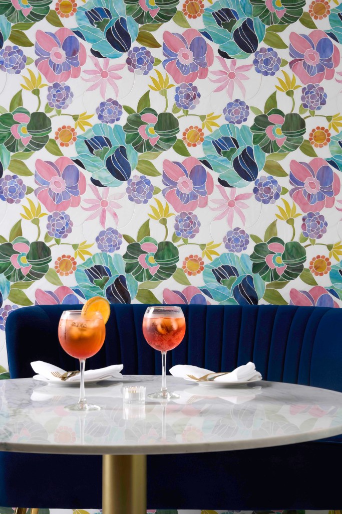
I started to think about its use in residential lighting. I knew a landscape lighting designer who used seven different gels or tinted blue filters on incandescent lamping to complement each varietal of evergreen, resulting in an otherworldly feel to the exterior spaces he lit. Perhaps the client didn’t know, but he and I suspect other designers certainly did.
Can we bring Mr. Kurosawa’s and my acquaintance’s dedication to color into the interior of a home? In fact, we may have already done that when we introduced LED to the home a few years back.
Incandescent light was VERY yellow, rendered dark blue, deep purples and browns poorly, but the amount of red did make it feel “comfortable/warm” to a large majority of the population. LED presents color in a different way because the spectral power distribution (a representation of the amount of each color in the visible electromagnetic spectrum) is different.
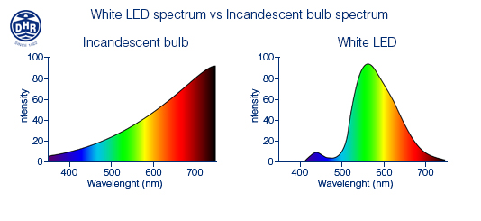
Don’t be frightened. The electromagnetic spectrum is easy to understand. Visible light spans from 380 nanometers to 700 nanometers. Ultraviolet light has a smaller measurement than 380nm (it appears to the left) and infrared light is larger than 700nm (it appears to the right.) The visible range begins after the ultraviolet light on the spectrum, runs from purple to blue, to green, into yellow, orange and finally red before disappearing from the human eye’s visible range into infrared light.
In this image, you can see the assortment of colors visibly represented across the horizontal, the intensity of each color is displayed vertically.
The incandescent light features a very small amount of intensity in the purple and dark blue area on the left, hence the reason it is so difficult to “see” the difference between a navy blue suit and a black suit.
All white LED starts with a blue diode that is influenced by phosphors. That blue seed is visible in the LED spectrum as the blue hump on the left, before the huge rise into light blue, green and yellow. The almost nonexistent “red” at the right is the reason humans feel that LED is somewhat cold, or less comforting than the “warm” old incandescent.
The good thing about LED is that the spectral curve CAN and HAS changed since the first LED were introduced into the market. The incandescent curve hasn’t changed since Thomas Edison. That means we have options today that were unimaginable yesterday. A 3000K output will increase the “hump” of blue slightly resulting in better rendering on purple, blues, blacks and even white. With the 2700K white light as illustrated here, the blue is marginally suppressed and the red is increased a bit allowing for better color rendering of warmer colors like beige, yellow, orange, wood and eathtones. Red is a VERY dominant color, so even with substantially lower intensity, it still renders the color well.
Most lamp and luminaire manufacturers now produce 2700K and 3000K LED products, so as consumers, we are faced with a very simple choice. Do we have a “warm” or a “cool” space? If warm, we should select 2700K products, cool means buying the 3000K option.
Akira Kurosawa’s movies are complex and will be studied by film scholars for decades to come. How he achieved some of the results will continue to illicit post-screening, coffee shop conversations for as long as we have movie fans. Choosing color in a residence is decidedly easier. As long as you grasp the underlying science.