I’m old enough to remember when all lighting was manufactured in the USA. I was also dropped, smack-dab in the middle of the transition from “Made in America” to “Made in China.” Let me help you understand the realities as we approach a political atmosphere with limited knowledge on the topic and the guillotine of added tariffs over our heads.
In the 1970s most lighting companies assembled parts made in-house, or by a collection of suppliers to the industry, also located in the US. Arms were bent, pipes were swaged, glass was blown and wood was turned and fabricated all by an army of small job shops. Painting, polishing and plating was done in-house, or at small local suppliers. France, Greece and Mexico made a fair amount of glass and the ubiquitous bronze was created in Spain, but that was about all that was imported.
That was followed by a short period when manufactures sourced components from around the world and assembled or packed them in the US or Mexico. This globalization of manufacturing was a precursor to the eventual shift to Asia, a move that was forming in the background.
During the energy crisis of the late 1970s, Taiwan began to build the inexpensive ceiling fans America demanded and through that effort, they inadvertently stumbled into the lighting fixture business. The floodgates were opened.
Taiwan and Korea became the primary source for lighting, but because of the highly educated local populations, neither could satiate the American demand. It was so difficult to find polishers and machine operators, Korea allowed many Bangladeshi migrants into the country, but it wasn’t enough. The Taiwanese manufacturers started to build alliances with people and facilities in China. Korea made attempts to partner with the Chinese, but for a series of reasons, they did not succeed and disappeared shortly thereafter. The Taiwan manufacturers kept the more complicated products and shifted the lesser-quality good to China. I and hundreds of other Americans spent days and weeks in the country helping the factories create the products that American consumers wanted.
The part most people don’t realize is that it took time to develop a mature global supply chain in China. Reliability, technological proficiency and production functionality needed to rise to western expectations. With that in place, the product quality, style and value progressively rose. Because decorative lighting is a low-volume business, Production automation was almost impossible. Components needed to be processed individually and the luminaires assembled one at a time. Some product would never have been made in the US. They were now possible in China. All those advancements however came at a price, duty.
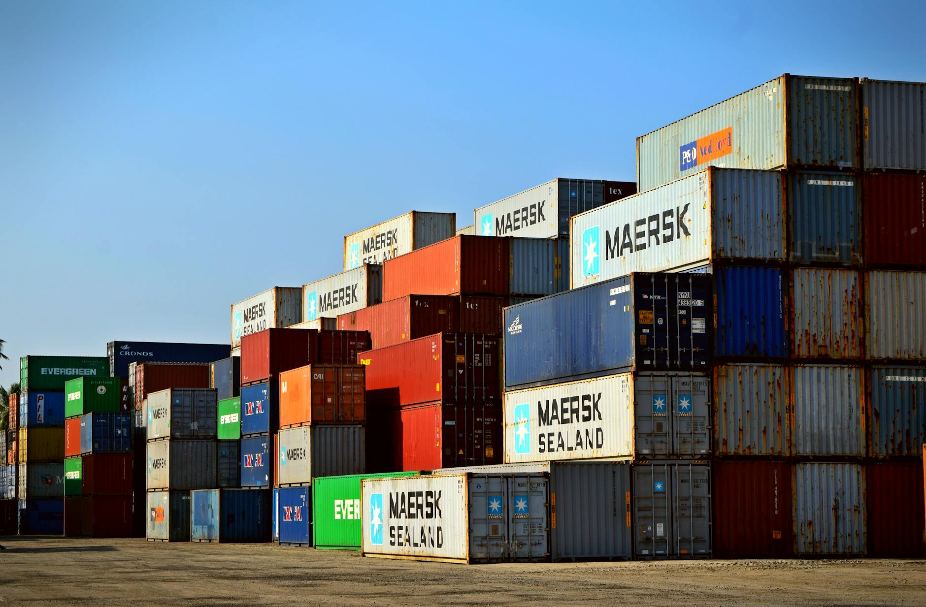
To assess a duty, each product produced overseas must be assigned a Harmonized Tariff Schedule (HTS) classification code. This informs the importer how much they must pay the US government to bring this product into the country. There are also duty brokers who facilitate this transfer of payment who need to be paid. The final adder can also be sizable, overseas and across-land freight.
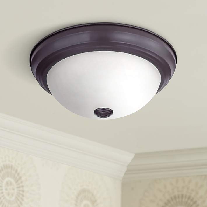
To better understand this, let’s consider buying a wall sconce from China. Here is a theoretical cost breakdown.
| Cost | Description | Paid to: |
| $10.00 | Cost of the wall sconce, assembled and packed | Chinese Manufacturer |
| $0.76 | HTS Code 9405.11.60 (Chandelier & other electrical ceiling or wall lighting fixture) 7.6% (not made of brass) duty | US Government |
| $1.00 | 10% added tariff by President Trump in September 2018 | US Government |
| $1.50 | 15% added tariff by President Trump in September 2019 | US Government |
| $0.05* | ½% Broker’s Fees (est.) | Brokerage Company |
| $2.36 | Ocean Freight 1 cu. Ft. volume carton. $5000 avg. cost for 40’ container w/ 90% efficiency. | Freight Company |
| $0.38* | Overland Freight $3/mile approx. 300 miles | Freight Company |
| $0.80* | Importer Overhead at 8% For Purchasing, Importation and Warehouse personnel + any drayage fees | Held by Manufacturer/Importer |
| $16.85 | Total cost in 2024 |
* Educated guesses
Now, let’s assume new tariffs are assessed to all imported products. All of the above will remain, but a new number will be added;
| Cost | Description | Paid to: |
| $1.00 | 10% added tariff promised by President Trump when he takes office (Per his 11/26/24 announcement) | US Government |
| $17.85 | New 2025 Total |
To this number, the manufacturer must now add their profit and the cost of doing business. If you’ve watched enough Shark Tank, this is called “margin” and can mean the difference of staying in business and going out of business. Simply, the margin is the percentage of the selling price that is profit. For this exercise, let’s assume we need a 50% margin to keep our theoretical company afloat. (in practice, this number can vary quite a bit.)
Now, let’s see how tariff increases impact the consumer costs.
| Importer/Manufacturer’s Cost | Profit Margin | Distributor’s Net Price | |
| Pre-2018 w/ duty base of 7.6% | $14.35 | 50% | $28.70 |
| Current state with the 25% 2018/2019 tariff upcharges | $16.85 | 50% | $33.70 |
| 2025 with the promised additional 10% tariff | $17.85 | 50% | $35.70 |
The retailer, who prior to 2018 purchase the sconce for $28.70, saw a 17.4% increase over two years and will see another 5.9% increase in 2025, if the new administration follows through with its plan. That means, the collective Trump administrations will be responsible for a 24.4% cost increase. This is in addition to any inflation-related increases.
The retailer must now take the price they paid to the importer/manufacturer and add a level of profit required to run their retail establishment. I am not a retail expert, but have learned that number can range from two to three times the incoming cost of goods. Some retailers might actually need a higher level of profit, especially if they are located in a high-rent district, or a city with a higher cost of living. For this exercise, I’ll provide a range of two to three times their cost of goods. Understand, it could be higher.
| Retailer paid Cost | Profit Margin | Retail Selling Price | |
| Pre-2018 | $28.70 | 2 to 3 times the cost | $57.40 to $86.10 paid by the end consumer |
| Current state with the 2018/2019 tariff upcharges | $33.70 | 2 to 3 times the cost | $67.40 to $101.10 paid by the end consumer |
| 2025 with the promised 10% added tariff | $35.70 | 2 to 3 times the cost | $71.40 to $107.10 paid by the end consumer |
The impact to the end consumer can now be assessed. An increased price in excess of inflation of 24.4% is the result. Most of that addition will be paid to the Federal Government.
Could the importer/manufacturer reduce their margins? Perhaps slightly, but most companies know their cost of running a business. If they slip below their 50% margin (in this hypothetical) or 2-3 time markup, something will need to be sacrificed. Service, salaries, employee/customer benefits, something will need to be reduced to make up for the loss. Retailers and manufacturers have no choice but to pass the added expense on to the consumer. It will either be that, or bankruptcy. In the last few years we have seen consolidation as an effort to reduce margins, initiated, in part, due to these increases. Perhaps more will be forthcoming.
Of course, the new President’s concept is that manufacturing will be returned to the United States, thereby eliminating the cost of duty, brokerage fees and ocean freight. (The Import Overhead will switch to Manufacturing Overhead and stay basically the same.) That supposes someone in America can hand-build, low volume products. Like the initiation of bringing lighting to China, all that will need to be repeated, this time in America. Labor, skill, investment and time will make this VERY difficult. It might work for highly automated, high volume industries like steel or automobiles, but the likelihood of lighting returning to the days of 1970 is slim.
That means a few realities will take place:
- Customers will pay more for lighting.
- The federal government will see a windfall of incoming dollars, all borne by the consumer.
- Things will remain pretty much the same for the Chinese manufacturers and the Chinese government.
Who is being helped and who is being harmed in this new scenario? It seems to me that someone from the new administration might be well served spending a day in the office of a lighting supplier before doing something rash.