Categories
Aesthetic Lighting Help

How Big is Too Big?

Simply add chain!
Photo by Dids on Pexels.com

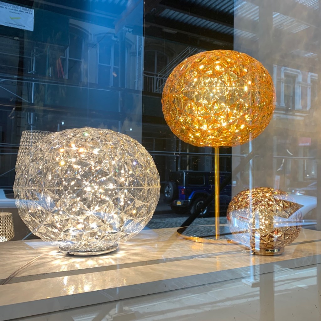
The Wall Street Journal asked the question, “Are Massive Lights the Next Big Thing?” in a January 8, 2022 article. In the story, radically oversized lighting was discussed, such as a 90” sisal pendant that oddly enough was dwarfed in the accompanying photo, by a huge room with 11’-0” ceiling heights. Personally, I think this was a case of a reporter jumping on a unique situation and turning it into a trend. It did, however raise the very real question of lighting size.

A quick search on the internet will deliver some very solid and consistent size recommendations for lighting size.

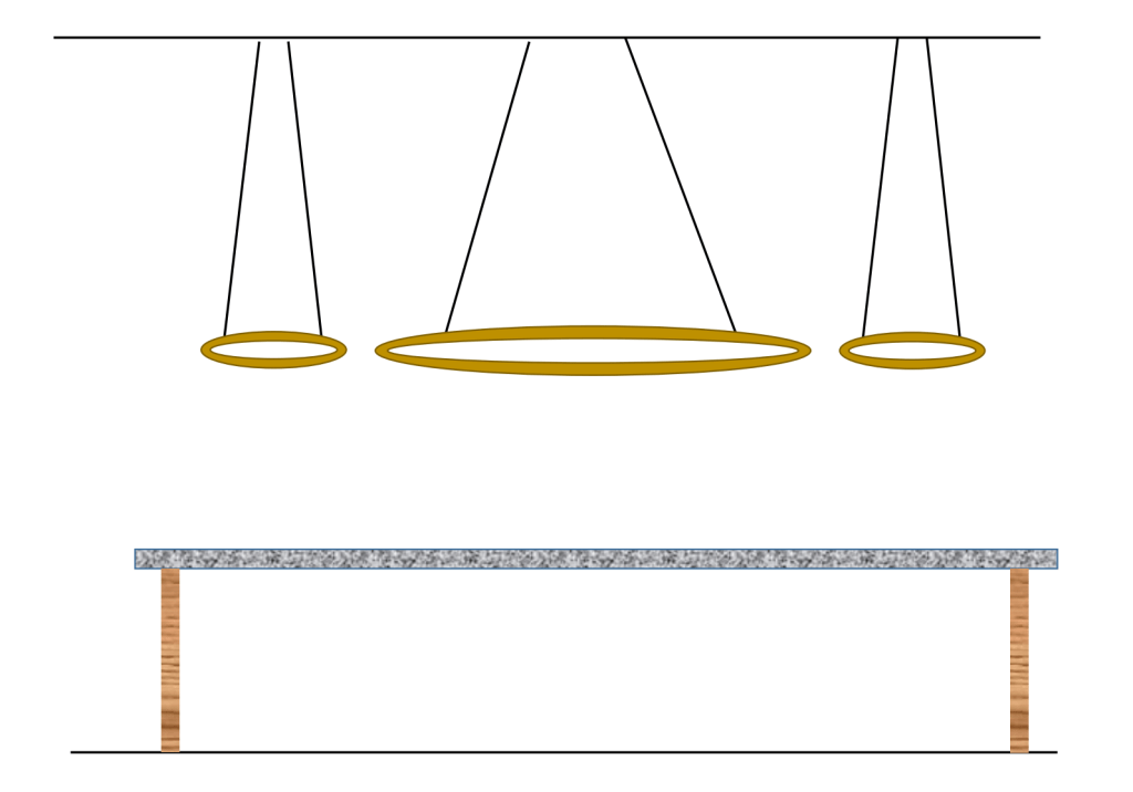
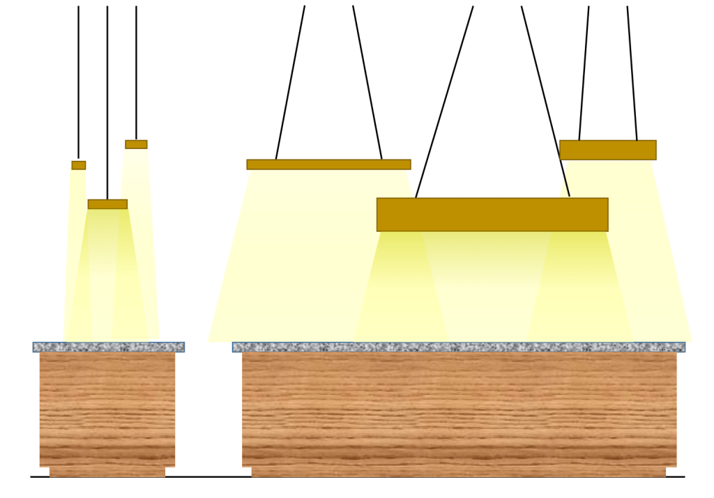
  • Add the two lengths of the room together to arrive at a minimum diameter (in inches) for a dining room chandelier.
  • Linear chandeliers should be between 1/3 and ½ the length of the table below.
  • Front porch lights should be between 1/5 and 1/6 of the door size.

I use these numbers, too…as a starting point. I then typically ignore them and think about the whole room, the size of the table and the height of the humans who occupy the space.

With those parameters understood, let’s unpack this reporter’s perception for a moment and think about when “big” (or bigger) could actually work in a design.

Dining Room

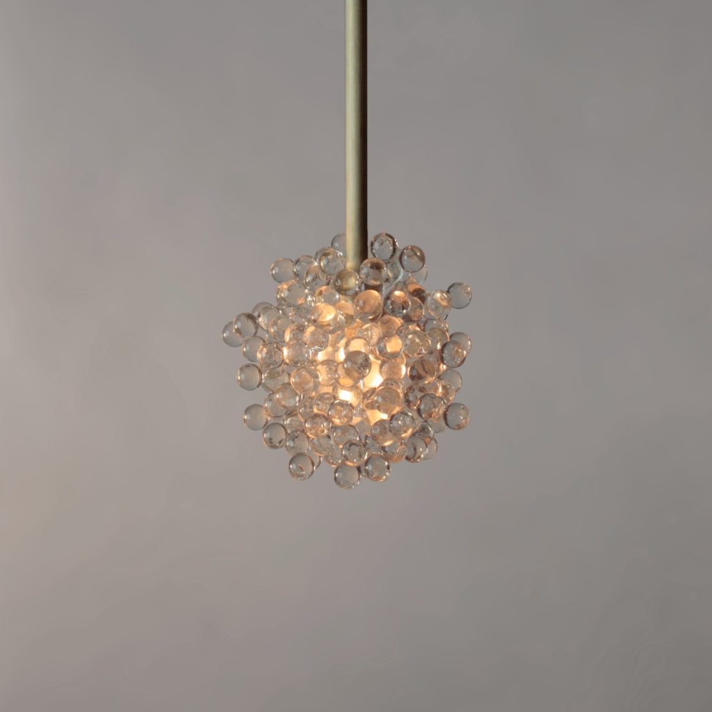
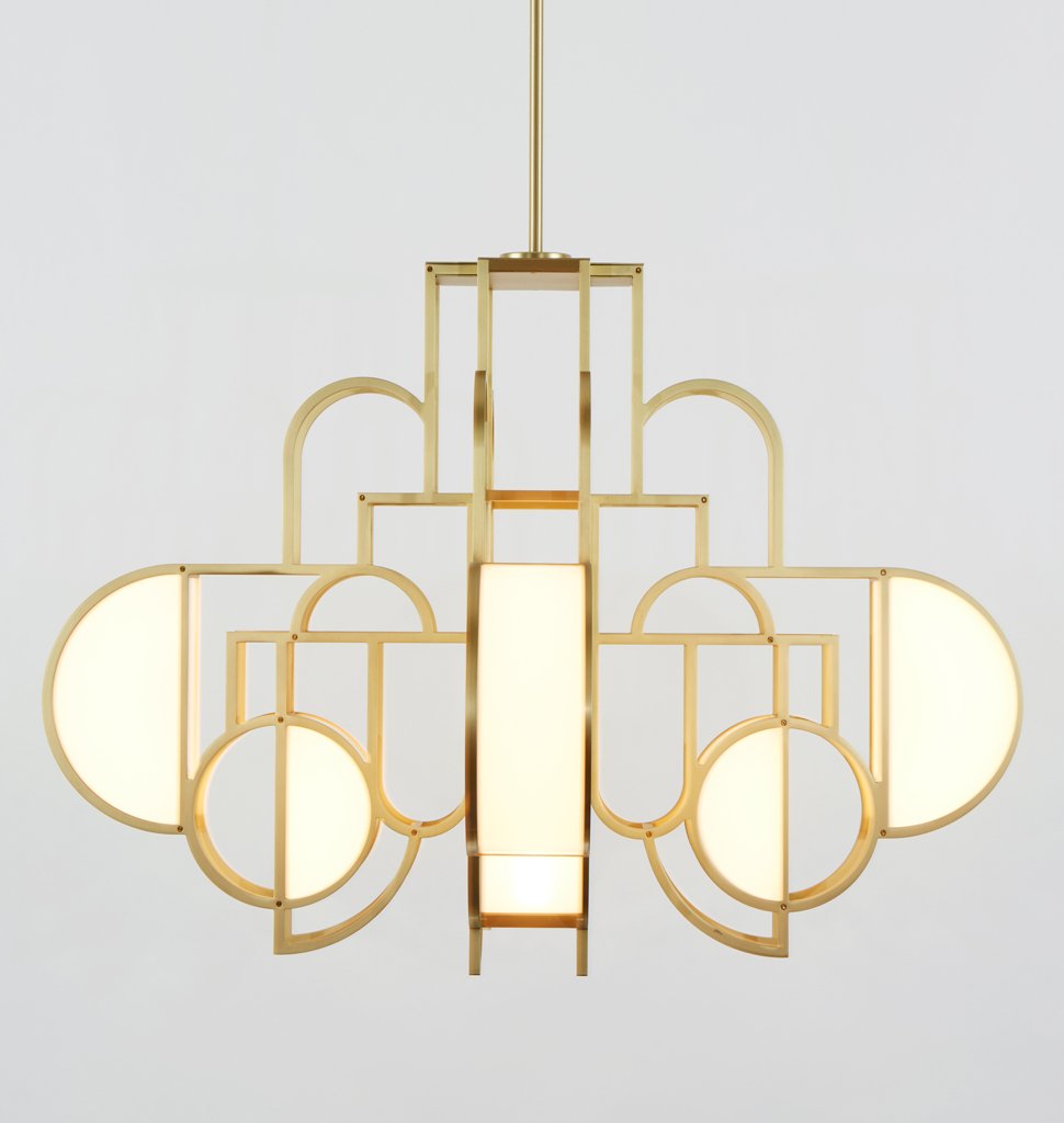
I always lean toward a larger chandelier than any calculation suggests. Most dining room tables are 30” wide, but if a larger one is used, that becomes a visual excuse to go bigger. 36” wide? Use a 36” diameter chandelier. A room that can hold a wider table can surely accept a larger chandelier. A 5’-0” to 6’-0” diameter or square table can also easily accommodate a larger chandelier.

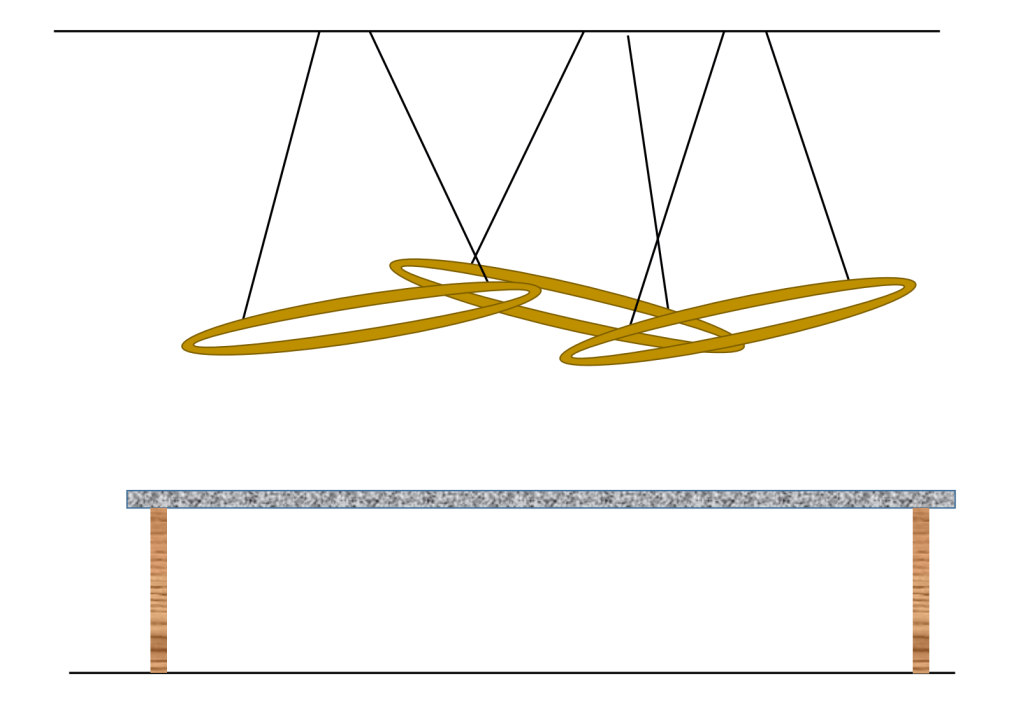
Consider too, the ceiling height. Larger should be considered in the verticality as well. 12’-0” ceiling demand some vertical attention. Fill that space with stretched and elongated chandelier designs.

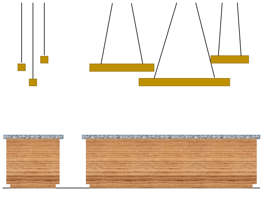
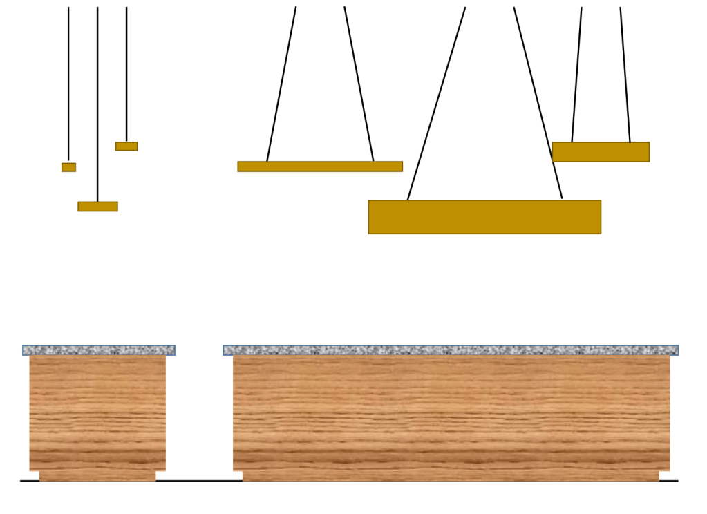
Squares contain more actual area than a round, so simply choosing a 32” square luminaire over a 32” diameter alternative will give you more mass and a bigger presence.

Dining rooms remain a showplace in a home. Allow them to earn that regard with majestically sized lighting.

Foyer

As we move away from two-story entrance foyers, we still need a dynamic introduction to the home. A one-story home with 10’-0” or even 12’-0” ceilings cannot accommodate a hanging chandelier, but a huge semi-flush, stretched across the ceiling can elevate that space. Unfortunately, not a lot of luminaire manufacturers build oversized semi-flush units. I suspect, if no one asks for one, and they can’t sell the ones they’ve made, there is a good reason for the void. I’d love to see a reverse of that trend.

Until more are made available, I suggest installing a chandelier without the chain or stem, tucked up to the ceiling. We can always find a wide variety of large chandeliers. Pay attention to the height. A chandelier with a body height of 18” will work on a foyer with ceilings as low as 9’-0”, 30” works on 10’-0” and 54” body heights will fit in spaces with 12’-0” ceilings. Not all designs will work hung in this manor, so attention must be paid to the view from below. Once the right piece is unearthed, you might ask why anyone would ever hang it from a chain or stem!

Consider the same thing with sconces. Forego the ceiling lights altogether and use a collection of TALL sconces around the perimeter. A 36” tall sconce will fit nicely in rooms with 9’-0” and 10’-0” rooms. Go longer in 12’-0” ceiling heights.

Islands

In the March 2022 edition of Architectural Digest, one of the featured homes used a 36” diameter wicker shade over a 5’-0” Square Island. This is probably larger than most of us would consider, but I think it works. The ceiling was exposed, the space was open and the light cane and whitewashed island material created an airy feel. Square, or oversized islands can be a great place to consider larger than average lighting. They are big and fill a lot of space in the room so, commensurately sized accessories work. The additional lesson here is to understand how the colors will impact the visual proportionality.

With conventional islands, we all know to stay away from the petite pieces that were popular over a decade ago. There is strong evidence we are moving in the correct direction. Larger and especially taller pendants are being used. Continue that trend, stretch the envelope. This is the right direction. The open floor plans of living can readily accept larger island pendant lighting.

Great Room

If you are not already using massive chandeliers, ceiling fans and wall sconces in the great room, start now and disown any previous installations. These rooms are called “great” for a reason! They are big spaces and anything less is a huge mistake. Seek out those 96” fans, 72” tall chandeliers and 36” tall sconces. This room should be the easiest of all to adapt to larger sizing options, especially if you are currently using Lilliputian-sized luminaires.

Big

You may never be responsible for a home that can comfortably embrace a 96” diameter pendant or a 10’-0” tall chandelier. Stretching common norms a few inches is however, a real possibility and should definitely be considered in more “typical” residences. That small difference can deliver a big impact.

Categories
Lighting Commentary

Eyes, Light and Sometimes, Brain

Photo by Ilargian Faus on Pexels.com

In an episode of the “Revisionist History” podcast (“The Dog Will See You Now” Revisionist History, Season 6, Episode 10) host, Malcolm Gladwell dug into the fact that different species rely more heavily on one of the five primary senses. In the story he tells of the amazing success dogs have had detecting the presence of diseases and viruses in humans. This is primarily due to the superiority of the dog’s nose. A dog’s nose is hundreds, perhaps thousands of times more powerful than a human’s, so they can pick up the subtleties of scents that humans cannot even comprehend. Dogs can and do easily sniff out weapons in airports and have been proven to detect the presence of colorectal cancer, prostate cancer, COVID and hundreds of other disease. They are 99% accurate, far superior to human-created methodologies.

Humans, on the other hand, are sighted beings, hence, we rely primarily on our sight. Because of that, we develop medical tests that allow us to see evidence of the physiological problem. An x-ray is taken, a doctor reviews the x-ray and when an issue is seen, the diagnosis is established. Because of the narcissistic nature of humans, we assume dominance of our intelligence. Dogs are unfamiliar with egalitarian structures. They understand a trainer seeking out a particular smell. Their superior nose can easily provide that information. A pat on the head and a doggie-treat and they are on to the next exam.

Dogs don’t understand the excellence of their nose, it’s just their nose and sniffing is what dogs do. Humans could come to terms with the hierarchical relevance of their scents, but don’t. Our inability to prioritize the right light, in the correct location, at needed times of the day is within our grasp, but we ignore it.

It is time for humans to pay more attention to the needs of their dominant sense. We rely more heavily on sight, but we don’t act like it. We accept light glare knowingly, we contort our bodies into odd configuration to grab a touch more of the light that has been poorly positioned and we pay little attention to the color, despite our bodies needs and wants. We then complain, unable to connect cause and effect.

Dogs don’t ask for “more scents” they simply push their head out of the window when they are lucky enough to enter a car, knowing a rush of interesting, life-affirming smells will be coming their way. Humans are smarter than dogs, but we don’t necessarily act like it all the time. Especially, when it comes to lighting.

Categories
Aesthetic Lighting Help

Rings! Rings! Rings!

A few posts ago, I talked about using linear LED extrusion luminaires. Almost as ubiquitous are LED rings. A wedding cake of them are stacked in halls, dining rooms and commercial spaces. Sizes at 5’-0” and beyond are not uncommon. Some are plain, in black or white. Others are finished in the popular metallic colors and even wrapped in leather or bejeweled in crystal. With this avalanche of options, what new options are possible? I think application offers a great amount of new possibilities. Like the linear pieces, let’s explore some alternate hanging scenarios.

Multiple Single Rings

A stack of rings has been a pretty reliable use of this luminaire type, but when faced with a shorter ceiling, or if in quest of something different, it might be time to consider an alternative.

Think about four or five smaller rings dancing over a dining room table. How about a ring at each corner of a large, square island? Three or five rings placed in the center of a bedroom tray ceiling will certainly add a look that departs from the norm. We already use multiples over countertops. Rings could be a nice variant, especially if combined with some of the ideas listed next.

Replacing one large ring chandelier with multiple smaller ring pendants can be a great way to differentiate a space.

Different Sizes/Colors

Is there a reason to have all the rings the same size? No! Try a variety instead. Are multiple finishes used in the room? Are two-toned elements used? Why not try three rings in one color and two in the other?

If using multiple rings, consider going one step farther and altering the size as well. A mix of sizes can create added visual interest. In rooms where it might work, consider using multiple finishes as well.

Varying Elevations

A collection of rings hung at different heights can be as interesting as size differences.

Angles

Rings are all aircraft cable suspended. Adjusting one cable can deliver a quirky angle for the ring. Repeat that with all of the suspended rings and the result will be a fun look. Don’t like it? The adjustment back to plumb, is easier than any of the other suggestions!

Adjusting the cable that suspends each ring can provide an interesting visual presentation that elevates the look and differentiates the space.

Placement

Pendants do not need to be on the centerline of the table or countertop below. Adjusting them closer to one edge will add yet another level of interest. Remember, if this is done, hanging heights may need some adjustments to avoid contact with the humans who occupy the space. You may also need to visually balance the space if doing this, unless an intentional asymmetry is the goal.

Shape Shifting

Take everything I just wrote here and replace rings with squares. Now take half of the rings and replace them with squares. You’ve just duplicated all of the possibilities! Black rings and Natural Brass squares. Chrome squares and White rings.

Exceeding Expectations

There is nothing wrong with simply using the ring as initially intended. Simple geometric shapes are classic elements of design and the rings (or squares) will look just fine. Consider moving beyond “just fine.” Experiment, explore and try something different. It might be exactly what is needed to elevate a room design and create something special.

Categories
Technical Lighting Help

DOE Solid State Workshop 2022

Photo by Olya Kobruseva on Pexels.com

Earlier this month, I spent a lot of hours in front of the computer listening to the virtual, U.S. Department of Energy, Solid State Workshop. This was four days of in-depth conversation covering the current-state and likely, future direction that solid state lighting technology will take. There was a ton of information shared and honestly, I felt somewhat like comedian George Gobel in the classic Tonight Show episode where he walked onto a dais with Bob Hope, Dean Martin and host, Johnny Carson. Clearly outclassed, Gobel quietly commented to Carson, “Did you even get the feeling that the world was a tuxedo and you were a pair of brown shoes?”

Like Gobel that night, a lot of the information was over my head. These highly educated individuals reached beyond common knowledge and current circumstances. The introduction of LED into the lighting world has elevated the conversations and concepts to heights heretofore unimaginable. Even for a lighting geek like me, it is hard to keep up!!

With that in mind, I’ve tried to boil down the information to that which concerns residential users, or might be of interest to “average” brown shoe-wearing folks.

  • No surprise, but LED efficiency continues to improve and gains in efficacy are likely well into the future. LED energy efficiency will however, be less important because of the tiny incremental growth the technology now experiences.
  • The use of smarter, better, more carefully programed controls will continue to earn larger and larger shares of the energy savings. The possibility of less expensive electricity (don’t add the money to your bank account, just yet) will change a lot in the way we consider operational value and energy investments.
  • In customer preference studies, 5000K lighting was considered the most favorable light in parking garages to find cars and find a parking space.
  • The same study showed that the old adage, “We cannot light our way to seeing better or feeling safer.” remains true. At a certain point, regardless of how much light is added, the perceptions of safety and our ability to see in the space do not improve.
  • The biggest barrier to altering state and local lighting ordinances for better efficiency, is public perception – people still believe MORE light is the best light.
  • As we learn more and more about the body’s need for light, some key metrics will be set on their ear. Initially, daylight harvesting was set in place to save electric lighting energy, but the byproduct may be a healthier environment. That healthier setting could result in higher rents garnered by the owner.
  • Additional study are showing that melatonin suppression has a more complex manor of functioning. The wavelength of melatonin sensitivity is different from the visual wavelength. That means, most, NOT ALL, of the impact comes from ipRGC (intrinsically photosensitive retinal ganglion cell) with the cones primarily responsible for short, initial reaction. As science gets closer and closer to understanding this complex interplay, expect lighting to be adjusted with the idea that good lighting can mean good health. This will be a powerful step in the maturation of solid state lighting! (I wrote about this point in a previous post, if interested in more information: https://wordpress.com/post/lightingbyjeffrey.com/483
  • Because of this newer understanding of melatonin wavelength peak, we now know that it overlaps with the blue LED that is the basis for most white light. There is now talk of changing blue to violet and then adjusting the phosphor blend resulting in the same visual appearance, but without the harmful byproduct. While not mentioned in this talk, there had been some concern that violet would reintroduce ultraviolet light, losing one of the key benefits of LED light. As with so much of these findings, more information is yet to come!
  • Remember the “L” prize light bulbs? The first 60-watt, incandescent LED retrofits announced in 2011? Those lamps are still energized and operating in the test lab! They are all operational, now at 90,000 hours with NO failures and virtually no reduction in light output and color shift! (Remember what I said in the previous post on “buying cheap? https://wordpress.com/post/lightingbyjeffrey.com/603 )
  • Many parts of a building are moving to a more sustainable version, but lighting is lagging behind. (Sound familiar? Remember the halcyon days of residential energy use improvements, pre-LED?) It is expected that lighting too, will be dragged into this desire for a more sustainable product. There are reasons why it is more difficult, but in the long run, change will be demanded.
  • Diffuser science is getting VERY interesting. Because of the adverse initial reaction to the intense LED “dots” of light, a substantially different diffuser is needed. Diffusers are not just pieces of plastic any longer! Waveguides push light in complex directions to eliminate the glare. Micro-printing adds microscopic dot of wave scattering ink onto the surface, without much light loss or color characteristics reductions.
  • Customers are now faced with a much more complex lighting systems. Because everyone want to “invent” the next, best, great luminaire, product has arrived in a silo and the backlash has started. There is growing demand for interchangeability. There is a need for a more common language. In the past, a 40W ballast on a luminaire could easily be swapped. That is not the case with LED. An industry agreement is needed to achieve cross-vendor flexibility. The customer is rumbling and this must be solved soon.
  • There is growing evidence that communication between the HVAC system and the lighting systems is needed. Both are needed when people are in a space and not needed when empty. Expect more conversations to come on this merger.
  • 28% of carbon emissions are from building operations. That includes lighting. If we are able to bring the cost of electricity down through the use of non-fossil fuel creation (still a while, in my estimation!) then the onus will be on carbon emission from buildings, not power plants! Improvements will be needed, fast.
  • The large-scale use of LiFi is as close as two to three years away. Because of our cluttered radio wave environment, this will be a welcome relief and a game-changer.

We need to design light for a space, rather than fitting light into a form that has previously existed. Remember, lighting started with a candle, replaced with gas, delivered in a pinpoint shape, like a wick, changed to a filament in a glass enclosure the shape of a flame and now we are stuffing LED componentry into the same flame shaped envelop! As the science matures, lighting used in the future will be very different. The arc of change is very long, but it does indeed bend. Get ready for it!

Categories
Aesthetic Lighting Help

How To Use Linear Extrusion Chandeliers/Pendants

It seems, slender, linear luminaires are all the rage today. The tiny profile and baseline aesthetics allow them to slip, almost unannounced, into a design. Channel extrusions have allowed this grown in popularity. Filled with LED Tape, they can now be configured into custom lengths, specifically formatted to the space. They are taking their place over kitchen islands, dining room tables, bedrooms and great rooms. Because of their simplicity, customizability and ease of use, expect these lighting options to stay around for a while.

The simplicity of a 1” wide by 2” or 3” height can be intoxicating, but what if you want more? The fact that it is so easy to customize, might promote the idea of using these pieces in more interesting ways. Sure, a line of light, 36” above the island, a foot shorter than the island length will be stunning, but could something more creative be considered? When asking about a unique option, my answer is always, “Yes!”

Consider multiples. Think about varying lengths, plan altered hanging elevations. There are countless ways employ these pieces. Here are a few inspiration starters.

Multiples

The idea of using two or three chandeliers over a dining room table is not new. Now apply that same logic and design sense to linear pieces. Perhaps they are positioned 45° or 60° to the surface of the table top. What about three lengths, forming a triangle over a rounded table? Four lengths can accentuate the perimeter of a table or island, one length on each side. Start with thinking about, “more than one.”

Varying Lengths

Each length can easily be different. A hacksaw and a blade that cleanly cuts aluminum will do the trick. Extrusion manufacturers sell end caps that can be assembled to whatever length you decide.

Using linear units of varying lengths can be a simple, yet exciting way to create a unique space, when faced with a tight budget.

Alternate/Angled Elevations

These extrusions are installed with the use of aircraft cable. This cable is easily adjusted, so hanging the piece at an angle is simple. One cable just needs to be shorter and an angle is created. Combine the angle hung akimbo to the ends of the table/countertop for a more exaggerated variant.

While hanging extrusion pendants parallel with the table/counter is fine, a slight angle will add energy to the space and interest to the room. In a plan view, avoiding parallels to the table or countertop will add another layer of interest.

Different Extrusions

Aluminum extrusions are available in a wide variety of shapes. We might be inclined to stick with a single profile, assuming the simple look will allow the lighting to disappear into the background. That is certainly an option. Variation can, however work well. Think about a common width and three different extrusion height, or a common height with varying width. This also invites the inclusion of additional strips of LED Tape. Like everything else in design, when done with intent, the results can be exciting.

Use linear extrusion pendants of varying widths and lengths to add more interest to a design and a space.

Different Lumen Levels

There are different extrusion sizes and each size can accommodate different quantities of LED Tape. Different amounts of light could be installed, delivering varying levels of illuminance. Perhaps the center light is brighter (has more strips of LED Tape) than those at its side. The supplemental light can serve as a more ambient illumination, thereby adding to the room’s aesthetic.

Think about using different levels of light in each of the extrusions. This play of light can be as visually exciting as multiple paint shades and complimentary tile solutions.

It’s Easy to Be Creative

Extrusions are just straight lines. If a straight line design can be imagined, it can be realized in light. When working with lighting, remember, they are simply another aspect of design. Treating them as such will open up a whole new palette of creativity.

Categories
Technical Lighting Help

Buying Cheap Will Cost You!

Photo by Medhat Ayad on Pexels.com

A recent Wall Street Journal article (Why LED Bulbs Don’t Always Live Up to the Hype About Their Life Span – Jo Craven McGinty 10-1-2021) detailed some of the frailties surrounding expected lifespan of LED light bulbs. Unfortunately, they failed to discuss a crucial element that is now leading to shorter lived lamps…the desire for cheap.

The reporter talked to the Director of Research at the Rensselaer Polytechnic Institute and he clearly defined the reasons for lower longevity. There is, however an underlying reason for his recommendation to use “LED System Life” rather than LED life as a better way to measure expected life. Multiple reports and investigations indicate failure is most likely to occur in the driver and electronics. The LED have proven to be very effective and hardy, failing at a very low rate. A quick overview by the DOE https://www.energy.gov/sites/prod/files/2014/04/f14/life-reliability_fact-sheet.pdf helps us to understand the conclusion delivered by Rensselaer.

Consumers were never able to justify a light bulb that cost tens times a conventional incandescent lamp. Initial sales were poor. At those prices, efficiency needs would not be met.

One of my favorite jokes tells the story. A kangaroo walks into a bar and orders a martini. The bartender prepares the drink and places it on the bar. “That will be $35.” The kangaroo pays the bartender and the bartenders comments, “You know, we don’t get many kangaroos in here.” The kangaroo responds, “At these prices, I’m not surprised!”

To make LED lighting more acceptable to the greater kangaroo population, they had to be cheaper. That means money needed to be extracted from the components and manufacturing process. Using high quality LED, electronic circuitry, drivers and a strong deference to thermal management, the original LED would last far longer than the advertised 50,000 hours. Cheaper electronics, disregarding heat or combining circuits on a common board all make the light bulb less expensive, but at a cost to longevity.

There is a wonderful analysis conducted by the website “Hackaday” that tells this tale. By analyzing the components and construction of three readily available LED lamps, understanding “you get what you pay for” is easy.

To paraphrase the research, a very inexpensive lamp combines the LED and driver on a single board. (There are other electronic and wiring variations I will not recount.) With inexpensive components, wiring and assembly, this lamp promises a life of 7500 hours. The second lamp is a bit more expensive and the life expectancy is doubled to 15,000 hours. This is accomplished by separating the driver, thereby protecting it from the heat and delivering an incrementally better product. The best of the three tested light bulbs separates the driver and LED and uses superior capacitors rated for higher temperatures. (There are other improvement as well.) The price is the highest of the three and it lasts the longest, at a promised 25,000 hours. If longer lasting light bulbs are desired, they can be had, but it will cost more.

(If desired, you may read the full report here: https://hackaday.com/2019/02/05/what-happened-to-the-100000-hour-led-bulbs/)

LED System Life should be the barometer of the future. The reality of our desire for cheap, cheaper and cheapest has forced a realignment of expectations for LED. It is a shame that the LED is getting the bad name.

Categories
Aesthetic Lighting Help

Interesting Things I Saw in NYC/ICFF/DBNY 2021

Photo by Roberto Vivancos on Pexels.com

Sure, I am a “lighting guy” but it is virtually impossible to ignore all or the “other” interesting design ideas that surround me. By nature, I am aesthetically inquisitive. I see, assess and catalog, fashion, labels, product design, interiors…almost anything that comes from the mind of a creative person. During that absorption, some strike me as interesting, fresh and worthy of note, perhaps indicating some sort of trend change, or maybe they might have an impact on the next trend. Here is my list of things that stood out.

Beige! Beige! Beige!

It’s as if gray neutrals never existed. Every major furniture manufacturer was showing beige products. Now don’t get me wrong. This does not mean a return to all beige, all the time. It simply indicates that beige, rather than gray will be the hinge on which interiors will be hung. In my mind, this makes sense. We see brass/gold rising, brushed nickel declining and black at its peak, with a decline inevitable. As we enter this warmer design phase, beige and warm brass are perfect partners. Expect this combo to dominate for the next ten to fifteen years.

Pile

Could Glyn John’s 60s era fashions, so dominant in “The Beatles: Get Back” documentary have made such an immediate impact (doubtful, simply because of timing) or are we just looking for something cozy because of the never ending pandemic separation? (More likely!) For whatever reason, pile is EVERYWHERE! Pile lined coats, pile coat exteriors, cuffs and collars, pile covered furniture (in beige, of course!) and pile trimmed everything else. It is textural, demands a touch and just feels engaging.

Demar Leather

We all know leather is hot right now, so I could have easily passed by this company. What is so striking here is the WIDE variety of color. They are combining high quality materials and a nice selection of textures with their ability to customize color. There are a lot of possibilities here, delivering trend-relevant material in brand-specific color palettes. https://demanrleather.com

Poltrona Frau

With leather in mind, I love to visit the Poltrona Frau showroom. The furniture is intoxicating and so beautifully crafted. In the window of their Wooster Street showroom they displayed ottomans with a basket weave pattern in dense red. Adding the pattern was a nice way to contemporize classic leather furniture.

Poltrona Frau – SOHO front window featuring beautifully woven leather furniture.

https://www.poltronafrau.com/en

Bernhardt (Terry Crews)

Many people know Terry Crews as an actor, most recently, television’s Brooklyn Nine-Nine. Others remember him as a football player. Football players remember him as the player who created individualized artwork that appealed to the narcissistic tendencies of the star athlete. Some people might even know him as a body builder, inspirational speaker or all-around “nice guy.” I, on the other hand respect him and know him for his talent as a designer. So does Bernhardt, the premium manufacturer of fine furniture. Over the last five (?) years, Crews has design some remarkable pieces for Bernhardt and I look forward to seeing each new item, every year. Crews worked his way through art school as a ball player, when success came in that field he never forgot his core calling. With success in many areas, his return to art/design probably was inevitable for such a motivated guy. Regardless of how he got here, we should all enjoy the end result. The new Belmont chair just became another jewel in his crown.

Bernhardt – The Belmont chair designed by Terry Crews

https://bernhardt.com/

Lioli Glass Tiles

Lioli produces thin micro-tiles (3mm) in an astounding array of colors. The small size allows them to contour to irregular surfaces and refract light in multiple directions. Because of the size and palette, there are endless possibilities for use. I must admit, their website and displays can be perceived as tacky with too much glitz and corny examples, but in the hands of the right designer, this is a product that could individualize a space.

Lioli Glass – miniature sized mosaic glass pieces combined to create amazing designs and item facades.

https://www.lioliglass.com/

Arte

When wallpaper reemerged I was mesmerized by the reinvention of the stale product I remember from my youth. Gone were the tiny flowers, pinstripes and inane patterns. Bold, clever design was everywhere. Since then, I have nodded politely to most wallcovering sources. Been there. Seen that. So I was surprised to be taken aback by Arte. Some were bold, some subtle, some textural, others with the complexity of a Persian rugs. Perhaps, to a more learned eye, there is nothing new here, but for me, this was notch above what I have seen for a while.

Arte – Textured wallpaper
Arte – Wallpaper borrowing from the detailed visuals created by Persian rug artisans.

https://www.arte-international.com/en

Lab Designs

Like wallcoverings, laminates have been readily available and oh, so typical. I found the variety and color of Lab Designs to be different and new. The range of creative patterns and colors was inspiring. A quick review of their samples has me wondering where I could use it. Done well, it could substantially elevate a space. I’m pumped!

Lab Design – It might look like wallpaper, but it is in-fact, a laminate surface!
Lab Design – It might look like wallpaper, but it is in-fact, a laminated surface!

https://www.labdesignlaminate.com/

Brizo Faucet

I’ve always associated the introduction of black into the bathroom with the Jason Wu collection of faucets for Brizo. Perhaps there were others who proposed matte black, but none so elegantly and persistently. They alone persevered until the whole industry followed. Black can now be found in Home Depot and Brizo has shifted to a wood-enhanced faucet, part of their Frank Lloyd Wright collection. While I’m not sure how FLW connects with this design, it is time to think about the proposed intersection of wood, chrome and water. The wood compels you to touch and feel the faucet in a way metallic finishes alone do not. The hardware feels soft and approachable. The designs are also available in metallic-only finishes, but they are really uneventful without the draw of wood.

By the way, Jason Wu is now showing Brizo faucet designs in white, a finish that has been unused in plumbing for over twenty years and it looks fresh, new and revolutionary. The difference here is a subtle matte instead of the 1990s gloss. Re-read the first few sentences of this section and buckle your seat belts for what is next!

Brizo – Frank Lloyd Wright inspired faucet suite.
Brizo – Frank Lloyd Wright inspired suite uses wood as a design element.

https://www.brizo.com/

Poggenpohl

What’s not to like about a Poggenpohl kitchen? I find myself drooling over each one. I was especially drawn to the Venova island, realized with chrome “legs,” gloss white surfaces and stepped countertop. It is flawless.

Poggenpohl – a streamlined island with simple legs and tiered countertop.

https://www.poggenpohl.com/

Vaask

Let’s face it, hand sanitation stations are REALLY ugly. Some are placed on a wobbly pole in the middle of a hallway, others are mounted in bathrooms featuring some pedestrian, brand-specific look. We need this cleansing juice, but we surely don’t want to interact with the homely dispenser. Vaask has elevated this yeoman’s piece of equipment into an aesthetically interesting and interactive tool. The station recognizes the user when a hand is placed under the sculptural spigot by illuminating the wall surface. As the sanitizer is distributed, the light replicates the fluid’s motion. A mirror-image drip guard eliminates the unsightly and inevitable puddle on the floor below. Don’t you love when a designer solves a multi-faceted problem with a great looking solution? Sure, it’s a sanitizer dispenser, but I love this design!

Vaask – Why do hand sanitation stations need to look ugly? Vaask has solved the problem with a beautiful, streamlined design.

https://www.vaask.com

Brian Peters

Peters is creating 3D printed ceramics and employing them in installations that take advantage of the multiplicity of the printed unit. Because of the digital manufacturing, these pieces appear to be delicate and more detailed than those produced using conventional methodology.

Brian Peters – 3-D printed ceramic that takes advantage of duplicates to form something amazing.

https://www.brian-peters.com/

Inspiration comes from many places. Pile lined parkas lead to furniture fabric that defines the tonal nuances of the metallic surroundings and that in-turn drives the style of a space. Trends start from the oddest places and typically die of exhaustion. Watchful eyes can understand those paths and determine how to use the information. Trips to New York help me sort through these concepts. I hope this miniature overview helped you as well.

Categories
Aesthetic Lighting Help

Interesting Things I Saw in NYC/ICFF/BDNY/LightFair 2021

Photo by Lukas Kloeppel on Pexels.com

Every year (COVID 2019/2020 excluded) I spend a long weekend, or two in New York. I plan my trip(s) around the International Contemporary Furniture Fair (ICFF) and another design-related show that attracts my attention. In the past, the Architectural Digest Design Show, NY Now and BDNY have provided a second reason to visit. This year, LightFair gave me that excuse. During two visits, I try to absorb ideas, trends and directions that provide a vison of where we are and where we are headed in home furnishings. This year, ICFF was combined with BDNY and Most Wanted, a show featuring emerging home furnishings and design talent. Outside of the show, I visit galleries, showrooms, window-shop and poke around the many corners of the city to simply absorb.

This is the first of two posts covering my trips of 2021. It is concentrated on lighting. The next post will review interesting “non-lighting” (basically, everything else!) finds.

Pure Edge TruTrack

So much track lighting looks like it is pasted on the ceiling. While we need the light at various points around the room, to do so, the track must build a path to those assorted locations. TruTrack is only 5/8” deep, so it can be mounted directly on studs. The drywall is then installed against the track. After following the finishing instructions and using a paintable track cover, the track disappears into the ceiling! Only the head is visible. Finally, a clean look on the ceiling where track is needed.

https://www.pureedgelighting.com/pure/products/trutrack.php

Hide-A-Trim

In the same way that TruTrack allows the track to disappear, Hide-A-Trim has developed tools to hide wall mounted light switches and GCOs. The componentry works with all of the popular brands of control devices. Paint and wall covering expose only the usable or moving parts of the controls.

Hide-A-Trim – Flush mounted GCO

Artemide Lighting

LED has allowed for a complete rethinking of how we build luminaires. The Shoegun lamp rethinks the purpose of a lampshade, dividing it in half and forcing each section to diffuse the light in an unusual and different way.

The classic 1960s Eclisse design has been reintroduced in a series of metallic finishes. As with the Shoegun, an inner-shade can be rotated to serve as a regulator of the light. The size, colors and functionality make these little table lamps highly desirable again.

Artemide – Shoegun Lamp with two, adjustable half-shades
Artemide – Eclisse portable lamps with directional shields.

Kartell

Kartell has always been known for fine acrylic that elevated simple product beyond what “plastic” means to most people. They have so often played with classic designs, typified by the Louis XV inspired, Ghost Chair that I should not have been surprised to see the fine facet-cut crystal rendered in acrylic. These smoke, clear and amber pendants and lamps (Planet) are dazzling.

Equally interesting are the lace inspired resin lamps (Kabuki.) With an offset inner and outer shell, the result is much more delicate than one would expect from thermoplastic!

Kartell – SOHO window featuring the Planet lighting products with a cut-crystal feel.

https://www.kartell.com/US/en

Kartell – SOHO window featuring the Kabuki lamp with a resin-lace look.

Ochre

Ochre does not introduce a lot of new products, but what they present is always intriguing and subtle. Mandala is a soft porcelain rectangle with light that peeks out from behind, with just the softest glowing ring in the face of the porcelain. Very ethereal. https://ochre.us/

Ochre – Mandala sconce with light through and around a delicate porcelain plate.

Original BTC

The new Pebble pendant from Original BTC uses plates of English bone china that are stacked into a sphere to deliver a warm alabaster glow. BTC excels in the use of fine china and each year I look forward to their new pieces, even though they are a bit more transitional than my person preferences. https://www.originalbtc.com/?country=United%20States&cclcl=en_US&redirectSeoId

Original BTC – SOHO showroom front window – Pebble Pendant featuring overlapping English bone china plates.

Bandido

This Mexican company is turning marble into beautifully handcrafted lighting. The NAGA pendant features a collar of marble that encases the diffuser and is topped by a metal cone. This is nicely done marble from a place where polished stone usually means inexpensive souvenir trinkets. This is heirloom quality. https://www.bandidostudio.com/

Bandido – NAGA pendant features a polished stone center ring,

Secto Design

Secto is a Finnish company that has created a line of paper-based laminate covered birch wood. The result is delicate and airy. The pendants seem to float in space (actually, they do, albeit via a cord!) The lightness is accentuated with an LED light source that is tucked up inside and almost invisible, allowing the rays of light to play along with the scored wood shading. I loved this warm Scandinavian feel. This is a look immediately on-trend today with the rise of “Japandi” styling.

https://www.sectodesign.fi/en-us

Secto Design – Paper based laminate covered birch wood shade.

Pablo

You can always count on Pablo to deliver an interesting and exciting new luminaire. This year, Luci forces a rethinking of what we think we know about portable lamps. Luci is unencumbered with cords. These are rechargeable and lightweight floor and table lamps. Light can be brought along wherever it is needed.

Danish company, Luxicole showed a similar product. It however featured a weighty base that subtracted from the light simplicity of the idea. Nonetheless, it is still a nice design.

http://www.pablodesigns.com/

Koncept

Do women still use compacts? The women in my life do not, but Koncept took this purse staple and turned it into the Gravy Wall Sconce. As the photo suggests, all manner of color and patterns are fair game, but more importantly, the reflective “lid” is fully adjustable, allowing the amount and direction of light to be adjusted as needed. This is a fun, playful little luminaire!

https://www.koncept.com/

Koncept – Gravy Wall Sconce with an adjustable front “compact” lid.

Nina Magon for Studio M

Studio M showed a collection of products designed by Houston based, Nina Magon called Zeppelin that made wonderful use of LED. The cylinders of glass feature linear etchings and are encased in a structural frame that hides the light source. That light magnifies the etch and defines the design. It is an elegant collection of light.

https://www.studiomlighting.com/

Nina Magon for Studio M – Zeppelin collection with a linear etched diffuser surrounded by a metal frame.

Aaron Ethan Green

A standout in the Wanted Design section of the show was the Roe collection by Brooklyn designer, Aaron Ethan Green and it was so simple. A collection of marble-sized glass spheres are gathered together in a cluster, reminiscent of fish eggs, hence the name, Roe. Light is nicely diffused and they look so delicate as a pendant or sconce.

https://www.aaronethangreen.com/

Aaron Ethan Green – Roe lighting collection features a collection of marble-sized spheres clustered together.

Roll & Hill

No trip to SOHO is complete without a visit to the Roll & Hill showroom. Imagine my disappointment when I found paper on the windows. Not to worry, they are adding a collection of furniture to their lighting lines that I am sure will be great. Sadly, I was unable to see their new Deco collection, Moonrise. As we exit a fairly strong Mid-Century trend, look for many people to find solace in Art Deco, or pieces that have an inkling of deco. Moonrise is perhaps more than an inkling, but nevertheless interesting and exciting.

https://www.rollandhill.com/

Roll & Hill – Moonrise collection.

Wood

There was a fair amount of wood used in lighting at the show. Much of it borrowing heavily from actual tree architecture. There were driftwood chandeliers, raw wood pendants and this polished tree branch lamp from Joel Seigle, a Brooklyn wood designer. Indo Puri went back to woven wicker, rattan, etc. to create folk-world and earthy lighting products.

https://joelseigle.com/

Joel Seigle – Wood portable lamp.

http://www.indopuri.com/lights.html

Retail

On a sad note, some of my favorite spots in New York closed. It might be hard to say if this is COVID related, or a result of internet sales, but the wildly inventive Ingo Mauer SOHO showroom is no more. Since his recent death, this may be the result of a company change or…? The Stickbulb SOHO showroom also closed. I wonder if this is a trend with no end in sight. I’ll see, when I return in May 2022.

I hope some of these new lighting ideas will inspire you. They sure motivated my creative juices! Remember, my next post will cover “non-lighting” ideas that caught my attention. I know. What could be better than lighting? Stay tuned!

Categories
Aesthetic Lighting Help

May You Have A Well-Lit Holiday Season!

Photo by Elina Fairytale on Pexels.com

Many years ago, I participated in an energy-use roundtable. Sitting around the perimeter of a hotel ballroom were representatives from energy producers (utility companies) energy program authors/administrators, governmental agencies and manufacturers. Many aspects of energy use were discussed, but I have been unable to forget the continual pleas from the Canadian utility representatives for more energy efficient holiday lighting. Throughout the day, it was brought up multiple times by all of the electrical producers in attendance. Finally, at about the three-quarter mark in the proceedings, one of the Americans asked what many of us were thinking. “Holiday lighting has been mentioned multiple times by every Canadian sitting around this table. Could someone explain why?”

At that point, all of the Canadians (knowingly) giggled. One of the members of the contingency from BC Hydro, the electric producer for the British Columbia province swallowed his laughter and helped us ill-informed Americans with a little known fact. According to the utilities, Canada is the world’s per-capita leader in the use of holiday lighting. (I have no way of confirming this, but if anyone should know, it was these electricity executives.) The period of time from the second week of December to sometime in mid-January represents the largest levels of electric consumption over the entire year. All production must be geared toward that six to eight week period of electricity demand. ANY reduction, however small is considered a gift to producers. Simply put, holiday lighting dictates their business.

This meeting occurred at the heady early days of energy efficient lighting. Much has changed since. Canada outlawed anything other than LED holiday lights and both Canada and America have made significant strides toward better lighting. Knowing that, let me leave you with a few holiday lighting tips.

  • Outdoors, it is best to remember, less is more. Clark Griswold probably doesn’t live in your neighborhood, but even if he, or his ilk do, your home will be better noticed with a subtle application of festivity.
  • Many people love to set up a “spot light” on their front door for the holiday season. I’m not sure when and why this started, but here we are, stuck with tradition. In this regard, I urge you to revolt. DO NOT light your front door with a spot! Don’t give your relatives an opportunity to quote Manfred Mann’s Earth Band, Bruce Springsteen or The Weekend (depending on age!) Aim the spot on a beautiful tree and save yourself a New Year’s law suit because your great aunt was unable to see the porch steps. (We’ll ignore the fact that she had a fourth egg nog.)
  • Telemarketers have been advertising a child’s “cuddly toy” that shoots light out of its belly, delivering a celestial pattern onto the nursery or bedroom ceiling. Yikes! This thing scares the hell out of me! Without better information on the color of light, the lumen intensity and its impact on sleep, I’d run far away from this product. No one needs an insomniac youngster. Buy a stuffed narwhal or cobra instead. It will be safer!

Most importantly, have a wonderful holiday. Please overeat. Have one more drink. Tip your taxi/Uber/Lyft/Curb driver. Resolve to pay more attention to lighting in the New Year. Of all resolutions, this is the one that will deliver dividends for many years to come! Life is too short to live with poor lighting.

Categories
Technical Lighting Help

Non-Visual Photoreceptors

What the heck are non-visual photoreceptors and why do I care about them? I’m not a research scientist, so let me explain this in the way I understand it. Please don’t use this simplified explanation in your application for a Nobel Prize!

Photo by Dih Andru00e9a on Pexels.com

When I started to research the color of light and its impact on human health, perhaps ten years ago, I became aware of the circadian cycle built into the human body (and almost every animal.) Our understanding of the circadian rhythm is actually new science. It was first realized in 2000. At the time, we began to learn about non-visual receptors in our eyes (iPRGC) whose singular job is to detect levels of blue light, thereby turning on and off the body’s production of melatonin, which in turn drives our circadian. More recently, scientists have learned that there are other factors that control this important body-clock.

An educational session at LightFair 2021 talked about new research that has uncovered additional non-visual photoreceptors that help our body function, based on the color of light with which they interface.

In a previous post, (Baseball and Lighting) I reminded readers that our body was engineered with only natural light in mind. The body needs blue light during the day and darkness at night. Unfortunately, we have chosen, over the last 100 years or so to live in opposition to the natural environment, employing artificial light. That artificial light presents to our body wavelengths different than the sun’s and different than what we need, hence the health problems we are encountering.

Melanopsin regulates the circadian with input from the iPRGC in the eye. New research indicates we have other “light sensing proteins,” opsins that have their own specific demand for light and their own specific reason for needing it. Because artificial light does not now deliver that type of wavelength, adverse medical conditions are occurring. Opsin 5, Neuropsin is located in the brain, skin, retina and cornea. Opsin 4, Encephalopsin is found in the brain, skin, retina and fat cells. That means there are tissues in our body that are light sensitive.

It is believed that a reduction of the light anticipated by these opsins is responsible for elevated retinopathy in infants, increases in myopia and the regulation of metabolism. Most every lighting system used today is designed, understandably, for the body’s visual system. In the future, we will likely need to design and employ systems that address the needed wavelengths of light by these opsins.

How Will This Be Done?

Again, we should remember the sun. The sun delivers light at every wavelength, in varying values. By looking at the research and the levels of light required, engineers can create artificial light commensurate with the needs of our visual system AND our non-visual receptors.

The direction in which light reaches us is also important. As you know, most artificial light comes to us from overhead, but the sun travels through the sky in an ever-changing pattern starting very low in the morning, overhead at midday and again, near the opposite horizon in the evening. That means our bodies anticipate more vertical light than we currently receive. We should expect this solution to come in fewer ceiling flush lights, more task plane lighting and even illuminated walls and panels.

At this point, there are some products on the market that address this need. As the research continues and grows, expect to see and hear more. Just remember, like so much in lighting lately, change is afoot!