
Sure, I am a “lighting guy” but it is virtually impossible to ignore all or the “other” interesting design ideas that surround me. By nature, I am aesthetically inquisitive. I see, assess and catalog, fashion, labels, product design, interiors…almost anything that comes from the mind of a creative person. During that absorption, some strike me as interesting, fresh and worthy of note, perhaps indicating some sort of trend change, or maybe they might have an impact on the next trend. Here is my list of things that stood out.
Beige! Beige! Beige!
It’s as if gray neutrals never existed. Every major furniture manufacturer was showing beige products. Now don’t get me wrong. This does not mean a return to all beige, all the time. It simply indicates that beige, rather than gray will be the hinge on which interiors will be hung. In my mind, this makes sense. We see brass/gold rising, brushed nickel declining and black at its peak, with a decline inevitable. As we enter this warmer design phase, beige and warm brass are perfect partners. Expect this combo to dominate for the next ten to fifteen years.
Pile
Could Glyn John’s 60s era fashions, so dominant in “The Beatles: Get Back” documentary have made such an immediate impact (doubtful, simply because of timing) or are we just looking for something cozy because of the never ending pandemic separation? (More likely!) For whatever reason, pile is EVERYWHERE! Pile lined coats, pile coat exteriors, cuffs and collars, pile covered furniture (in beige, of course!) and pile trimmed everything else. It is textural, demands a touch and just feels engaging.
Demar Leather
We all know leather is hot right now, so I could have easily passed by this company. What is so striking here is the WIDE variety of color. They are combining high quality materials and a nice selection of textures with their ability to customize color. There are a lot of possibilities here, delivering trend-relevant material in brand-specific color palettes. https://demanrleather.com
Poltrona Frau
With leather in mind, I love to visit the Poltrona Frau showroom. The furniture is intoxicating and so beautifully crafted. In the window of their Wooster Street showroom they displayed ottomans with a basket weave pattern in dense red. Adding the pattern was a nice way to contemporize classic leather furniture.
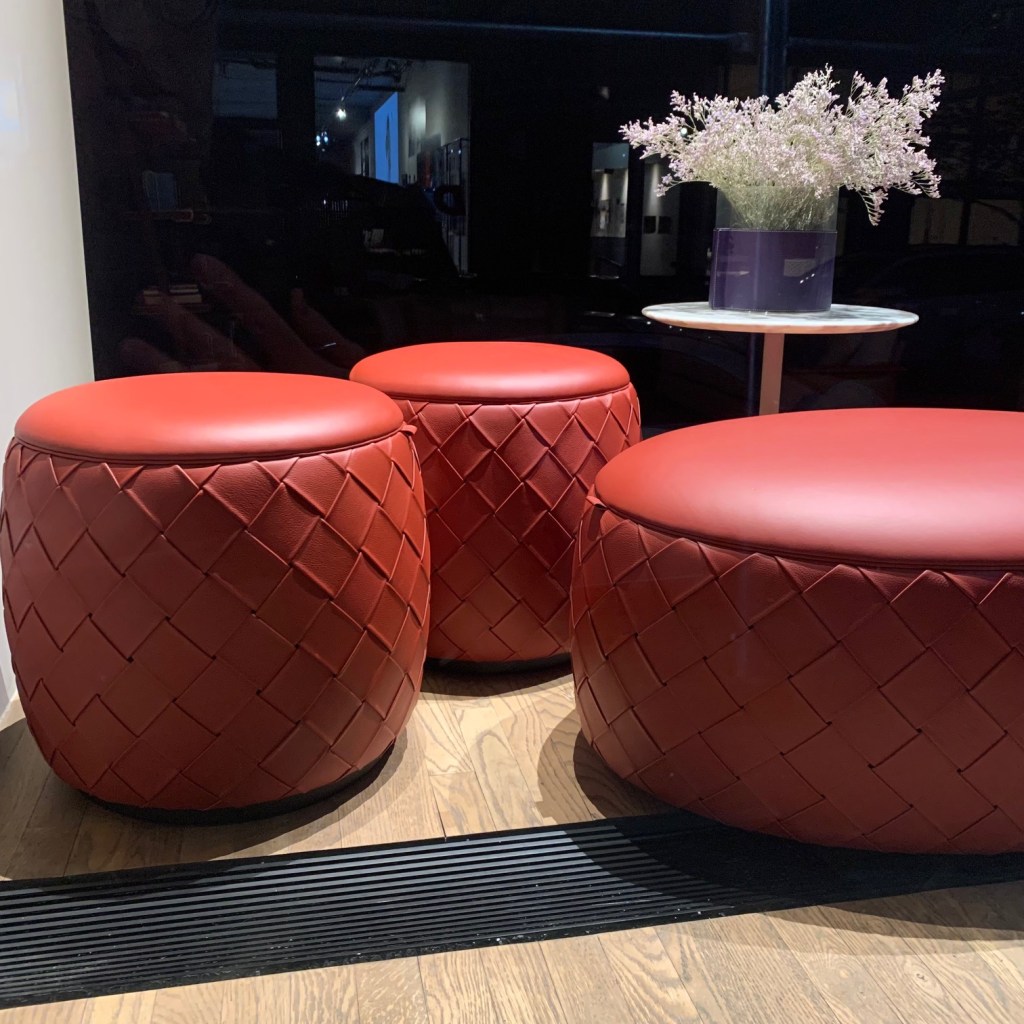
https://www.poltronafrau.com/en
Bernhardt (Terry Crews)
Many people know Terry Crews as an actor, most recently, television’s Brooklyn Nine-Nine. Others remember him as a football player. Football players remember him as the player who created individualized artwork that appealed to the narcissistic tendencies of the star athlete. Some people might even know him as a body builder, inspirational speaker or all-around “nice guy.” I, on the other hand respect him and know him for his talent as a designer. So does Bernhardt, the premium manufacturer of fine furniture. Over the last five (?) years, Crews has design some remarkable pieces for Bernhardt and I look forward to seeing each new item, every year. Crews worked his way through art school as a ball player, when success came in that field he never forgot his core calling. With success in many areas, his return to art/design probably was inevitable for such a motivated guy. Regardless of how he got here, we should all enjoy the end result. The new Belmont chair just became another jewel in his crown.
Lioli Glass Tiles
Lioli produces thin micro-tiles (3mm) in an astounding array of colors. The small size allows them to contour to irregular surfaces and refract light in multiple directions. Because of the size and palette, there are endless possibilities for use. I must admit, their website and displays can be perceived as tacky with too much glitz and corny examples, but in the hands of the right designer, this is a product that could individualize a space.

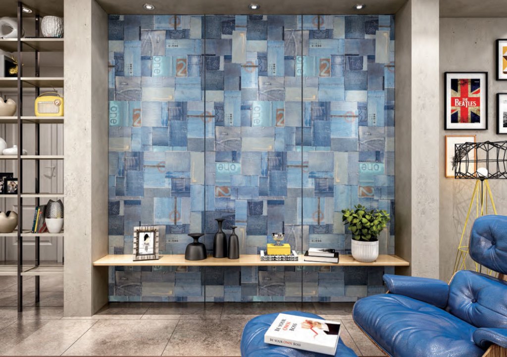
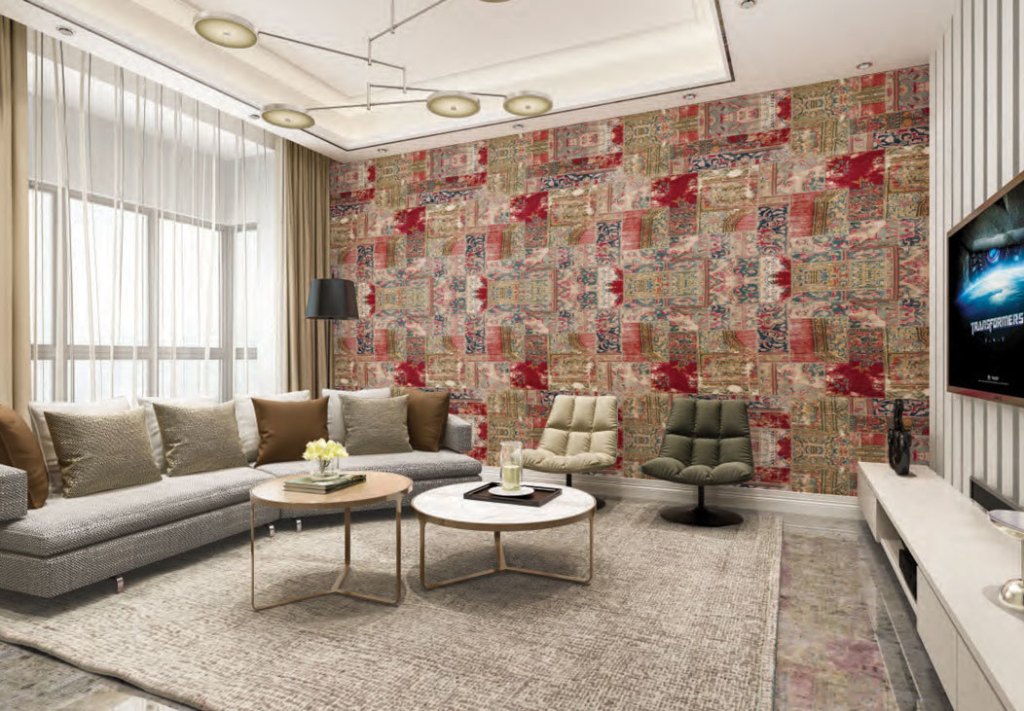
Arte
When wallpaper reemerged I was mesmerized by the reinvention of the stale product I remember from my youth. Gone were the tiny flowers, pinstripes and inane patterns. Bold, clever design was everywhere. Since then, I have nodded politely to most wallcovering sources. Been there. Seen that. So I was surprised to be taken aback by Arte. Some were bold, some subtle, some textural, others with the complexity of a Persian rugs. Perhaps, to a more learned eye, there is nothing new here, but for me, this was notch above what I have seen for a while.
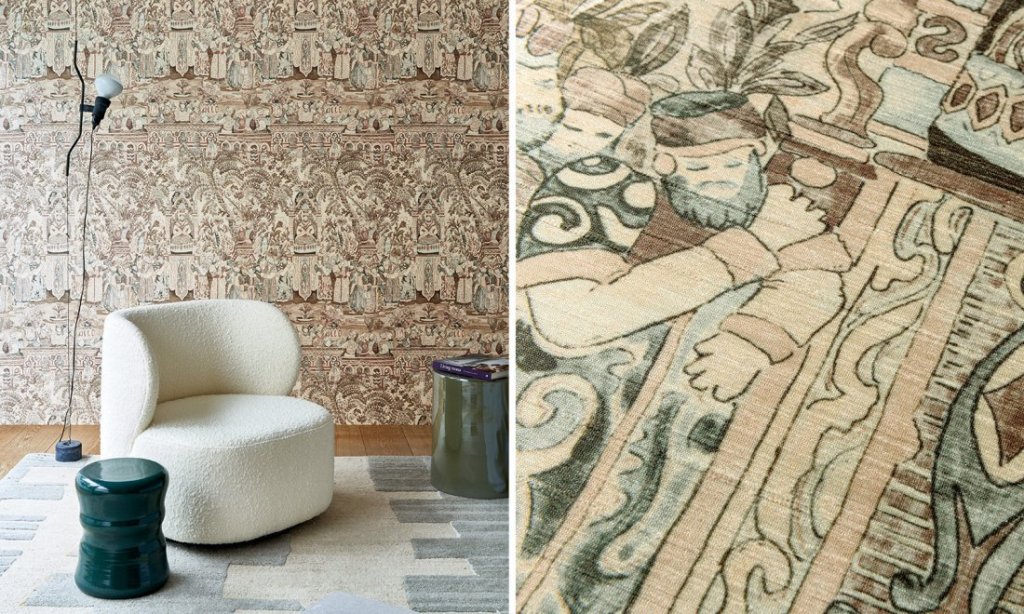
https://www.arte-international.com/en
Lab Designs
Like wallcoverings, laminates have been readily available and oh, so typical. I found the variety and color of Lab Designs to be different and new. The range of creative patterns and colors was inspiring. A quick review of their samples has me wondering where I could use it. Done well, it could substantially elevate a space. I’m pumped!
https://www.labdesignlaminate.com/
Brizo Faucet
I’ve always associated the introduction of black into the bathroom with the Jason Wu collection of faucets for Brizo. Perhaps there were others who proposed matte black, but none so elegantly and persistently. They alone persevered until the whole industry followed. Black can now be found in Home Depot and Brizo has shifted to a wood-enhanced faucet, part of their Frank Lloyd Wright collection. While I’m not sure how FLW connects with this design, it is time to think about the proposed intersection of wood, chrome and water. The wood compels you to touch and feel the faucet in a way metallic finishes alone do not. The hardware feels soft and approachable. The designs are also available in metallic-only finishes, but they are really uneventful without the draw of wood.
By the way, Jason Wu is now showing Brizo faucet designs in white, a finish that has been unused in plumbing for over twenty years and it looks fresh, new and revolutionary. The difference here is a subtle matte instead of the 1990s gloss. Re-read the first few sentences of this section and buckle your seat belts for what is next!


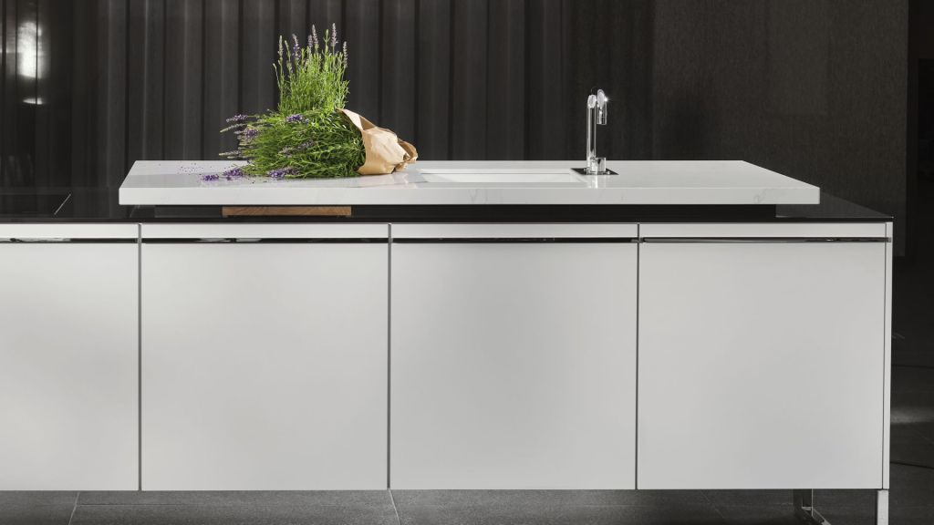
Poggenpohl
What’s not to like about a Poggenpohl kitchen? I find myself drooling over each one. I was especially drawn to the Venova island, realized with chrome “legs,” gloss white surfaces and stepped countertop. It is flawless.
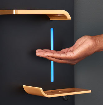
Vaask
Let’s face it, hand sanitation stations are REALLY ugly. Some are placed on a wobbly pole in the middle of a hallway, others are mounted in bathrooms featuring some pedestrian, brand-specific look. We need this cleansing juice, but we surely don’t want to interact with the homely dispenser. Vaask has elevated this yeoman’s piece of equipment into an aesthetically interesting and interactive tool. The station recognizes the user when a hand is placed under the sculptural spigot by illuminating the wall surface. As the sanitizer is distributed, the light replicates the fluid’s motion. A mirror-image drip guard eliminates the unsightly and inevitable puddle on the floor below. Don’t you love when a designer solves a multi-faceted problem with a great looking solution? Sure, it’s a sanitizer dispenser, but I love this design!
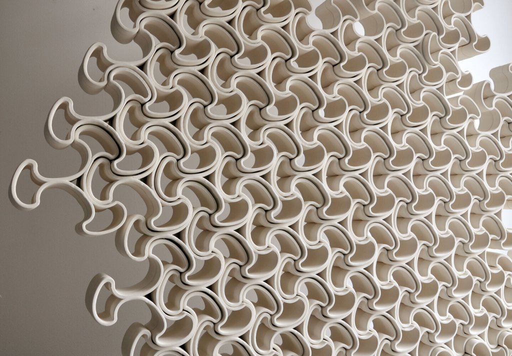
Brian Peters
Peters is creating 3D printed ceramics and employing them in installations that take advantage of the multiplicity of the printed unit. Because of the digital manufacturing, these pieces appear to be delicate and more detailed than those produced using conventional methodology.
Inspiration comes from many places. Pile lined parkas lead to furniture fabric that defines the tonal nuances of the metallic surroundings and that in-turn drives the style of a space. Trends start from the oddest places and typically die of exhaustion. Watchful eyes can understand those paths and determine how to use the information. Trips to New York help me sort through these concepts. I hope this miniature overview helped you as well.
