I’ll have more to say about the actual show in my next blog post. For now, let me share the interesting things I saw at this year’s installment of Boutique Design New York (BDNY) a trade show created to serve the hospitality design community.
Wicker/Cane/Reed/Woven
There are two noticeable trends that permeated the show. Neither are surprising, I guess I was simply surprised by their dominance.
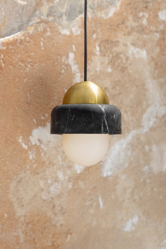
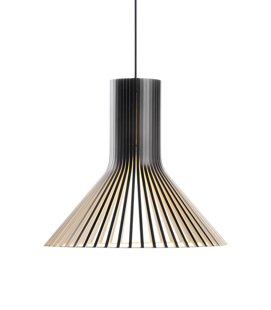
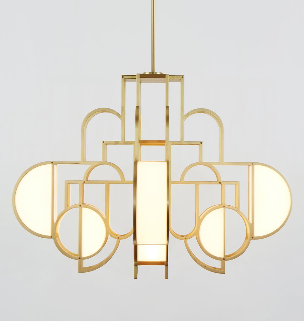
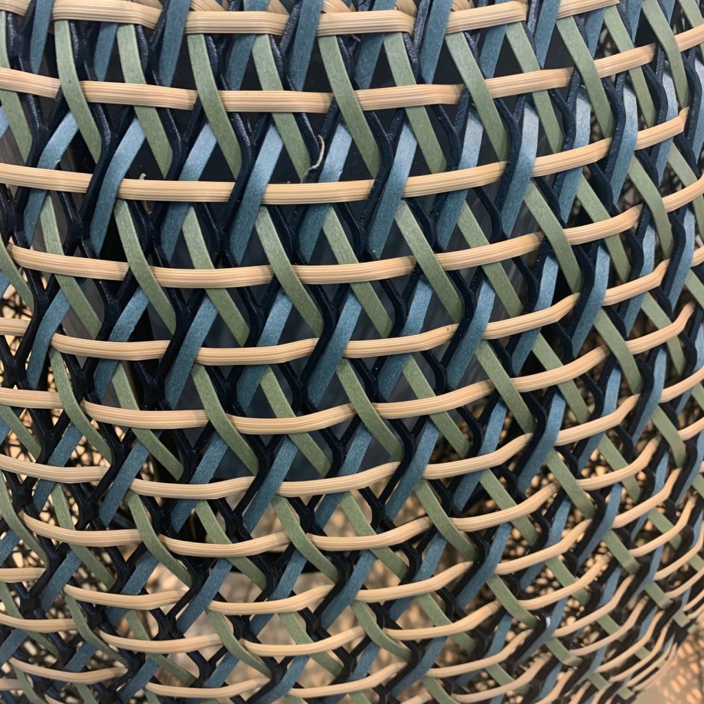
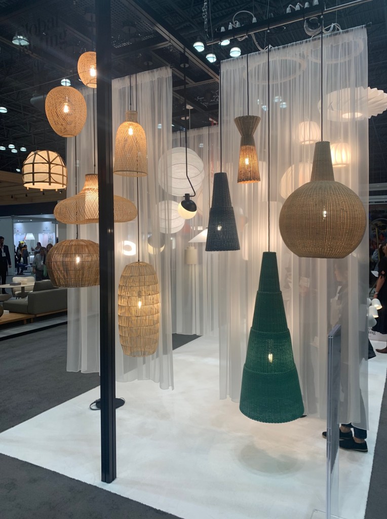
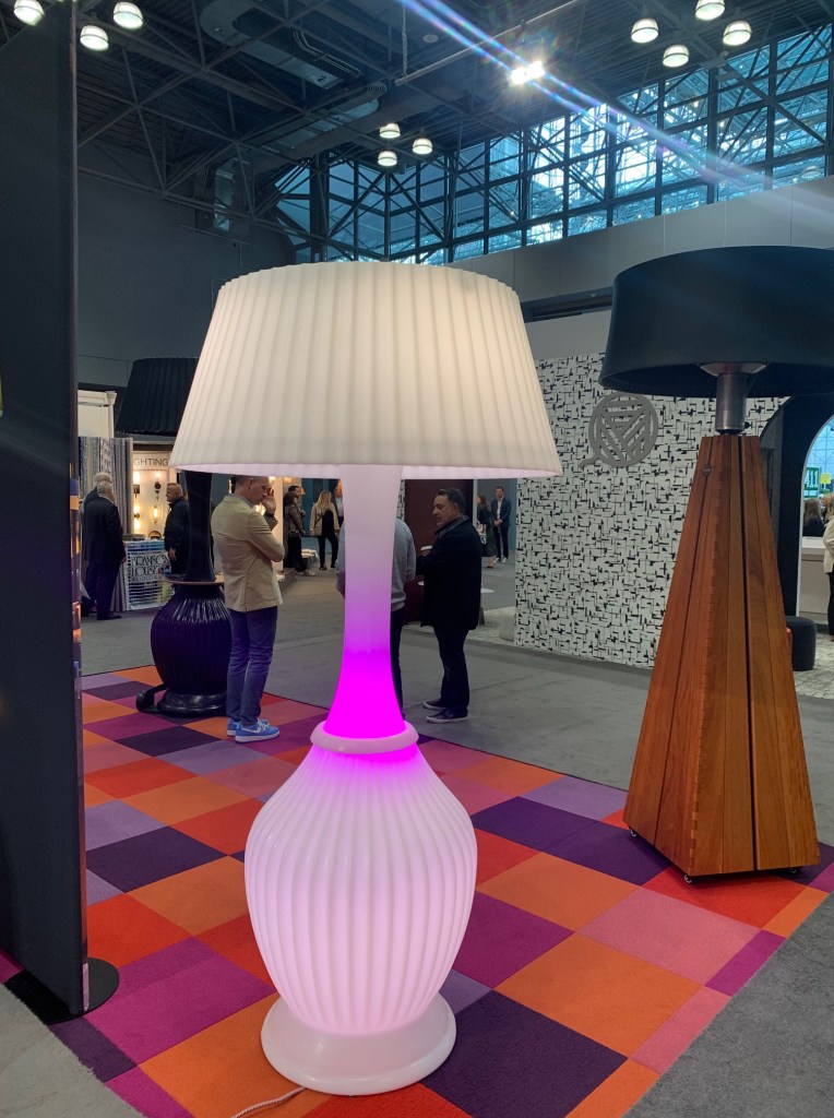
First, wicker and cane was everywhere. Dedon used a composite woven into the new Roii collection of outdoor furniture with great color combos. https://www.dedon.de/ Global Lighting used cane to create oversized pendants. https://www.globallighting.com/ Summer Classics https://www.summerclassicshome.com/gabby and Arteriors https://www.arteriorshome.com/shop/lighting both also showed oversized wicker, reed and cane pendant options. Pallacek http://www.palecek.com/product/palecek/lighting/ varied slightly with woven fiber pendants. There is no doubt the hospitality industry is embracing this natural trend. With such saturation, should we now question it duration?
LED Mirrors
As I prepared to attend the show Sunday morning, I commented to myself how horrible the hotel lighting was at the sink. In this particular room, a spotlight was aimed at my hair from overhead and no light anywhere near my face. I moved about like an indecisive fly until an adequate amount of illumination fell on my face. That preface was a telltale reminder when the second overarching trend became noticeable.
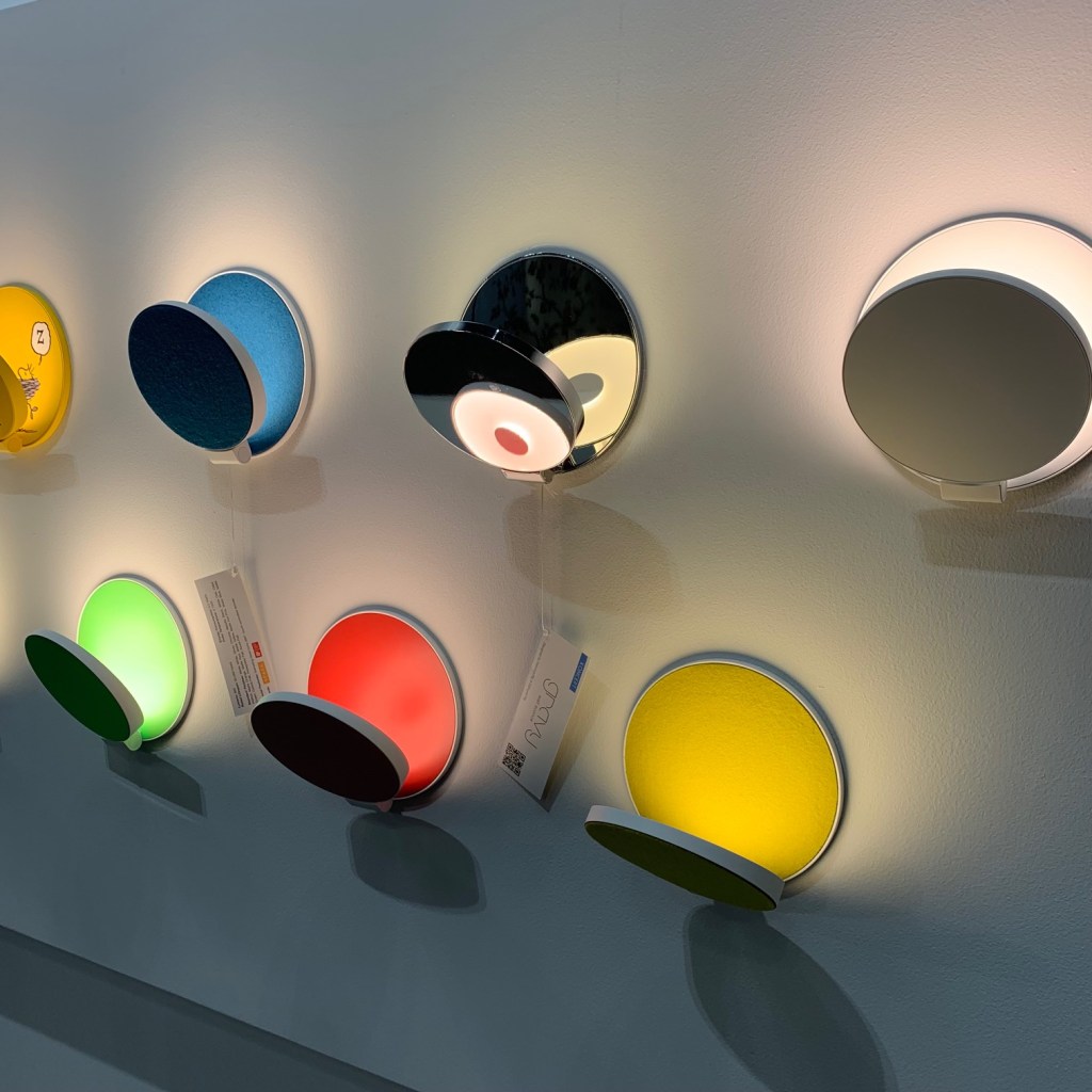
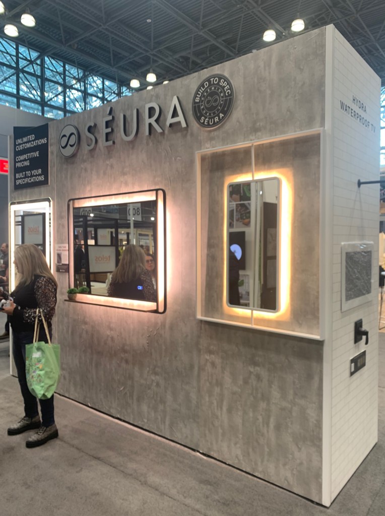
Seeing LED lighted mirrors in such abundance made me optimistic. Some, of course are glare-bombs with light aimed at blinding the user, but many of the pieces on display were making an honest attempt to deliver decent light for personal grooming. Seura, https://www.seura.com/products/lighted-mirrors?loggedIn=false has a very professional collection with much attention paid to color and luminance levels. Artline Group and Mirror Image https://mirrorimageinc.com/ also showed a few interesting options with attention to aesthetics and light delivery. While I’m sure I should know better, I’m keeping my fingers crossed that better lighting in hotels is around the corner.
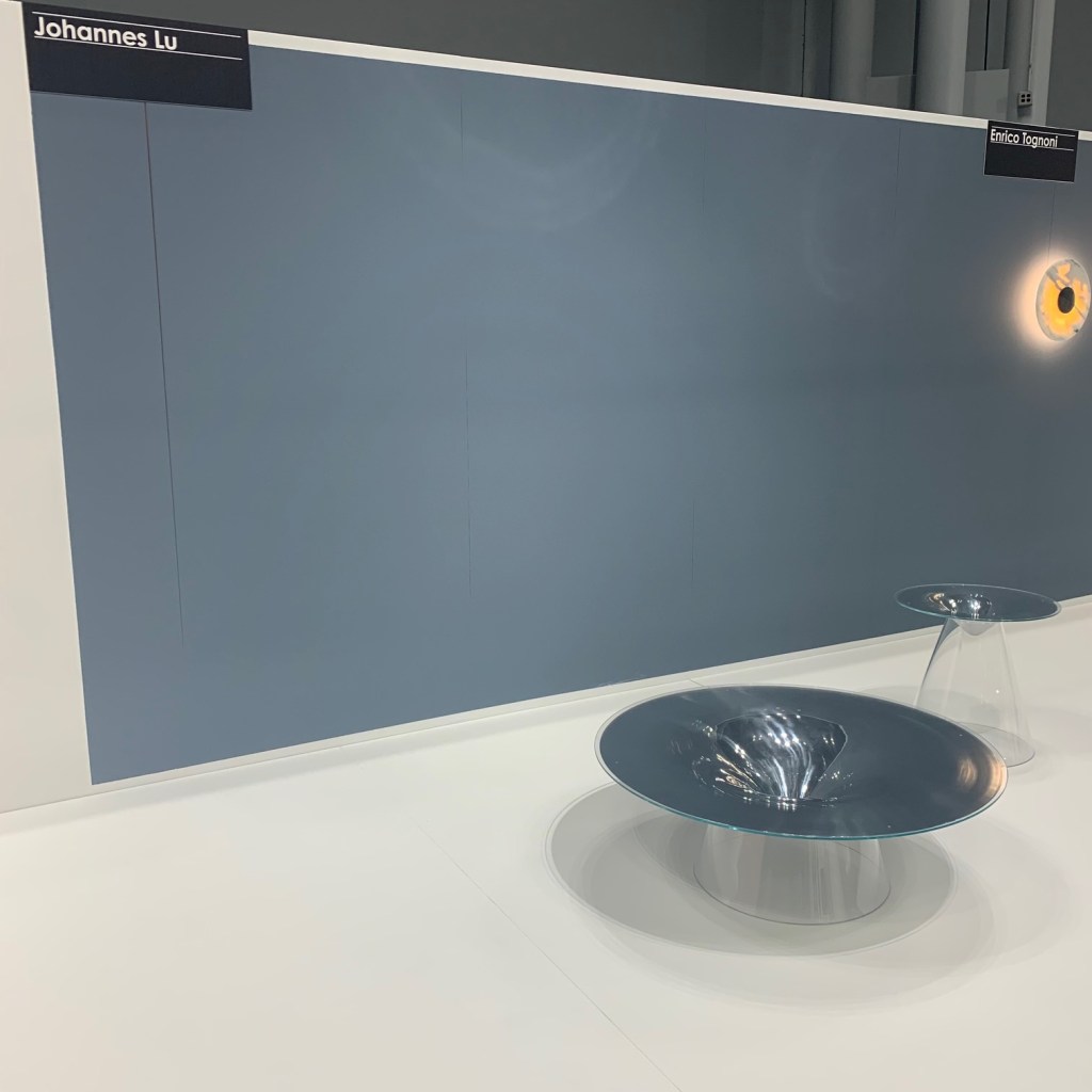
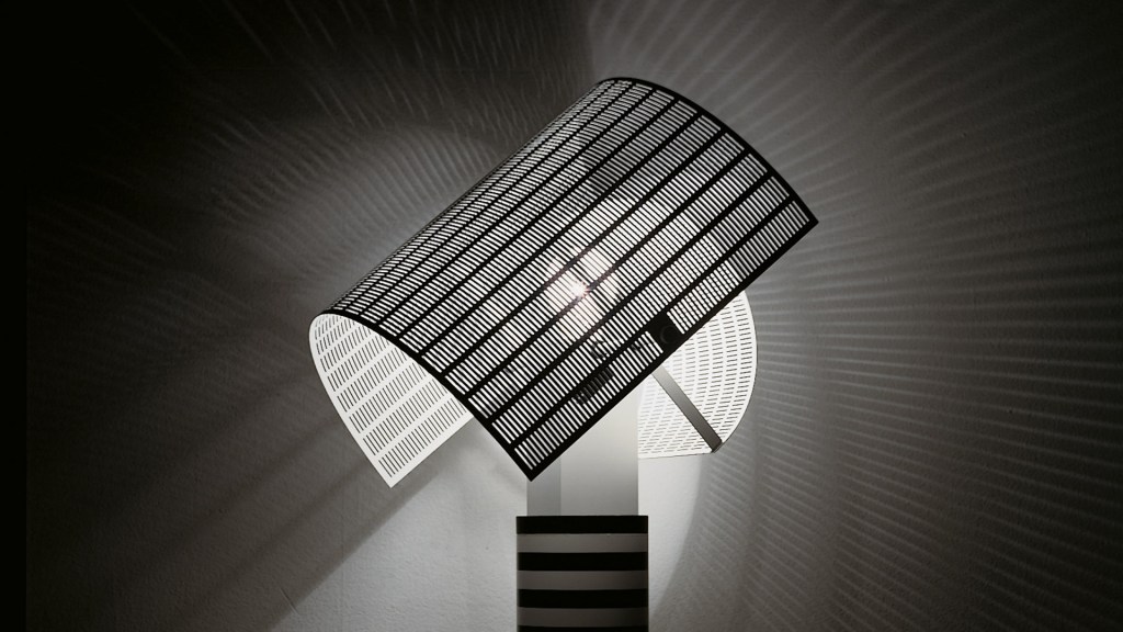
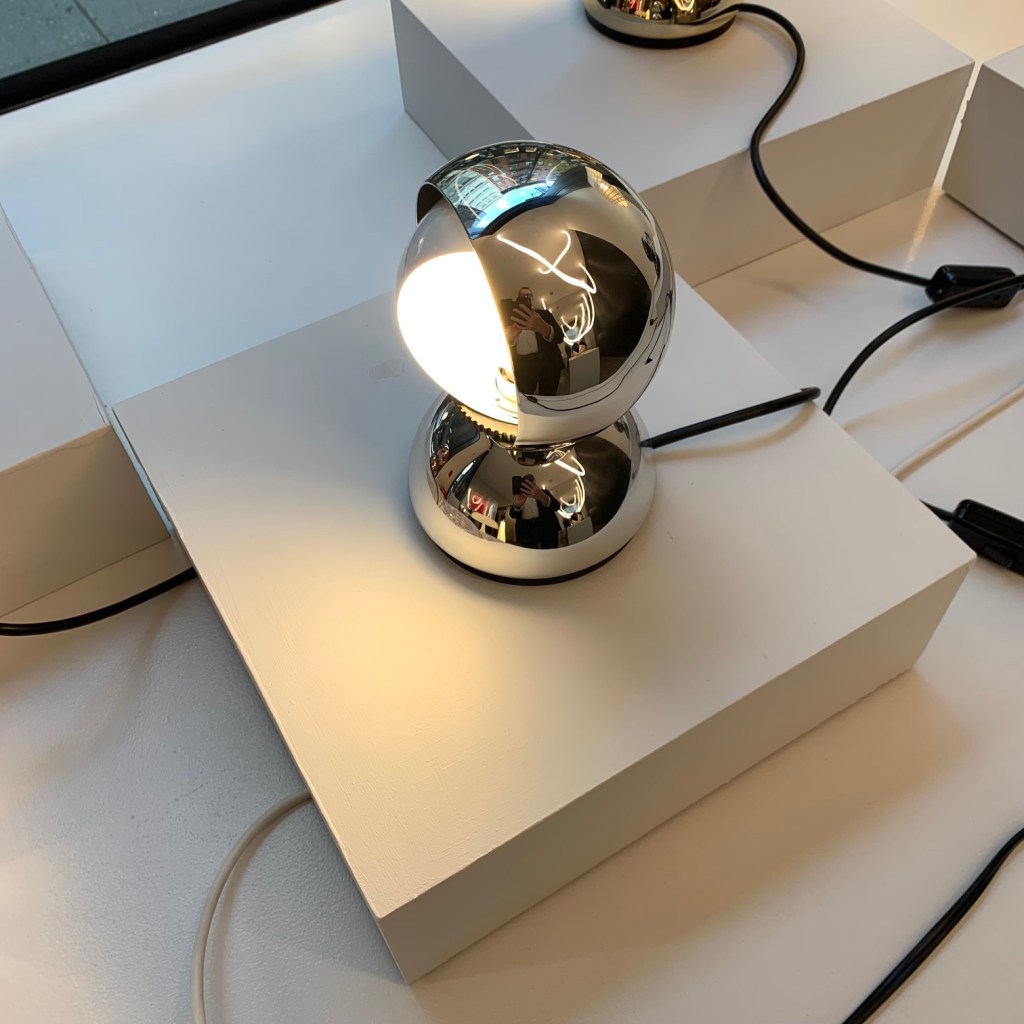
Lighting
Of course I gravitate to lighting. After working 49 years in this industry, I can’t, not look at lighting!
Cerno lighting showed an interesting assortment of products. Very “smart” modern and using some edgy colors and finishes, I found myself surprised. I have either ignored or forgot about this company. I think I will pay attention in the future.
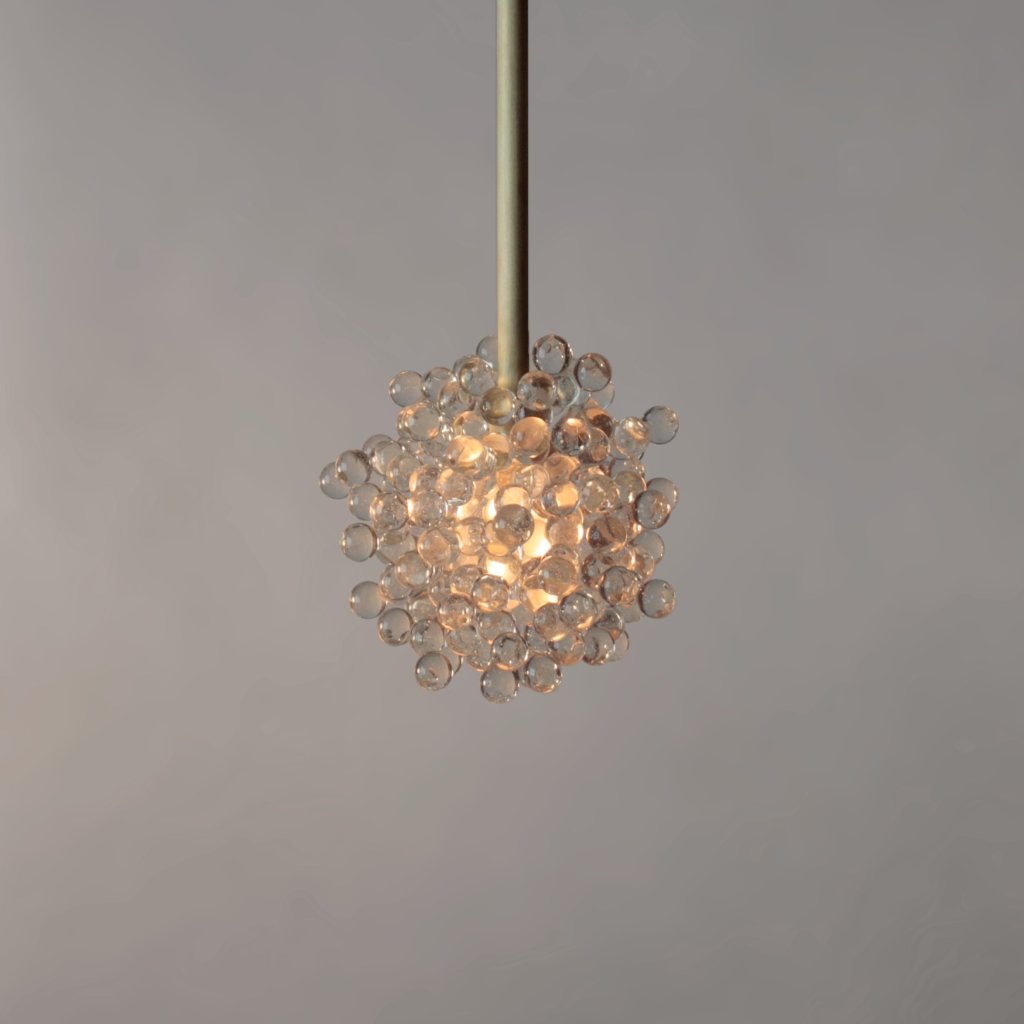
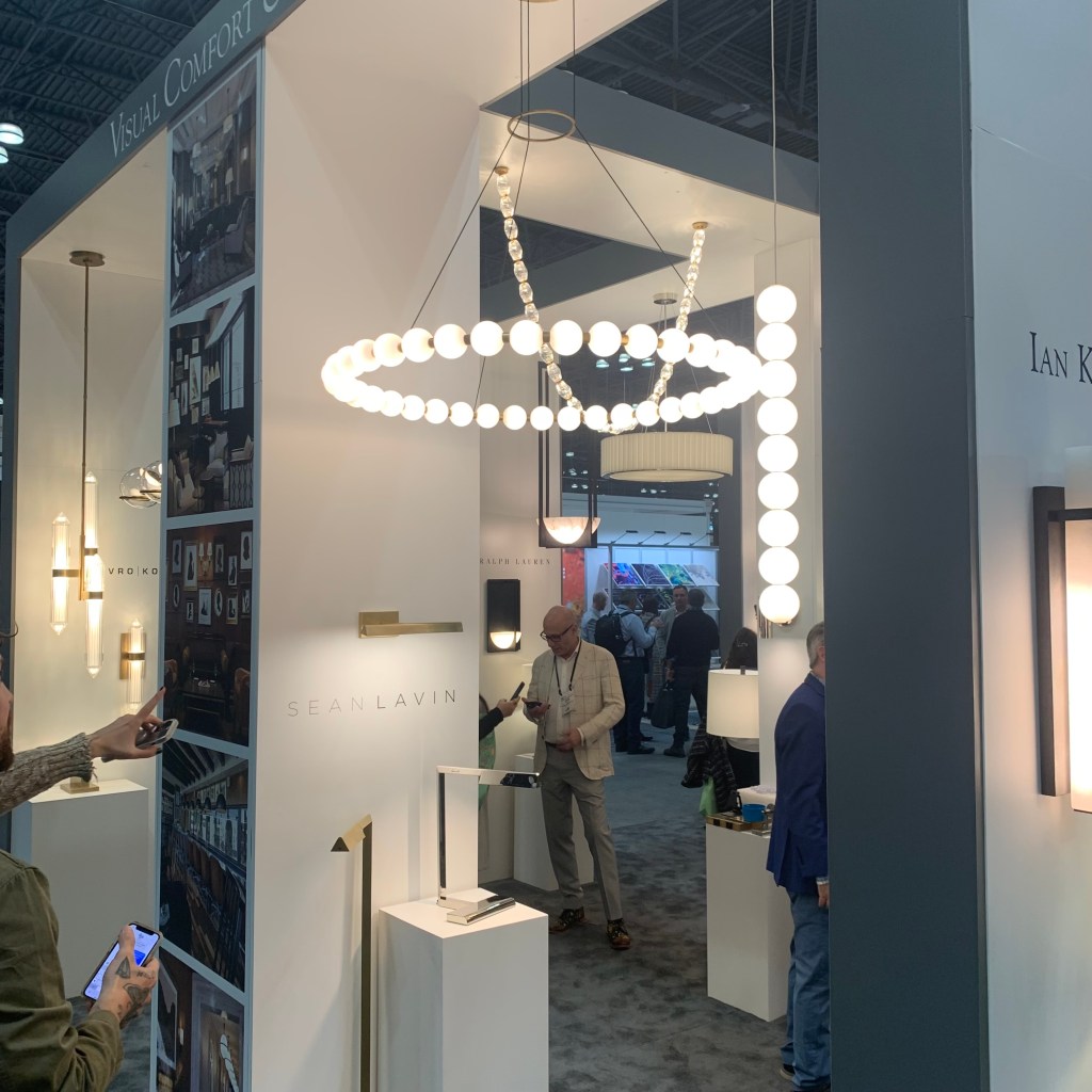
Loved two pieces shown at the Visual Comfort booth. The Comtesse by Paloma Contreras is a very shallow spherical sector of metal, all the light is indirect and sizes are grand. The Orsay Pendant, also by Contreras stacks a small metal cone atop a larger for a clean simple look. The Sean Lavin designed Orbet pendant is a strings of white glass balls in a single drop, almost serving as a simple string of pearls against a black dress for the home, which of course, is always in fashion.
I do not believe I have ever come across Bover Barcelona Lighting https://www.bover.es/en/ while I was drawn in with their display, a quick review of their website and I found many interesting items. It might be worth a look!
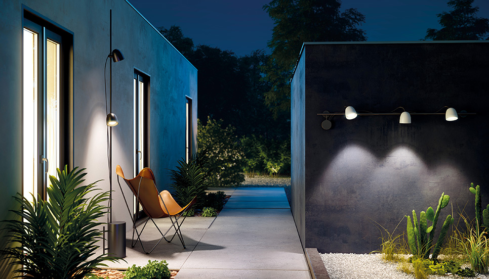
Conversely, I have run across B.Lux https://www.grupoblux.com/en/ many times in the past. Their new outdoor solutions are completely different. Track lighting and pole lamps for the outdoors? Wow! Exciting.
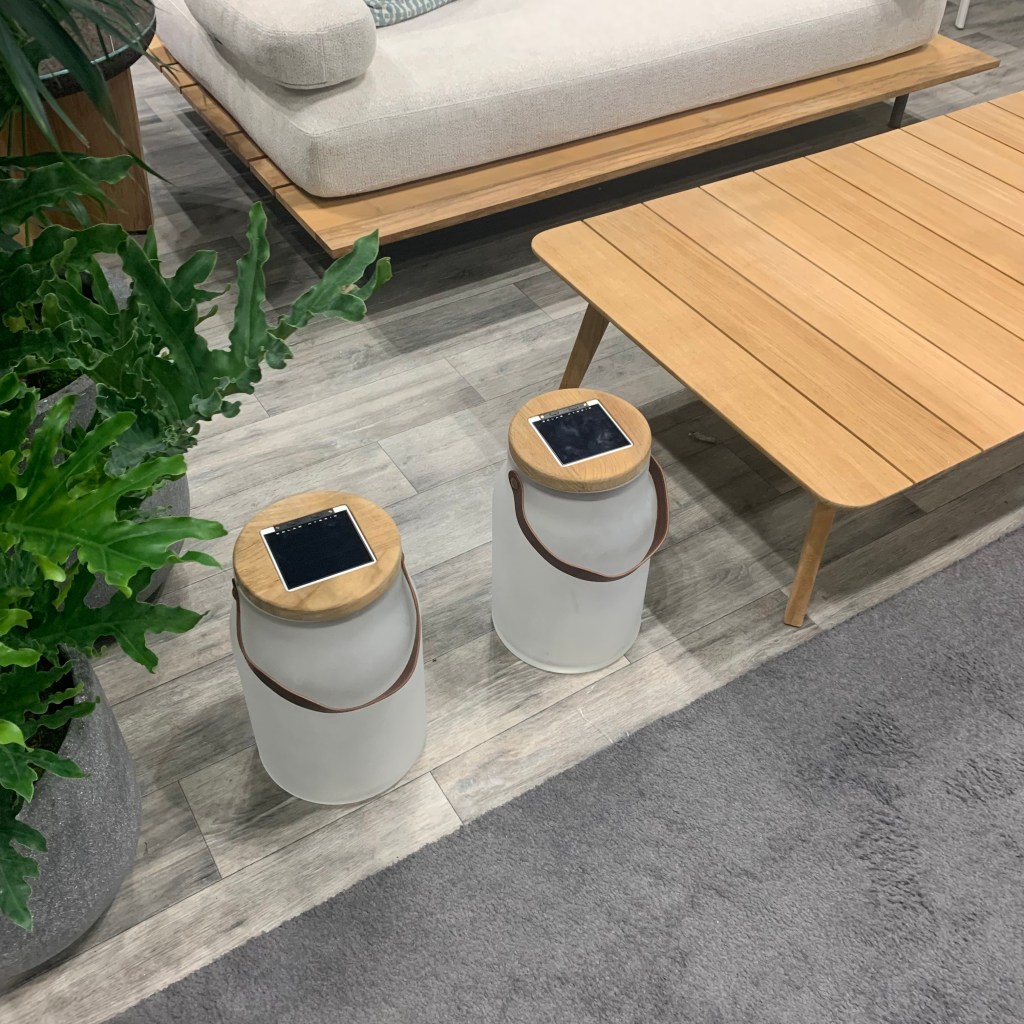
Ethimo https://www.ethimo.com/en looked again at solar lights, this time, they were porch portables in the shape of milk jugs, obviously called Milk. I still wonder if anyone will crack the code for solar longevity and power retention. These guys are nonetheless cute and would work nicely in most every patio setting. Longevity is however always the key with solar.
Sort of Lighting
Perhaps a result of the pandemic and the desire for outdoor eating deep into autumn and early in the spring, Kindle Living has developed a deep line of “Heat & Light” outdoor heating units that now include a lighting element. What is nice is the varied style. Some are clearly “outdoor” aimed, but traditional and mission styling is also available. These are nice solutions for any exterior look.
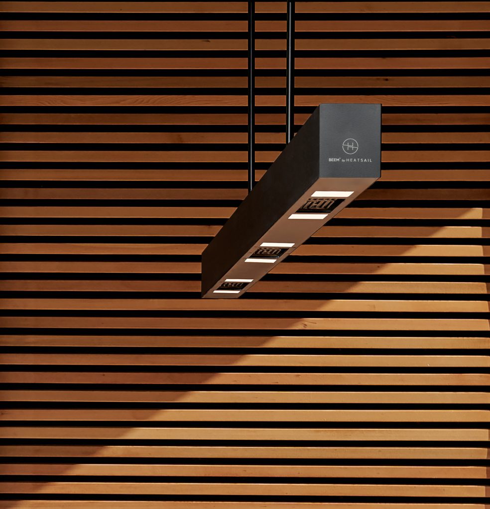
Beem by Belgian manufacturer, Heatsail is a unique product. This is an outdoor lighting unit that includes a heating and misting option all in a compact, contemporary package. One product that solves three problems, heat, light and cooling, must certainly be of value for patio living.
Not Lighting
Make no mistake, this show is filled with minibar suppliers and room safe providers. (I’m not sure I could make a career out of providing keycard access equipment to the industry, but that’s probably just me!) Stepping over all of the boilerplate, there was some interesting non-lighting things worth mentioning.
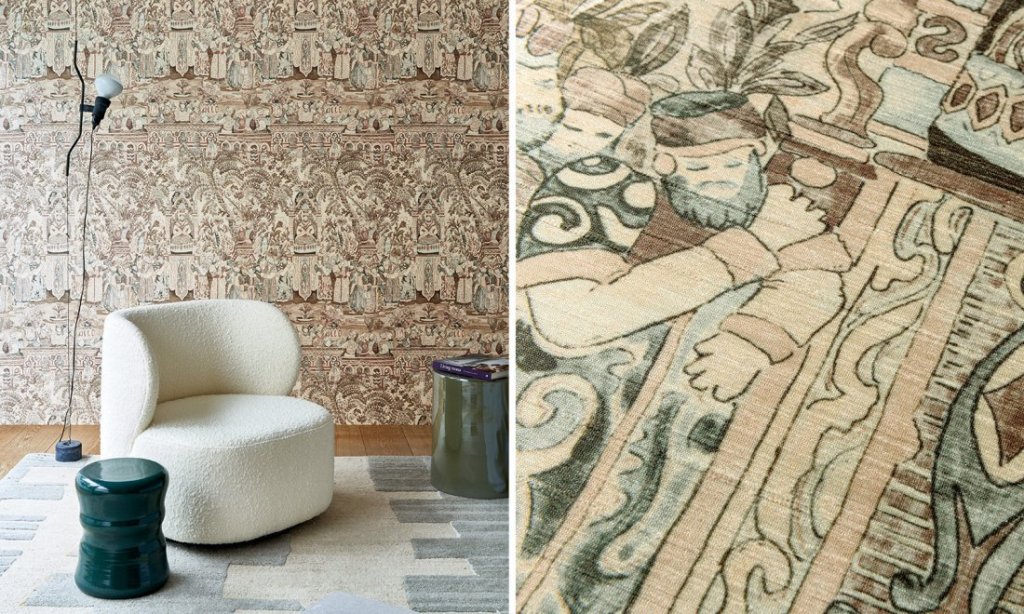
At most shows, there is always one wallcovering supplier that catches my eye. This time, Innovations displayed a textured collection that felt like cork and featured metallic veining that would nicely compliment the rise of warm brass use today.
https://www.innovationsusa.com/

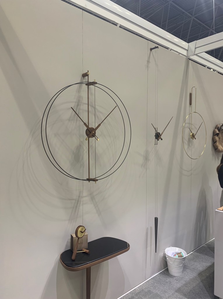
I’m not sure I have thought much about wall clocks lately, if I have ever! That changed at the Noman booth. Rather than the massive blobs of white with schoolhouse numbers placed 30° apart, this company has created products that disappear into the architecture with wisps of metal and minimalist mechanics. These designs have turned functional necessities into beautiful wall accessories. Quite a feat.
https://www.nomonwallclocks.com/en/
While they advertise their product “for island living” Teaki Tiles could have a much wider application, as long as imagination is used. Rather than ceramic, these tiles are fabricated from teak wood. Teak is an excellent hardwood that has been used around water for decades, so It might seem obvious to use it on floors and walls in patterns. That said, I don’t think I’ve seen it used before in these applications. Their offering could enliven almost any design. I felt sunnier after having seen it!

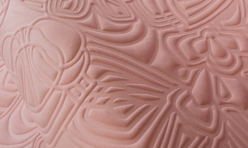
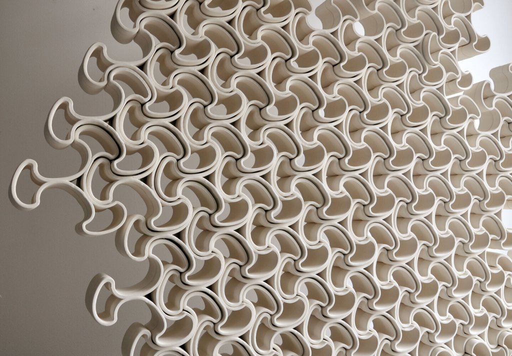
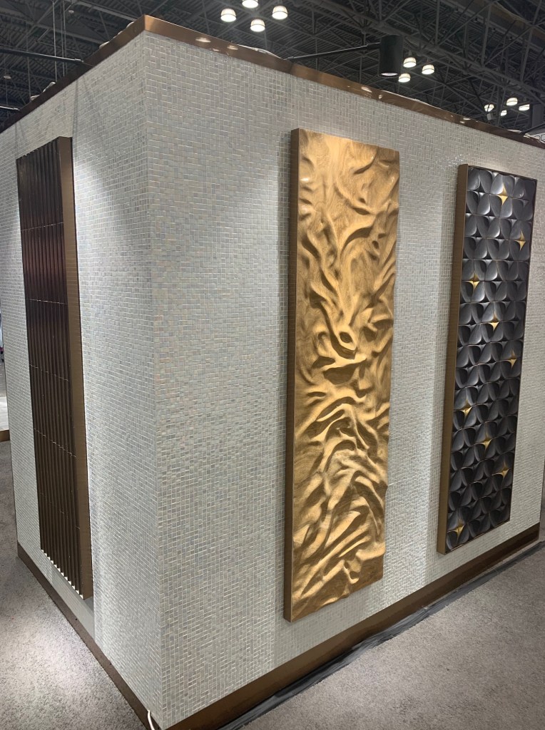
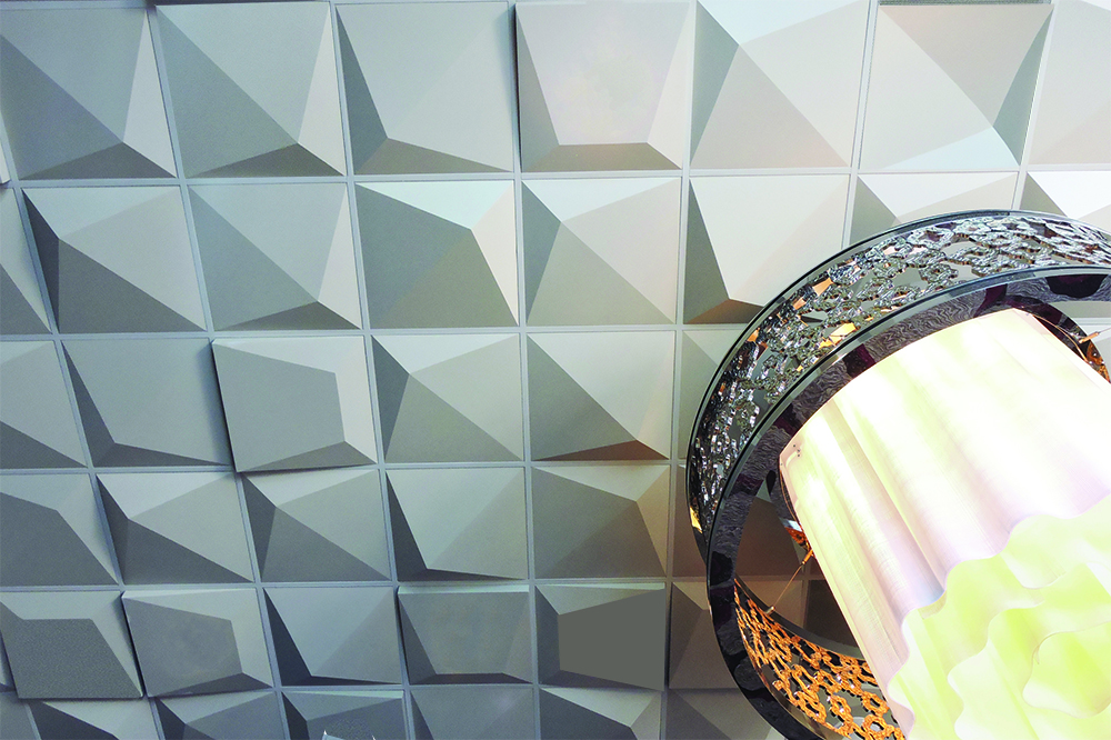
I really liked the heavily textured, ceramic wall panels at Medici & Co.
Medici&Co Home
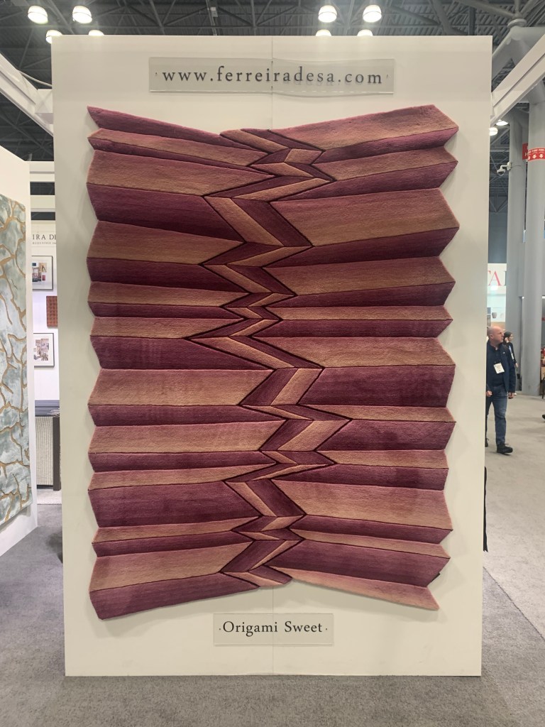
As I took this photo of a very creative rug shown at Portuguese weaver, Ferreira, I overheard a passing designer ask her friend, “Is someone going to trip while walking over that?” I don’t know if that would occur, but it sure will cause one to pause for a moment. These were beautiful textured and tufted floorcoverings.
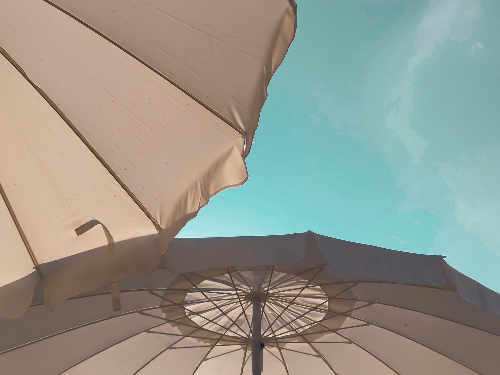
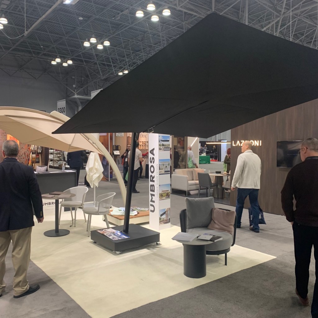
Yes, we’ve all seen outdoor shade umbrellas. There were three or four manufacturers at the show. Only one made me stop and look. Umbrosa were much more interesting and based on the salesperson demonstration, very easy to manage. A quick look at their website and even more variation is available. I wish I had a place for one!
This was a neat idea. Kenco Hospitality showed a collection of double window coverings tucked into an illuminated valance. The front drape was sheer, allowing sight onto the photo-realistic scene printed on the back drape panel, giving you the illusion of a much more interesting exterior. As I opened my hotel window onto the stone wall of an adjoining structure, it appeared to me how valuable this could be in urban hospitality settings.
https://www.kencohospitality.com/

The idea of printed surfaces heretofore left plain was again mentioned when an old friend showed me printed shower stall environs at ABG Hospitality. Printing on glass added a level of excitement and style to these surfaces. While created for the hospitality industry, I wondered if applications could be found for residential spaces. Something to consider.
Finally, why shouldn’t the sixth wall be interesting? Above View wants designers to think about the ceiling with creative artisan ceiling tiles. Geometric, textures, patterned and completely different ideas. I liked the idea that this product forced a conversation that stretched the idea of design.
BDNY & NY
Despite the fact that I found only a few visually excited things at the show, it is always nice to reconnect with friends and immerse oneself in a creative space. A few days in New York also allowed me to sample a few new restaurants, (Try Cadence and The Musket Room!) see some shows (I highly recommend Ohio State Murders & Kimberly Akimbo.) and check out some museum exhibitions. (Loved the Alex Katz retrospective at the Guggenheim.) Refreshed and energized, I’m ready to handle a cold and snowy winter while I hold my breath for Spring.