One of the most confounding questions to which I am asked to comment, regards the annual “Color of the Year” announcements. For years, the only “Color of the Year” I ever regarded was that predicted by Pantone. Because Pantone spans colors across multiple industries, it would find itself in fabric, ads, clothing, print/graphics, wall coverings and accessories. Finding some relevance in a single “color” and how it might manifest itself across twelve months was somewhat self-explanatory. As it relates to lighting, virtually none of the “colors” resulted in a luminaire finish trend. Impact was much more subtle.
Today, “Color of the Year” is considerably different. Pantone still releases a prediction, but a few years ago, the paint industry decided to jump into the fray. Most had a dominant annual color prior, but with the addition of increased marketing dollars, these started to grab more media attention. The yearly press release is no longer restricted to industry publications, but mass media has now embraced the concept and eagerly awaits the prognostication. There lies the rub.
Let’s look at the six primary “Color of the Year” for 2024. (There are, unfortunately, more.) I’ve listed them here in a specific order for easier comment below.
Pantone – Apricot Crush – a fleshy, apricot tone
Sherwin-Williams – Persimmon – a pale orange tone
Glidden – “Limitless” – a pale, soft yellow
Valspar – Renew Blue – a pale transition between blue and green
Dutch Boy – “Ironside” – a dark grey-green blend
Behr – Cracked Pepper – a dark grey, almost black tone
What can we observe here? The first two are variations of washed out, pale orange, the Glidden and Valspar colors are also pale, but instead yellow and blue-green. Seeing these alone, we might be inclined to observe a pastel takeover; a quiet approach rather than anything that might ruffle feathers. We will have a year where color is non-confrontational.
Now let’s add Ironside (presumably, no connection to Raymond Burr) and Cracked Pepper. Out of left-field a drab Army grey-green and an almost black color are added. How does this comport with the others? Are these the anti-pastel options America needs?
I understand Pantone’s Apricot Crush and S-W’s Persimmon. Designers love orange in all its variants. It’s a color that is used less than others and because of that, almost always seems fresh. We often think about yellow being bright and shiny, so Glidden’s shift to a milky version also appears new. Blue has been the accent color of choice in kitchens for about six years. I’ve been predicting a shift to a variant of green. This is a learned option that could easily predict a not too subtle shift and extend a kitchen accent color a few more years. As designers use darker and darker wall finishes, it seems natural for Behr and Dutch Boy to promote darker tones to prominence. They are after all trying to sell wall paint to consumers and both of these brands are in the popular-priced category.
In the hands of consumer good specialists, not typical homeowners, the Pantone color could be helpful in defining their product lines. Related industries, like residential lighting would know that substantial amounts of household accessories would use the tone. This featured color would be used across related industries and would visually benchmark the introduction to a specific era. I would always tell people who asked, that the decorative lighting finish would need to “play well” with the coming “Color of the Year” and it has.
In 2015 Pantone defined Emerald as their choice for the year. In 2017 it was Greenery. At the time, Oil Rubbed Bronze was the dominant lighting finish and it worked well with these annual choices. The secondary decorative luminaire finish at the time was Brushed Nickel and the 2014 and 2015 “Colors of the Year” were Radiant Orchid and Marsala (a sort of wine-red) that likewise felt comfortable and could easily be seen sharing a living space. When Natural Brass began to build momentum, similar observations could be made with 2021’s Illuminated, a buttery yellow and Living Coral from 2019. Ever-present Chrome shined with the bold statements expressed in 2018 with Ultra Violet and 2020’s Classic Blue. It all made sense and could be used and explained.
That logic has now disappeared. A friend of mine is a retired Public Relations executive who had knowledge of the paint industry and he continually reminds me that, “They are just trying to sell more paint.” He also reminded me that Valspar and Dutch Boy are Sherwin-Williams brands, so which “Color of the Year” is the real “Color of the Year?” There can only be one king. With the addition of all these variations, I believe he is right. Gun-to-head, I’d suggest paying attention to the Pantone color because it crossed so many industry lines. The declarations provided by the paint manufacturers might be better regarded within the same parameters as my friend’s.
With increased interest rates, existing homes are not selling at the rate they were a year ago. The hyper-charged seller’s market has softened and owners must again find ways to entice buyers. According to a number of sources, homes that require some level of rehab are even more difficult to sell. The combination of initial price, higher interest rates and the cost of the rehab, to say nothing of the problems encountered when trying to find and hire a contractor, move-in-ready houses can make all the difference.
That raises the question, “Is it necessary to swap out the lighting during a pre-sale rehab?”
You’re reading commentary written by a lighting guy, so the answer to the question might be self-evident. If all of the lighting supplied in the home is decorative, then that answer too, might be self-evident. There are however, a few other factors that could come into play. Following are some guidelines to help answer the question, “Do I need to replace the lighting to quicken a real estate sale?”
Finish
What finish is the lighting? Like all fashion, the material finish carries with it, a date of expiration. If you still have a textured sand chandelier in the dining room, YES you must replace it. Same with Verdigris, multi-layered umber paints and a painted brick-mahogany color. If the lighting is finished in Oil-Rubbed Bronze, or painted in a similar dense bronze, there is a 75% likelihood that it will need to be replaced. The Bronze trend lasted longer in the “middle” of the United States and portions of Canada, so you might have a more forgiving buyer than those who are seeking homes in more populous areas and on each coast of North America.
The popularity of Brushed Nickel is winding down right now. If the satin or brushed nickel is used on more traditional products, you might be able to get by without a change. If it is on a more contemporary designed product, the brushed finish will appear dated. These should go.
You’ll be OK if the lighting is finished in Chrome, Natural Brass, Matte Black or White. Polished Brass will define the product and design of the space as firmly planted in the 1990s. Respond accordingly.
Style
Heavy Olde-European looks with scores of scrolls and crystal droplets are a telltale sign the lighting was installed in the early part of the millennium. You will need to replace this lighting. Same thing with Mission or Arts & Crafts lighting. Tiffany-style lamps, unless they are original Tiffany art pieces should also be replaced. These will provide hints to the buyer that you haven’t redecorated since the Bush administration, a time when Donald Trump was still considered a successful businessman.
The era of Modern Industrial design is over. Vintage Edison lamps, exposed inside all the luminaires in the home will look older and older each week. Because of its design specificity, like the Tuscan kitchen, it can quickly be identified as an old look. It is very likely you will need to make a change here, unless you can somehow contemporize the look with a simple change of glass, lamping or shades.
Despite what a recent New York Times article suggested, the shine is definitely off the Farmhouse-look, but there are still enough people who haven’t got the notice yet (the point of the article.) There are also easier ways to mask this trend, so you are probably OK to leave it alone. There are a few years of forgiveness left on Mid-Century Modern, especially if it is not too specific in its implementation. If there is a way to drive the feel more toward Art Deco, that should be tried, as well. It might be helpful in attracting some hyper-aware buyers.
Stark, cool, Hard Contemporary is softening, so you might need to find ways to polish the edges off the crisp look. A warmer room color might negate the need to replace some of the internal products. In all likelihood, you can leave this lighting alone and the future buyer will be happy.
Homes with an eclectic look, parred-down traditional, transitional and softer contemporary styles will be fine. Spend rehab money elsewhere.
Type
A big, three-tier chandelier in the foyer is a telltale sign of age. (There is some regionality in this observation; the middle of the country employing them longer than other areas.) Swapping this to a cascading suite of pendants will elevate the entry and make it feel newer.
A collection of mushroom-shaped glass diffusers marching down the hallways can also add an older look to the home. A swap to slender surface-mounted lighting, or replacing them with recessed cans/pot lighting will elevate the look of the whole house.
If the bathroom mirror is surrounded by rows of clear ball-shaped light bulbs, just like a Hollywood makeup station, then it is time for a change. There are many LED strip options now on the market. Be certain they deliver adequate lumens of light and they will be an excellent alternative to the old-school lighting of the 1980-90s.
Are the mini-pendants over the island in the kitchen really small? Are they perhaps, cobalt blue? If so, these are ripe for change. Larger mini-pendants are now needed. If the ceiling height is 9’-0” or greater, be sure to select taller pieces. If the island is wider/larger, move to pendants in the 12”+ range. They will feel more in-sync with today and the way kitchens are used currently.
Functional Lighting
The more functional light is used, the less alteration is needed. A prospective buyer will not regard this type of light to be detrimental. They will not see functional lighting as something that will require post-purchase dollars. Sure, newer recessed lighting might be desired and a swap to new under-cabinet lighting might be nice, but it will not trigger the same warning flags as a big fluorescent box of light in the center of the kitchen. Don’t allow dated lighting to be the reason a house doesn’t sell.
Vanessa Friedman writes fashion reviews for the New York Times. I read her regularly, but I’ve always found her commentary to be somewhat tough to comprehend. She clearly understands the industry and fully recognizes the vision presented in each show of each season, but she can often, perhaps too often, deliver it in a way that is too “inside baseball.” (Wow, mixing sports and haute couture! Who the hell is going to understand what I’m trying to say?) Regardless, her comments in her February 26, 2023 review are crystal clear. (Diesel is Here to Show Us Why Designers Matter) https://www.nytimes.com/2023/02/23/style/diesel-glenn-martens-milan-fashion-week.html?searchResultPosition=1
Pharrell Williams, a musician with a clear understanding of fashion has been appointed Creative Director of Louis Vuitton men’s wear, but what in god’s name does a musician know about creating fashion? (An in-depth feature on his first season was subsequently featured in another Times article on June 18, 2023. https://www.nytimes.com/2023/06/18/style/louis-vuitton-menswear-pharrell-williams-louis-vuittons.html?searchResultPosition=1 ) Do fashion houses even need a designer now? Why not just appoint a well-dressed celebrity?
Through her observation of the work of Glenn Martens, Creative Director of Diesel, she helps even the most aesthetically-oblivious to understand what a designer brings to a line. In detailed examples, without a negative assertion toward Mr. Williams, she helps her readers to comprehend the impact that Mr. Martens has had on Diesel in two short years and why things are better when a mature designer is in command.
As an old (old) retired guy, I am often asked to comment on lighting design trends. Why are certain companies or specific lines so popular? Why is [fill-in-the-blank] trending up now? Inevitably, the queries boil down to some celebrity “designer” and their involvement in the line. In their mind, success is based on the celebrity involvement. Without Ellen Degeneres or Kathy Ireland, the company would not be such a hot property.
Nothing could be farther from the truth. As Ms. Friedman carefully points out, the kernel of an idea hatched by some famous name is just that. Diesel integrated a co-branding with a condom company into their recent Milan Fashion Week 2023 offerings. No doubt some marketing guru realized the possible synergy between a sex-forward brand like Diesel and condom maker Durex, but it was up to Glenn Martens to figure out HOW. Some lighting manufacturer, likewise thought it a good idea to invite Degeneres to “design” a luminaire. In the background of the manufacturer is a real designer who figured out how to translate a sketch, photo, 3-D image or whatever Degeneres’ people submitted into a functional, viable lighting product that could actually be manufactured and could also be built for a reasonable cost. Long after Williams and Degeneres cash their check, work will continue and that work will be accomplished by a trained designer.
Kathy Ireland, Ellen Degeneres, Parrell Williams and even Donald Trump know how to plaster their names on all types of goods and services, beyond the reach of their core capabilities. A bedding designer mopped-up after Ireland dropped off her sheet and pillow case sketches, a fashion designer will be responsible for gathering William’s thoughts at Louis Vuitton and making them a reality and a professional golf course designer must translate the mush delivered by Trump and turn it into a playable 18-hole course. Let’s send out a little respect to the unknown designers, who make the celebrities who play designers on TV, look good.
I was happy to experience an elevated level of excitement this year at the International Contemporary Furniture Fair (ICFF) held at the Javits Center in New York.
ICFF 2023 – Crowded aisles and lots of interest.
Overall, I think we are seeing more complexity being added to products. At a macro level, this makes sense. Design was pared down to bare minimums in the 2010s and we are seeing that inevitable trend swing back to increased levels of detail and a higher appreciation for craftsmanship.
Wall coverings and floor coverings were uniformally more complicated. Furniture moved away from straight lines to added layers of detail. We have not yet returned to the nouveau European product of the early 2000s and I don’t believe we will reach that far, but an increased appreciation for a more deliberate approach to design is blooming.
Following are observations on non-lighting elements that caught my eye as indicators of design direction or unique approaches to complex solutions. In the next post, I will cover lighting and combine it with the few interesting things I saw at LightFair 2023, held concurrently, upstairs at the Javits.
Floor Coverings
If the interior rugs are headed in a specific direction, rest assured exterior rugs are doing the same. The Brazilian company Tidelli offered a nice assortment of patterns and shapes that will enliven outdoor living spaces.
From a distance, the rugs created by Auda Sinda appear to be simple tweed weaves. Upon closer examination, they are handwoven by artisans located in the Pacific Northwest and include leather strips, fiber, fabric and any number of linear strands. These were beautifully complex, bespoke pieces made in the United States.
60s walnut paneling never looked this good. Evove sculpts the panels with cut patterns. When washed with good lighting (it all comes down to good lighting!) a wall takes on added meaning and interest. With the use of Mid-Century and Art Deco showing only minor deterioration, these are going to be meaningful now and should easily carry into more involved design trends.
ICFF 2023 – Evove wall panels
Furniture
My father was an upholsterer. Creating good tufting was always a challenge and as a kid, amazing to watch. The “buttoned” center of the pleat was installed first, so while the whole piece of furniture was naked, a blossom of rows and columns was developing across the chair back. A similarly complex set of deliberate steps allowed for the creation of pleated arm fronts. Decorative nailhead placement is also another near-lost art. All of this came back to me looking at the beautifully crafted headboards and seating at Fleming & Howard. This step back in time did not seem dated, but instead, the rediscovery of a lost art.
As we slowly add detail back into design, finesse is a key. Wooliv, a Portuguese furniture manufacturer really showed an adept hand. Meaningful design elements were carefully added to create some of the cleverest pieces in the show. I wish I was redecorating now!
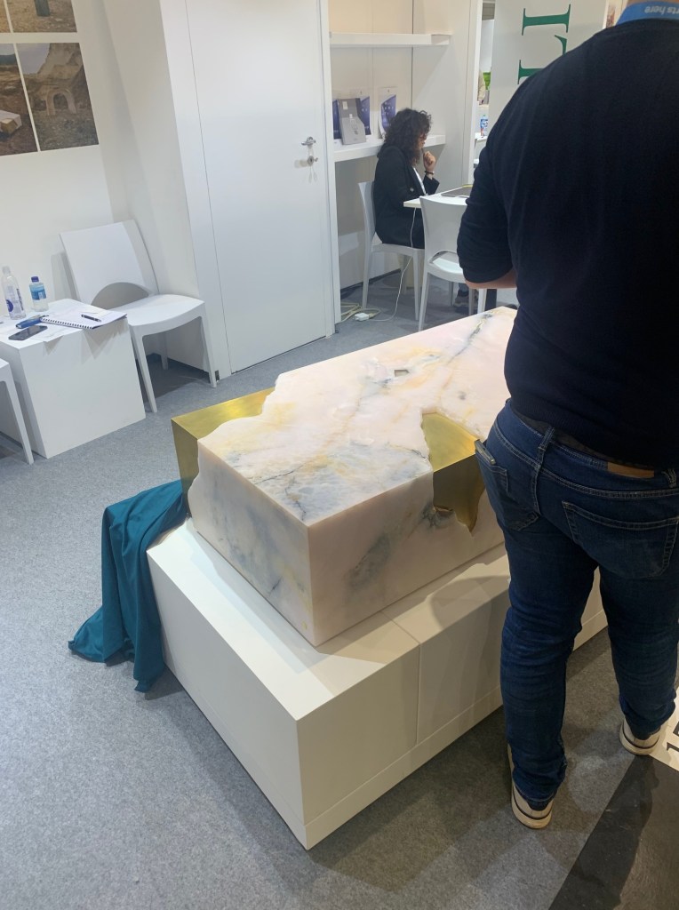
Almost as a definition of the transition to more detail, Serafini showed a solid brass block table. As a way of defining the shift, a marble overlay with snapped and natural edges clung to the corners. The cold, hard brass was softened by the warm embrace of marble.
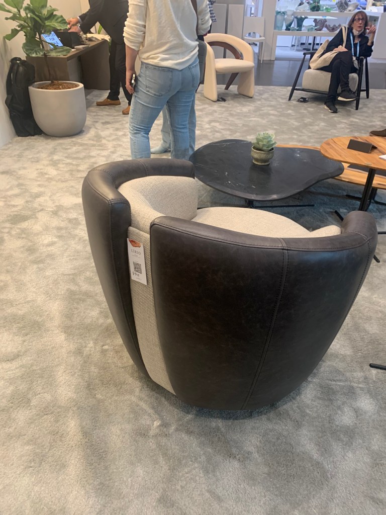
Liro from Brazil displayed split-back leather chairs. To differentiate, the “split” was filled with a tweed fabric or a rattan fiber. Adding this alternate material to the cool leather softened the look and elevated the interest.
ICFF 2023 – Liro
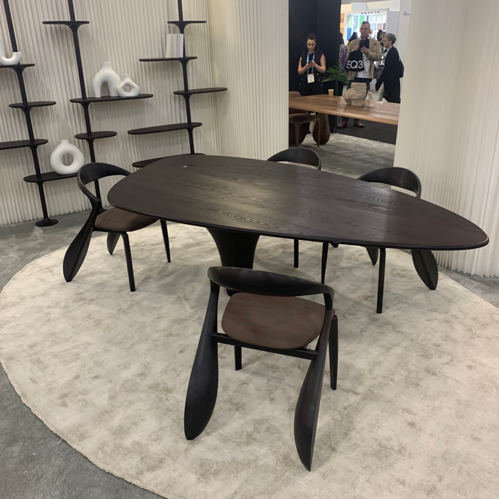
I fell in love with the Mozea asymmetric dining table and especially the Locus chairs with tri-sided legs. Everything about this work of art detracts from the norm. Great lines, a different approach and how it will fill a room.
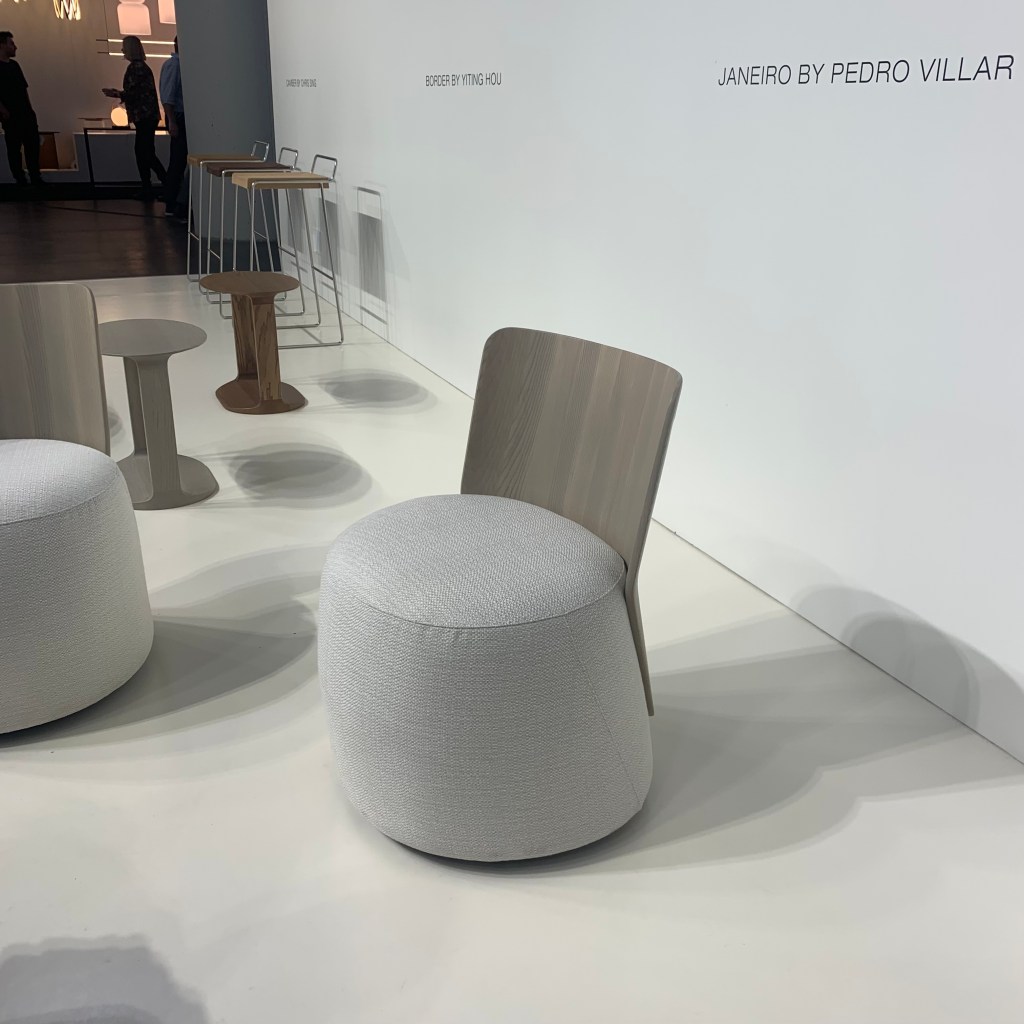
The Bernhardt display is often the largest at the show and they always feature a nice variety of new lines. I liked the small barrel chairs, Janeiro designed by Pedro Villar. Like the dual materials of the Liro pieces, they used a mix of fabric and a formed walnut slab. I also look forward to the new Terry Crews design, a reoccurring feature each show. His RKC chair has beautiful lines with a base that solidly connects the piece to the floor, but doesn’t feel weighed-down, probably because of the reduced seat height.
ICFF 2023 – Bernhardt RKC by Terry CrewsICFF 2023 – Bernhardt Janeiro by Pedro VillarICFF 2023 – Bernhardt
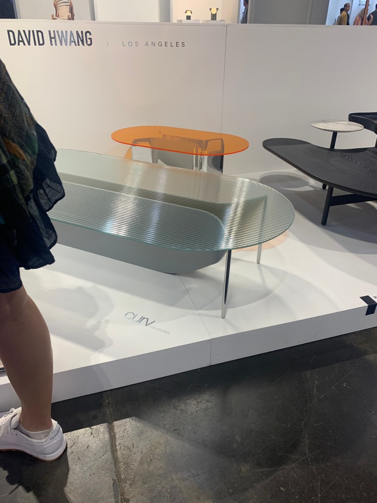
My favorite student, or emerging designer piece of the year was by David Hwang. Curv has a beautifully curved base that just barely connects to the pencil legs, all holding an oval clear ribbed top. He also showed an amber top. This is a young person with a future.
Raising sustainability to new levels, Model No is 3-D printing furniture from biodegradable, plant-based material. The whole process is also net-zero. While some of the product was interesting, the company was more important because of their manufacturing direction. I suspect we will see more of this in the future.
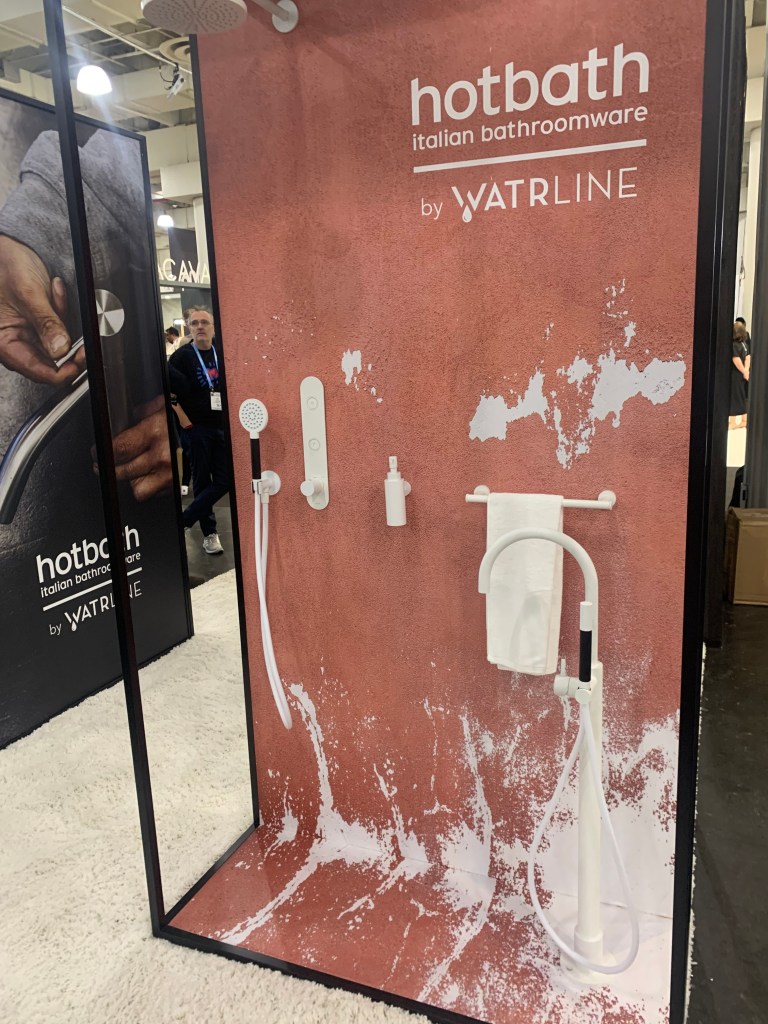
There is only one overarching trend I see in plumbing. Tenzo FinePlomberie is the latest to show decorative knurling details on the handles and faucets, but I’m more interested in the impact of matte white.
For a few years, most of the manufacturers have been offering matte white tubs and sinks as an alternative to the ubiquitous glossy white porcelain. A few years ago, Jason Wu, who really started the Matte Black trend at Brizo, showed matte white on plumbing hardware. This year, Watrline featured some of the same. I think we need to pay attention to this. We are seeing an uptick in white accessories throughout the house, including lighting, probably as a balance to the more involved and detailed other furnishings that complete a room. I also believe that Matte Black, very popular now, but must be nearing an end. Since 1960, black as a finish has never lasted this long. Matte White will be a nice transition from the density of Matte Black and a good compliment to the brass tsunami that will dominate finishes for the next decade.
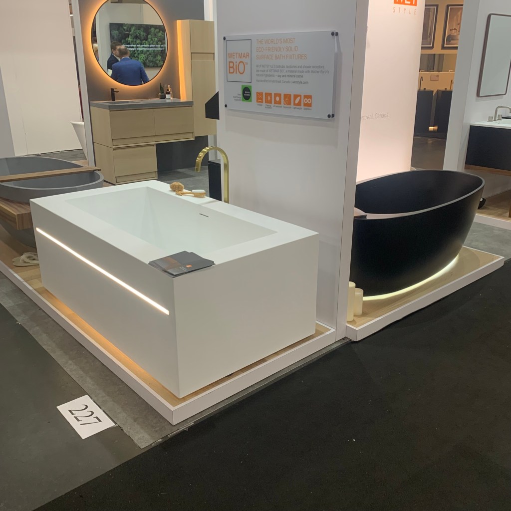
The Wetstyle tubs sort of bridge the gap between this post and next week’s. They are now embedding their tubs with LED to highlight the sides and serve as toekick accents. This is such a natural use of light.
ICFF – WetStyle
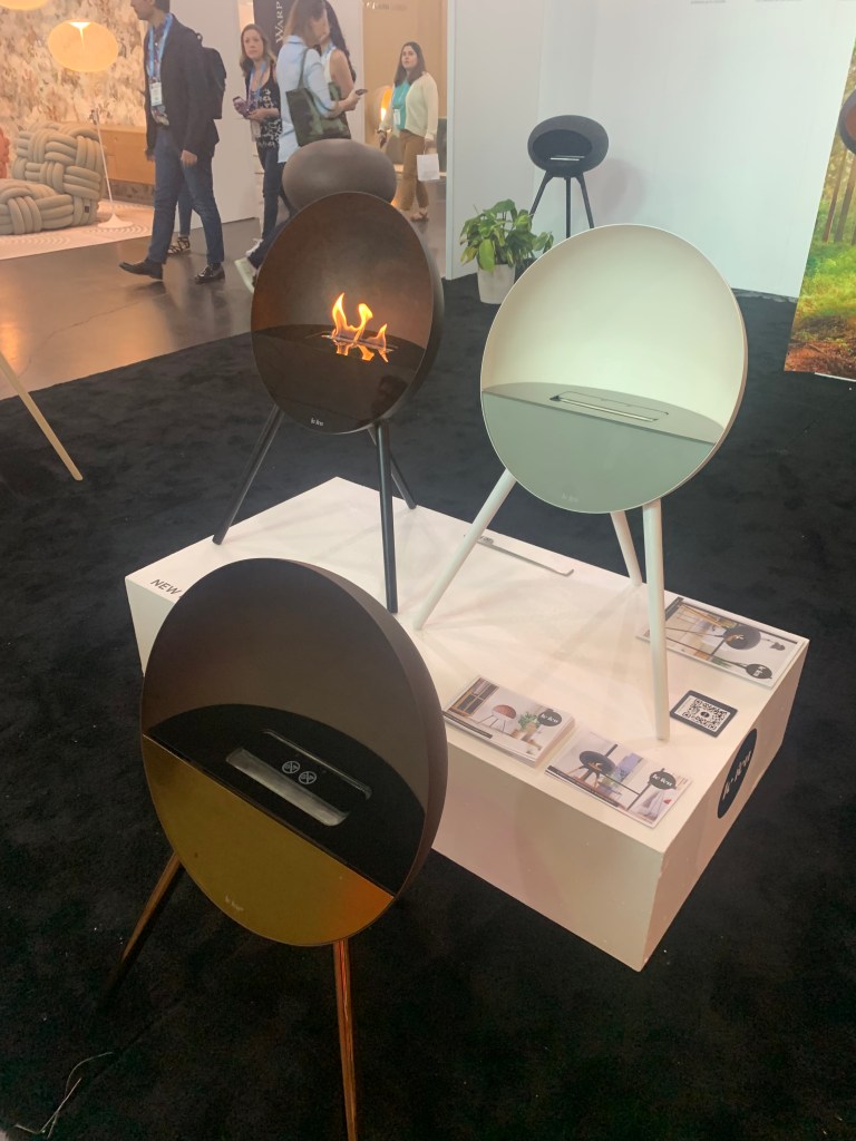
Fire!
No, I’m not talking about the late 60s song by The Crazy World of Arthur Brown. There was, however an equal fascination with the subject matter at the show. Fire pits are hot (no pun intended) and some very creative options were on display. The Lumacast line is a much more refined than the chimineas we saw a decade ago. These are cast concrete in a stylish, sleek design. The “pit” area is filled with an equally appealing group of stone or glass. We have come a long way in the creation of exciting outdoor environments.
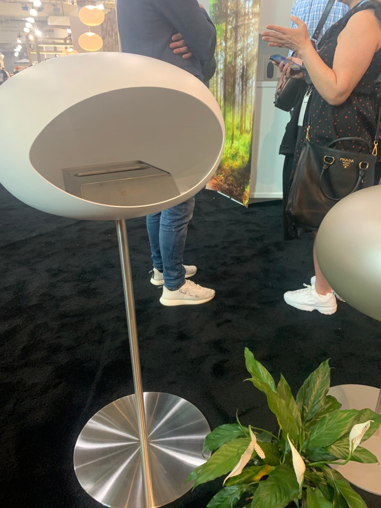
Focus suspended a fireplace from the ceiling, but perhaps more interesting where the sphere-shaped fire pits for the outdoors. The Bubble is a great shape for contemporary exterior spaces and different from the majority of what is currently offered.
My favorite fire feature in the show were the Le Feu “pots.” Somewhat reminiscent of the 60s suspended fireplace, (see Focus above.) but in an ellipsoid, oval shape. They are also quite compact in size, making them very usable in a number of applications. They use bioethanol to create the flame. As explained, bioethanol is made from agriculture waste and claims to be more sustainable than other options. This combo of a trend and sustainability is exactly the type of product that could “catch fire.” (Pun intended?)
Reduxwood has discovered submerged forests of trees in Central American lakes. They rescue these water-infused skeletons and use them in furniture. The years of water apparently alter the grain and color making them stunning “live-edge” tabletops. Live-edge is not new, but the influence of decades-long submersion add an element of interest here that is quite unique.
The show featured two suppliers of “live walls,” essentially plants arranged on a wall surface in patterns, using different species to present multiple colors. Wildleaf Design and Garden on the Wall showed this biophilic solution but I wonder if this has staying power. Does the maintenance warrant the end result?
I didn’t know this was needed, but Trova sells biometric-access safes. Rather than a key or combination, they allow access via a combination of secure app and biometric scanning. Only “you” can open the safe making it easier to use and more secure.
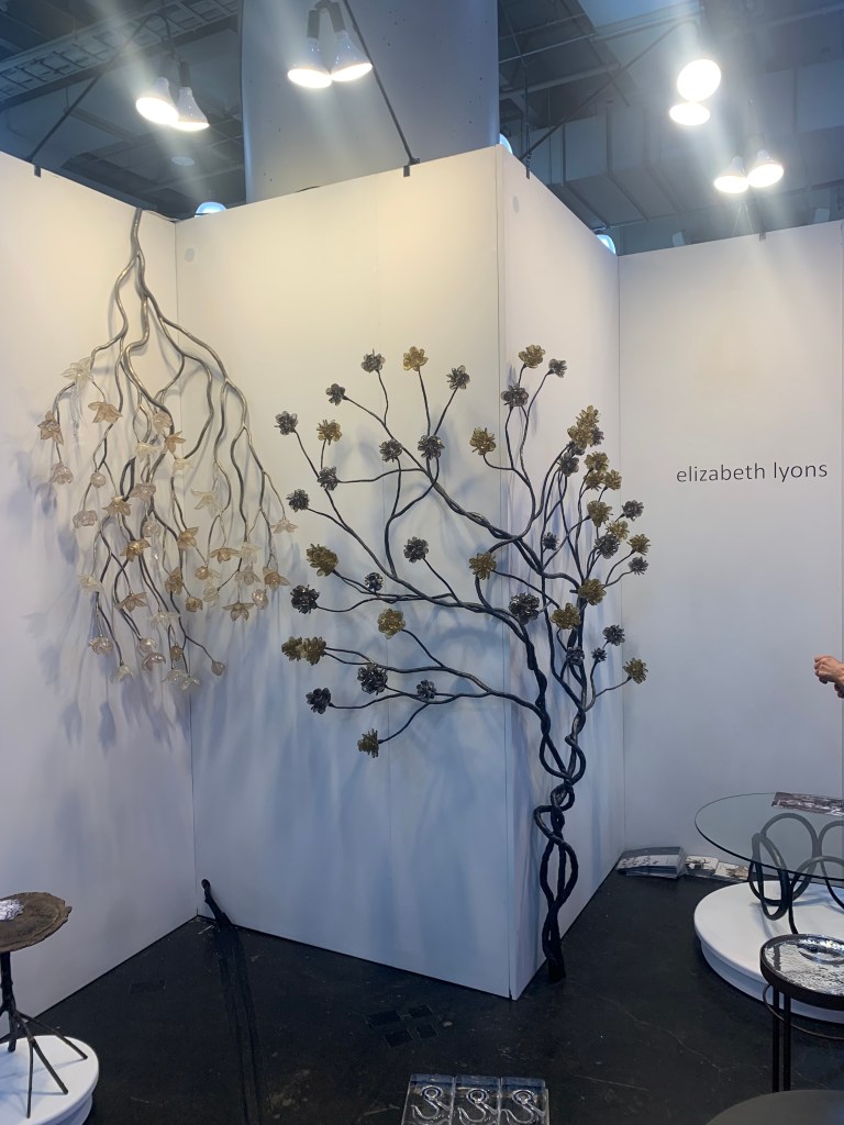
Why don’t we decorate corners? There aren’t a lot of options. Elizabeth Lyons showed some nice choices using her glass creations, combined with organic-inspired wrought iron, filling an unused space is now possible.
Beyond aesthetics, it was easy to see the growing value of sustainable products. More respect was given to biophilic solutions, locally sourced goods and low/no waste production. As I listen to future concerns and worries, the climate and the way in which humans have negatively influenced it has reached a point where a lack of response is unconscionable. As is always the case, smaller manufacturers and designers are always at the forefront of new solutions and fresh ideas. Eventually, this will trickle up as demand increases. This is a great thing for the future of design, but an even better thing for the future of the planet.
Ceiling semi-flush lighting has been reasonably popular. Coming into heightened demand when builders started to increase ceiling heights around fifteen years ago, these have been an easy way to bring the lighting deeper into the room and deliver more illuminance for a reasonable price. Flip through a couple dozen luminaire catalogs and you will see scores of units in the 13” to 15” size. They have become somewhat ubiquitous to the industry.
I’ve always wanted more from a semi-flush luminaire. If sized appropriately, these could grow into a much more aesthetically desirable option. A 13” diameter is fine when running down a hallway or filling a pantry, but why can’t a grand-sized semi flush take center stage? My vision was piqued at the January Lightovations show when I saw a healthy 22” piece offered. (Image below.) Now here was a semi-flush that demanded respect. It had come to play with the big boys.
Eurofase – Jalore Semi-Flush 22″ diameter – Introduced January 2023
This piece was perfect for a single story foyer. I wanted it to also command a smaller dining room. Simply employing a semi-flush lighting fixture in these key spaces would set them apart, force attention and demand reckoning.
But wait! There’s more! How about three or five of them in a pattern over a larger dining room? If a second size was available, think about varying sizes AND elevations dotting the ceiling! If no added sizes are offered, could a larger chandelier size be hung with little or no chain or stem and achieve a similar look? Wow! My head was spinning with ideas.
I thought my fever dream of semi-flush lighting was singular. I was singing solo in the Mohave. “Table for one, please!” Then, the new issue of Architectural Digest arrived. (Crowning Glory – February 2023) In a home designed for a couple of worldly software engineers/investors the Interior Design firm, The Archers placed a goliath semi-flush light/sculpture over their 10-seat dining room table. “Alas, I am not alone!”
Nacho Carbonell’s oversized semi-flush
This piece was designed by Spanish designer, Nacho Carbonell https://www.nachocarbonell.com/ and introduces us to a place where centerpiece lighting is destine, a position that straddles art and luminaires. As we use fewer decorative pieces and more functional lighting to answer multiple demands, such as sustainability, functional light will carry the bulk of the luminance weight, while centerpiece lighting will provide a glow and an aesthetic punch to the space. His work does that and in this instance, it forgoes the expectation of a chandelier and affixes the light, tight to the ceiling. It will be hard for me to forget the look created here.
A Few Asks
To join me in this requests, let’s all row together in the same direction.
Manufacturers, how about a few more oversized semi-flush pieces? If that isn’t feasible, how about an occasional application photo where a large chandelier is hung tight to the ceiling as an alternative to “every other set-shot in the world” where the chandelier is located at the prescribed 30” from the tabletop.
Designers, let’s step off the green and into the rough. Suggest a showpiece worthy, semi-flush luminaire as a way to create a unique look. Remember too, most large chandeliers and pendants CAN easily be hung close to the ceiling. Be sure to select a piece wisely, some will not adapt to this position, others may not look “right.” Those that do can excel in this alternate configuration. Think differently as you plan a space.
Consumers, you don’t need to hang a chandelier in a dining room! There is no such thing as The Lighting Police…yet. (I would however like a position of authority when it is established!) If your friendly neighborhood lighting salesperson suggests a semi-flush, don’t lift your nose in disgust. Relax and say, “Yes!” Your visiting friends and family will be envious! You’ll be the talk of your posse. It is, after all, a semi-flush world.
Hinkley – Reign pendant configured to hang as a sconce
I don’t think we use enough sconces in residential lighting. Sure, most manufacturers present sconces. At the just completed, Lightovations lighting show in Dallas, I saw a few exciting sconces that I would love to see used, but my deep seated fear is that they will be considered by interior designers and ignored by everyone else. That said, this is my plea to keep sconces top of mind.
Foyers
Here’s an idea I love. Forget the foyer chandelier and use a collection of tall sconces positioned around the perimeter of the space. Of course, the architecture must be compliant. When it is, this can be a great alternative, especially when the foyer is single-story.
Perhaps you are not inclined to forgo the chandelier in a two-story space. Consider this. Use a smaller diameter foyer pendant or narrow and long chandelier and add a few sconces. This will add a layer of light variation that will supply depth and interest to the room.
Bathroom/Vanity
Sometimes I feel like a one-man band reminding people that the best bathroom lighting is a sconce on each side of the mirror rather than one long piece, over the top. Every expert and almost every book written about lighting tells us this, but the economics of one outlet box vs. two is too powerful. Over mirror lighting is unflattering and is so laden with glare, it is considered the most egregious luminaire for senior eyes in the entire house. So I’ll say one more time with feeling, “Use sconces on each side of the bathroom mirror used for personal grooming. Your eyes and make-up will thank you.”
Halls
Most hallways are now illuminated with a string of recessed cans down the center. There is nothing wrong with this, but it is predictable and somewhat boring. To elevate these pedestrian areas, why not consider using sconces instead?
Great Rooms
Recessed can lighting, 22’-0” overhead in a two-story Great Room is very close to being useless. The light is so far overhead, the amount of measureable light is minimal. Nonetheless, light is very important in these communal areas. Floor and table lamps are crucial, but sconces can add a layer of light that serves two purposes. The light, closer to the user become functional, unlike the faraway cans. On a massive 20’-0” to 24’-0” wall surface, the space can be humanized and brought into better perspective. The room takes on a more intimate appearance. Forget the light kit on the overheard ceiling fan and the useless recessed cans in a two-story Great Room and replace them with sconces.
Bedroom
Forget the bed lamps. Use a sconce on each side of the bed with an individual control switch. Using a sconce rather than a lamp will save tabletop space and can be very effective in smaller rooms.
Kitchens
As some designers have eliminated upper cabinets in kitchens, the light needed on countertop surfaces must be provided by something other than under cabinet lighting. Sconces are a natural option. They also add an element of design to the now blank walls.
Size
When ceiling heights were typically 8’-0”, 8” to 12” sconces were common. With 9’-0” ceilings now common and 12’-0” readily found, sconces must be taller, lest they appear puny and out of scale with the home. Seek out taller pieces. Forget anything under 18”. In multi-story foyers or great rooms, even taller units should be used.
Alora Lighting – Akoyo linear “string” has been configured in some applications running down the face of a tall wall in lieu of a sconce.
While many 24”, 36″ and 48” linear sconces are now available, recently, I have seen some exciting “string” products that can be installed like a sconce. Think of a string of pearls. Both ends use a type of canopy to connect to a surface. If one end is installed, say, 3’-0” from the next, a beautiful drape can be created. One end on a ceiling or wall can create a type of sconce that drives down a long wall surface. Some manufacturers are using plain white balls, others crystal baubles. Regardless, this is a wonderful option to create interest on wall surfaces.
Convinced Yet?
Please don’t let me sing this song alone! Sconces are a meaningful way to add light to many spaces in a home. Let’s all do our part to make sconce a more meaningful way to light residences.
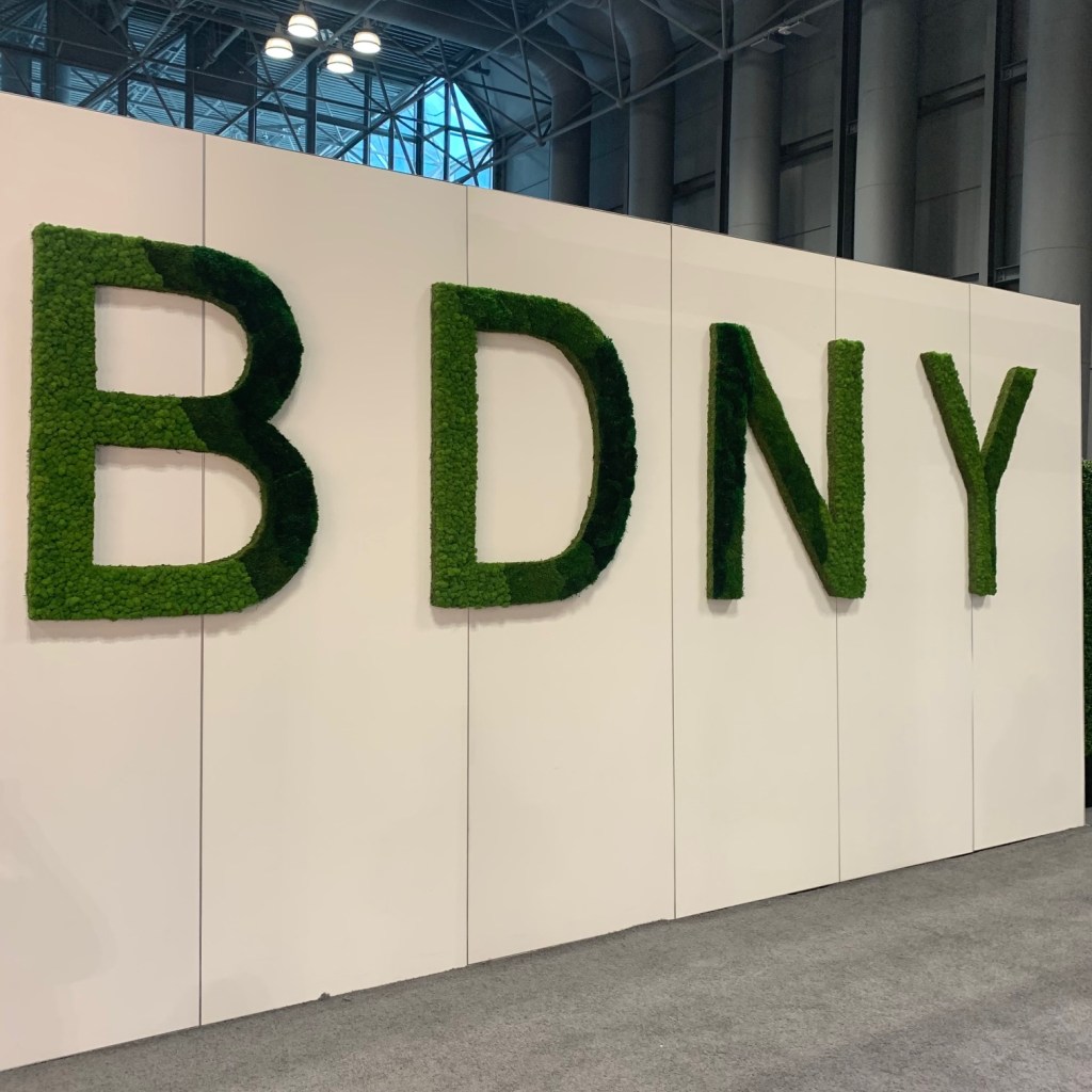
I’ll have more to say about the actual show in my next blog post. For now, let me share the interesting things I saw at this year’s installment of Boutique Design New York (BDNY) a trade show created to serve the hospitality design community.
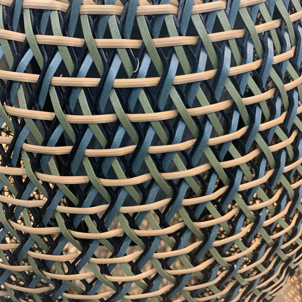
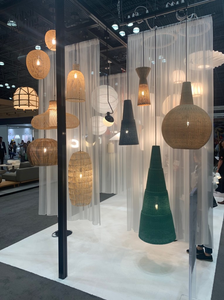
Wicker/Cane/Reed/Woven
There are two noticeable trends that permeated the show. Neither are surprising, I guess I was simply surprised by their dominance.
BDNY 2022 – Deadon woven patternBDNY 2022 – Global Lighting – Wicker and Cane Oversized Pendants
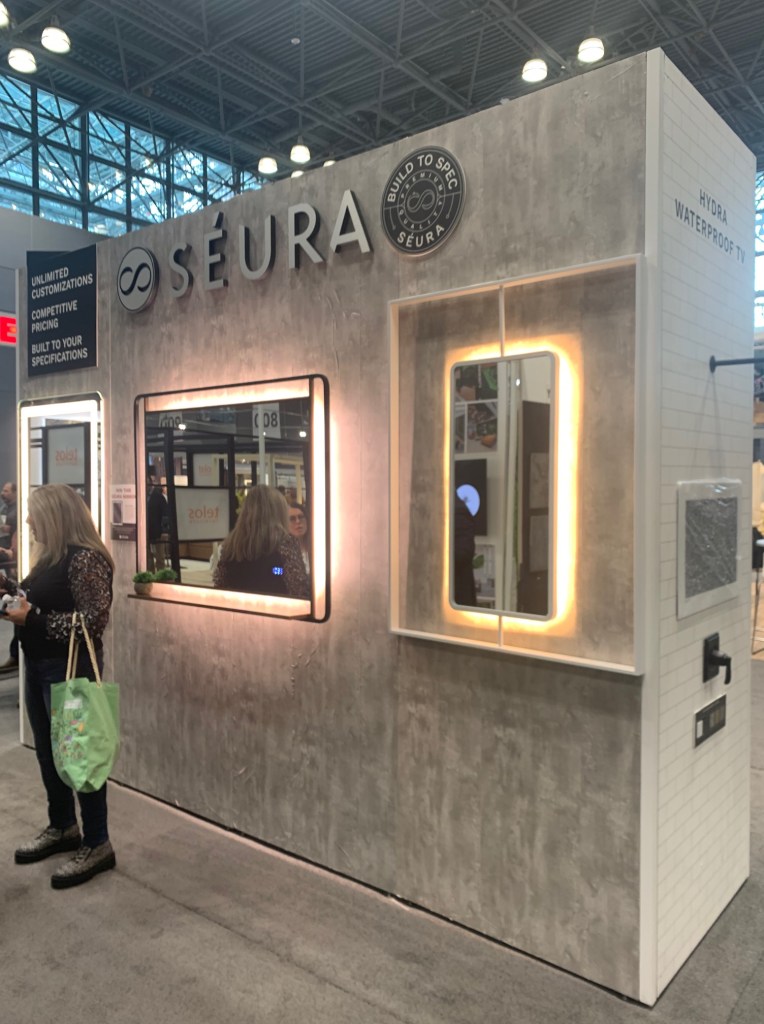
LED Mirrors
As I prepared to attend the show Sunday morning, I commented to myself how horrible the hotel lighting was at the sink. In this particular room, a spotlight was aimed at my hair from overhead and no light anywhere near my face. I moved about like an indecisive fly until an adequate amount of illumination fell on my face. That preface was a telltale reminder when the second overarching trend became noticeable.
Seeing LED lighted mirrors in such abundance made me optimistic. Some, of course are glare-bombs with light aimed at blinding the user, but many of the pieces on display were making an honest attempt to deliver decent light for personal grooming. Seura, https://www.seura.com/products/lighted-mirrors?loggedIn=false has a very professional collection with much attention paid to color and luminance levels. Artline Group and Mirror Imagehttps://mirrorimageinc.com/ also showed a few interesting options with attention to aesthetics and light delivery. While I’m sure I should know better, I’m keeping my fingers crossed that better lighting in hotels is around the corner.
BDNY 2022 – Seura – LED Lighted Mirrors
Lighting
Of course I gravitate to lighting. After working 49 years in this industry, I can’t, not look at lighting!
Cerno lighting showed an interesting assortment of products. Very “smart” modern and using some edgy colors and finishes, I found myself surprised. I have either ignored or forgot about this company. I think I will pay attention in the future.
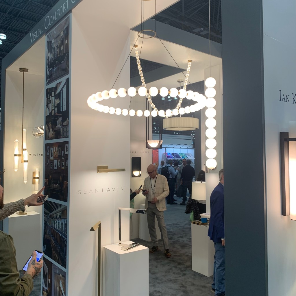
Loved two pieces shown at the Visual Comfort booth. The Comtesse by Paloma Contreras is a very shallow spherical sector of metal, all the light is indirect and sizes are grand. The Orsay Pendant, also by Contreras stacks a small metal cone atop a larger for a clean simple look. The Sean Lavin designed Orbet pendant is a strings of white glass balls in a single drop, almost serving as a simple string of pearls against a black dress for the home, which of course, is always in fashion.
BDNY 2022 – Visual Comfort – Orbet Chandelier and Pendant
I do not believe I have ever come across Bover Barcelona Lightinghttps://www.bover.es/en/ while I was drawn in with their display, a quick review of their website and I found many interesting items. It might be worth a look!
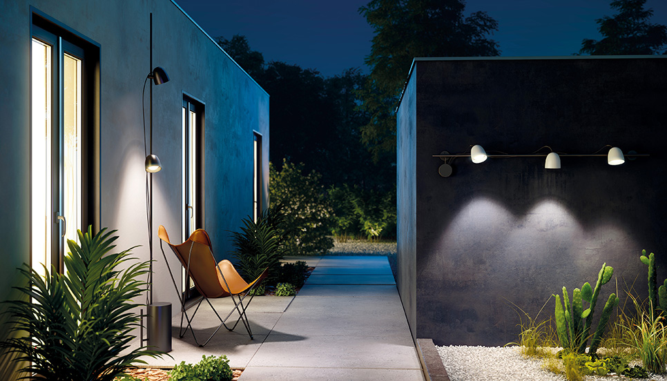
Conversely, I have run across B.Luxhttps://www.grupoblux.com/en/ many times in the past. Their new outdoor solutions are completely different. Track lighting and pole lamps for the outdoors? Wow! Exciting.
b.Lux Outdoor track and pole lamp
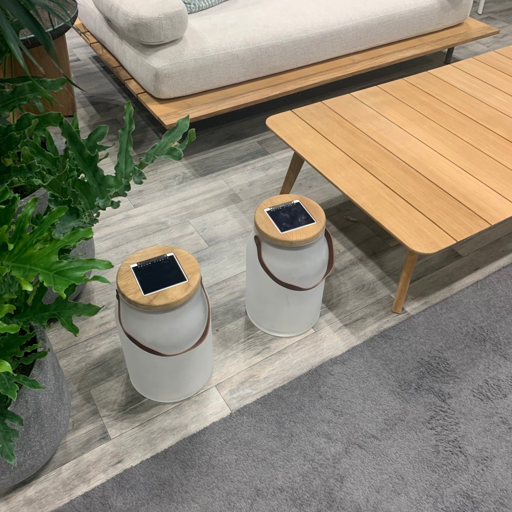
Ethimohttps://www.ethimo.com/en looked again at solar lights, this time, they were porch portables in the shape of milk jugs, obviously called Milk. I still wonder if anyone will crack the code for solar longevity and power retention. These guys are nonetheless cute and would work nicely in most every patio setting. Longevity is however always the key with solar.
BDNY 2022 – Ethimo – Solar portable porch lamps
Sort of Lighting
Perhaps a result of the pandemic and the desire for outdoor eating deep into autumn and early in the spring, Kindle Living has developed a deep line of “Heat & Light” outdoor heating units that now include a lighting element. What is nice is the varied style. Some are clearly “outdoor” aimed, but traditional and mission styling is also available. These are nice solutions for any exterior look.
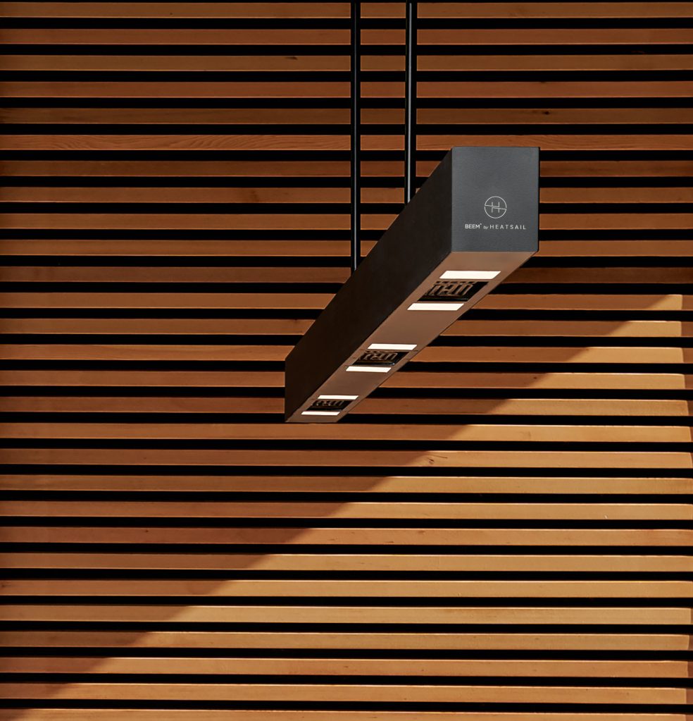
Beem by Belgian manufacturer, Heatsail is a unique product. This is an outdoor lighting unit that includes a heating and misting option all in a compact, contemporary package. One product that solves three problems, heat, light and cooling, must certainly be of value for patio living.
Heatsail – Beem lighting-heating-misting all-in-one, over table unit
Not Lighting
Make no mistake, this show is filled with minibar suppliers and room safe providers. (I’m not sure I could make a career out of providing keycard access equipment to the industry, but that’s probably just me!) Stepping over all of the boilerplate, there was some interesting non-lighting things worth mentioning.
At most shows, there is always one wallcovering supplier that catches my eye. This time, Innovations displayed a textured collection that felt like cork and featured metallic veining that would nicely compliment the rise of warm brass use today.
BDNY 2022 – Innovations – wallcovering with metallic veining
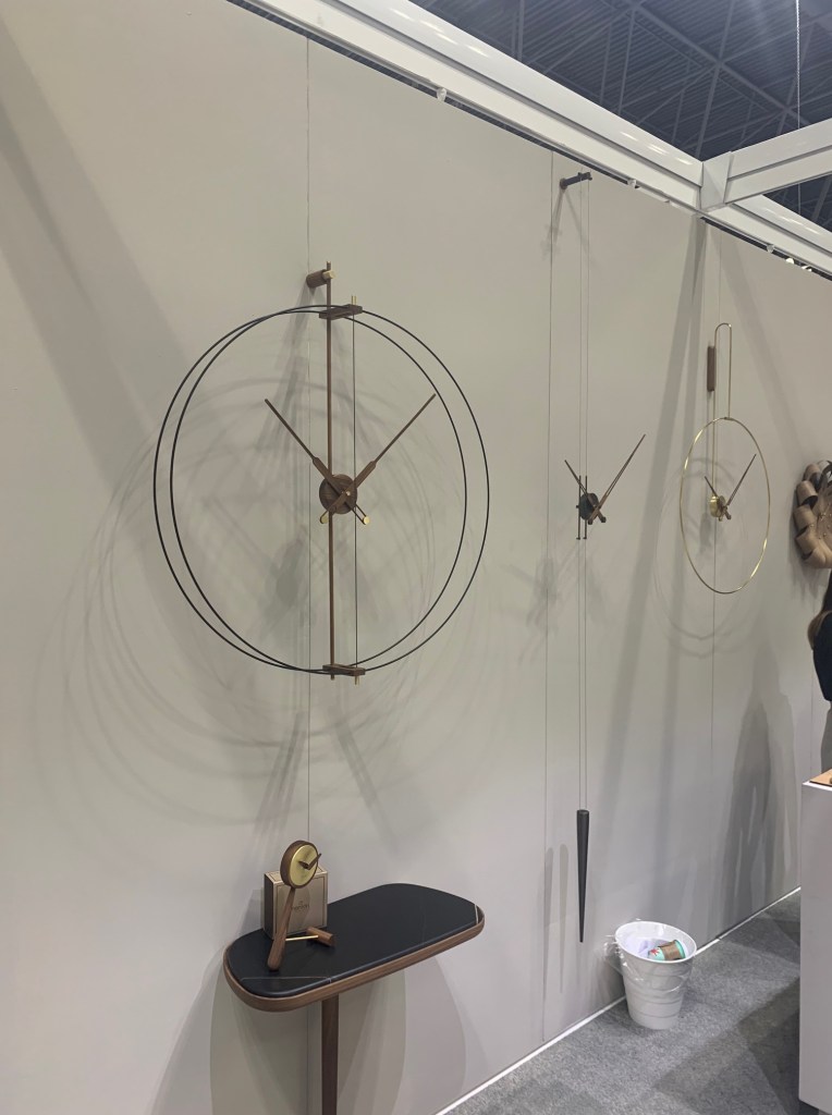
I’m not sure I have thought much about wall clocks lately, if I have ever! That changed at the Noman booth. Rather than the massive blobs of white with schoolhouse numbers placed 30° apart, this company has created products that disappear into the architecture with wisps of metal and minimalist mechanics. These designs have turned functional necessities into beautiful wall accessories. Quite a feat.
BDNY 2022 – Noman – Subtle wall clocks that disappear into the surface
While they advertise their product “for island living” Teaki Tiles could have a much wider application, as long as imagination is used. Rather than ceramic, these tiles are fabricated from teak wood. Teak is an excellent hardwood that has been used around water for decades, so It might seem obvious to use it on floors and walls in patterns. That said, I don’t think I’ve seen it used before in these applications. Their offering could enliven almost any design. I felt sunnier after having seen it!
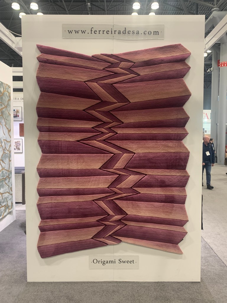
As I took this photo of a very creative rug shown at Portuguese weaver, Ferreira, I overheard a passing designer ask her friend, “Is someone going to trip while walking over that?” I don’t know if that would occur, but it sure will cause one to pause for a moment. These were beautiful textured and tufted floorcoverings.
BDNY 2022 – Ferreia – creative sculpted rugs from Portugal
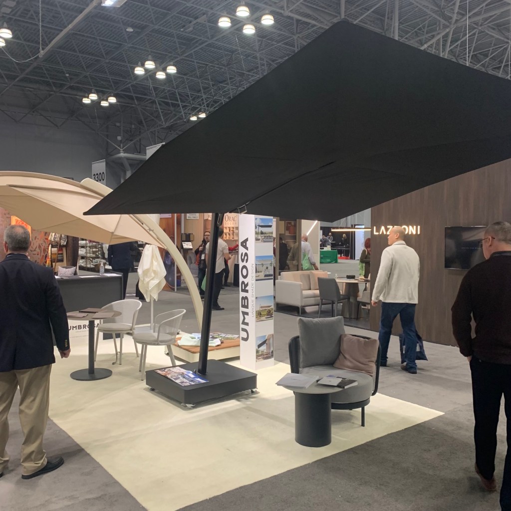
Yes, we’ve all seen outdoor shade umbrellas. There were three or four manufacturers at the show. Only one made me stop and look. Umbrosa were much more interesting and based on the salesperson demonstration, very easy to manage. A quick look at their website and even more variation is available. I wish I had a place for one!
This was a neat idea. Kenco Hospitality showed a collection of double window coverings tucked into an illuminated valance. The front drape was sheer, allowing sight onto the photo-realistic scene printed on the back drape panel, giving you the illusion of a much more interesting exterior. As I opened my hotel window onto the stone wall of an adjoining structure, it appeared to me how valuable this could be in urban hospitality settings.
BDNY 2022 – Kenco Hospitality – Lighted valance with two drapes allowing for the creation of alternate window views.
The idea of printed surfaces heretofore left plain was again mentioned when an old friend showed me printed shower stall environs at ABG Hospitality. Printing on glass added a level of excitement and style to these surfaces. While created for the hospitality industry, I wondered if applications could be found for residential spaces. Something to consider.
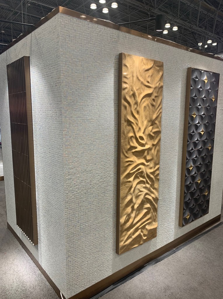
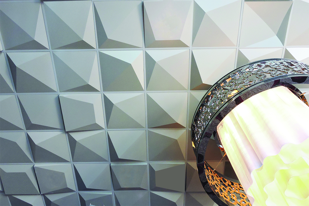
Finally, why shouldn’t the sixth wall be interesting? Above View wants designers to think about the ceiling with creative artisan ceiling tiles. Geometric, textures, patterned and completely different ideas. I liked the idea that this product forced a conversation that stretched the idea of design.
Above View – creative ceiling tiles that bring interest to areas previously left blank.
BDNY & NY
Despite the fact that I found only a few visually excited things at the show, it is always nice to reconnect with friends and immerse oneself in a creative space. A few days in New York also allowed me to sample a few new restaurants, (Try Cadence and The Musket Room!) see some shows (I highly recommend Ohio State Murders & Kimberly Akimbo.) and check out some museum exhibitions. (Loved the Alex Katz retrospective at the Guggenheim.) Refreshed and energized, I’m ready to handle a cold and snowy winter while I hold my breath for Spring.
When my wife and I are shopping in a multi-department retail store, she always knows where to find me when we get separated. Inevitably, I am wandering the aisles in the Housewares section. What sheets, dinnerware, appliances, cooking equipment and household accessories are on the racks, on sale, sold out or in the clearance section? What colors are low in supply and what finishes are in the discount section? Has the “latest trend” been reduced in price?
A recently opened H&M Home featured a prominent “SALE” rack. What is that telling us about Teal and Dark Blue home accessories?
Initially, we all want to know what is new. If we shop a store, or flip through a mail-order catalog or browse an online website, we do so to see the latest options. Understanding what is waning is of equal importance.
The same H&M Home with regular priced merchandise, not a blue or teal accessory to be seen!
I wander retail aisles to try and understand the impact on the look and trends of home interiors. One retailer selling orange, bunny motif accessories is just a funky idea. After the initial sighting, that observation is filed someplace in my brain. I move on. When I then notice the fifth or tenth retailer selling a variety of goods with orange bunnies it is likely becoming a fad or possibly a trend. An idea with which some reckoning is needed. Orange bunnies will now apparently be a factor.
Of course, orange bunny motifs are deceptively simple. They are most likely going to end up in the sale rack during the next season and in the “dollar store” six months later. Paying as much attention to the closeout racks as the new merchandise will help in the understanding of the trend cycle. One orange bunny at 50% off is a sale. Every retailer with all of their orange bunnies at 50% to 75% off and orange bunnies aplenty at the “Dollars Are US” store means they are no longer relevant.
I remember the first time I questioned the continuing viability of Oil-Rubbed Bronze. The finish had been red-hot for about a decade. I knew, the end had to be near, but it remained popular. I toured a new construction home (I’m always touring new construction!) and noticed the oil rubbed faucet in the bathroom. It immediately looked dated. The dark lighting above brought a depressed feel to the room. I knew then, it was on the downslide. A subsequent visits to Home Depot, TJ Maxx and Target confirmed stocked shelves of oil-rubbed bronze. When mass retailers are neck deep in a trend, it is clear, the end is nigh.
When a long-serving trend winds down it means a new option is on the rise. By paying attention to deteriorating trends, it forces observers (and me!) to ask the question of replacement. That in itself is just as loaded a problem. There is almost never a one-for-one swap. What happens after a trend deteriorates is a rebalancing. New ideas come forward and fill in gaps, trends midway through a cycle become more dominate and some other rising trends might accelerate their decline. In short, it turns into an aesthetic game of “Whac-A-Mole.” Balance is usually stabilized when the economy is roaring. Sluggish economies instigate change.
Consciously or subconsciously, we all know trends have a finite lifespan. Our personal methods for digesting them and using the information to our best ability can be supplemented by good observation skills. It is important to comprehend upcoming trends. One way which we can supplement that knowledge is by embracing the information gathered around the discount rack and discount stores.
Sure, I’m a “Lighting Guy” but it is impossible to visit showrooms, galleries, design show floors and window-shop without seeing things outside of lighting that attract attention and ultimately will interact with lighting in the residential environment. While exploring the International Contemporary Furniture Fair and the streets of New York, the following items could not be ignored.
A New Finish Direction?
I immediately fell in love with the new Umber finish show by THG called simply “Umber”. If you’ve been around metallic finishes for a while, you might remember the Burnished Umber or Umbered Brass finish popular in the late 1990s. It was created by oxidizing brass and polishing off the oxidization into a sheen, rather than the matte found in antiqued finishes. The oxidization was brownish. The new THG Umber has more black with red undertones. Darker than the brass now used, this could be a nice brass/bronze finish alternative, or next-gen brass direction. The same finish is also available in a matte version, equally interesting.
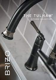
I was struck by the addition of textural elements in some new plumbing products. Brizo showed the new Tulham faucet with a glossy faceted ring on the end of a matte ensemble. This small ring detail was a nice way to extend the idea that some accessories are indeed, the “jewelry of the home.”
ICFF 2022 – Brizo Tulham faucet set with faceted trim ring
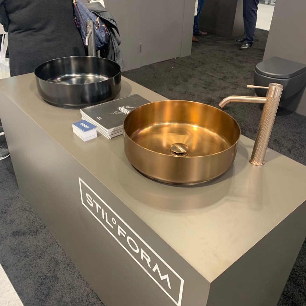
Similarly, Samuel Heath, the British “tap” manufacturer used a faceted ring around the handles of their One Hundred Collection. Stiloform, an Austrian company displayed a faucet with a knurled shaft that extended the texture idea into new areas.
ICFF 2022 – Samuel Heath One Hundred CollectionICFF 2022 – Stiloform
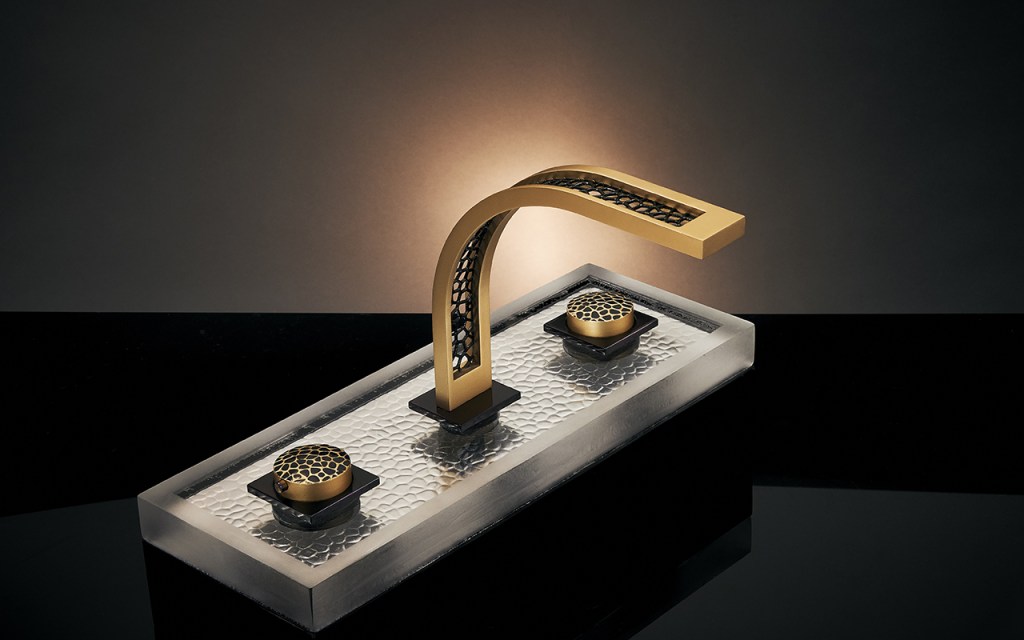
Perhaps some of the most interesting and amazing faucets in the whole show were on view at Uniq-e! an Italian concern that appears to be reinventing all of the known parameters surrounding faucets. A quick look through their website information will provide an idea of their creativity.
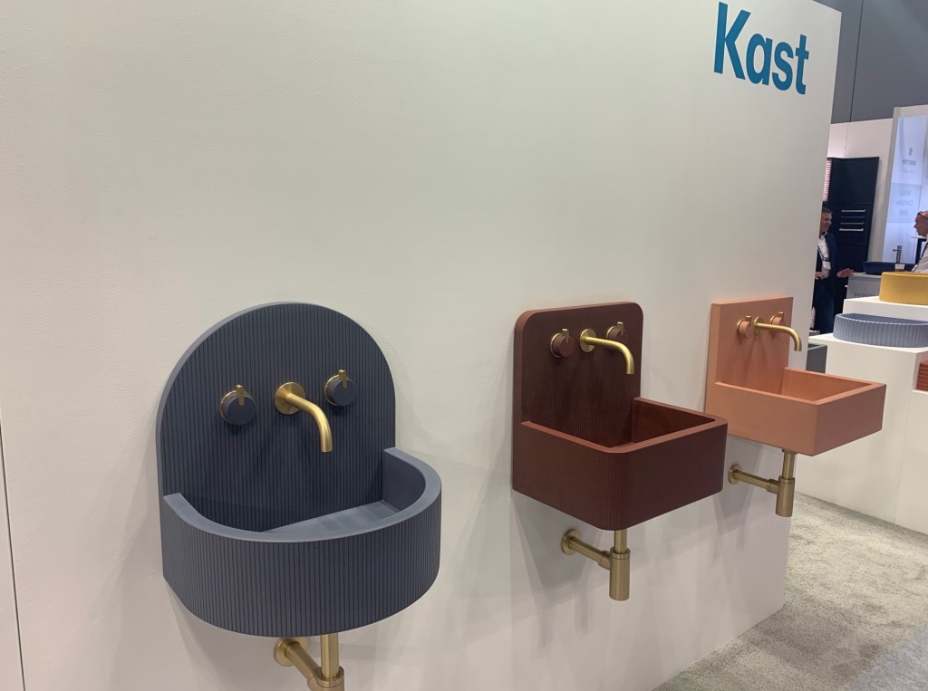
For the last couple of decades, vessel sinks have been sucking up all most all of the creative air in the bathroom space. Thankfully, that era is at an end. Placing the proverbial nail in the coffin, a number of manufacturers were helping designers to ease out of their reliance to these ubiquitous sink options. Perhaps the most engaging and “fun” were the cast concrete sinks shown by Kast. In fresh colors and interesting shapes, these will quickly allow a homeowner to forget they ever hear of a vessel. They can read as modern, deco, mid-century or slightly retro. These are exciting options for the progressive home.
The LaCava Linea sink has reinvented the vanity and enclosed it within an invisible frame of square tubing. Add to the mix a delightful collection of colors and it immediately ups the appearance of any bathroom. There is also a wide variety of frame configurations available. I like this look.
I am a sucker for almost anything Philippe Starck does and his White Tulip collection for Duravit is no exception. With just the gentlest of curves, the standing sink opens at the top to serve as a beautifully sculpted tower sink. The tub and surface mounted sink feature the same appealing curve. This is a stunning bathroom suite.
ICFF 2022 – Duravit White Tulip collection by Philippe Starck
On the opposite end of the aesthetic spectrum are the handmade sinks from Whitebirk. Made in England, these sinks are beautifully crafted, but lean a touch more traditional. Again, color is being used to better differentiate what is available from a high-quality supplier and that which is purchased through mass-retailers.
ICFF 2022 – Whitebirk
Outdoor Living
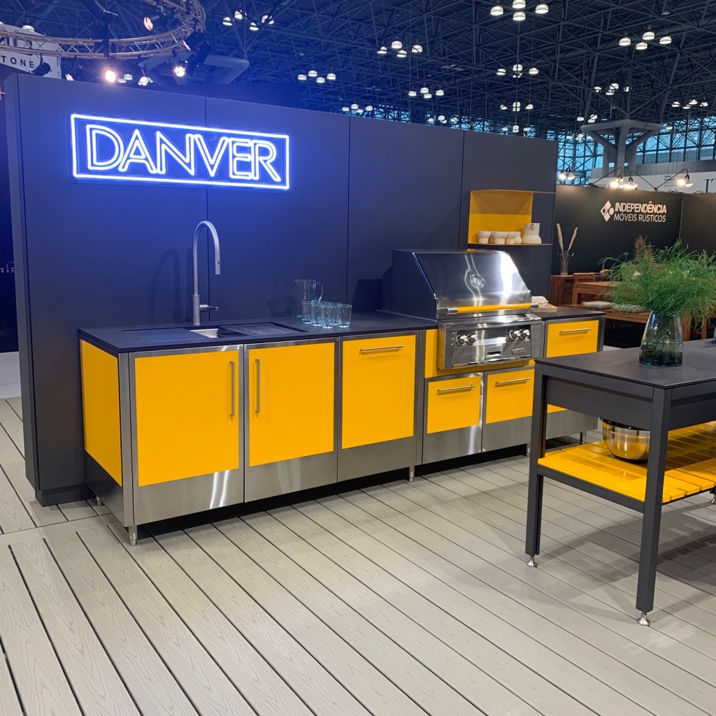
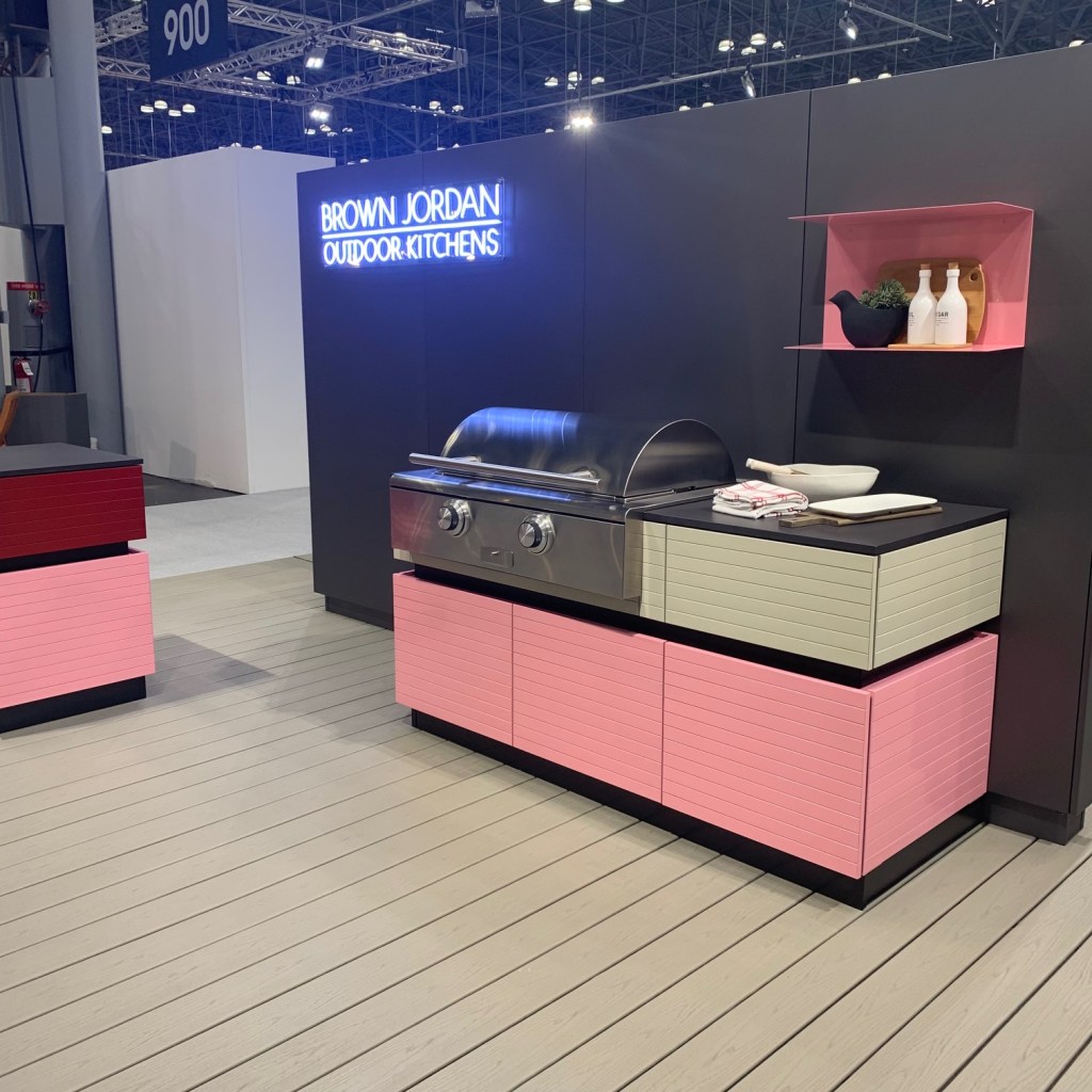
The partnership between Danver and Brown Jordan has produced exciting outdoor kitchens in bold, unusual colors (notice a pattern here?) Danver showed an electric yellow outdoor kitchen and a contemporary pink option. The acceptance of colored laundry room appliances, then high-end ranges (or was the progression reversed?) has allowed consumers to feel comfortable using big ticket items in something other than stainless steel. I think this is a wonderful step forward. We can never have too much color in a home.
ICFF 2022 Danver outdoor kitchen for Brown JordanICFF 2022 – Danver outdoor kitchen for Brown Jordan
Opiary is a Brooklyn creator of concrete outdoor furnishings. The product is so fluid and organic that it belies the tough material employed in fabrication. Seating, water features, tables, planters and surrounds are all built for an unyielding outdoor reality, but look as if they are delicate and born of the earth.
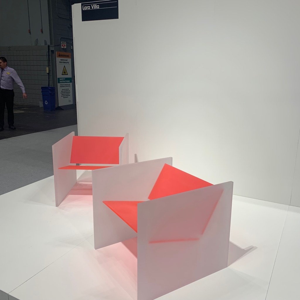
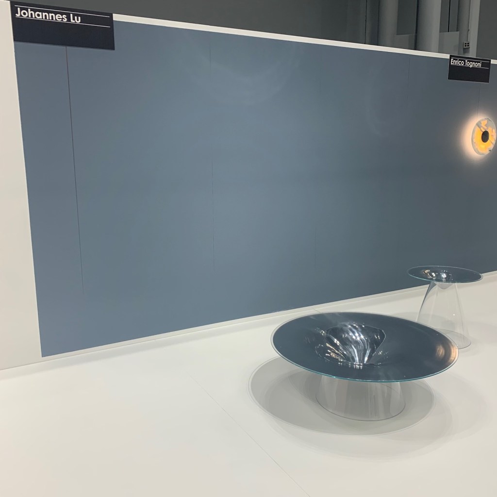
Interestingly, I’m seeing fewer and fewer new and exciting things in furniture. Yes, I liked the Bernhardt seating and I loved the joint between leg and top of the Ethnicraft PI tables. I also loved the student presentations of a table (Johannes Lu) and chair (Lara Villa) in the ICFF Studio. Despite that, I’m just not seeing the next “big thing” beyond the reemergence of beige I discussed in the 2021 report.
ICFF 2022 – Ethnocraft – PI leg-top jointICFF 2022 – Studio – Chair by Lara VillaICFF 2022 – Studio – Table by Johannes Lu
Wallpaper
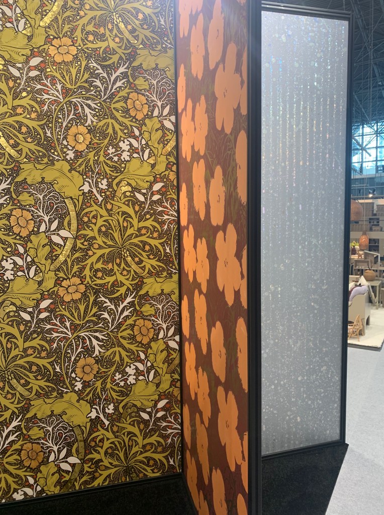
Wallpaper continues to be BIG, BOLD and exciting. A quick review of the options available from Wow Papers reveals an explosion of color and patterns. Even the staff manning the booth were dressed commensurately. The patterns replicated illuminated surfaces with blasts of neon and lighted tubes. Flavor Paper options were tame in comparison, but not when set aside toile versions of the past. Both of these companies believe that if a wall is going to be covered, it may as well be for a reason…a very bold reason. I love these extreme wall covering options!
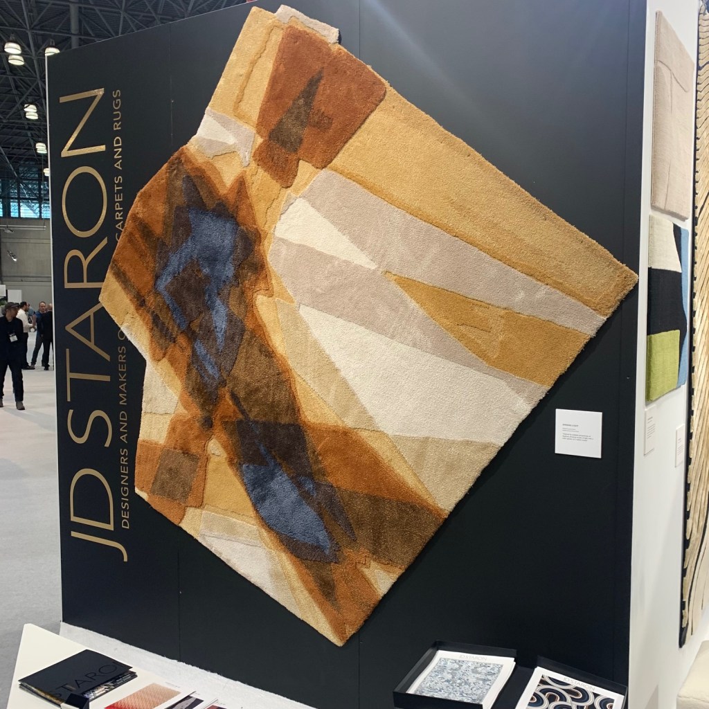
Two different accessories stood out to me. JD Staron creates rugs like Flavor and Wow create wallpaper, big and bold. This bespoke creator can deliver a variety of custom handwoven rug options. Each is more beautiful than the next.
Equally interesting were the mirrors shown by Zieta. One might initially believe these are fabricated from blown glass, but instead they are metal formed in Poland using the internal pressure, FiDU process. This involves welding thin plates of metal together at the edge, then inflating the assembly to create the interesting shapes. Sort of like a balloon made of metal! Construction process aside, what really matters is the amazing result. Airy mirrors, “blow-up” tables and ice cube columns. Really amazing stuff. I encourage you to follow the link below and check out some of their other projects.
ICFF 2022 – Zieta inflated metal
Fashion
I’m always challenged to understand how personal fashion connects with home furnishings. Window shopping New York revealed light, feminine colors and fabrics and dainty jewelry for women and a wider color palette of equally light materials for men. The dichotomy here is the shoes. Sure, there is an occasional spike heal and slim brogue, but most women’s shoes were heavy, clunky and dark, while men are being sold heavy sports sneakers. What does this mean? Do we want a carefree life of fun and excitement, but our feet must be firmly planted on the ground to do so? Is the weight a counterbalance to the fluff we encounter daily? Are we both serious and goofy at the same time? The differences certainly make for an interesting conversation starter.
Faith Ringgold – The New Museum
Perhaps the single more interesting thing I experienced in New York this spring was the Faith Ringgold retrospective at The New Museum. This was a fascinating review of a 50+ year career that explores and attempt to understand the life of a Black, female artist in a world that is primarily centered on white European men.
She supplants herself in classic European cultural environments, places where no African descendants were likely to be found. It forces one to ask, “But, why not?” why wasn’t a Black artist, or simply a female amongst the masters in Arles? Shouldn’t a Black artist or writer have been involved in the roundtable conversations at Gertrude Stein’s Paris salons? While not invited and not expected, her art forced the viewer to see her image there and ask, why this is not a reality. Why would she have been relegated to Alice B Toklas’ separate room each Saturday evening?
Her artistic questions do not stop there. She brought the same perplexing questions into her later work. Women and Black individuals are missing from so many of our cultural milestones. Today we see images of Kamala Harris, Nancy Pelosi and Ketanji Brown Jackson, but we are well into the 21st Century. Ringgold’s art forced the point decades prior. Is it possible her work established a path to these “firsts?”
Ms. Ringgold remains an active artist, now well into her 90s. She continues to force everyone to recon with the failings of an American society to include ALL of its citizens. By doing so, through her art, Faith Ringgold explains the losses and missed opportunities we all face.
New York
No, I did not spend all of my time working in New York! I caught some exciting new shows on Broadway. A Strange Loop and POTUS should be on your list! I also ate at some dynamic new restaurants. Consider a visit to the inventive, Ernesto’s, Kimika and The Commerce Inn. By considering all a city has to offer, a better idea of where we are going can be imagined. I can’t wait to go back and see what is next!
Each month, I deliver an educational lecture to hundreds of talented designers and architects from across the United States and Canada. A recent event centered on the color of light, a subject that has leapfrogged in importance exponentially since the introduction of LED and which I have spent a fair amount of time studying. In the Q&A section, for the first time, in a long time, I was stumped by a question. One of the designers wanted to know what I understood about those with tetrachromatic vision. Like a teenage boy being asked to define onomatopoeia and differentiate between a gerund and a noun, I mumbled, “Ahhh, I don’t know.”
Days after my Rick Perry, “Duhhh?” moment, a friend, who knows of and understands my interest in all things color, sent me an article from the Wall Street Journal discussing the research of tetrachromatic sight. (The Rare Gift of Seeing Extra Color – Jackie Higgins, February 22, 2022) The world was telling me it is time for some additional study.
Human color perception is delivered through tri-stimulus values. In other words, we have three photoreceptors in our eyes, one with peak sensitivity for blue, one with more highly refined sensitive to green and the third with heightened sensitivity for red. Images enter our eyes, the colors are separated into three “buckets” (R,G&B) and the information is sent to our brains for processing the understanding of the color of an object. (If you’re an ophthalmologist reading this, I apologize for that simplistic explanation!) If a person has some sort of color-blindness, one, or more of those photoreceptors does not work properly. If a person has tetrachromatic vision, they have a fourth photoreceptor. This fourth receptor allows that person to perceive higher gradations of color.
What Does Tetrachromatic Vision Do?
Explaining this is akin to developing an orthographic projection of an M. C. Escher drawing. How do we understand a higher level of color perception, when we, or the researchers can never experience it?
Imagine two paint samples. The average person sees the same color. In his research on color perception at Kodak, David MacAdams found that 90% of the population had average color comprehension, but about 10% had some level of elevated ability. They are able to hone in on the nuances and discern a difference. Those folks are likely my audience of designers, but also printers, photographers, artists, paint store specialists and even a few like MacAdams, a Physicists and Color Scientists. To understand persons with tetrachromatic vision, they see multiples of differences even in color samples perceived to be the same, by the rarified 10%.
Hourly and salaried wage-earners are the 90%, the 10% with better color perception are millionaires and those with tetrachromatic vison are the multi-billionaires of the world. Just a few, with overabundant powers.
So How Do We Respond to These Talents?
Unless the designer is equally gifted, it is near impossible to design to the demands of a tetrachromatic client. From comments provide by those with tetrachromatic vision, they also have no way of perceiving a life of color in any other way. How does one understand what one does not possess?
Recruiting people with tetrachromatic vision into the field of LED technology would be very helpful. Their superior color perception could help in the development of better products. If it passes muster with them, the rest of us will be well served with lighting of perfect quality. Wage-earners, millionaires or billionaires will all have great light. That egalitarian color solution sounds pretty good to me!