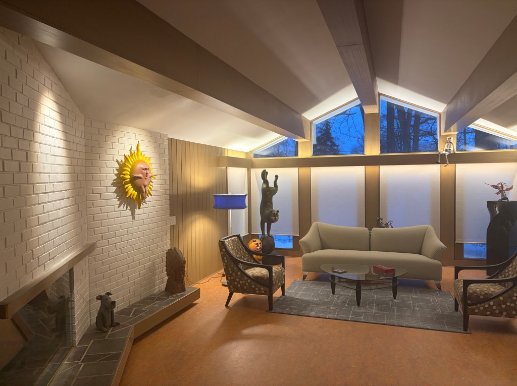
If you’ve read any of my recent blog posts, you’ll know, my wife and I just moved into a new, rehabbed mid-century ranch. The house was rat-infested, filled with mold, had holes in the roof and otherwise, only partially functional. My wife likes to say, “We built a whole new home inside an existing shell.” While that may be true, we were careful to maintain at least 90% of the original character. Walking into the front door, all of the living spaces are exactly as were envisioned in 1957. Sadly, an original bathroom could not be saved as water leakage compromised the supporting floor joists underneath. 1980s era remodeling of the main bathroom and kitchen were not worth the effort to save. We think the house is now a perfect blend of reverence to the past and functionality for today and tomorrow.
Because the lighting and electric was barely viable, up to and including problematic Federal Pacific electric panels, a full rewire with all new lighting was required. This has allowed me to make some observations about the state of residential lighting, at least in this one small instance.
I have been involved in lighting for over fifty years, so I’ll add two provisos. First, I spent more time than the average homeowner thinking about the lighting I wanted and where I wanted it placed. Secondly, I probably used more lighting than most remodelers or designers would typically specify. That said, I believe I have created a nice lighting design for our home and I have solved the consistent lighting complaints we both lived with in our previous homes and their rehabilitation projects. In addition, while our vision is good right now, statically, more and better lighting will be needed as we age. It was easier to add the light at this juncture, rather than later, when we’re less suited to deal with it.
Some Stats
26 outlet box mounted luminaires (12 of which are utilitarian flat-panel flush mounted luminaires plus 2 monopoint spots.)
52 recessed units and recessed housings
223 feet of LED Tape (four different types)
32 lighting strips totaling 71’-0” illuminate the clothes closets
15 remote power supplies (for tape and lighting strips)
14 step lights
4 exterior spots
Scores of cables, connectors & clips, for the assorted lighting systems
Stat Calculations
28% of the fixtures purchased were outlet box mounted
72% of the lighting was a functional systems, placed in, above, below or behind architectural elements of the structure
29.6% of the budget was spent on outlet box mounted lighting
70.4 % of the budget was spent on functional lighting
If we include the utilitarian, surface-mounted items as functional lighting, that number jumps to 76.7%
Project Stats
2600 square feet of livable space (includes a basement studio/office/entertainment space) 3105 square feet includes garage, which was also lit.
2902.18 watts are consumed if ALL luminaires are engaged
0.93 watts of lighting energy per square foot
7% – percentage of total budget was dedicated to lighting. If initial cost of the building is included, (this was a rehab) the number falls to 5.6%.
As I look at these numbers, they reflect what I have suspected and mentioned here over the years.
Functional lighting is heavily outweighing decorative lighting in quantity, dollars and impact to the room at a pretty substantive level.
As a percentage of new home or remodel budgets, lighting needs to be increased. I suspect my number, at 5-7% is higher than most. Many people believe 10% is a better number. The electricians on the job parroted that, indicating our house was the most involved they had ever done. While there was a room or two in their past, a whole-home of correct lighting hasn’t been normal. That means, there are a lot of poorly illuminated houses out there.
Despite my large number of lighting options, my watts/square foot umber fell below most averages of 1.0 to 2.5. Not where it needs to be if I wanted LEED, or some other energy saving certification, but pretty low. (More on this point in the next blog post.)
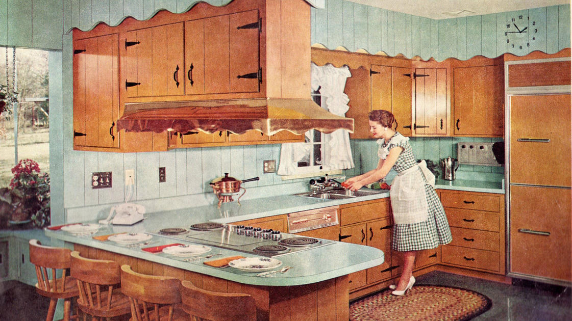
When I started work in this field, well over 90% of lighting used in a home was outlet box mounted decorative. A handful of recessed pieces were used in select spots and undercabinet lighting was, if used, fluorescent strips. 2’-0” x 4’-0” fluorescent boxes in the kitchen were soon replaced with a grid of 6” recessed cans. Bedroom bent glass was replaced with bowls, then ceiling fans. Hallway bowls were swapped for more recessed. Now, many bath strips are being supplanted with illuminated mirrors. Fluorescent undercabient was replaced with Halogen, then Xenon and now LED Tape. The ease of LED Tape, to say nothing of the reduced cost, has made accent lighting much more viable. All of these transitions are visible in my “real world” lighting installation. Are we, as professional lighting people dedicating the correct percentage of our efforts to the right categories? I’m not sure we are. We seem to spend an inordinate amount of time on decorative products and not enough on functional.
I also worry about our failure to push for better lighting. I often play a game when the new issue of Architectural Digest magazine arrives. I count the visible, decorative lighting fixtures in each article/issue. The number was shockingly low when I first started. As we moved toward the minimalistic 2010s, it got even smaller. Recently, the number is increasing because designers are doing exactly as I expected, they are featuring one or two key luminaires in a space. Lighting fixtures have moved from functional distributors of light to art that also provides some light. What hasn’t changed is the overall poor lighting found in almost every article in the magazine. If you’ve made it into Architectural Digest, there is no question, the design and implementation of the space is breathtaking. The furniture, wallcoverings and window dressings are flawless. You can’t help but be envious. Look a little deeper and the lack of usable light in the majority of the rooms is astonishing. Millions were spent on the redecoration, but only a couple of thousand dollars was spent on lighting that will allow you to see the space and live in the house.
The lighting design I provided for our new/old (last) home solved multiple problems, too little light, too much glare, poorly located lights and light oblivious to our security needs. Combined with a home automation system, the home lighting functions almost without our intervention. To achieve that, more systems-based functional lighting was needed than decorative outlet box mounted products. I’m not sure I’m an anomaly. As an industry, are we balancing this need correctly? All we need do is check out the statistics.
I have had a delightful “back and forth” conversation about trends with my closest friend for many years. While I had a career in lighting, he was a PR executive, concentrated primarily within the residential products space. He is more likely to push back against change and of course, I am inclined to embrace the “new” even when it might be to the detriment of good logic. At the conclusion of every email chain or tavern conversation between us two old retired guys is the agreement that change ALWAYS triumphs, like it or not.
The New York Times has an engaging compilation of the major trends and inventions that have matured kitchens over the last 100+ years. It tells of the background of the kitchen triangle, when the “open concept” first grabbed the interest of homeowners and recounts some of the innovations we now take for granted. This article is naturally pointing out the thing we now find indispensable to the function of a home. Score one-point for Jeff.
My friend’s score would heavily outweigh mine with the “hottest things” that DID NOT make the list. We don’t all have a steam oven, despite a couple of decades of manufacturers telling us it is essential. We don’t have a breakfast bar in our Primary Suite, few of us have a dirty kitchen (prep-kitchen) in our home and even fewer of us have a horizontal shower. Basically, my friend wins. We ignore far more than we adopt.
In the article, they asked seven questions. I asked him to send his answers to me and thought we could compare notes.
We both agree on kitchens. 55% of the readers agreed that the kitchen should be “a little separate” rather than open.
Jeff wins on freezers. My friend, unlike 76% of the readers does not believe the freezer should be on the bottom. He doesn’t like the “side” freezer option either, preferring the top. The very practical reason, he simply, “Doesn’t like to bend over for ice.” A good point.
We are again alike on the indispensability of a microwave or an air-fryer. We both have microwaves, but use them infrequently. Neither of us have an air-fryer (although I have a toaster oven with the feature.) 86% of those polled voted for the microwave.
We both agree that one island is enough. I actually prefer no island and have never had one in a house. 90% of the people agree there is no reason for two islands.
I think subway tile is over. My friend still likes it; so do 66% of the respondents. One point for my buddy.
I believe open shelving in a kitchen is great, if you don’t cook in your kitchen. It also takes a lot of aesthetic skill to make an open shelf kitchen work. My friend and 87% of the public agree. With too much stuff, you need the cabinets closed.
My friend prefers an eclectic style for his kitchen, so he reluctantly voted for the “colorful and cozy” option. I want everything as “streamlined and sleek” as possible. 76% agreed with my friend.
We agreed with the collective four times, he voted with the population on two additional points. I only agreed once, so my friend is more in tuned with the general population than me. Nuts. I thought for sure I knew what people wanted. I can hardly wait for the next time we have a beer together and discuss the latest household trends. I just know I’m going to win that conversation!
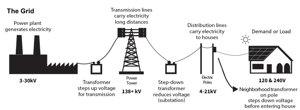
The US federal government has pulled its support or hindered alternative power sources such as solar, wind and battery.
Inefficient and dirty coal-run electric power plants are regularly being decommissioned. Natural gas fueled plants are also shutting down. Some for these two reasons, others because they are simply at a natural “end of life” and can no longer function properly. Most are not being replaced.
Electric demand is on the rise, primarily from data centers being added to support an Artificial Intelligence (AI) boom.
The rest of the US electric grid (substations, high-voltage transmission lines and local distribution lines) is OLD, in poor health and crumbling.
Electric rates are increasing.
According to the North American Electric Reliability Corporation, (NERC) “Long-Term Reliability Assessment” of January 2026, this combination of events will result in a higher levels of blackouts, impacting tens of millions of users over the next five years.
The most vulnerable area is Texas. Apparently, Texas is like Hawaii, in that its grid is not largely connected with the greater national system. They are also seeing an increase of residents, industrial demand, data centers and bitcoin mining. Their grid isolation led to the 2021 power failure that resulted in over 200 deaths and makes them extremely vulnerable for future blackouts and losses. They are not alone, The Upper Mid-west, the Mid-Atlantic and the Pacific Northwest were also cited as vulnerable.
Add to this what we already know. (According to the Energy Information Agency [EIA] 2020 report and research done by the University of Minnesota on this topic.)
Americans experience an average of six hours of electrical disruption per year.
North Carolinians experience 30 hours of electrical disruption, five times the national average and twice as much as #2 Vermont.
The United States has more power failures than any other developed nation.
Americans experience more time without electricity than eight other industrialized countries.
Power failures in 2012 were ten times more common than in 1985.
Power failures doubled from 2003 to 2012.
What Do Lighting Folks Do?
It is time to take resilient lighting more serious. We can all buy some clunky battery backup light that looks like it was designed for a garage, but you wouldn’t want to put it anywhere else. If regular power outage is our new reality, we’ll need a recessed can (that looks like all the other cans in our ceiling) with backup power. We’ll need a decent looking flush mount and perhaps semi-flush luminaire that functions once the power disappears. There will need to be multiple styles, sizes and finishes. Building codes should be adjusted to require a handful of resilient luminaires in crucial spots across the home. To meet the needs of consumers, they should mimic their non-resilient sister. We should not suffer aesthetically because our power grid in not being protected by our elected officials. We need to do better.
I live in an older, inner-ring suburb of Cleveland that is supplied by underground electric from the 1925s to 1950s. We lose electric regularly; on an average of six times per year. As we rehabbed our mid-century ranch (also in the same neighborhood) we wanted to protect ourselves from this inevitability. We were okay with the occasional loss of electricity, (we’ve been here almost 25 years, it’s a reality of our life) except for the loss of heat. I wanted some sort of battery back-up for the thermostat and igniter/pilot. The furnace (and before it, the boiler) were gas powered. Once started, the natural gas would function fine. The only thing preventing a warm house was a small, low-voltage “spark” from the thermostat. Nothing was available. Everyone looked at me like I was asking for a gold-plated raccoon. Their only solution was a whole-home generator. That’s like using a gold plated .50-caliber rifle to kill the gold-plated raccoon. Perhaps the HVAC community won’t help, but lighting could be a better partner for homeowners.
The NERC report does provide some good news. California is no longer considered a vulnerable location for blackouts. After years of weakness, they now have a solar-powered grid of batteries ready to serve as backup, should the need arise. If only other states and the federal government would adopt this solution, we wouldn’t be in such a pickle. Until then, it’s up to lighting people to help America live with rolling blackouts by dedicating more resources to the creation of well thought-out, aesthetically pleasing, resilient lighting.
You know I love a big tranche of data! This report is chock full of good information. To read the entire report:
Recently, my LinkedIn feed has been filled with conversations about the cost of electricity, likely due to the noticeable surge in price. Most include a graphic and many include dated or erroneous/suspicious information. I don’t think people are being malicious, this is a complex topic and the supportive data is equally fraught with confusion.
Energy vs. Electricity
When a point is being made about energy consumption that does not necessarily mean electricity. If you look at the US energy Information Administration (EIA,) energy is defined as electricity, natural gas and heating oil and propane. Some statistics even include the cost of gasoline and diesel fuel because it is energy we consume. Even more broadly, we could include the cost of coal, hydropower, solar, wind, geothermal, biomass, ethanol and uranium because they are used in the creation of electricity. None of these are wrong observations, but what information is right for a viable assessment of cost and cost savings?
As lighting people, we can’t really impact home heating and gasoline has little bearing on watts consumed to illuminate a space. The cost of coal, hydro or nuclear power are baked into our price per kilowatt-hour of electricity. That said, it might be easy for us to home in on the price of electricity, but that too, is complex.
The Different Prices for Electricity
Electric companies across the United States sell electricity at different rates to different entities. There are residential, commercial, transportation and manufacturing rates. There is also a combined average. If you are like me and have spent a career concentration on residential lighting, the residential price per kilowatt-hour is all that you need. Commercial lighting people will need the commercial and industrial (manufacturing) numbers to help aid in justifications.
States, Regions and National
Data is collected across states; states are accumulated into regions and a national average is finally calculated. All those numbers are made available and by themselves, are correct. So which do you use?
It is important to note that the price of electricity varies wildly across the nation. Hawaii is always the highest in the country, the Northeast corridor typically makes up the remainder of the “Top10” with Alaska and California also in that top ranking. The least expensive electricity seems to change each year from the bottom ten states. That means the national average should be considered just that, an average.
2024 Stats
(A note, about EIA stats. Yearly numbers take a few months to accumulate. The 2025 averages will likely be published sometime mid-year to the third quarter. For that reason, most people will be using the 2024 number for the next few months.)
The average price for electricity to the ultimate residential customer in 2024 was 16.48¢/kWh. For the commercial businesses, 12.75¢/kWh, Industry paid 8.13¢/kWh and the transportation sector price was also12.75¢/kWh. Across all four sectors, the average was 12.94¢/kWh.
To understand the wide variation of prices, the EIA breaks the data down. In 2024, Hawaii, of course had the most expensive residential electricity in the nation at 42.86¢/kWh and North Dakota enjoyed the least expensive electric cost of 11.51¢/kWh, almost four times less. The commercial, industrial and transportation sectors, by and large, fall into similar proportional rankings.
Hawaii is the most expensive because it is an island-state. It must generate all of its electricity on the islands. Buying or selling excess production is not possible, hence the high prices. Alaska also finds itself in the same position for the same reason. Within the contiguous United States, high prices are borne by densely populated areas and low prices are enjoyed in sparsely populated states. For that reason, California, New England states and New York comprise the list of the most expensive contiguous states.
The cheapest electric rates have a few anomalies. Washington is always on the list, because of the large amount of hydro generated power. Tennessee is also a constant primarily because of the TVA. The other states have smaller and more rural population, in general.
Twenty Years
I have been talking about electrical consumption for over twenty years. To help designers, lighting professionals and consumers understand the benefits of energy efficient lighting, first fluorescent, then LED, I talked about the long-term or lifecycle cost of lighting. To give people a better understanding of the financial reality, we looked at first cost PLUS the cost of electricity over the lifespan of the luminaire, knowing full well, electricity would increase.
When I first started delivering talks on lighting energy consumption, the 2004 national average cost of electricity was 8.95¢ per kWh. That means the average cost of residential electricity has increased 84.8% in twenty years! Has your salary increased 84% in that time? If not, more of your discretionary dollars are being used for non-discretionary needs.
As I began my research, I remember reading that electric cost had not really experiences huge jumps in the decades prior to 2004. Later, listening to a speech given by the CEO of ComEd, I learned that those rates were stable primarily because the market was continuing to grow. In the early 2000s, growth was difficult and even impossible. Fewer households were being formed, it was getting very difficult, almost impossible to build a new power plant and because of age, the power infrastructure was in dire need of replacement. She promised at the time, “Rates will/must go up.” Today, we are hearing that electric rates are rising primarily because of the massive draw required by data companies to facilitate Artificial Intelligence (AI.) To undertake this massive level of computer processing a lot of electricity is used. What’s more, it takes a lot of electricity in a country where almost no added electric creation is being built. No new output with substantial new demand and only limited ways to increase efficiency do not make for a good future. The short prognosis must be, rapidly increasing electric rates. Aren’t you glad the federal government cancelled all those wind and solar energy creation initiatives? (Sarcasm implied.)
But there is one more wrinkle, PUCs. Public Utility Commissions regulate the electric rates for regions and states. Because they are political organizations they may be resistance to increase rates commensurate with demand and reality. If that becomes the case, then expect electric reliability to fade. When the money is not available, maintenance is the first thing to suffer. Our 100 year old electrical infrastructure is in poor health. Things will break. Users have a horrible choice ahead of us, pay more for electricity or assume outages as a typical way of life. Sorry for the Sophie’s Choice, but this also explains the increased introduction of resilient lighting product.
I’m actually very pessimistic as we enter the second quarter of this century. America was finally looking at energy creation alternatives, but the Luddite community persevered. Even if we make substantial changes to our government makeup, progressive initiatives do not just restart in an instant. All this occurred while China continues to decommission coal power plants and increase non-fossil fuel alternatives. We could quickly enter a time with rapidly increased electric cost for a supply that is unreliable. I’m not sure I like that prognosis.
PS: To my Canadian friends and readers, SORRY, I have not done twenty years of research on Canadian rates, but I do know that Canadian utility companies have been far more proactive than US concerns. Hopefully you’re not in the same boat!
If you want the best information available on energy, check out the US federal government’s excellent resource, The Energy Information Administration:
Since I have spent time trying to understand the health implications of light, I have read scores of scientific reports on the subject. The work of Dr. Mariana Figueiro is of course very central and most people in the lighting industry have had the privilege to read and listen to her talk about practical solutions for light and health. The name that comes up second is Dr. Martin Moore-Ede. He has probably been a louder voice with a perceived higher level of worry about the new LED and how they interact with human health.
His most recent realm of concern has been aimed at how LED manufacturers achieve more (and more) efficient LED light sources. He believes that the newer LED are eliminating output in specific color ranges to achieve the required efficacy. By so doing, the human body is not receiving enough light to satiate the demand of certain opsins in our body.
As you know, I’m not a doctor. Lord help us if indeed that were the case, so I’ll try to explain this as simply as I can, one lighting person to another. If you’re a doctor or a scientist, please stop here and read another blog post!
You, me and all other humans have a series of opsins in our body. These opsins are receptors in our eye’s photoreceptors that detect light in their various wavelengths and responds in some sort of predetermined physiological way. For example, Opsin #1 provides us with color vision and Opsin #2 allows us to see in minimal light and the dark. Most every LED works fine delivering light in this wavelength range.
Opsins #3, #4 and #5 are non-visual opsins. Receiving light in their required wavelength aid in human health. If an inadequate amount of light is delivered in these wavelengths, human health suffers. The correct amount of light at 480nm drives our circadian cycle, thanks to the work of Opsin #4. Opsin #3 requires light at 430nm and Opsin #5 requires a wavelength of 380nm. All three help regulate glucose levels, energy and retinal refraction. The increase in myopia (nearsightedness) is linked to reduced levels of the violet-rich (380nm) light needed by Opsin #5.
Light at the far-right end of the visible spectrum, moving into infrared light is likewise important for human health. This light, peaking at 825nm, is not detected by opsins because it has the ability to penetrate deeply into the skin. Proper amounts of light in this range have shown to improve blood flow, skin health and assorted healing properties.
Imagine you are a caveman or an early farmer, living off the land with no electric light. Much of your life is spent outside, planting, foraging, playing or cleaning. Daylight naturally delivers light in the full spectrum. The body receives an ample quantity in each wavelength, for each purpose. Skip ahead to today where children play inside and adults work in an indoor office or factory. To get the proper amount of light in the proper wavelength we must rely on artificial light.
Full spectrum LED lighting can provide light across all wavelengths, thereby delivering all the light needed for human health. As efficacy requirements are raised and consumers demanded less expensive options, manufactures have built LED that produces light across a narrower band of light. Most of the lumen measurement is concentrated in the green-yellow range (500nm-600nm.) While less expensive, they fail to provide the lower and higher wavelengths needed by these opsins and our skin.
Where Does That Leave Consumers?
The easiest answer is, “Spend more time outside!” Of course, that is somewhat impractical in today’s world. Your second option should then be natural light indoors. Place work desks near windows, prevent light inhibition, avoid using fenestration materials that filter out light wavelengths (if you have the option) and as a last resort, buy better lighting.
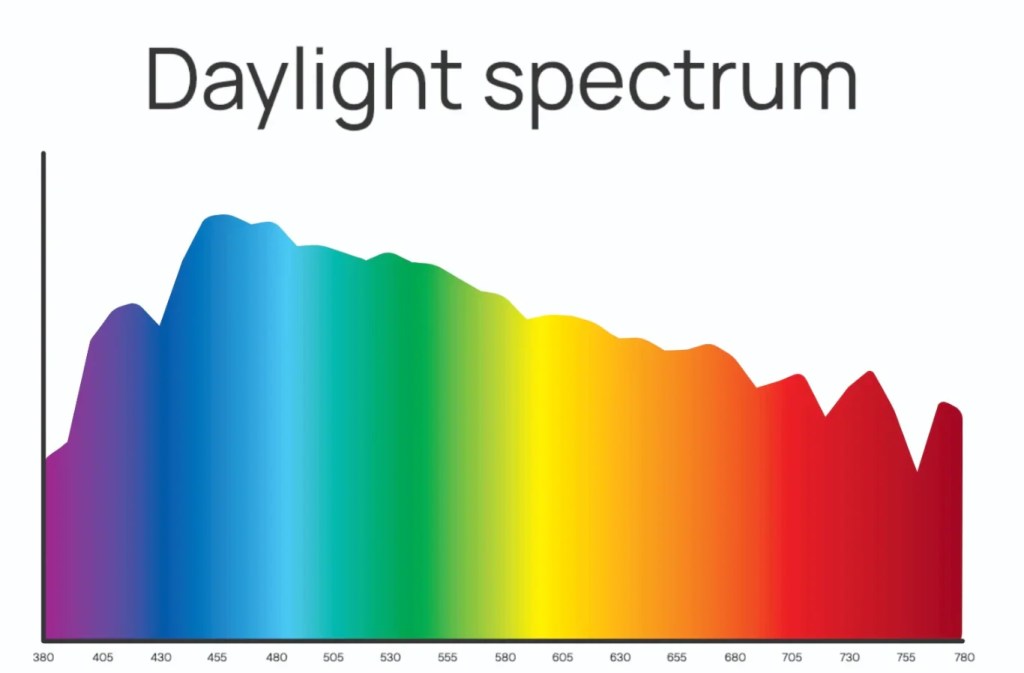
The color spectrum of natural light stretching across the area visible to humans
This is an image of the color spectrum of natural light across the area visible to humans. (380nm to 750nm) Ultraviolet light would be off the chart, on the left and infrared light is situated off the chart, on the right. While there are some peaks in the blue area, most of the colors are equally and evenly delivered.
If selecting artificial daytime light, you want to look at a spectrum diagram of the light and select one that is as close to this as possible. It is important to know that artificial daytime light should ONLY be used during the day. We need great light during the day and minimal levels of warm/red light at night. Using full spectrum light at night might have an adverse impact on our circadian system. Again, go back to our analogy of a pre-electricity farmer. Even on a great day, the sun did not shine for 24 hours. Think of a full spectrum light as a replacement for sun, not a light bulb. (Some full spectrum LED is available with a nighttime mode that removes the blue, thus creating a warmer evening illumination.)
Remember too, Full Spectrum lighting is NOT the same as Daylighting. Most daylight LED is simply 5000K to 6500K and not likely to be spread across the full spectrum. Full spectrum lights do not have to be 5000K or 6500K, but might.
One more thing. The sun is very bright. Light bulbs are not the same as the sun. You can get the right color of light from a lamp, but not the same amount. Think of full spectrum artificial light as a supplement to the sun, not a replacement.
I hope this has helped a bit. This remains a complicated issue. We are hoping artificial light can alter lifestyle changes. Perhaps it can help, but it is unlikely to replace the body’s need for sunlight. When possible, get outdoors, plant some flowers, drag the laptop onto the patio when you’re working and do your homework on a lawn chair. Your body will thank you…and you’ll sleep better, too.
I had a designer friend who loved guns and military pageantry. Admittedly, this is not your typical combination of profession and advocacy, but good design comes from many places and he delivered a lifetime of excellent, saleable designs.
One Monday morning, he arrived in the office with a pile of sketches and scraps of paper and quietly got to work. His weekend was spent at an antique armaments show and he became fascinated with the hand-tooling and fine engraving he found on the old firearms. For the next few months he used this inspiration in a wide variety of designs. “See this element, it’s based on a gunstock pattern I saw at the arms show.”
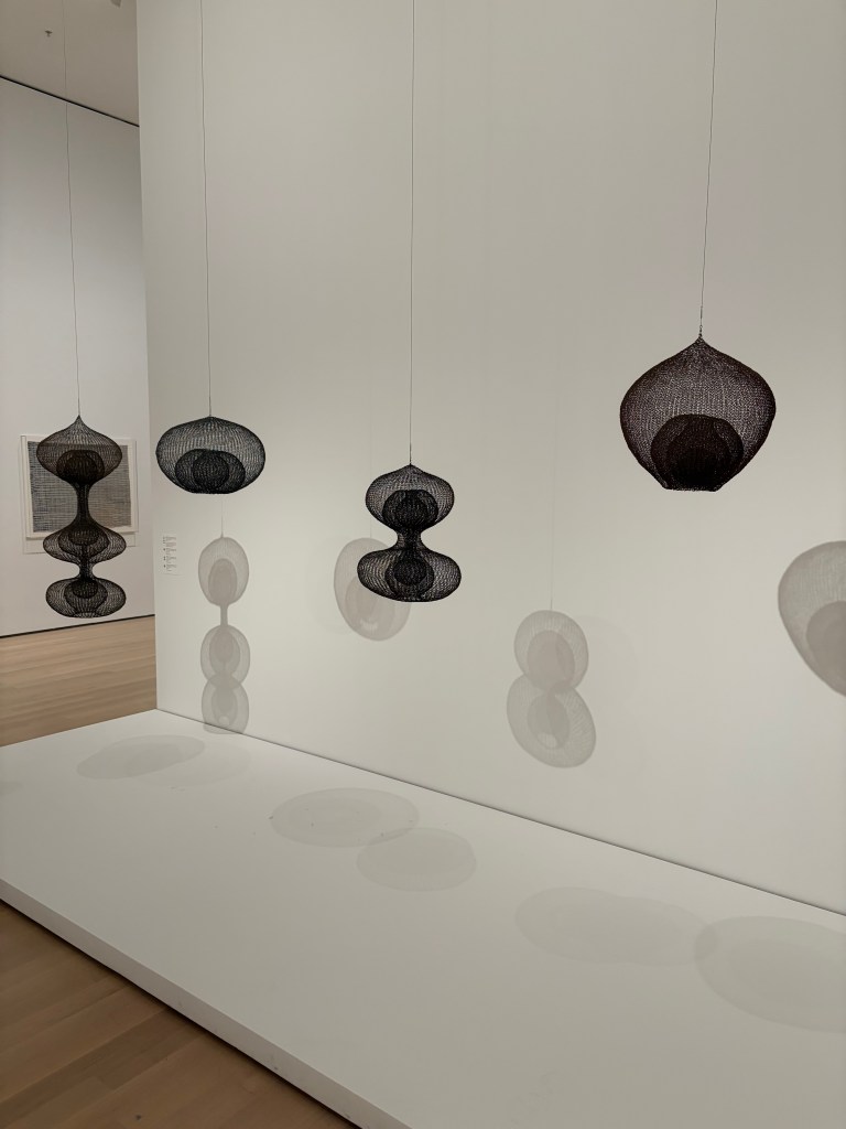
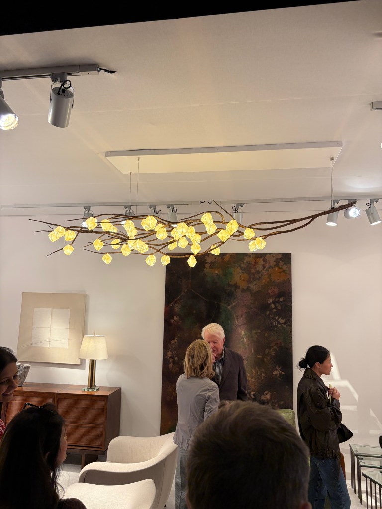
I thought of my late friend while visiting the Ruth Asawa show at the Museum of Modern Art (MOMA) in New York last November. I became aware of Ms. Asawa’s work a few years back at a Museum of Art & Design (MAD) exhibit. I was so intrigued by her single piece in the show, I photographed the museum label. When I learned MOMA would be doing a life retrospective, I could not wait. I was more than amazed at her vision, but also by her prolific and varied output.
The most larcenous takeaway from the Asawa show for a lighting product person is her collection of crocheted wire, hanging forms. Through their creation, Asawa was trying to explore density, form continuity and lines. The idea was born from her teaching art to tribal Indian youth. When not teaching, she spent time with the village women who were master basket weavers. The technique so interested her that she asked one of the women to teach her and she took that skill and wrapped a substantial portion of her creative career around it.
These forms would make wonderful luminaire products. Some shapes are perfect shades, others lend themselves to floor lamp and torchiere bases. The transparency lends themselves to tiny LED and the airiness would allow them to disappear into a designed space and make a statement, all at the same time. They are remarkable.
While walking down Lexington Avenue ten or twelve years ago, I passed a gallery displaying the artwork of a Japanese artist. I couldn’t stop staring. I took a quick photo and went about my trendspotting. The whole day and into the next week, I could not get this idea out of my head. For the next year I began digging the essence of the idea out of my head and into reality. Once I figured out how I could realize the idea, I began making pieces.
If I showed you the Japanese art and what I have been making, you might not make the connection. We are miles away. Nonetheless, without the initial jolt of inspiration, I might not have created these pieces. The same goes for almost every creative person I know. An idea, regardless of how far afield, can shock the system, but you never know in which way.
Why do I frequent art museums? For multiple reasons, but one is without question. You never know what piece or what artist will light a fire that could take multiple years to contain.
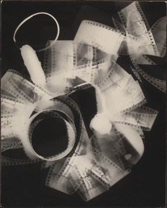
Last year I read the engaging biography, “Kiki Man Ray” by Mark Braude, a book about Kiki de Montparnesse, companion and muse to artists Man Ray. While in New York this fall I had the opportunity to view the mesmerizing new exhibit at the Metropolitan Museum of Art, “Man Ray: When Objects Dream.” In both the book and the exhibit literature, it was explained that Man Ray came to photography almost by accident. He originally went to Paris to further his painting career, but realized his passion upon discovering the wonders of photography and what could be done beyond conventional “picture taking.”
As many of you know, I studied architecture, with hopes of a career in design and building, but a part time job in lighting tore me away. The evolving industry kept me engaged for over 50 years. Over the years I have met many people who, like Man Ray and me, did not follow an expected path, but still enjoyed a rewarding career.
My old boss, while studying at Carnegie Tech helped sculptor, David Smith prepare some of his work. Whenever we visited the Cleveland Museum of Art, he was drawn to the brutal welded piece (Pilgrim) featured in the center of the contemporary gallery, at the time. While he was an excellent lighting designer, I think some portion of him secretly wanted to weld steel artwork. Another talented lighting designer really wanted to do toy designs. I’ve met accountants who wanted to create video games, marketing people who hoped for a life in comedy and sales people who really wanted to create musical theater.
It is easy to discount this in two ways. Many people say you should only follow your dreams, otherwise you will be unsatisfied. Others feel the fantasy job is a pipe dream. The real world tells us there is limited room in multiple professions. Part of growing up is buckling down and taking the work that is available. I like to consider an alternative to those ideas.
I don’t know if I would have been a good architect, but I was pretty good in my lighting career. I think there are many people, probably all the people I mentioned above and many of my friends who could succeed in almost any career, within reason. An acquaintance from high school became a bus driver. I do not think I could have survived that job choice and he probably wouldn’t have excelled in lighting. Within reason, we might all be suited for multiple avenues of employment. Some will be interesting, others a bit more boilerplate, but there can be lots of ways to earn a living.
I used to joke, no child pines for a career as a “lighting person.” Doctor, fireman, baseball player, sure, but the talented people I have encountered in my life as a lighting person have made significant contributions to the industry. They have earned the friendship of scores of people and have aided in the profitability of the folks who owned the company, or the company they started. Within the slice of time we are allotted on this planet, should we ask for more?
My wife and I really don’t do anything special for the holidays. Beyond a few small decorations, we don’t transform the house like others. Over the years we have made a few concessions. One New Year’s day, we visited a swimming pool store that transforms into a Christmas Tree retailer for a couple of months each year. There we saw the anti-Christmas Tree of our dreams. It was all-white with all red ornaments and all red lights…and it was 75% off! Whenever we were so inclined, we’d set up the tree and as soon as we did, we’d remember why we avoided it the previous year. Our cat would gather up the cotton batting we used at the base to replicate snow. In the morning it would all be in a ball next to the exposed steel tree trunk. Dutifully, we’d reassemble it. Just as dutifully, she’d rearrange it each night. The lesson here is you NEVER win in a duel of persistence with a cat. Oh, some of the low-hanging ornaments would also be on the floor, just to make sure we knew who the boss was.
Eventually, it just stayed in the attic, until we moved this spring. The white tree had aged and yellowed after a decade and a half in storage. As we were downsizing this was an easy “toss.”
As I looked at the pile of white branches ready for the trash heap, I couldn’t envision tossing the strings of lights with hundreds of miniature red dots. I unbound all the strings from around the faux needles and put them in a bag. Surely, I can come up with a clever way to reuse them in the new home.
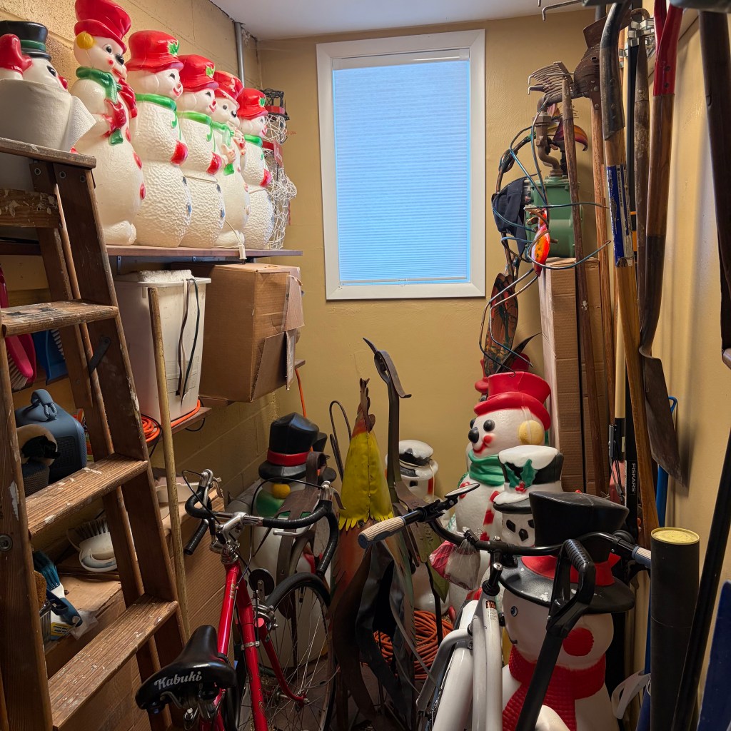
2025 has been a year of transition and lots of work. Restoring one house, selling a second, packing, moving and the hundreds of challenges all of this brings have plunked us down in December with no good idea and even less motivation. To be fair, we barely had a moment to think of one. So I sit here with a new/old house and another Christmas with no decorations. The chorus of snowmen are not set up because of an early snowfall. Coupled with that shelved bag of red lights, our home is decidedly non-festive, just like normal.
Here’s hoping you have a “normal” holiday season, whatever normal means to you and your people. Stay tuned for more tales of lighting in 2026.
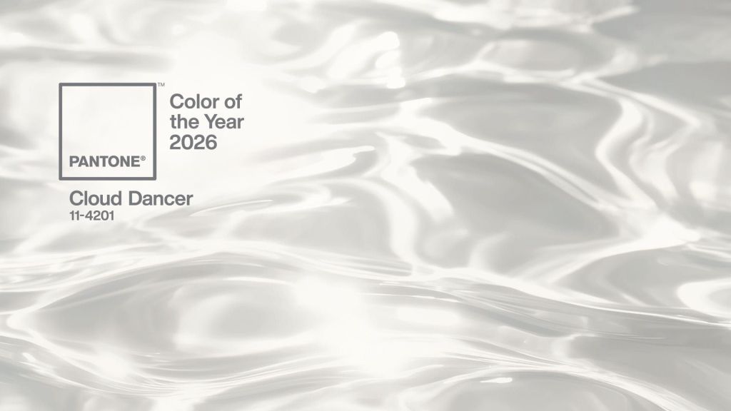
As usual, lots of comments have been tossed around this week concerning the Pantone choice of “Cloud Dancer” white as the color of the year. Much has been political. In a country where white supremacy is on the rise, DEI hiring is decreasing and disproportionate amounts of Black and Brown people are being targeted by immigration enforcement agencies, it might be easy to assume we are in for an elevation of all things white. Citizens can no longer drift from the centerline path. Keep your eyes pointed forward. Blasé white classicist design and architecture are now mandated by the president and the federal government. No bold hues will be accepted.
I’m looking instead at the tone of the white selected by Pantone. From my observation, this is a cooler, greyer white. Definitely NOT on the warm side. I’m reading this as a push against the “beige-ification” of style.
If you’ve read my previous post on BDNY 2026, and a few other this years, I have been sharing my observation that beige is EVERYWHERE. Pantone’s color for 2025 was Mocha Mousse, a warm and embracing brown that felt completely at home in the beige world we have. By all accounts, Mocha Mousse was well received and heavily adopted across industries. Both beige and mocha are also well suited for the shift to brass/gold we are seeing in lighting. Cloud Dancer white is Pantone’s antidote from such dominance. I don’t think they want to see beige, “everything, everywhere, all at once.” There should be more variety. Endorsing an alternative is a good way to stir up change.
Why can’t my idea be right? I just read a very thoughtful piece by three highly regarded critics of fashion and they could not agree on the reason or impact of a greyish-white tone of white being named the most important color for the coming year. Why not the opinion of an old lighting guy who has tracked trends for forty years? I could be right.
After a year of home rehabilitation, I needed a creative rush to recharge. The house project was fun and exciting and fulfilling, but it was a consistent expenditure of energy. At some point, revitalization is necessary. A long weekend in New York was just what the doctor ordered. I caught the Man Ray exhibition at the Metropolitan Museum of Art and the Ruth Asawa retrospective at the Museum of Modern Art. (As they relate to lighting, those will be detailed in subsequent posts.) My love of theater was satiated most evenings (“Two Strangers Carry a Cake Across New York” is the show to see! Avoid “The Queen of Versailles” and only see “Waiting for Godot” if your absurdist/surrealist cap is securely in place.) I spent multiple hours visiting showrooms and galleries to explore current consumer products. While reading the New York Times a few days prior to leaving home, I came across an ad for Salon Art + Design at the Park Avenue Armory, so I checked out that show, along with the real reason for the trip, BDNY.
As you likely know, BDNY is geared toward the hospitality industry. That means, while there are many elements of design that demand note, the show floor is filled with functional products that don’t tell me much about consumers and their preferences. Room safes, suite number plaques and faux artwork are needed by hospitality operators, but tell me nothing. That said, I was drawn in by three companies offering a new twist on a pedestrian problem. IAP asked the question, “Can a garbage can be sexy?” Based on their booth, I’d say, yes. Stable Table provided a solution for every diner’s nightmare, a wobbly table, regardless of the ground material. Covers & All makes custom covers (surprise!) for everything you might need to shield from the elements. Sometimes, the most mundane things become interesting, especially to an outsider like me.
Overall, it is clear that the hospitality industry, like the residential business has fully embraced warm and cozy beige. Almost every booth used some variation from off-white to brown. As I have said before, when the interior industry adopts beige as a neutral and the enjoined brass metallic, it becomes a trend for the long haul. To augment that direction, the Bulthaup showroom in SOHO, typically a bastion of hard-edged kitchen simplicity displayed a waterfall countertop made of wood. This single element softened the room far more than I would have expected.
I don’t expect much movement on this trend for at least a decade. That being the case, how do we advance design within these parameters? I believe I saw some telltale signs at both shows and in the storefronts I visited.
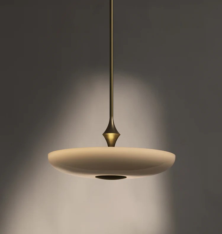
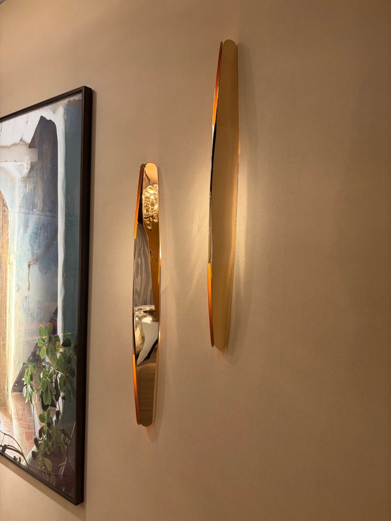
At the Foscarini showroom in SOHO “Buds” were in bloom. (Sorry, I couldn’t resist.) Buds uses a variety of shade shapes, but all are in subtle shades of off-white and cream. Honestly, I have been waiting for this shift. We have used white-white glass for a handful of years now, and with the preponderance of brass, the warmer glass just seemed inevitable. We are not, however going back to 2000. The new warm glass is much cleaner, much closer to white than the heavy umbers, ambers and gold of the past. I believe this will be the tone you should expect moving forward.
Also in SOHO the Roll & Hill showroom featured The Met Pendant, likewise using a warm beige glass. The difference a quarter-century makes is the shallowness of the diffuser, made possible by LED. At that time, we needed to enclose incandescent and even the much larger fluorescent lamping. That meant bowls were quite large. This slender profile defines the difference when trends reemerge and are not exactly the same.
That warmth is carried through with the products shown at United Alabaster a Spanish company dedicated to showcasing natural alabaster in lighting products. As this is natural stone, the level of warm veining can vary, but the overall softness is evident, especially in their Ozark product. The ring and ball design could read “cold” were it not for the earthy material.
A pleasant reason for attending shows is finding someone new. I never heard of J Adams & Co. This is a British manufacturer that has developed a beautiful collection of warm and comforting, but not traditional, products. I encourage you to check out the website. There is beautiful lighting here.
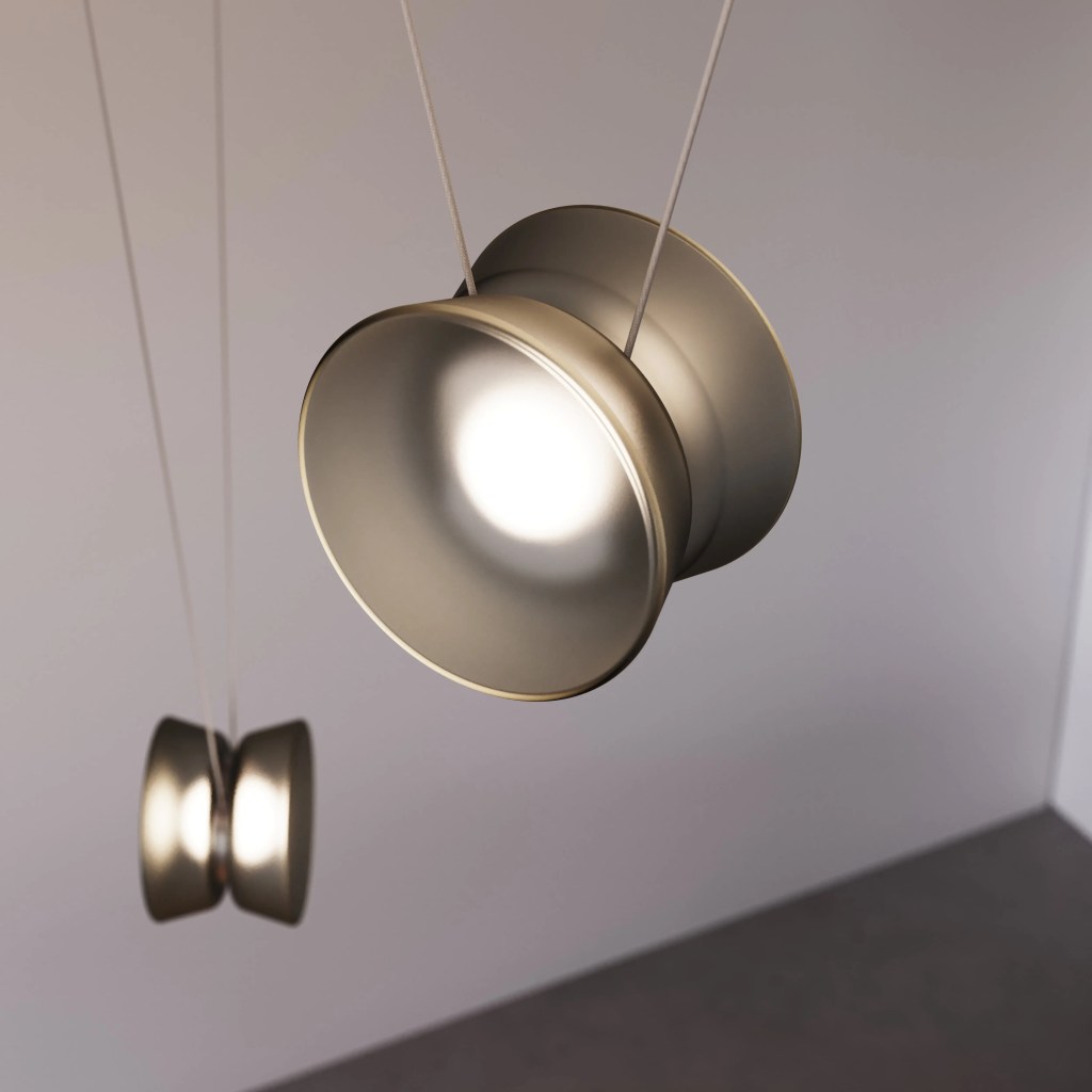
In my youth, I was barely proficient with a yoyo, but I do remember being amazed at the trick others could perform. Borrowing from this childhood toy, the YoYo Adjustable Pendant (think about the cradle yoyo trick) from Sonneman is fun and functional. Suspended from a narrow cable, the lighted unit height can be adjusted as needed.
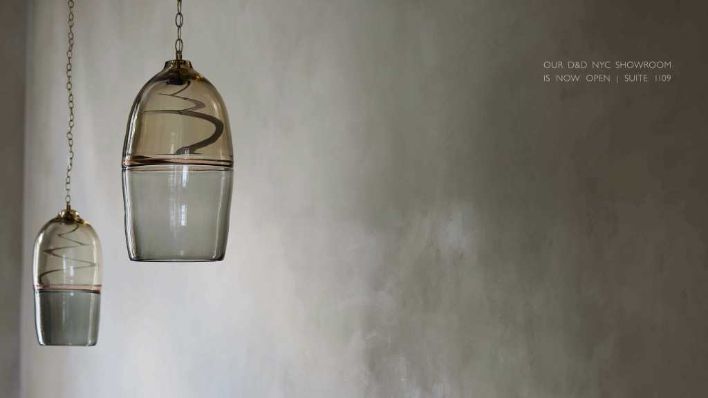
Also seeking “the next diffuser” is Ochre. The window of their SOHO showroom was graced with Marea. Rather than using beige, they employed warm smoke variations on deep blown glass. Because of a slender disc of LED, the entire Murano diffuser became the focal point, uninterrupted by a pedestrian light bulb.
Always a fun visit is the Original BTC showroom. Their Titan pendants reuses a 1940s deep industrial metal shade and pushes the LED light source far up inside to create light with almost no glare. Many colors are available to soften the hard edges of what might be a harsh concept.
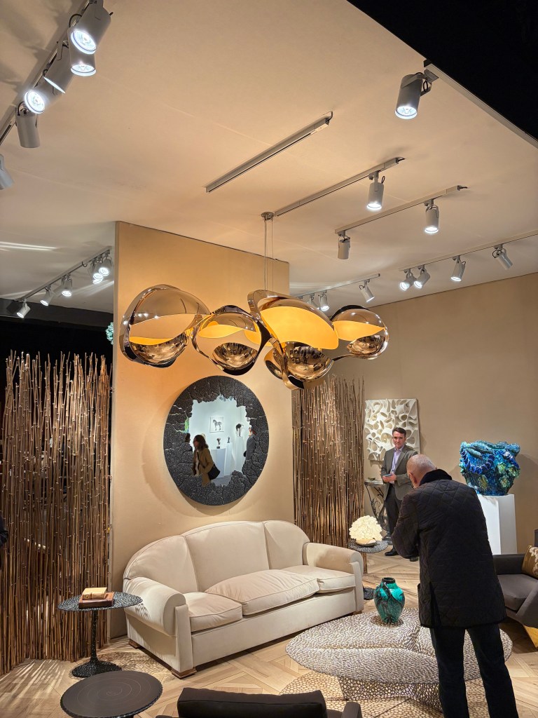
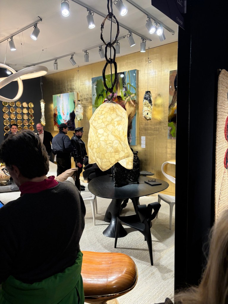
Salon Art + Design 2025 – Over-scaled chandelierSalon Art + Design 2025 – Metal pods with light source tucked insideSalon Art + Design 2025 – Porcelain draped over a glass diffuserSalon Art + Design 2025 – Light tucked inside pinched, polished slender vertical surfacesSalon Art + Design 2025 – Broken mirror pieces formed into a classic European chandelier shapeSalon Art + Design 2025 – Crocheted copper wire covered with sawdust and sapSalon Art + Design 2025 – Onyx pendant / In rear, cast bronze enclosing onyx segmentsSalon Art + Design 2025 – Fine, detailed feather and leaf vein patterns painted inside blown glass shapes
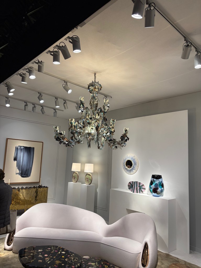
The lighting at Salon Art + Design clarifies what the future might hold. Salon speaks to a very high-end client where functional product can and should also be art pieces. Museum finishes and statement pieces are their milieu. In almost every room setting/booth display, the lighting was over scale and heavily artistic. Its function as a light source was secondary. That was of course supplied by the surrounding, largely hidden, functional lighting. As we move to a world with fewer decorative luminaires, those that are used will have more meaning aesthetically. An early detection, provided by this boutique event should harken to us the likely direction of products for the future.
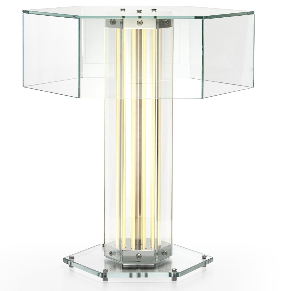
SOHO 2025 – Flos – SuperWire T portable lamp
One last comment about the new lighting I saw at the show and throughout New York. The Flos showroom featured their new design, SuperWire T that upends almost everything I’ve said heretofore. The table lamp features a shade (sort of) but the illumination is provided by the column. The torchiere is simply an illuminated column, the LED tubes running in tandem to the hexagon shape. It is important to remember, contemporary still has a place, as it has always.
Like most of the comments included here, you see the crucial element played by integrated LED. We are getting farther and farther away from a “light bulb” and that is a good thing. Designers are figuring out how to control glare by placing the light source correctly. Integrated LED is allowing forms to be realized in new ways. For a few years now, there has been this “argument” about retrofit vs integrated LED. I’ve always said that integrated would eventually win. As it becomes a mature technology and consumers become more accepting of the concept, we are seeing the integrate approach rise. Sure, there will still be retrofit options, but I expect that direction to lessen each year.
What About the World Outside of Lighting?
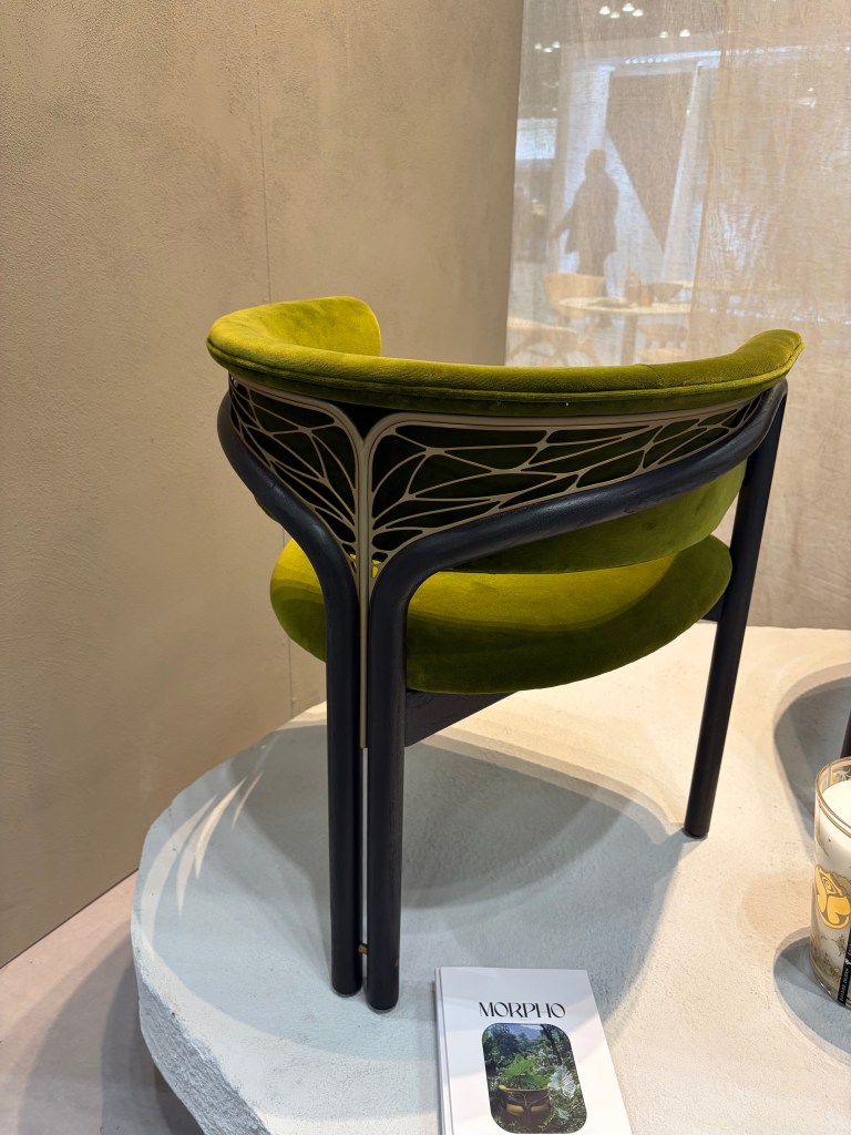
BDNY – Tomorrowland – Morpho
The “nouveau” back of the Morpho chair by Tomorrowland was beautiful!
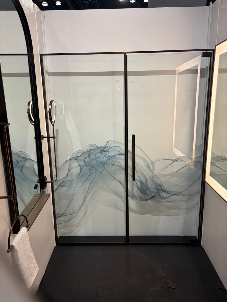
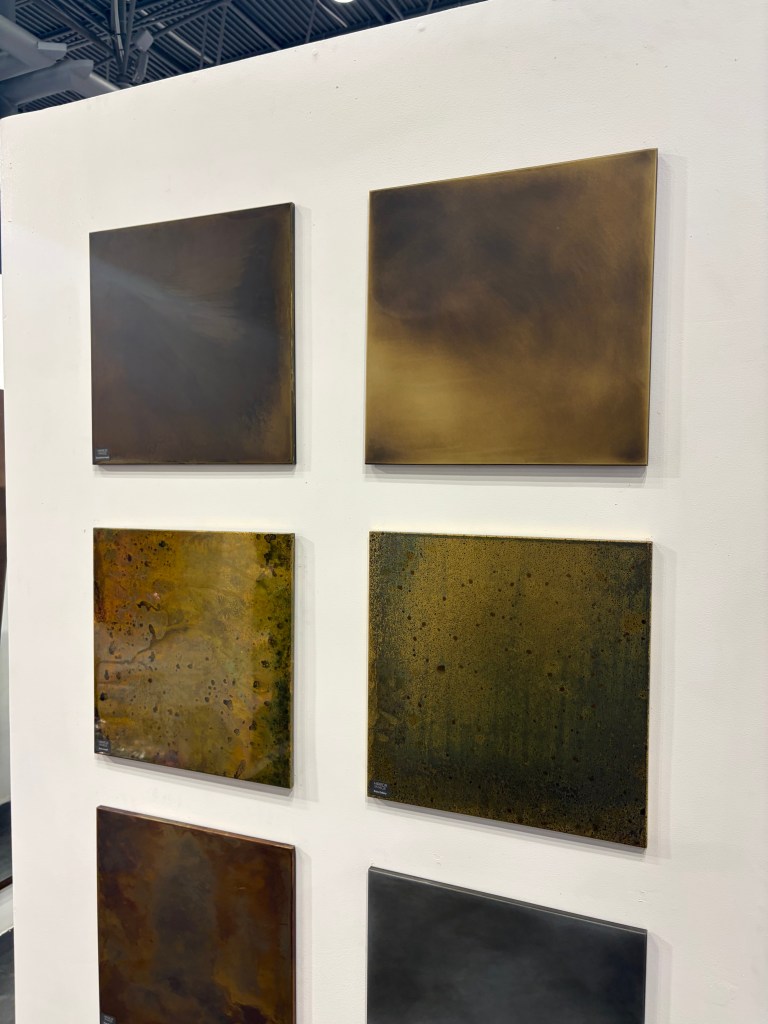
BDNY – Mirror Image – One of many shower door decorationsBDNY – Mirror Image – A collection of decorative metal panels for walls
There was lots to appreciate at the Mirror Image booth. The custom shower enclosures were nice, especially the graphics on the glass. In a hospitality situation, I could imagine a different image on every door in each room. It could be a fun conversation point that probably won’t translate to a residence, however. The simple hardware also fit the doors. In addition, they offered a collection of patina metal panels to be used as decorative wall coverings. I found these interesting. Not rated for inside a shower enclosure, it was simple a different option for walls.
How it works was explained to me at the show and I read the description again on their website and I’m still not certain how water is turned into fire, but, Aquafire fireplace inserts do just that. Light and scent can also be added in what appears to be a very safe way to employ open flames in living spaces. This seems like a very practical answer to the need for fire.
I loved the Adagio tiles at the Mutina booth. This is a modular installation that gives the finished appearance of an unbroken weave. This is one in a series of configurable sets of ceramic tile they offer. You can imagine a vine working its way through the installation. (Their website features a looped video detailing the installations.)
I usually see one rug booth that pulls me in, this year it was Warp & Weft. This was just a nice selection of rugs that met the current demand for warm and comfortable room accessories.
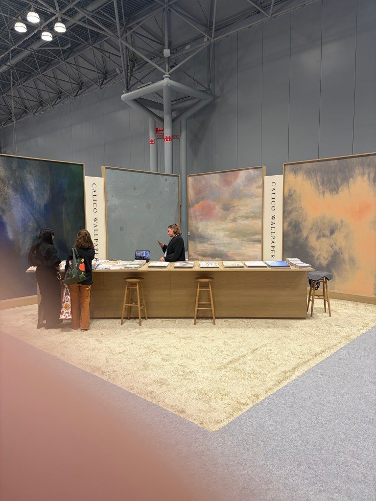
BDNY – Calico Wallpaper – Calm on a busy show floor
Similarly, there are scores of wallpaper manufacturers at the show and I usually am drawn to one or two. This year, the Calico Wallpaper booth was an island of calm in a calamitous sea of people and visuals.
BDNY – hush.Acoustics – Acoustic coverings in nicely muted colors and interesting patterns
It is interesting, over the last year, I have been hearing a lot about acoustic. I have even been asked about acoustic lighting options. No surprise then to find hush. Acoustics at a hospitality show. This Canadian company showed a number of interesting colors, textures and patterns all designed to promote a quieter building and atmosphere.
As a person who in a past life spent a fair amount of time working in a show booth, I always try and find interesting and unique ways companies define their product and brand. This year, multiple booths used a monochromatic approach to tell their individual story. Most people intuitively know chairs, wallpaper and outdoor umbrellas are available in multiple color options, but their respective booths displayed only blue and white umbrellas, only brown leather chairs and all green wallpaper on the walls. Rather than a cacophony of color, the booth appeared uniform and inviting. The tailored looks allows the visitor to see a more refined solution intuitively raising their view of the firm.
The Yuanzhicheng Home Textile Company sold and displayed fabrics and wall coverings with a decidedly Asian look. Some was very detailed. The main wall included an almost mural-like embroidered scene. The staff wore blazers using the same fabric and embroidery pattern.
I’ve always favored a uniformity of look, if it went beyond matching polo shirts. I also prefer a minimal installation to raise the impact. The point of a show, such as BDNY is to make acquaintances and raise visibility of the company. Selling happens later. (You can tell I’m not a salesman!) Clever tools such as these instill remembrance. It opens a door to a sales person to assist the prospective customer personally, with the details of their specific needs, later. The more intelligently a company uses their show booth and their people, the better they are situated to move to the second phase.
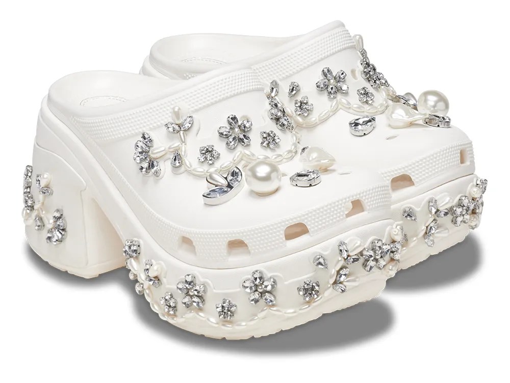
Do We Really Need Bejeweled Crocs?
SOHO – Simone Rocha – Crocs – coming to a thrift store near you…soon!
I was reminded of the fragility of trends and fads while walking through SOHO. In a previous report on New York trends, I mentioned the “hot” puffer jackets and a line of customers who waited in the rain to be allowed into the Moncler store, for the privilege of purchasing one. Fast forward to today and while the ropes and stanchions were at the ready on Prince Street, the humans weren’t. Around the corner in the Simone Rocha showroom window a pair of bauble encrusted Crocs caught passerby attention. While it is easy to imagine continued use for the warm puffer jackets, it is hard to see a long-term demand, beyond curiosity, for the bejeweled Croc rubber shoes. We want new things, but most of us want them to last at least a few moments longer than a fad. I believe the items I’ve highlighted here will last for a reasonable time. We all know, however that trends change. As we enter a rough economic period, we can be insured that trends will shift soon. Most of these should last. A few will be the gem embellished Croc available at discount in a closeout store near you.