I have had a delightful “back and forth” conversation about trends with my closest friend for many years. While I had a career in lighting, he was a PR executive, concentrated primarily within the residential products space. He is more likely to push back against change and of course, I am inclined to embrace the “new” even when it might be to the detriment of good logic. At the conclusion of every email chain or tavern conversation between us two old retired guys is the agreement that change ALWAYS triumphs, like it or not.
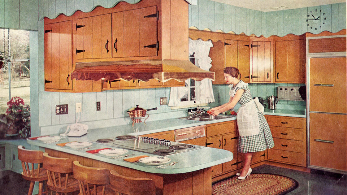
The New York Times has an engaging compilation of the major trends and inventions that have matured kitchens over the last 100+ years. It tells of the background of the kitchen triangle, when the “open concept” first grabbed the interest of homeowners and recounts some of the innovations we now take for granted. This article is naturally pointing out the thing we now find indispensable to the function of a home. Score one-point for Jeff.
My friend’s score would heavily outweigh mine with the “hottest things” that DID NOT make the list. We don’t all have a steam oven, despite a couple of decades of manufacturers telling us it is essential. We don’t have a breakfast bar in our Primary Suite, few of us have a dirty kitchen (prep-kitchen) in our home and even fewer of us have a horizontal shower. Basically, my friend wins. We ignore far more than we adopt.
In the article, they asked seven questions. I asked him to send his answers to me and thought we could compare notes.
- We both agree on kitchens. 55% of the readers agreed that the kitchen should be “a little separate” rather than open.
- Jeff wins on freezers. My friend, unlike 76% of the readers does not believe the freezer should be on the bottom. He doesn’t like the “side” freezer option either, preferring the top. The very practical reason, he simply, “Doesn’t like to bend over for ice.” A good point.
- We are again alike on the indispensability of a microwave or an air-fryer. We both have microwaves, but use them infrequently. Neither of us have an air-fryer (although I have a toaster oven with the feature.) 86% of those polled voted for the microwave.
- We both agree that one island is enough. I actually prefer no island and have never had one in a house. 90% of the people agree there is no reason for two islands.
- I think subway tile is over. My friend still likes it; so do 66% of the respondents. One point for my buddy.
- I believe open shelving in a kitchen is great, if you don’t cook in your kitchen. It also takes a lot of aesthetic skill to make an open shelf kitchen work. My friend and 87% of the public agree. With too much stuff, you need the cabinets closed.
- My friend prefers an eclectic style for his kitchen, so he reluctantly voted for the “colorful and cozy” option. I want everything as “streamlined and sleek” as possible. 76% agreed with my friend.
We agreed with the collective four times, he voted with the population on two additional points. I only agreed once, so my friend is more in tuned with the general population than me. Nuts. I thought for sure I knew what people wanted. I can hardly wait for the next time we have a beer together and discuss the latest household trends. I just know I’m going to win that conversation!