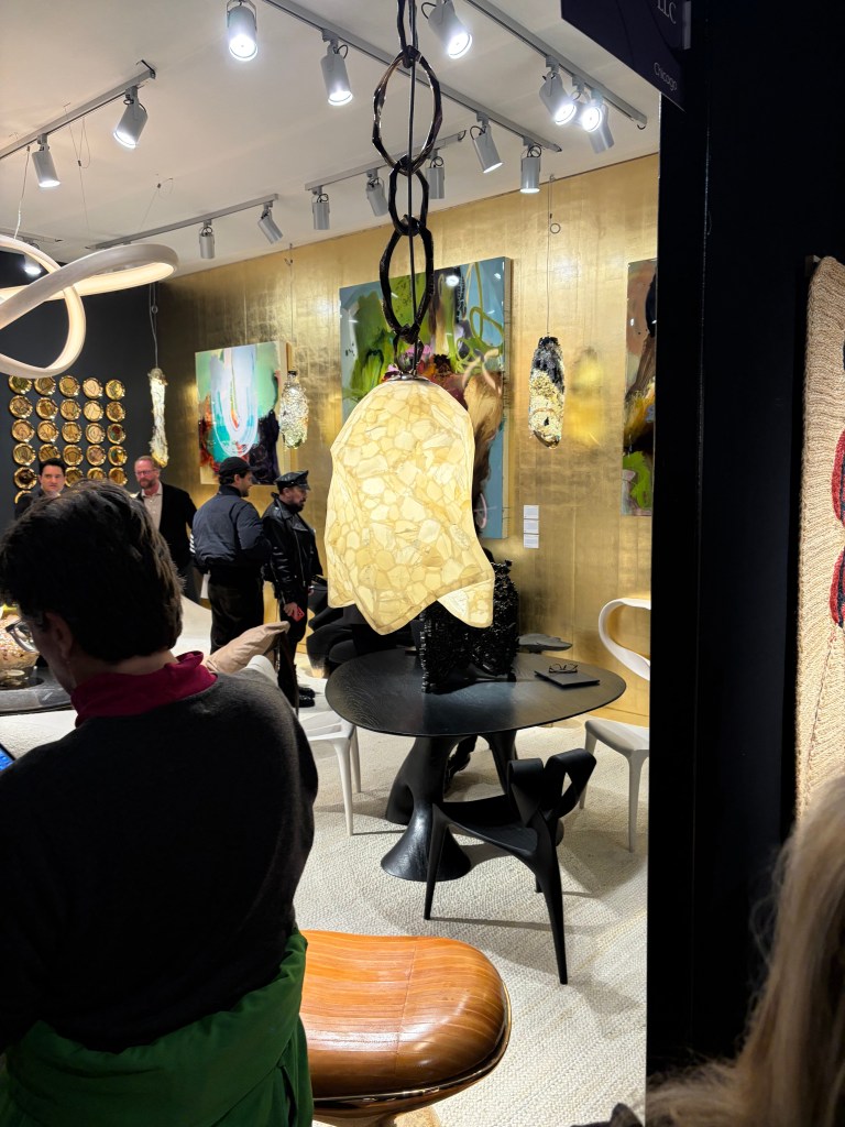
After a year of home rehabilitation, I needed a creative rush to recharge. The house project was fun and exciting and fulfilling, but it was a consistent expenditure of energy. At some point, revitalization is necessary. A long weekend in New York was just what the doctor ordered. I caught the Man Ray exhibition at the Metropolitan Museum of Art and the Ruth Asawa retrospective at the Museum of Modern Art. (As they relate to lighting, those will be detailed in subsequent posts.) My love of theater was satiated most evenings (“Two Strangers Carry a Cake Across New York” is the show to see! Avoid “The Queen of Versailles” and only see “Waiting for Godot” if your absurdist/surrealist cap is securely in place.) I spent multiple hours visiting showrooms and galleries to explore current consumer products. While reading the New York Times a few days prior to leaving home, I came across an ad for Salon Art + Design at the Park Avenue Armory, so I checked out that show, along with the real reason for the trip, BDNY.
As you likely know, BDNY is geared toward the hospitality industry. That means, while there are many elements of design that demand note, the show floor is filled with functional products that don’t tell me much about consumers and their preferences. Room safes, suite number plaques and faux artwork are needed by hospitality operators, but tell me nothing. That said, I was drawn in by three companies offering a new twist on a pedestrian problem. IAP asked the question, “Can a garbage can be sexy?” Based on their booth, I’d say, yes. Stable Table provided a solution for every diner’s nightmare, a wobbly table, regardless of the ground material. Covers & All makes custom covers (surprise!) for everything you might need to shield from the elements. Sometimes, the most mundane things become interesting, especially to an outsider like me.
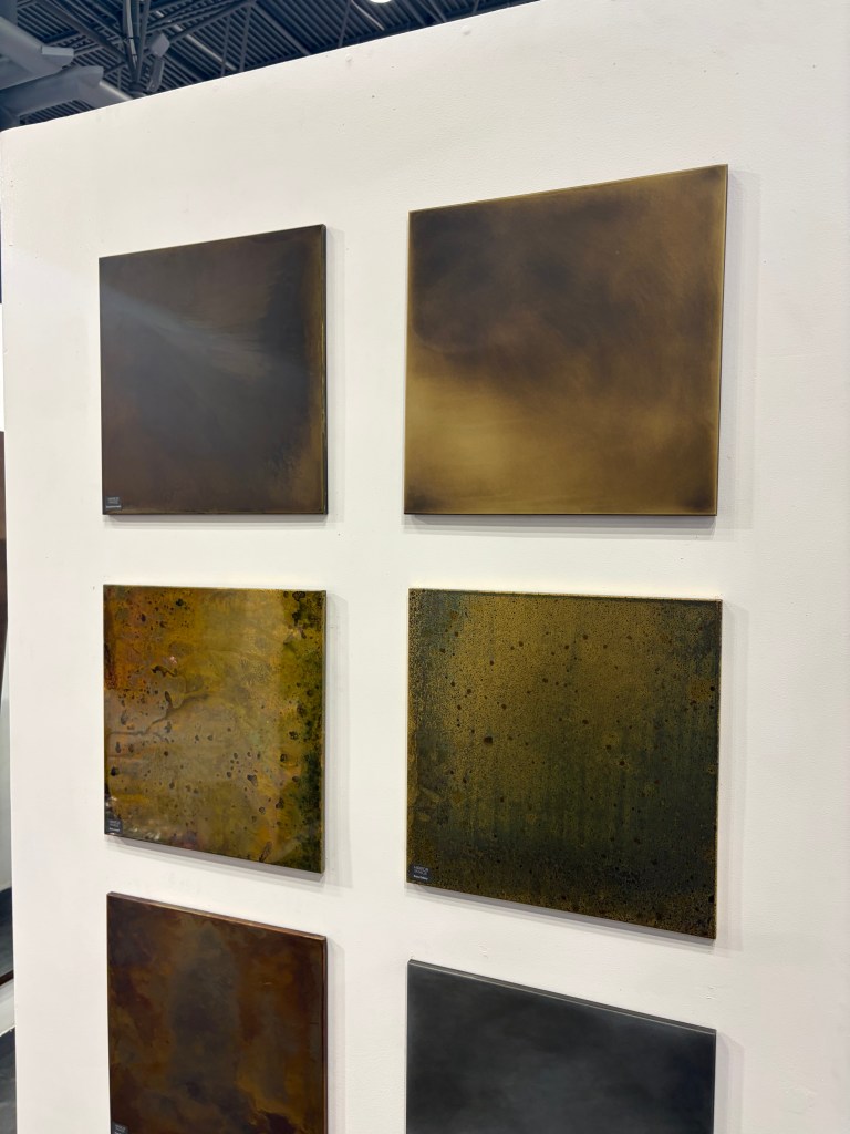
Overall, it is clear that the hospitality industry, like the residential business has fully embraced warm and cozy beige. Almost every booth used some variation from off-white to brown. As I have said before, when the interior industry adopts beige as a neutral and the enjoined brass metallic, it becomes a trend for the long haul. To augment that direction, the Bulthaup showroom in SOHO, typically a bastion of hard-edged kitchen simplicity displayed a waterfall countertop made of wood. This single element softened the room far more than I would have expected.
I don’t expect much movement on this trend for at least a decade. That being the case, how do we advance design within these parameters? I believe I saw some telltale signs at both shows and in the storefronts I visited.
Lighting


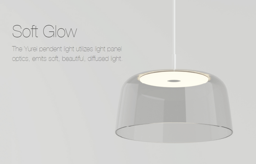
At the Foscarini showroom in SOHO “Buds” were in bloom. (Sorry, I couldn’t resist.) Buds uses a variety of shade shapes, but all are in subtle shades of off-white and cream. Honestly, I have been waiting for this shift. We have used white-white glass for a handful of years now, and with the preponderance of brass, the warmer glass just seemed inevitable. We are not, however going back to 2000. The new warm glass is much cleaner, much closer to white than the heavy umbers, ambers and gold of the past. I believe this will be the tone you should expect moving forward.
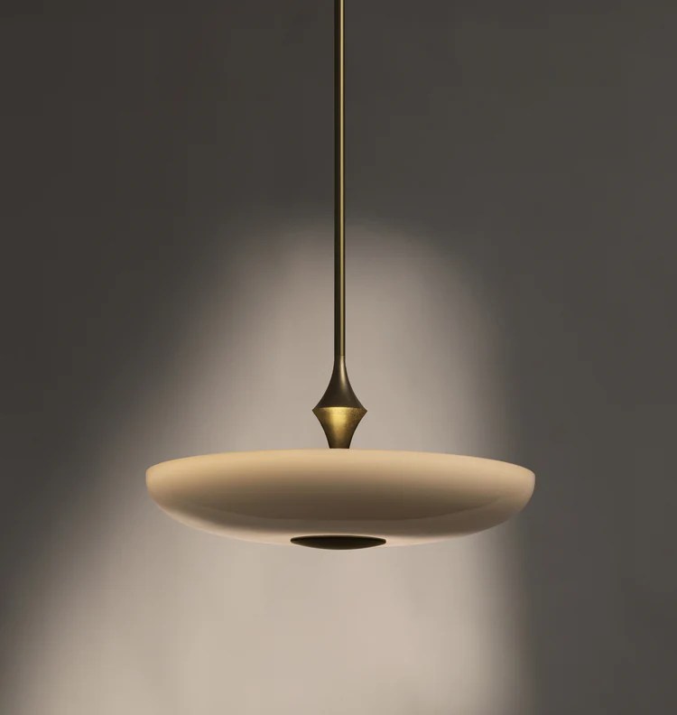
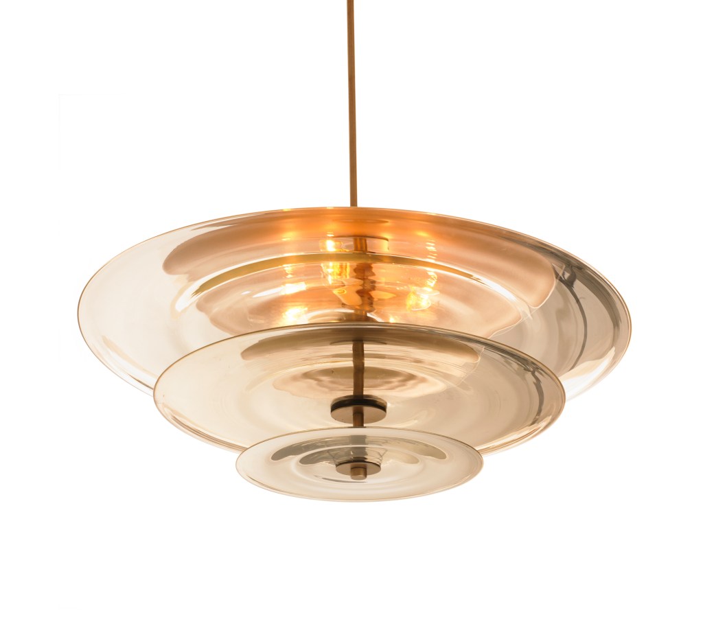
Also in SOHO the Roll & Hill showroom featured The Met Pendant, likewise using a warm beige glass. The difference a quarter-century makes is the shallowness of the diffuser, made possible by LED. At that time, we needed to enclose incandescent and even the much larger fluorescent lamping. That meant bowls were quite large. This slender profile defines the difference when trends reemerge and are not exactly the same.

That warmth is carried through with the products shown at United Alabaster a Spanish company dedicated to showcasing natural alabaster in lighting products. As this is natural stone, the level of warm veining can vary, but the overall softness is evident, especially in their Ozark product. The ring and ball design could read “cold” were it not for the earthy material.
A pleasant reason for attending shows is finding someone new. I never heard of J Adams & Co. This is a British manufacturer that has developed a beautiful collection of warm and comforting, but not traditional, products. I encourage you to check out the website. There is beautiful lighting here.
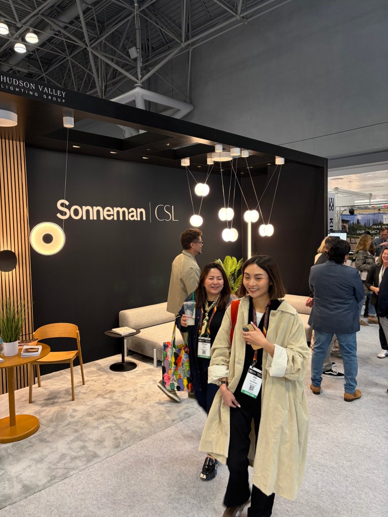
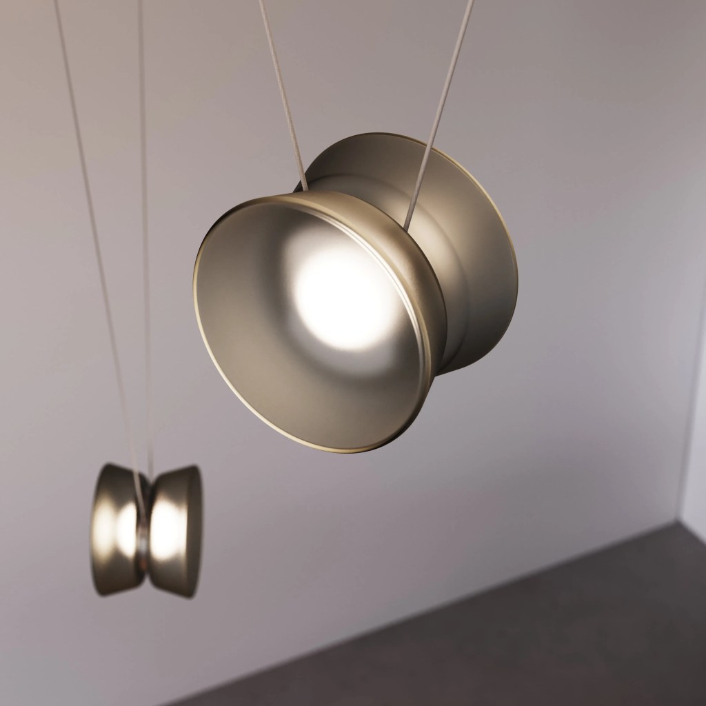
In my youth, I was barely proficient with a yoyo, but I do remember being amazed at the trick others could perform. Borrowing from this childhood toy, the YoYo Adjustable Pendant (think about the cradle yoyo trick) from Sonneman is fun and functional. Suspended from a narrow cable, the lighted unit height can be adjusted as needed.
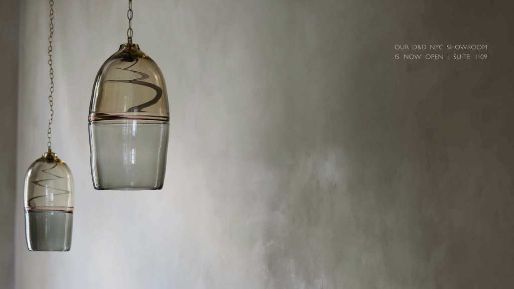
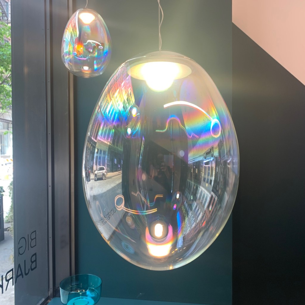
Also seeking “the next diffuser” is Ochre. The window of their SOHO showroom was graced with Marea. Rather than using beige, they employed warm smoke variations on deep blown glass. Because of a slender disc of LED, the entire Murano diffuser became the focal point, uninterrupted by a pedestrian light bulb.
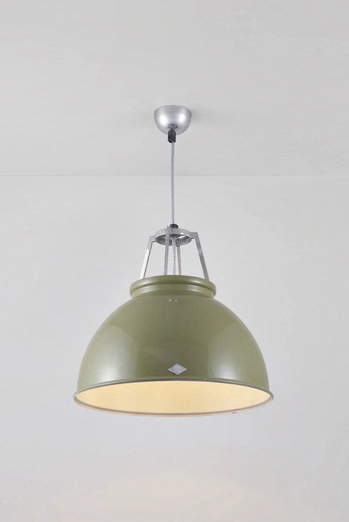
Always a fun visit is the Original BTC showroom. Their Titan pendants reuses a 1940s deep industrial metal shade and pushes the LED light source far up inside to create light with almost no glare. Many colors are available to soften the hard edges of what might be a harsh concept.
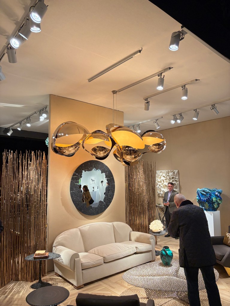
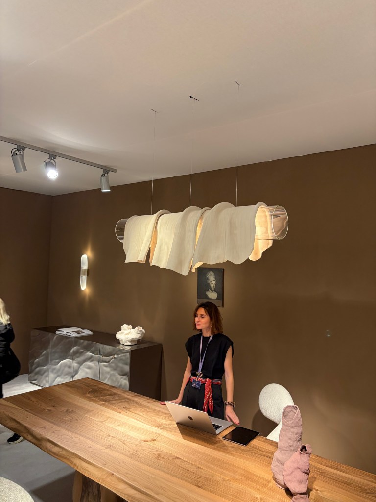
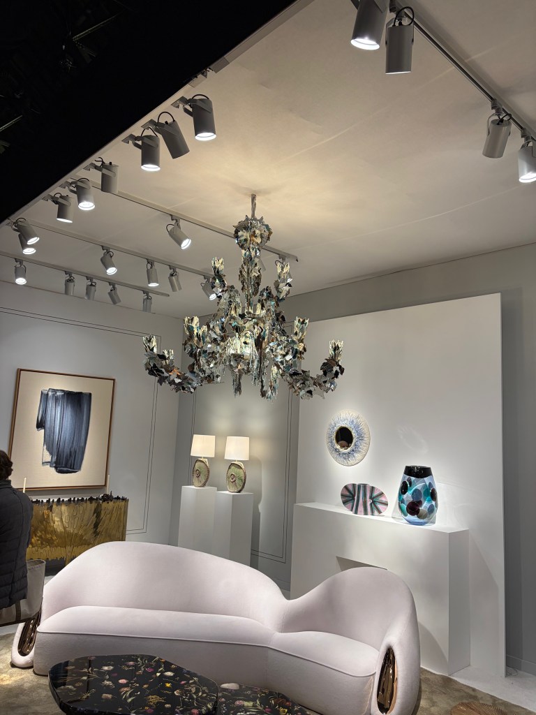


The lighting at Salon Art + Design clarifies what the future might hold. Salon speaks to a very high-end client where functional product can and should also be art pieces. Museum finishes and statement pieces are their milieu. In almost every room setting/booth display, the lighting was over scale and heavily artistic. Its function as a light source was secondary. That was of course supplied by the surrounding, largely hidden, functional lighting. As we move to a world with fewer decorative luminaires, those that are used will have more meaning aesthetically. An early detection, provided by this boutique event should harken to us the likely direction of products for the future.
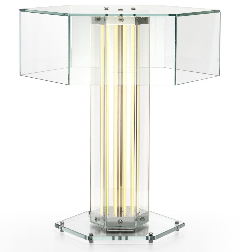
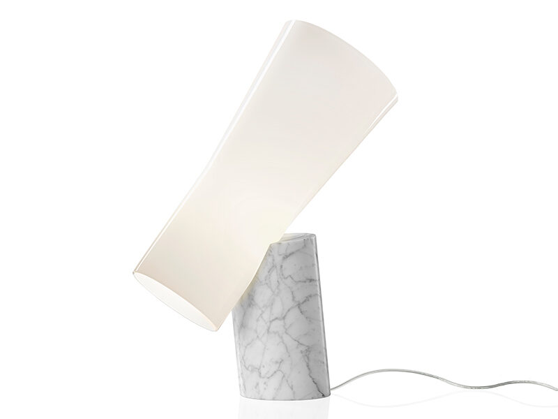
One last comment about the new lighting I saw at the show and throughout New York. The Flos showroom featured their new design, SuperWire T that upends almost everything I’ve said heretofore. The table lamp features a shade (sort of) but the illumination is provided by the column. The torchiere is simply an illuminated column, the LED tubes running in tandem to the hexagon shape. It is important to remember, contemporary still has a place, as it has always.
Like most of the comments included here, you see the crucial element played by integrated LED. We are getting farther and farther away from a “light bulb” and that is a good thing. Designers are figuring out how to control glare by placing the light source correctly. Integrated LED is allowing forms to be realized in new ways. For a few years now, there has been this “argument” about retrofit vs integrated LED. I’ve always said that integrated would eventually win. As it becomes a mature technology and consumers become more accepting of the concept, we are seeing the integrate approach rise. Sure, there will still be retrofit options, but I expect that direction to lessen each year.
What About the World Outside of Lighting?
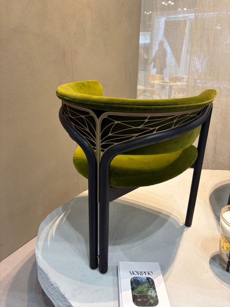
The “nouveau” back of the Morpho chair by Tomorrowland was beautiful!
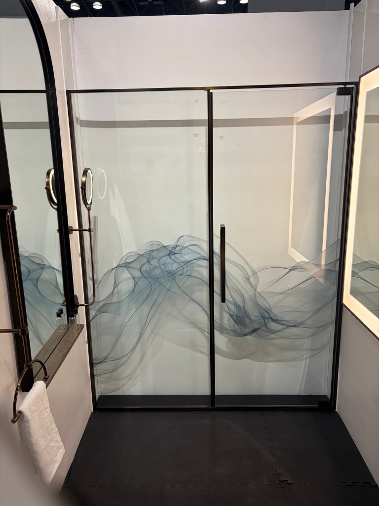
There was lots to appreciate at the Mirror Image booth. The custom shower enclosures were nice, especially the graphics on the glass. In a hospitality situation, I could imagine a different image on every door in each room. It could be a fun conversation point that probably won’t translate to a residence, however. The simple hardware also fit the doors. In addition, they offered a collection of patina metal panels to be used as decorative wall coverings. I found these interesting. Not rated for inside a shower enclosure, it was simple a different option for walls.

How it works was explained to me at the show and I read the description again on their website and I’m still not certain how water is turned into fire, but, Aquafire fireplace inserts do just that. Light and scent can also be added in what appears to be a very safe way to employ open flames in living spaces. This seems like a very practical answer to the need for fire.

I loved the Adagio tiles at the Mutina booth. This is a modular installation that gives the finished appearance of an unbroken weave. This is one in a series of configurable sets of ceramic tile they offer. You can imagine a vine working its way through the installation. (Their website features a looped video detailing the installations.)
I usually see one rug booth that pulls me in, this year it was Warp & Weft. This was just a nice selection of rugs that met the current demand for warm and comfortable room accessories.
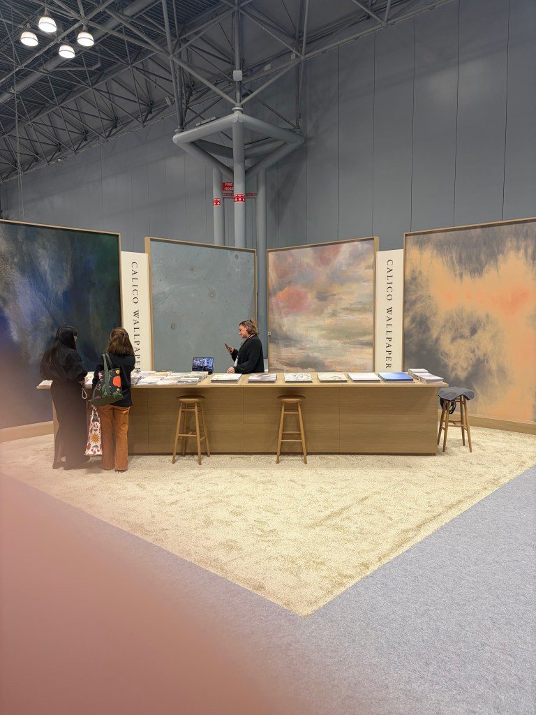
Similarly, there are scores of wallpaper manufacturers at the show and I usually am drawn to one or two. This year, the Calico Wallpaper booth was an island of calm in a calamitous sea of people and visuals.

It is interesting, over the last year, I have been hearing a lot about acoustic. I have even been asked about acoustic lighting options. No surprise then to find hush. Acoustics at a hospitality show. This Canadian company showed a number of interesting colors, textures and patterns all designed to promote a quieter building and atmosphere.
Booth Observations
As a person who in a past life spent a fair amount of time working in a show booth, I always try and find interesting and unique ways companies define their product and brand. This year, multiple booths used a monochromatic approach to tell their individual story. Most people intuitively know chairs, wallpaper and outdoor umbrellas are available in multiple color options, but their respective booths displayed only blue and white umbrellas, only brown leather chairs and all green wallpaper on the walls. Rather than a cacophony of color, the booth appeared uniform and inviting. The tailored looks allows the visitor to see a more refined solution intuitively raising their view of the firm.
The Yuanzhicheng Home Textile Company sold and displayed fabrics and wall coverings with a decidedly Asian look. Some was very detailed. The main wall included an almost mural-like embroidered scene. The staff wore blazers using the same fabric and embroidery pattern.
I’ve always favored a uniformity of look, if it went beyond matching polo shirts. I also prefer a minimal installation to raise the impact. The point of a show, such as BDNY is to make acquaintances and raise visibility of the company. Selling happens later. (You can tell I’m not a salesman!) Clever tools such as these instill remembrance. It opens a door to a sales person to assist the prospective customer personally, with the details of their specific needs, later. The more intelligently a company uses their show booth and their people, the better they are situated to move to the second phase.
Do We Really Need Bejeweled Crocs?
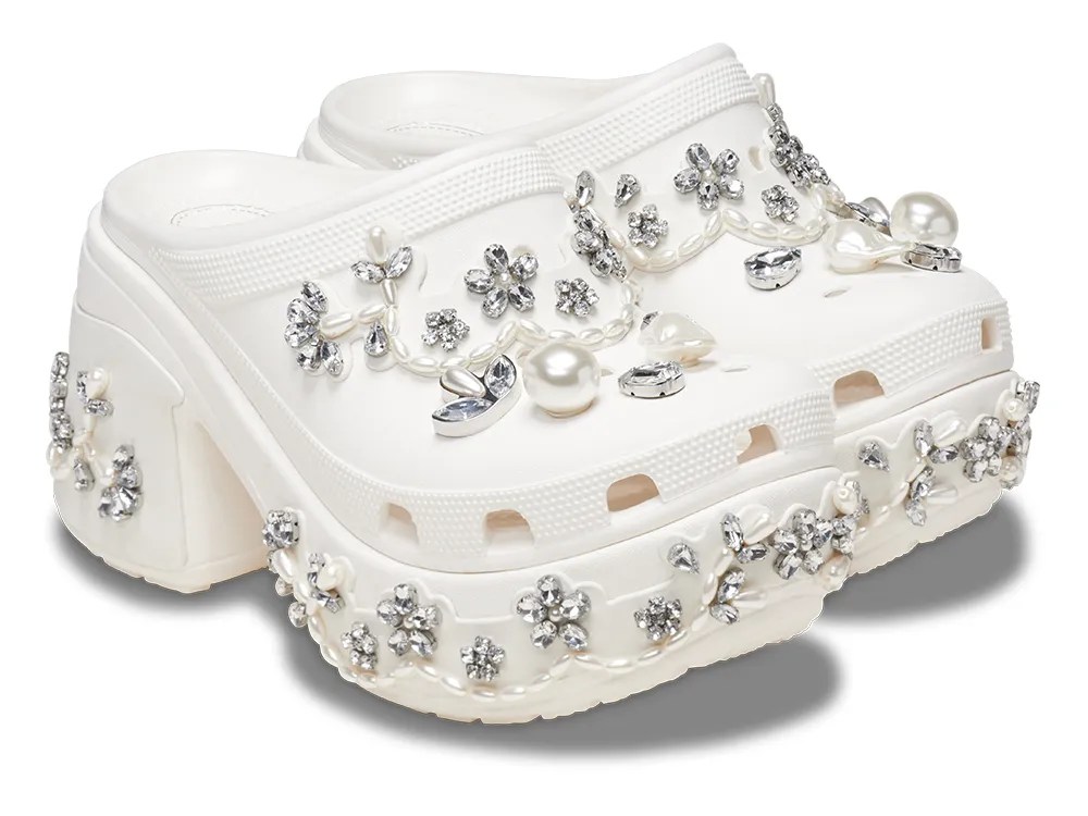
I was reminded of the fragility of trends and fads while walking through SOHO. In a previous report on New York trends, I mentioned the “hot” puffer jackets and a line of customers who waited in the rain to be allowed into the Moncler store, for the privilege of purchasing one. Fast forward to today and while the ropes and stanchions were at the ready on Prince Street, the humans weren’t. Around the corner in the Simone Rocha showroom window a pair of bauble encrusted Crocs caught passerby attention. While it is easy to imagine continued use for the warm puffer jackets, it is hard to see a long-term demand, beyond curiosity, for the bejeweled Croc rubber shoes. We want new things, but most of us want them to last at least a few moments longer than a fad. I believe the items I’ve highlighted here will last for a reasonable time. We all know, however that trends change. As we enter a rough economic period, we can be insured that trends will shift soon. Most of these should last. A few will be the gem embellished Croc available at discount in a closeout store near you.