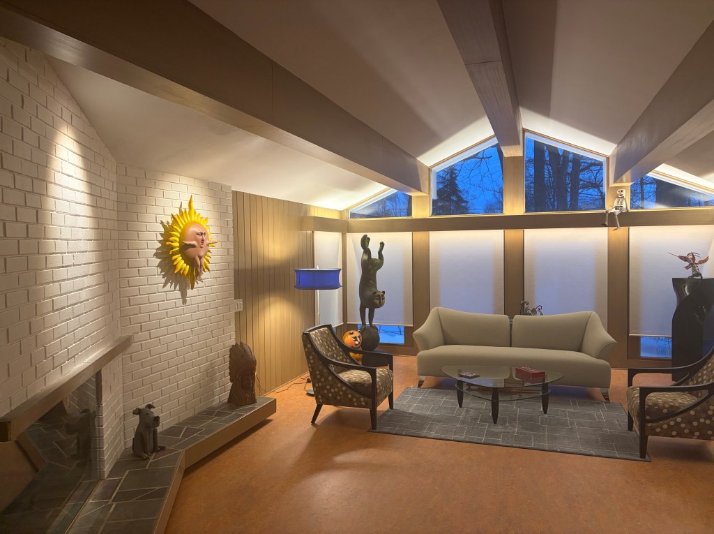
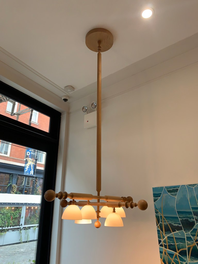
If you’ve read any of my recent blog posts, you’ll know, my wife and I just moved into a new, rehabbed mid-century ranch. The house was rat-infested, filled with mold, had holes in the roof and otherwise, only partially functional. My wife likes to say, “We built a whole new home inside an existing shell.” While that may be true, we were careful to maintain at least 90% of the original character. Walking into the front door, all of the living spaces are exactly as were envisioned in 1957. Sadly, an original bathroom could not be saved as water leakage compromised the supporting floor joists underneath. 1980s era remodeling of the main bathroom and kitchen were not worth the effort to save. We think the house is now a perfect blend of reverence to the past and functionality for today and tomorrow.
Because the lighting and electric was barely viable, up to and including problematic Federal Pacific electric panels, a full rewire with all new lighting was required. This has allowed me to make some observations about the state of residential lighting, at least in this one small instance.
I have been involved in lighting for over fifty years, so I’ll add two provisos. First, I spent more time than the average homeowner thinking about the lighting I wanted and where I wanted it placed. Secondly, I probably used more lighting than most remodelers or designers would typically specify. That said, I believe I have created a nice lighting design for our home and I have solved the consistent lighting complaints we both lived with in our previous homes and their rehabilitation projects. In addition, while our vision is good right now, statically, more and better lighting will be needed as we age. It was easier to add the light at this juncture, rather than later, when we’re less suited to deal with it.
Some Stats
26 outlet box mounted luminaires (12 of which are utilitarian flat-panel flush mounted luminaires plus 2 monopoint spots.)
52 recessed units and recessed housings
223 feet of LED Tape (four different types)
32 lighting strips totaling 71’-0” illuminate the clothes closets
15 remote power supplies (for tape and lighting strips)
14 step lights
4 exterior spots
Scores of cables, connectors & clips, for the assorted lighting systems
Stat Calculations
28% of the fixtures purchased were outlet box mounted
72% of the lighting was a functional systems, placed in, above, below or behind architectural elements of the structure
29.6% of the budget was spent on outlet box mounted lighting
70.4 % of the budget was spent on functional lighting
If we include the utilitarian, surface-mounted items as functional lighting, that number jumps to 76.7%
Project Stats
2600 square feet of livable space (includes a basement studio/office/entertainment space) 3105 square feet includes garage, which was also lit.
2902.18 watts are consumed if ALL luminaires are engaged
0.93 watts of lighting energy per square foot
7% – percentage of total budget was dedicated to lighting. If initial cost of the building is included, (this was a rehab) the number falls to 5.6%.
As I look at these numbers, they reflect what I have suspected and mentioned here over the years.
Functional lighting is heavily outweighing decorative lighting in quantity, dollars and impact to the room at a pretty substantive level.
As a percentage of new home or remodel budgets, lighting needs to be increased. I suspect my number, at 5-7% is higher than most. Many people believe 10% is a better number. The electricians on the job parroted that, indicating our house was the most involved they had ever done. While there was a room or two in their past, a whole-home of correct lighting hasn’t been normal. That means, there are a lot of poorly illuminated houses out there.
Despite my large number of lighting options, my watts/square foot umber fell below most averages of 1.0 to 2.5. Not where it needs to be if I wanted LEED, or some other energy saving certification, but pretty low. (More on this point in the next blog post.)
When I started work in this field, well over 90% of lighting used in a home was outlet box mounted decorative. A handful of recessed pieces were used in select spots and undercabinet lighting was, if used, fluorescent strips. 2’-0” x 4’-0” fluorescent boxes in the kitchen were soon replaced with a grid of 6” recessed cans. Bedroom bent glass was replaced with bowls, then ceiling fans. Hallway bowls were swapped for more recessed. Now, many bath strips are being supplanted with illuminated mirrors. Fluorescent undercabient was replaced with Halogen, then Xenon and now LED Tape. The ease of LED Tape, to say nothing of the reduced cost, has made accent lighting much more viable. All of these transitions are visible in my “real world” lighting installation. Are we, as professional lighting people dedicating the correct percentage of our efforts to the right categories? I’m not sure we are. We seem to spend an inordinate amount of time on decorative products and not enough on functional.
I also worry about our failure to push for better lighting. I often play a game when the new issue of Architectural Digest magazine arrives. I count the visible, decorative lighting fixtures in each article/issue. The number was shockingly low when I first started. As we moved toward the minimalistic 2010s, it got even smaller. Recently, the number is increasing because designers are doing exactly as I expected, they are featuring one or two key luminaires in a space. Lighting fixtures have moved from functional distributors of light to art that also provides some light. What hasn’t changed is the overall poor lighting found in almost every article in the magazine. If you’ve made it into Architectural Digest, there is no question, the design and implementation of the space is breathtaking. The furniture, wallcoverings and window dressings are flawless. You can’t help but be envious. Look a little deeper and the lack of usable light in the majority of the rooms is astonishing. Millions were spent on the redecoration, but only a couple of thousand dollars was spent on lighting that will allow you to see the space and live in the house.
The lighting design I provided for our new/old (last) home solved multiple problems, too little light, too much glare, poorly located lights and light oblivious to our security needs. Combined with a home automation system, the home lighting functions almost without our intervention. To achieve that, more systems-based functional lighting was needed than decorative outlet box mounted products. I’m not sure I’m an anomaly. As an industry, are we balancing this need correctly? All we need do is check out the statistics.
I have had a delightful “back and forth” conversation about trends with my closest friend for many years. While I had a career in lighting, he was a PR executive, concentrated primarily within the residential products space. He is more likely to push back against change and of course, I am inclined to embrace the “new” even when it might be to the detriment of good logic. At the conclusion of every email chain or tavern conversation between us two old retired guys is the agreement that change ALWAYS triumphs, like it or not.
The New York Times has an engaging compilation of the major trends and inventions that have matured kitchens over the last 100+ years. It tells of the background of the kitchen triangle, when the “open concept” first grabbed the interest of homeowners and recounts some of the innovations we now take for granted. This article is naturally pointing out the thing we now find indispensable to the function of a home. Score one-point for Jeff.
My friend’s score would heavily outweigh mine with the “hottest things” that DID NOT make the list. We don’t all have a steam oven, despite a couple of decades of manufacturers telling us it is essential. We don’t have a breakfast bar in our Primary Suite, few of us have a dirty kitchen (prep-kitchen) in our home and even fewer of us have a horizontal shower. Basically, my friend wins. We ignore far more than we adopt.
In the article, they asked seven questions. I asked him to send his answers to me and thought we could compare notes.
We both agree on kitchens. 55% of the readers agreed that the kitchen should be “a little separate” rather than open.
Jeff wins on freezers. My friend, unlike 76% of the readers does not believe the freezer should be on the bottom. He doesn’t like the “side” freezer option either, preferring the top. The very practical reason, he simply, “Doesn’t like to bend over for ice.” A good point.
We are again alike on the indispensability of a microwave or an air-fryer. We both have microwaves, but use them infrequently. Neither of us have an air-fryer (although I have a toaster oven with the feature.) 86% of those polled voted for the microwave.
We both agree that one island is enough. I actually prefer no island and have never had one in a house. 90% of the people agree there is no reason for two islands.
I think subway tile is over. My friend still likes it; so do 66% of the respondents. One point for my buddy.
I believe open shelving in a kitchen is great, if you don’t cook in your kitchen. It also takes a lot of aesthetic skill to make an open shelf kitchen work. My friend and 87% of the public agree. With too much stuff, you need the cabinets closed.
My friend prefers an eclectic style for his kitchen, so he reluctantly voted for the “colorful and cozy” option. I want everything as “streamlined and sleek” as possible. 76% agreed with my friend.
We agreed with the collective four times, he voted with the population on two additional points. I only agreed once, so my friend is more in tuned with the general population than me. Nuts. I thought for sure I knew what people wanted. I can hardly wait for the next time we have a beer together and discuss the latest household trends. I just know I’m going to win that conversation!
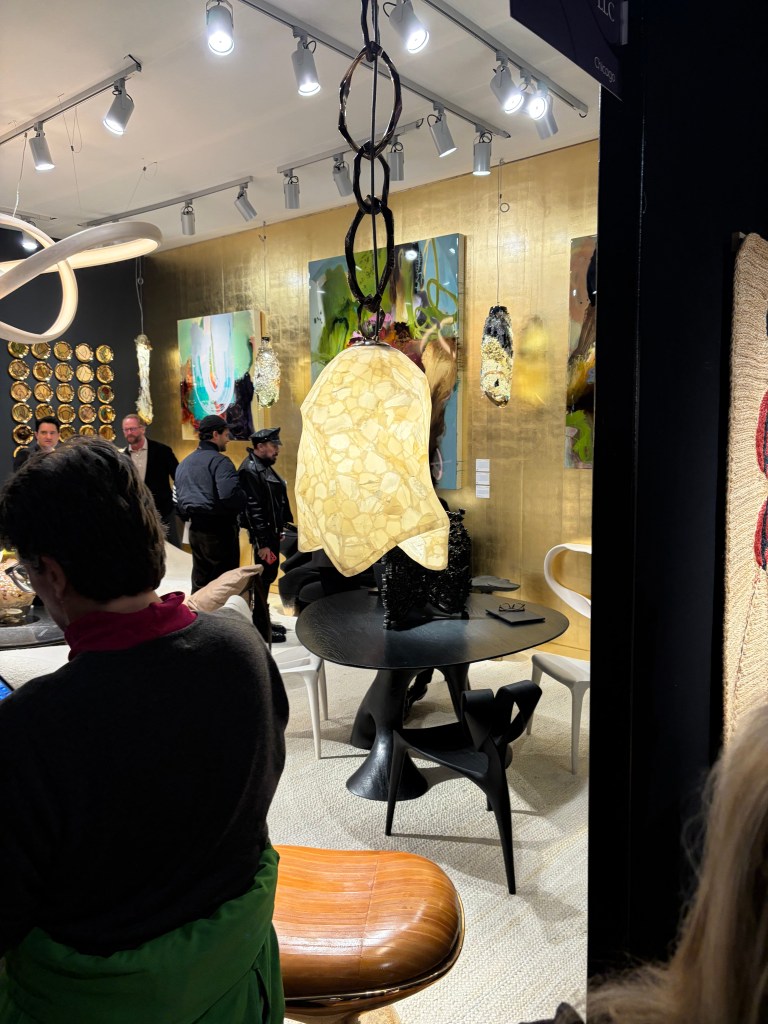
After a year of home rehabilitation, I needed a creative rush to recharge. The house project was fun and exciting and fulfilling, but it was a consistent expenditure of energy. At some point, revitalization is necessary. A long weekend in New York was just what the doctor ordered. I caught the Man Ray exhibition at the Metropolitan Museum of Art and the Ruth Asawa retrospective at the Museum of Modern Art. (As they relate to lighting, those will be detailed in subsequent posts.) My love of theater was satiated most evenings (“Two Strangers Carry a Cake Across New York” is the show to see! Avoid “The Queen of Versailles” and only see “Waiting for Godot” if your absurdist/surrealist cap is securely in place.) I spent multiple hours visiting showrooms and galleries to explore current consumer products. While reading the New York Times a few days prior to leaving home, I came across an ad for Salon Art + Design at the Park Avenue Armory, so I checked out that show, along with the real reason for the trip, BDNY.
As you likely know, BDNY is geared toward the hospitality industry. That means, while there are many elements of design that demand note, the show floor is filled with functional products that don’t tell me much about consumers and their preferences. Room safes, suite number plaques and faux artwork are needed by hospitality operators, but tell me nothing. That said, I was drawn in by three companies offering a new twist on a pedestrian problem. IAP asked the question, “Can a garbage can be sexy?” Based on their booth, I’d say, yes. Stable Table provided a solution for every diner’s nightmare, a wobbly table, regardless of the ground material. Covers & All makes custom covers (surprise!) for everything you might need to shield from the elements. Sometimes, the most mundane things become interesting, especially to an outsider like me.
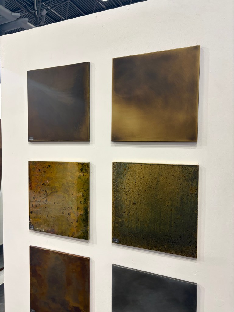
Overall, it is clear that the hospitality industry, like the residential business has fully embraced warm and cozy beige. Almost every booth used some variation from off-white to brown. As I have said before, when the interior industry adopts beige as a neutral and the enjoined brass metallic, it becomes a trend for the long haul. To augment that direction, the Bulthaup showroom in SOHO, typically a bastion of hard-edged kitchen simplicity displayed a waterfall countertop made of wood. This single element softened the room far more than I would have expected.
I don’t expect much movement on this trend for at least a decade. That being the case, how do we advance design within these parameters? I believe I saw some telltale signs at both shows and in the storefronts I visited.
At the Foscarini showroom in SOHO “Buds” were in bloom. (Sorry, I couldn’t resist.) Buds uses a variety of shade shapes, but all are in subtle shades of off-white and cream. Honestly, I have been waiting for this shift. We have used white-white glass for a handful of years now, and with the preponderance of brass, the warmer glass just seemed inevitable. We are not, however going back to 2000. The new warm glass is much cleaner, much closer to white than the heavy umbers, ambers and gold of the past. I believe this will be the tone you should expect moving forward.
Also in SOHO the Roll & Hill showroom featured The Met Pendant, likewise using a warm beige glass. The difference a quarter-century makes is the shallowness of the diffuser, made possible by LED. At that time, we needed to enclose incandescent and even the much larger fluorescent lamping. That meant bowls were quite large. This slender profile defines the difference when trends reemerge and are not exactly the same.
That warmth is carried through with the products shown at United Alabaster a Spanish company dedicated to showcasing natural alabaster in lighting products. As this is natural stone, the level of warm veining can vary, but the overall softness is evident, especially in their Ozark product. The ring and ball design could read “cold” were it not for the earthy material.
A pleasant reason for attending shows is finding someone new. I never heard of J Adams & Co. This is a British manufacturer that has developed a beautiful collection of warm and comforting, but not traditional, products. I encourage you to check out the website. There is beautiful lighting here.
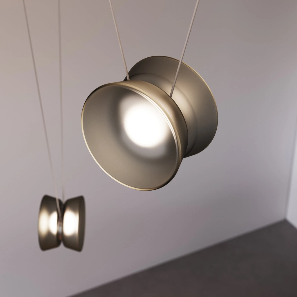
In my youth, I was barely proficient with a yoyo, but I do remember being amazed at the trick others could perform. Borrowing from this childhood toy, the YoYo Adjustable Pendant (think about the cradle yoyo trick) from Sonneman is fun and functional. Suspended from a narrow cable, the lighted unit height can be adjusted as needed.
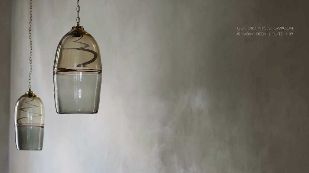
Also seeking “the next diffuser” is Ochre. The window of their SOHO showroom was graced with Marea. Rather than using beige, they employed warm smoke variations on deep blown glass. Because of a slender disc of LED, the entire Murano diffuser became the focal point, uninterrupted by a pedestrian light bulb.
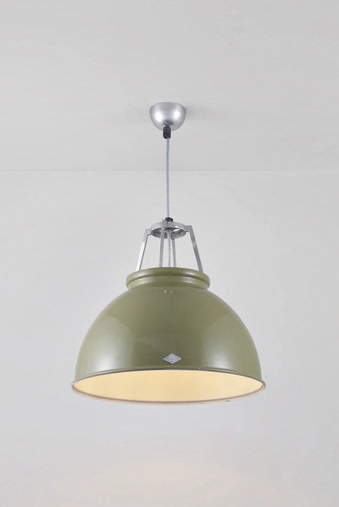
Always a fun visit is the Original BTC showroom. Their Titan pendants reuses a 1940s deep industrial metal shade and pushes the LED light source far up inside to create light with almost no glare. Many colors are available to soften the hard edges of what might be a harsh concept.
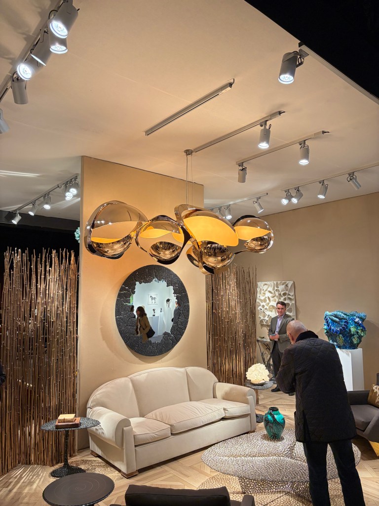
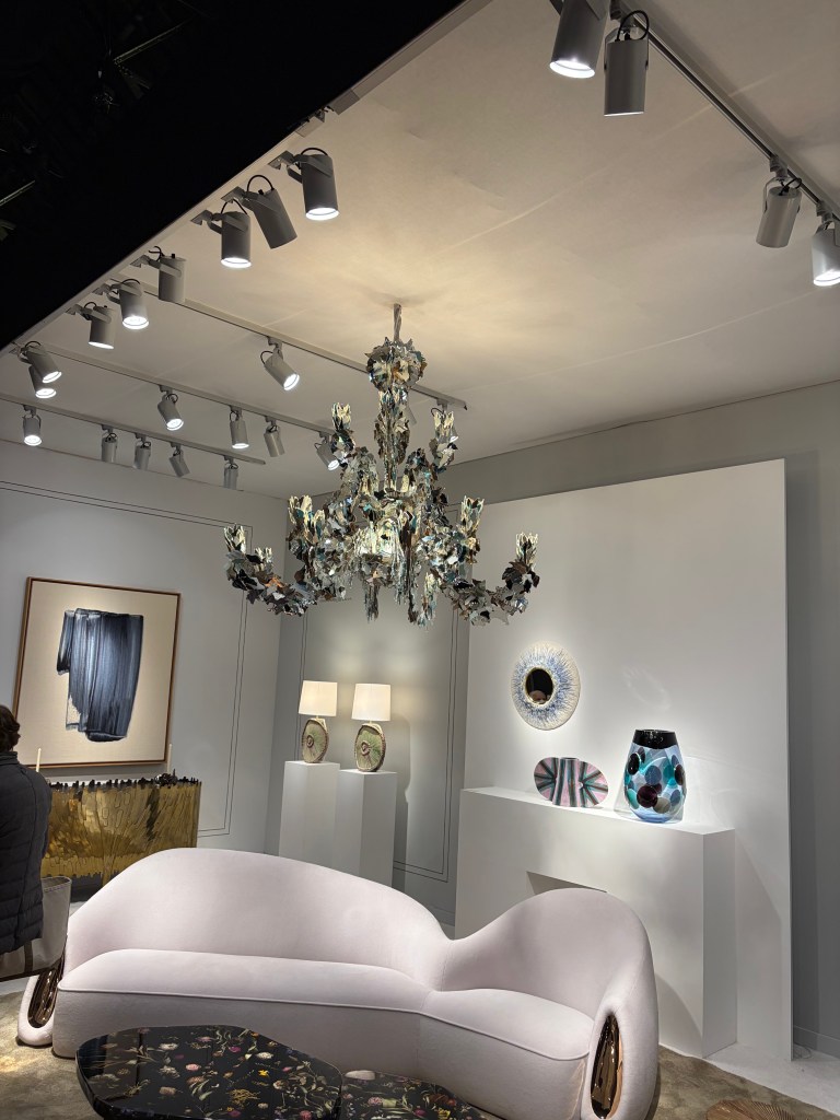
Salon Art + Design 2025 – Over-scaled chandelierSalon Art + Design 2025 – Metal pods with light source tucked insideSalon Art + Design 2025 – Porcelain draped over a glass diffuserSalon Art + Design 2025 – Light tucked inside pinched, polished slender vertical surfacesSalon Art + Design 2025 – Broken mirror pieces formed into a classic European chandelier shapeSalon Art + Design 2025 – Crocheted copper wire covered with sawdust and sapSalon Art + Design 2025 – Onyx pendant / In rear, cast bronze enclosing onyx segmentsSalon Art + Design 2025 – Fine, detailed feather and leaf vein patterns painted inside blown glass shapes
The lighting at Salon Art + Design clarifies what the future might hold. Salon speaks to a very high-end client where functional product can and should also be art pieces. Museum finishes and statement pieces are their milieu. In almost every room setting/booth display, the lighting was over scale and heavily artistic. Its function as a light source was secondary. That was of course supplied by the surrounding, largely hidden, functional lighting. As we move to a world with fewer decorative luminaires, those that are used will have more meaning aesthetically. An early detection, provided by this boutique event should harken to us the likely direction of products for the future.
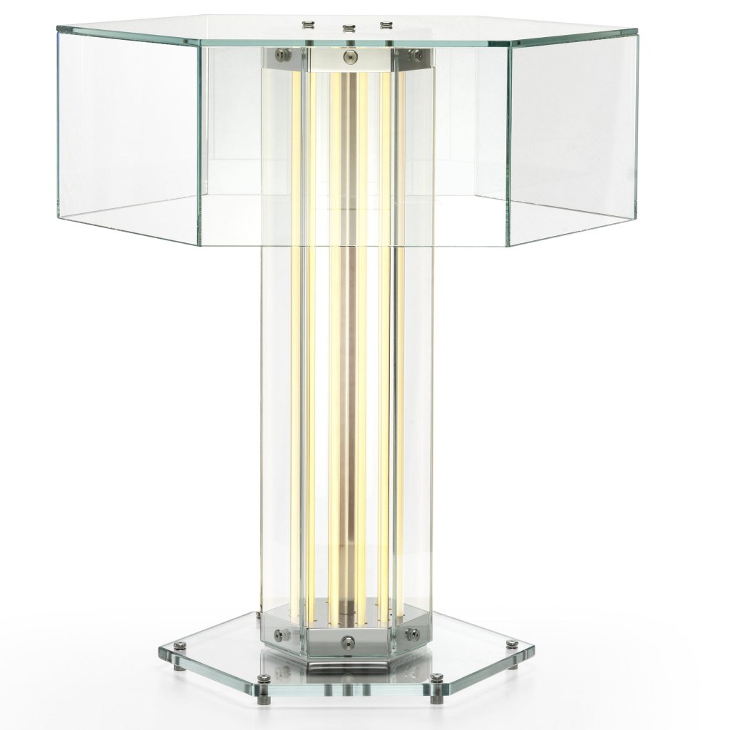
SOHO 2025 – Flos – SuperWire T portable lamp
One last comment about the new lighting I saw at the show and throughout New York. The Flos showroom featured their new design, SuperWire T that upends almost everything I’ve said heretofore. The table lamp features a shade (sort of) but the illumination is provided by the column. The torchiere is simply an illuminated column, the LED tubes running in tandem to the hexagon shape. It is important to remember, contemporary still has a place, as it has always.
Like most of the comments included here, you see the crucial element played by integrated LED. We are getting farther and farther away from a “light bulb” and that is a good thing. Designers are figuring out how to control glare by placing the light source correctly. Integrated LED is allowing forms to be realized in new ways. For a few years now, there has been this “argument” about retrofit vs integrated LED. I’ve always said that integrated would eventually win. As it becomes a mature technology and consumers become more accepting of the concept, we are seeing the integrate approach rise. Sure, there will still be retrofit options, but I expect that direction to lessen each year.
What About the World Outside of Lighting?
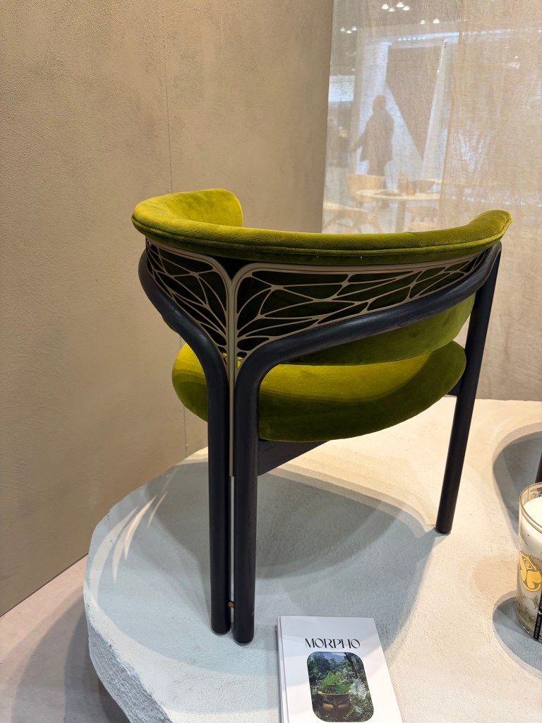
BDNY – Tomorrowland – Morpho
The “nouveau” back of the Morpho chair by Tomorrowland was beautiful!
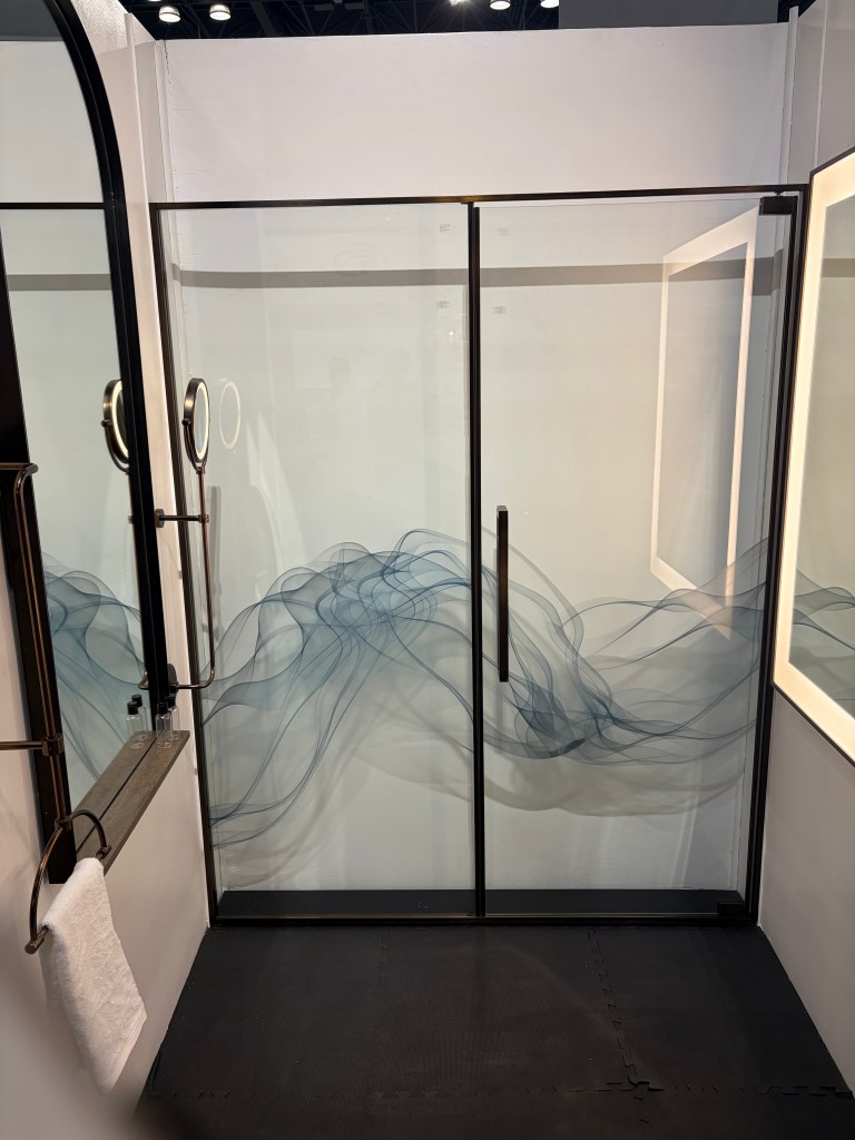
BDNY – Mirror Image – One of many shower door decorationsBDNY – Mirror Image – A collection of decorative metal panels for walls
There was lots to appreciate at the Mirror Image booth. The custom shower enclosures were nice, especially the graphics on the glass. In a hospitality situation, I could imagine a different image on every door in each room. It could be a fun conversation point that probably won’t translate to a residence, however. The simple hardware also fit the doors. In addition, they offered a collection of patina metal panels to be used as decorative wall coverings. I found these interesting. Not rated for inside a shower enclosure, it was simple a different option for walls.
How it works was explained to me at the show and I read the description again on their website and I’m still not certain how water is turned into fire, but, Aquafire fireplace inserts do just that. Light and scent can also be added in what appears to be a very safe way to employ open flames in living spaces. This seems like a very practical answer to the need for fire.
I loved the Adagio tiles at the Mutina booth. This is a modular installation that gives the finished appearance of an unbroken weave. This is one in a series of configurable sets of ceramic tile they offer. You can imagine a vine working its way through the installation. (Their website features a looped video detailing the installations.)
I usually see one rug booth that pulls me in, this year it was Warp & Weft. This was just a nice selection of rugs that met the current demand for warm and comfortable room accessories.
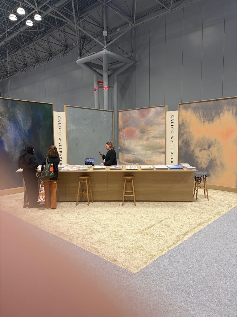
BDNY – Calico Wallpaper – Calm on a busy show floor
Similarly, there are scores of wallpaper manufacturers at the show and I usually am drawn to one or two. This year, the Calico Wallpaper booth was an island of calm in a calamitous sea of people and visuals.
BDNY – hush.Acoustics – Acoustic coverings in nicely muted colors and interesting patterns
It is interesting, over the last year, I have been hearing a lot about acoustic. I have even been asked about acoustic lighting options. No surprise then to find hush. Acoustics at a hospitality show. This Canadian company showed a number of interesting colors, textures and patterns all designed to promote a quieter building and atmosphere.
As a person who in a past life spent a fair amount of time working in a show booth, I always try and find interesting and unique ways companies define their product and brand. This year, multiple booths used a monochromatic approach to tell their individual story. Most people intuitively know chairs, wallpaper and outdoor umbrellas are available in multiple color options, but their respective booths displayed only blue and white umbrellas, only brown leather chairs and all green wallpaper on the walls. Rather than a cacophony of color, the booth appeared uniform and inviting. The tailored looks allows the visitor to see a more refined solution intuitively raising their view of the firm.
The Yuanzhicheng Home Textile Company sold and displayed fabrics and wall coverings with a decidedly Asian look. Some was very detailed. The main wall included an almost mural-like embroidered scene. The staff wore blazers using the same fabric and embroidery pattern.
I’ve always favored a uniformity of look, if it went beyond matching polo shirts. I also prefer a minimal installation to raise the impact. The point of a show, such as BDNY is to make acquaintances and raise visibility of the company. Selling happens later. (You can tell I’m not a salesman!) Clever tools such as these instill remembrance. It opens a door to a sales person to assist the prospective customer personally, with the details of their specific needs, later. The more intelligently a company uses their show booth and their people, the better they are situated to move to the second phase.
Do We Really Need Bejeweled Crocs?
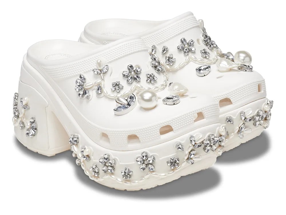
SOHO – Simone Rocha – Crocs – coming to a thrift store near you…soon!
I was reminded of the fragility of trends and fads while walking through SOHO. In a previous report on New York trends, I mentioned the “hot” puffer jackets and a line of customers who waited in the rain to be allowed into the Moncler store, for the privilege of purchasing one. Fast forward to today and while the ropes and stanchions were at the ready on Prince Street, the humans weren’t. Around the corner in the Simone Rocha showroom window a pair of bauble encrusted Crocs caught passerby attention. While it is easy to imagine continued use for the warm puffer jackets, it is hard to see a long-term demand, beyond curiosity, for the bejeweled Croc rubber shoes. We want new things, but most of us want them to last at least a few moments longer than a fad. I believe the items I’ve highlighted here will last for a reasonable time. We all know, however that trends change. As we enter a rough economic period, we can be insured that trends will shift soon. Most of these should last. A few will be the gem embellished Croc available at discount in a closeout store near you.
I believe we lighting people have a tendency to mix or confuse Human Centric Lighting with Circadian Supportive Lighting. It was a point well-made by a lecturer at the recent Cleveland Electric Expo. I’ve written a lot about Circadian needs and concerns, but I really haven’t touched on Human Centric Lighting. I hope this brief description helps clarify the differences.
First, let’s remember that Circadian lighting is basically a replica of natural light, regardless of what we humans are doing, the sun rises and falls. The sun doesn’t care about us, it is totally independent. At a base level, this is the light our body craves. The main point the speaker made was that Human Centric Lighting was more of a design practice, with a goal to improve the life of the human who uses the space. Designers must balance the physiological needs with the practical demands of life. That can be done is a number of ways.
Quality of Light
The point of the light is to bring out the beauty of the surroundings and the space being lit. To do so, the quality of the luminaire must be high. Selecting good light insures the result will be excellent.
Natural Light
The goal is to end up with light that feels natural, not forced or fake. It should have a connection to daylight in color and direction.
Connection to the Outdoors
The built environment should have a link to the surrounding landscape. A harmonious blend makes the space feel real and comfortable. People will enjoy occupying the space because of these connections.
Adaptive and Personal Controls
We all feel better when we have control. Control of the lighting is included in that emotion. Intelligent solutions should adapt to the user. If automation is not being used, then the occupant should have the ability to personally adjust and regulate the light as needed.
Shading
Shading is a crucial part of lighting, especially with the inclusion of more natural light. Direct sun can produce a lot of glare. Proper shading can ameliorate that problem and create a comfortable place. For successful shading, a designer must consider the proper material and how use will impact energy consumption.
Benefits
Human Centric Lighting has been found to deliver benefits to businesses, employees and tenants.
Where Do I Start?
When thinking about Human Centric Light, one must consider natural light first. It is consistent and dependable, so how does the sun fall on the building? With more daylighting employed, how will that natural light enter and work within the interior space? How will you, as a designer balance the desirable natural light with the designed interior space? You will need to have adjustable interior light that can match the natural light in intensity and color. That will require control systems and shading (as mentioned above.)
Now, take a minute to understand what the body needs. (Circadian Supportive Lighting) How can we balance that need and the needs of modern people? Working adults cannot awake at 8:00AM in the winter and still hope to get paid, so we make a sacrifice. What is the task? What type of light will accomplish that? Can it be done with the least possible offense? We introduce lighting into the space that will deliver what is needed in the most respectful way possible.
During the day, our bodies want to absorb as much light as possible, but as people, we need to perform tasks and glare can be a huge deterrent. We might need some glare shields. We might need controls. Applying the points listed above lets us do that.
Unless we are a 19th century farmer, it is unlikely we will go to sleep at sunset, so a good lighting designer will provide light that allows us to perform any necessary life tasks, while preparing our bodies for sleep, perhaps six hours later. Light, of the right color and delivered in the most amiable way will have minimal impact to our circadian needs.
Understand the circadian needs; add only the light needed to supplement tasks in a way that connects the user to the space; make sure that light is of high quality and add shading and controls to increase its value.
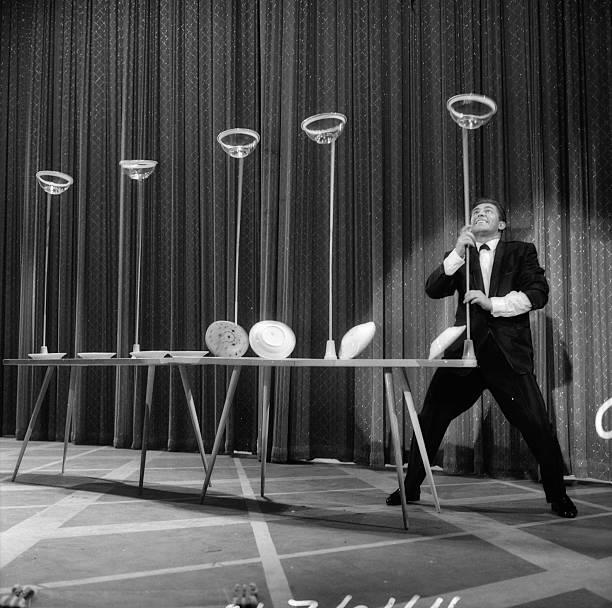
This is new territory for all of us. When I first started in the lighting business, we simply worried about filling all the outlet boxes in the ceiling and walls. As we entered the new millennium we learned about the power of our circadian rhythm and its impact on our life and health. Plants and animals had similar needs. That has complicated things, at the same time we began to adopt a new light type. We are now like the guy on the Ed Sullivan show who balanced a dozen plates on wobbly sticks. Each plate needs attention or the whole act will come tumbling down.
We have all heard the statistics about dimmers. An inordinately high percentage of dimmers are never changed. People set it to some level they desire and it never moves from that point for the rest of its usable life. I recently attended the 2025 Cleveland Electric Expo and listened to a lecture covering controls and learned that the same thing is happening with color controls. This expert indicated that 85% of their installations are set once and never moved again. Sort of defeats the idea of circadian-sensitive lighting, hum?
If you have listened to me speak or read my posts, you know I do not use many dimmers in my lighting designs. I’d much rather have multiple switches control specific areas of the room. With multiple switches, I get all the variation I could possible need or want. For example, I have five switches in my kitchen that control lighting (one controls a non-illuminated ceiling fan, so we won’t bring this into the conversation.) That provides me with 120 variations of light. (5 x 4 x 3 x 2 x 1) Do I need more than 120 options? Does anyone?
My reasons also go beyond simple options. When I spent a portion of my career thinking about landscape lighting, dimmable product was entering the market. I couldn’t think of anything less viable. The job of a landscape lighting designer is to place the correct amount of light in the right area and contrast that with the surrounding lighted and unlit elements in the space. The result is a delicate balance. Some trees are intentionally lit brighter. Some shrubs are simply touched with light. Yard art might demand more (or less) brightness. Pathways and steps are illuminated to provide safety to the user. This symmetry would be quickly defeated upon the introduction of a dimmer. Nonetheless, I see dimmers advertised for use in landscape lighting. Why? It’s a gadget marketing can use to grab the attention of the consumer.
I understand the need for field adjustability in commercial spaces. Commercial lighting is far more complex than the residential world I inhabit. Field adjustability is a crucial aspect, insuring each unique business and workspace gets the light needed and desired, while maximizing savings on energy. The adjustability might only be used upon initial set-up, or perhaps when a new occupant takes over a space or office. A leather boutique might have very different demands for light when compared with a jewelry store. Adjustability has its place.
I worry now about color adjustability. We are learning more daily about the demands our body has on light. We could begin regulating light color transitions that support our circadian needs (bright bluer mornings and afternoons and dim, warmer evenings.) Then the customer gets involved playing with the dials and before you know it, they are lighting the evenings with bright 6500K light and wondering why they can’t sleep. Sure, once we go away, the property is owned by the client, but do we forfeit responsibility? How do we prevent our clients from being their own worst enemy?
I remember talking to a landscape designer about customer interaction. He told me that he explains to the prospective customer that he will select ALL the accent lighting used on a job. The customer would choose the pathway luminaires. He then offered three options. I asked why he only gave them three. He told me that if he gave the customer more, or, god-forbid, the whole catalog, a decision would never be made. Seeing the catalog and reading the marketing descriptions, the client might also start asking about some of the accent lighting choices. By limiting their options, he gave the homeowner a choice of what he believed to be three excellent options. Any of the three would properly illuminate the pathways. It insured a better job than if the client were in the driver seat.
Field adjustability is not a dimmer. Some significant variants can now be programed and provided with lighting. Human health benefits are now possible with light programing. Do we really want to leave this in the hands of a layman?
In an editorial overview of the latest New York Fashion Week, New York Times Fashion Editor, Vanessa Freidman wondered, “What it means to dress like a woman in the era of the manopshere…? When macho posturing is on the rise, do you lean into ruffles and lace and corsets and hobble skirts?” (New York Times February 16, 2025) Our new political reality has already caused economic rumblings, if not instability. The tariff-happy president insures we will be paying more for a host of goods and virtually every economics professional has predicted instability and higher inflation. In an era when reliable trading partners have become enemies, the first financial statistics of the new administration are backing this up. It appears we will be entering a period of time circumscribed by a difficult economy.
The connection to fashion and economics goes deeper. We have always heard that women’s hemlines rise during prosperous economic times and fall when the economy declines. I’ve always found, in lighting and most home goods, economically fruitful times means a somewhat stagnant period of design. Manufacturers are so busy meeting production demand that new ideas and new design trends fall to the back burner. When the economy begins to slip, new ideas are proposed to initiate added interest and fuel demand where it might otherwise flounder. I believe we will be entering a time like this shortly.
If you think about lighting design lately, we are in an aesthetic rut. How many more spindly chandeliers with a bare bulb can we digest? These, of course were created when lighting duty was increased (by the same President) in 2017 and 2018. Builders and consumers refused to pay more for a luminaire, so the result was product with a smaller physical size. The elimination of a diffuser made packaging easier and less costly as well. Add to that a declining economy and this reemergence of white male dominance and the landscape is ripe for a new shift.
Where do we go from here? For the cost-conscious tract-builder, the elimination of decorative lighting seems almost certain. There is virtually nothing left to remove from a chandelier now and it will be 20% more expensive. Unfortunately, that will likely mean more surface mounted faux-recessed lighting. In smaller homes, the dining room is probably on the block as well, so even an “inexpensive” chandelier will not be an issue. Spec and custom homes are likely to continue to use decorative pieces. I just wonder how many and at what price point.
Numbers and demand aside, here are a few things I expect to see in the next year or two. (2025-2026)
Natural Brass/Warm Gold will remain dominant. As I’ve indicated before, once natural colors alight at the top of lighting trends, they stay for an inordinate length of time. Polished Brass lasted 40 years the last time it was popular. We are at the beginning of a long run for brass/brasses/golds.
Brushed Nickel seems ripe for disappearance, but I still see it being used in more traditional settings. Brushed Nickel is surprisingly not going away without a fight, even after a quarter century of popularity. Nonetheless, it is now the oldest finish, by many measures and its influence continues to shrink beyond builder product and big-box retailers.
Hard Contemporary continues to slip in importance, in favor of its more amiable sister, Soft Contemporary. Softer lines that fit more comfortably with casual living environments will be the most in demand. This is a category that almost disappeared after its heyday in the end of the 1990s-beginning of the 2000s. Trends are cyclical.
I had expected to see a rise in more overtly traditional products. We had touches of maximalism and nouveau Victorian, but neither appears to have connected with wide swaths of consumers. Will the rise of he-men and a call for “beautiful” public buildings change this? I don’t think so. Some softer, or transitional styles will remain, but we are headed into a very casual style period. We see this in fashion and food and an almost complete lack of fine china, crystal and flatware sales. It should not be a surprise. If we need more supporting data, we are in the middle of a generational shift of home buyers. Gen Xers are buying the most expensive houses and Millennials are buying the largest quantity of homes. Theirs is a much more laid back lifestyle and their homes will reflect that.
Bare bulbs and clear diffusers are likely to be replaced with more white, etched, smoked or colored finishes. If we see clear, it will be supplemented with textures, surface treatments and obfuscation of some sort, in an effort to diminish the glare. Glare, which has always been bad will be discovered as such by the greater population (again!)
Pendants, of all sizes (small to jumbo large & shallow to tall) in any styles will be very popular. We might even be inclined to blur the line between chandeliers and pendants and linear chandelier/pendants. These will be the decorative showpiece items in a home, whether placed over a dining room table, nook dinette or kitchen island. Sure, chandeliers will remain, but I expect pendants to meet the cost and size demands of the home for the next few years. They are an easy way to fit within a builder’s budget.
Lighted mirrors will continue to replace conventional bath and vanity luminaires, especially in powder room applications.
This will be a new era. A desire to return the US to the 1950s when white men were supreme, but it wasn’t too hot for everyone else. Male dominance will be at the forefront of society. The general population and the economy will suffer as a new experiment in economics is tried. Consumers will again take their well-worn backseat as this fad plays out. Like has happened before, new ideas and change will keep the economy rumbling in the interim.
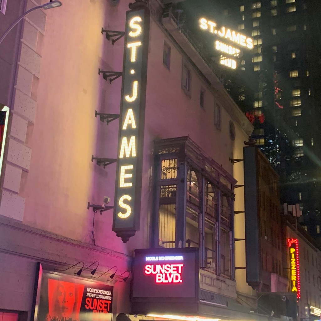
While watching the stunning new production of Andrew Lloyd Webber’s “Sunset Blvd.” I couldn’t help but wander back to the afternoon I spent walking Madison Avenue. From about East 50th up to around East 90th, there are clothing stores from almost every brand you’ve heard of and many you haven’t. I was trying to make sense of the direction of fashion. I wrote a few notes in my book, but nothing coalesced, until the show.
If you are familiar with the Billy Wilder movie starring Gloria Swanson, you probably remember Swanson’s magnetic film performance, but you’ll also recall the wonderful 50s style of Joe Gillis and the young Hollywood wannabees countered by the bygone palatial style and elegance of the 20s era Norma Desmond mansion. If you are old like me and you have seen the 1990s original theatrical production, it was famous for having a swimming pool on stage to service the climactic end. To understand the plot a viewer needed to be immersed in the ambience, right? But what if that is not necessary?
In a neck-twisting reversal, the new production forgoes almost all the outward decadence, drapes the actors in simple black and white, strips the set of everything except the most basic necessities and even inserts cultural anachronisms. The result was as mesmerizing a show as I’ve ever seen. The story was crystal clear because rather than ogling the surroundings, you were instead concentrating on the story, fine lyrics and award winning performances. It is a musical I won’t soon forget.
Like the show, it is no secret that daily-use clothing is becoming increasingly casual. The complex story of life can and does however continue. There was no secret held by outwardly elegant clothing. They did not/do not define the human inside.
As I noted points about fashion, it is clear that the basic units of clothing have stabilized into a uniform of sorts, jeans, cords, pullovers, vests and slightly oversized shoes/boots. The colors acceptable to men are however expanding beyond grey and black. I see more rich greens, burgundy, gold and different blues in menswear. Men are being given a wider berth with accessories. Glasses and sunglasses are becoming more fanciful. (Hey, the conservative Governor of Ohio has been wearing blue glasses for years!) There is more jewelry, bolder belts and funky swimwear available to men today. Women continue to have plenty of options to dress up or down. The extent to which they use that advantage, still remains in question. That power appears to be slimming almost daily.
So how does this relate to interiors?
We see the rise of a softer contemporary percolating right now. Consumers don’t want those stark hard edges, instead they are seeking softer lines, added radiuses and the warmer tones of brass in place of chrome. While still popular, I can see the end of Black on the horizon, it being too stark, too invasive for this new direction. The traditional side of the aesthetic world is seeing increased ornamentation, even the partial return of Victorian design is a muted version. None of this is staid or stifling, however. All of it feels like a home dressed in blue jeans and a cozy, overstretched sweater.
Nothing in the home defines casual more than the return of beige. Beige is again the center of the world. It dominates every showroom I visited over three days. With metal accessories now firmly entrenched in brass/gold, this is a trend that has legs. I really wouldn’t expect to see a shift any time prior to 2040. Brass and beige are THAT dominant a force. If you question this, check out the historical perseverance of this duo from the 1970s to the end of the millennium.
We are not a nation that will go back to the era of Nick and Nora Charles, a proper 5:1 gin martini and dressing for dinner, but the cyclical nature of design and style will drive change. That change will be mixed with the cultural reality of the time, including fashion…as it always has.
Another year, another trade show. Overall, I found less of interest than normal at this year’s BDNY. It also seemed like a lighter attendance than last year. Nonetheless, there are a handful of things worth noting from this show, which concentrates on the needs of the hospitality trade.
Germs
Stern Engineering Ltd. showed touchless WC partition doors. Operating via proximity sensors, the user no longer needs to manually operate the toilet partition door. As we become more sensitive to germs and with the reality that 80% of germs are transferred by touch, this is a solution for a problem that might extend beyond a public restroom.
A continual issue with shower enclosures is grout mold. Mincey Marble is promoting cast marble that eliminates the grout. Unfortunately, for me, it has the look of the inexpensive resin/plastic tub enclosures that are advertised on late-night television. Too bad, they may be on to something here with a higher-end answer to black mold. I hope they continue to work on it.
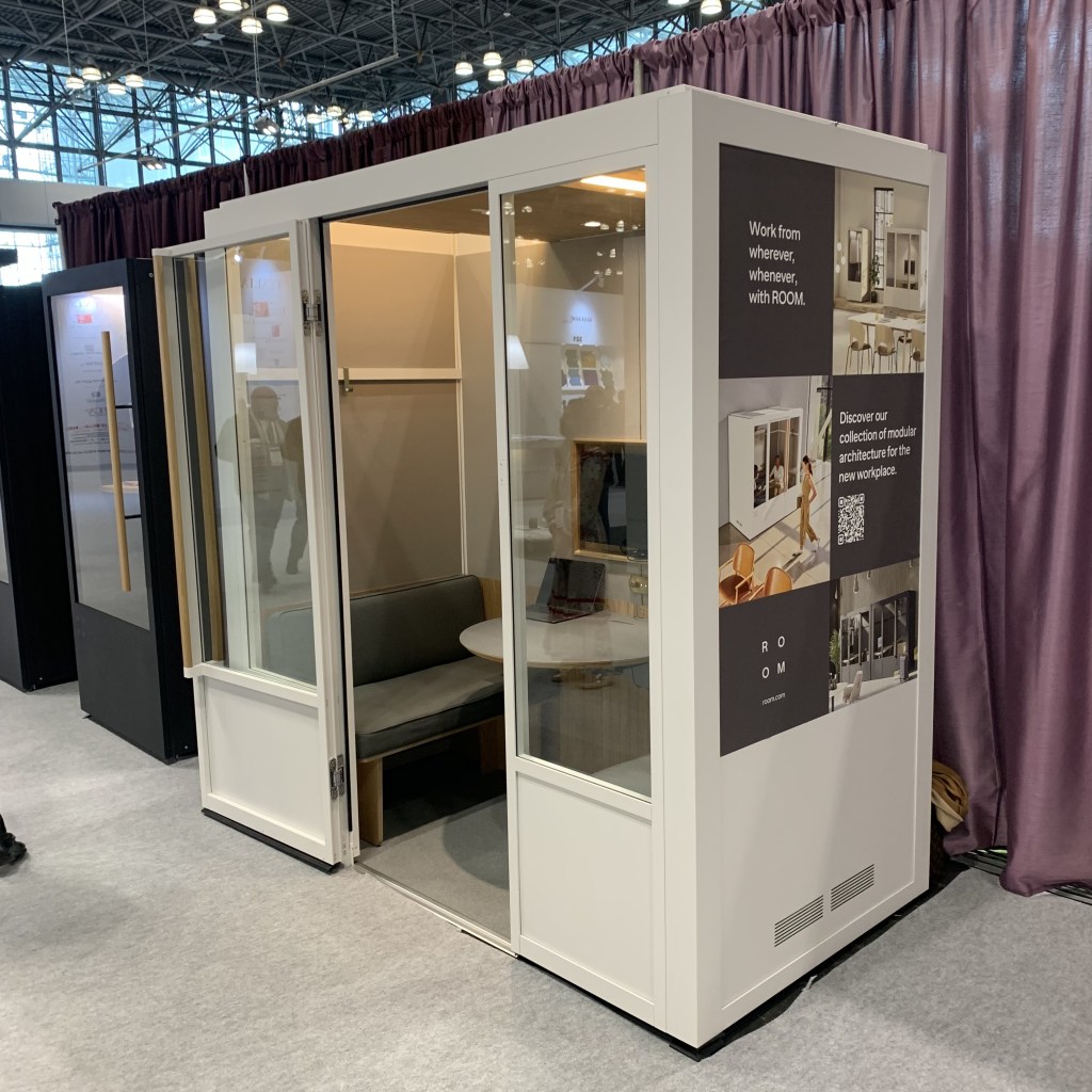
Need privacy in a large space? Room offers a collection of portable spaces that can insure some level of quiet and a place to meet. While this can be of value in hotels, I can also see the importance in open-plan office settings and maybe even homes with two “work from home” living partners.
I have mentioned Swadoh before and their product bears repeating. Their design approach is different and unique. I was especially drawn to the look of torn and battered pages of a book used in their Fungia collection. If something special is needed, I’d suggest a look here.
Uecko is a Spanish cabinet company. Nice products, but what attracted my attention was the internal lighting. 3/8” wide LED Tape has become the default for so many tasks, so when I saw the internal cabinet lighting, I was very surprised. A tiny 3/16”, at most ¼” sliver of LED lit the cabinet interiors. This forced me to ask, “Why have we settled on the current LED Tape width?” Perhaps it is easy. No need to reinvent the printed circuitry that drives the concept. No need to engineer new connectors. Regardless, LED is very adaptive and why not consider a smaller concept. It certainly works here.
As I gazed into the Artemide showroom window in SOHO, I was reminded of a past comment I made on RGB lighting. “Just because you can, doesn’t mean you should.” Yes, color changing lighting is fun, but it has a very limited practical use, especially in a home. I’m not sure where “Discovery Dialogue” by Ernesto Gismondi will be used, but I love the conversation and I appreciate the respect for technology expressed in the creator’s abstract. We must understand lighting technology will change and luminaire design and application will change. We need to get on board, or step aside.
I liked the combined materials of ceramic and leather used by Meso Goods in their wall hanging, Tela de Barro. Meso products are made in Latin America and this was an especially appealing design and use of mixed materials.
BDNY 2024 – Meso Goods – Mix of leather and ceramic
Anytime I see Zaha Hadid, I am hooked. Despite her dying many years ago, her architectural firm continues and they have been remarkably consistent with her artistic vision. Isimar, a Northern Spain manufacturer of galvanized metal rod products, has engaged her firm and they have created Topos an outdoor chaise and chair that immediately brings to mind some of Hadid’s architectural work.
BDNY 2024 – Isimar – Zaha Hadid designed Topos collection
Outdoor heating has become more and more important, yet the design of the units has been somewhat pedestrian. Heatsail is a Belgian company that is creating interesting and fashionable heating units. Resembling pendants and 70s era Italian floor lamps, outdoor heating in outdoor spaces can be achieved more beautifully now.
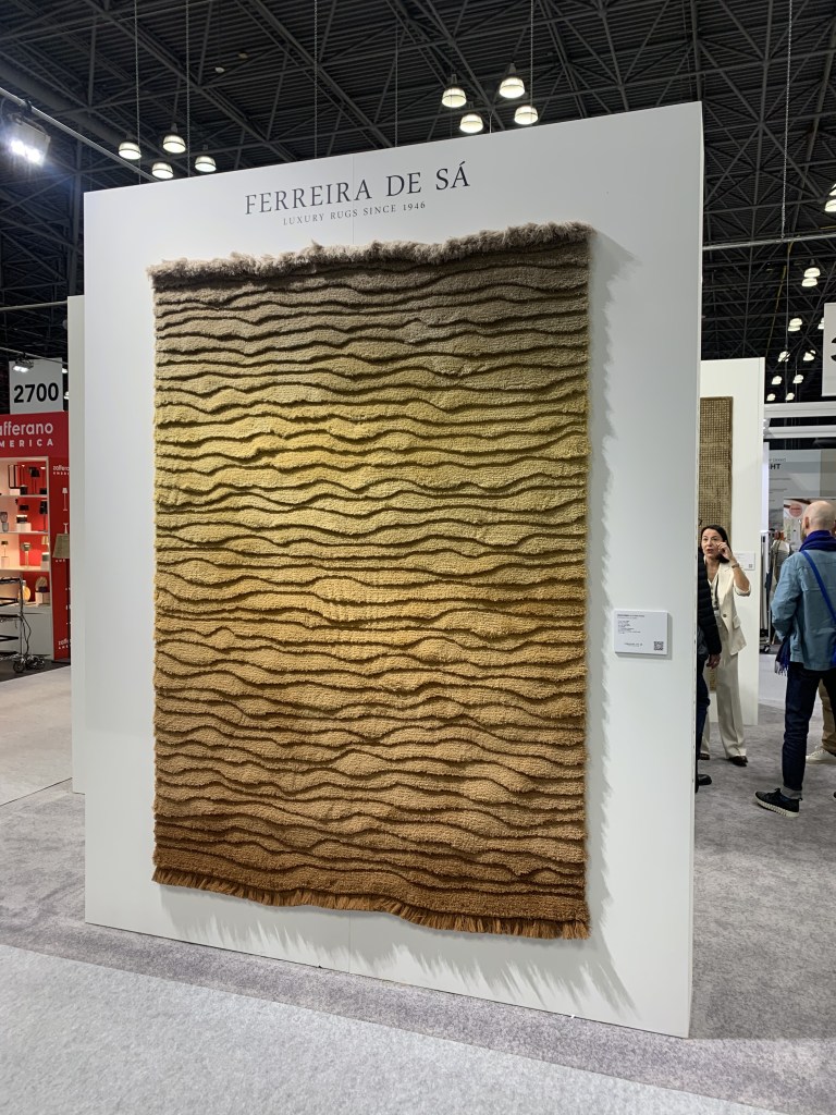
I loved the dimensionality of the rugs at the family run, Portuguese weaver Ferreira de Sá. The addition of these pieces would make almost any room better.
BDNY 2024 – Ferreira de Sa – Sculpted RugsBDNY 2024 – Ferreira de Sa – Sculpted Rugs
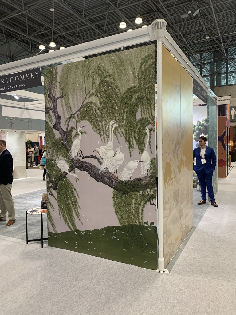
These might appear “old fashion” but I liked the full wall murals displayed by Paul Montgomery. I think these could find a place in the interiors of the next decade, especial the less literal compositions like birds on a tree and jungle scenes. The concept of large, immersive wall coverings fits with the bend to maximalism and these are wonderful options.
Despite a limited amount of new ideas, my trip to New York and BDNY did deliver a few concepts that will drive the future. We must all remember that the hospitality industry is often the driving force of design for the residential consumer. It is important to understand this industry to better determine what the residential consumer will want and desire in the future.
An article on the lack of dining rooms in a recent issue of “The Atlantic” reinforced what I’ve been saying for a long time. When the dining room disappears, so too does the need for a formal chandelier. As this becomes more and more prevalent, like the article predicts and any visit to new model home illustrates, it will be a devastating blow to the decorative lighting business.
We can’t say the warning signs have not been posted. Grandiose, crystal-enhanced, multi-tier monsters have been virtually nonexistent of late. The more casual linear chandeliers continue to grow in popularity. Pendants, in place of classic chandeliers, have reduced the formality of the dining space. Dining room furniture has gone through its own metamorphosis, from stately and staid sculpted wood to mismatched tables and chairs, benches in place of seats and an almost complete elimination of buffets and china cabinets. Formal crystal, silver and china is a thing of the past. As homes increased in size, dining rooms have shrunk. It is only natural and obvious that the 100 to 200 sq. ft. dedicated to a barely used room would soon succumb to the inevitable, elimination.
I heard a designer years ago say, “…a chandelier is the feature, around which a home is built.” If that is true, we’ll need to find a way to replace this central luminescent element of our residential living spaces. I have three options.
About a year ago I wrote about smaller spaces and the rise of prominence in island lighting (Select Meaningful Island Pendants in Smaller Homes – https://wordpress.com/post/lightingbyjeffrey.com/2357 ) The same logic can be applied to larger homes. The kitchen island is becoming the new centerpiece, so the pendants selected should carry the same aesthetic punch as chandeliers of the past. An increased awareness of pendants over an island and selecting pendants that are commensurate in size and shape to the island is key. Combined with proper placement, island lighting will be the new residential showpiece.
Most of the guests to our homes enter through the front foyer. This is the place to make first impressions. At the beginning of the millennium, the foyer was king, but like the dining room, it has suffered the indiscretions of reality. Foyers represented a LOT of wasted space that could be more effectively used. Still, by nature of its location, it remains the spot with the most potential to impact opinion. I’ve written about well-placed semi-flush lighting. https://wordpress.com/post/lightingbyjeffrey.com/1790 Perimeter sconces can also differentiate a foyer, so too can floor lamps, illuminated mirrors and buffet lamps. We often ignore this tiny area of a home. Doing so is a mistake. It will be a larger folly when dining rooms exit the home.
This post is beginning to sound like a recap of my past warnings, so at the risk of delivering a blog post version of a broken record, this point might be expected. We all must be better at defining functional and non-decorative accent lighting so it delivers fashionable results. Using LED linear lighting well, selecting the proper recessed lighting with the proper beam angle, considering perimeter lighting and layering light so that the delivery of illumination is interesting and varied is crucial. Meaningful functional and intelligently placed accent light can easily be interpolated as an aesthetic statement, if defined by a smart designer.
I had a conversation about disappearing dining rooms with a builder based in Texas a few years ago. They were simply not seeing the reduction of demand. She reminded me that, “This was, after all, Texas. If we have one thing, it is land.” Texas, after all held onto oil-rubbed bronze, long past the rest of the country. Texas withstanding, America is in the midst of a substantial household structure deficit. We simply don’t have enough building to support the quantity of new households being formed. Affordability, caused by years of irrational minimum wage numbers has made homes and home ownership nearly impossible. Average homes will be smaller, spaces will become more compact and yes, the dining room will disappear from many, if not most homes. To maintain the impact light can provide, it is time to rethink how that is achieved.
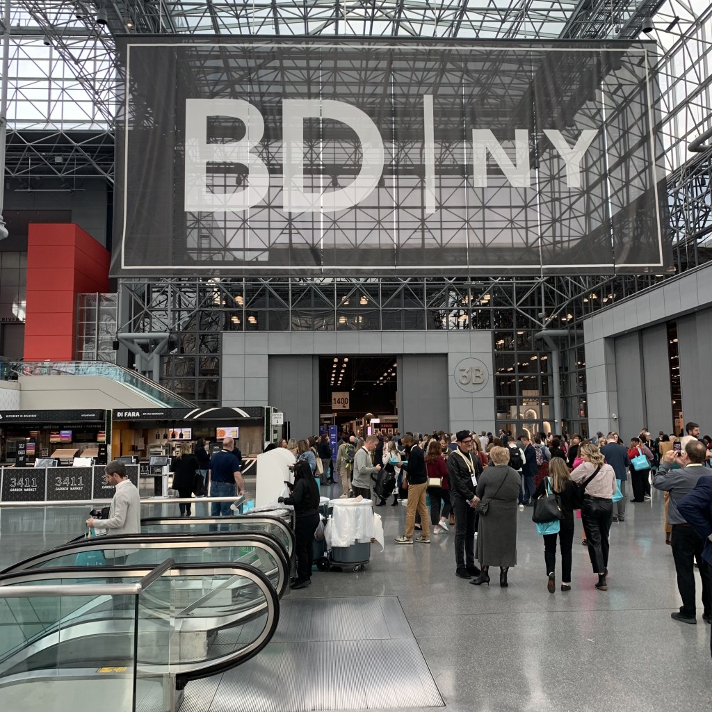
Last weekend, I attended BDNY in New York City. BDNY primarily concentrates on the material needs of the hospitality industry, but the line between their aesthetics and residential desires continues to blur. Sure, most homes have no need for security safes, temporary door locking systems and parking controls, but by digesting the relevant sections of the show floor, one can interpolate some of the aspects of trends that crossover.
Prior to the show I checked out showrooms in the Flatiron District and SOHO. I’ve combined those observations here. This blog posting will cover lighting. The next will deal with the non-lighting aspects of design I found interesting.
I always enjoy a stop at the Roll & Hill showroom. New items are typically shown on the first floor, older, but still relevant pieces are displayed in the upper floors. While there are newer contemporary pieces, I was struck by two collections of far more traditional designs then I have previously seen from this exciting manufacturer. De Playa is a collection using turned wood and ceramic diffusers. The wood brings to mind 70s turned wood luminaires (very popular!) and a somewhat “Early American” style that disappeared many years ago. The second collection, Rue Sala, by the same designer, Jessica Helgerson, uses turned brass shapes that reminded me of classic metals with an animated “Jetson’s” skyline influence. This traditional turn should be noted. When I asked the staff about the consumer response, they indicated a high degree of embrace to a point where line extensions will be forthcoming. We are seeing a shift away from hard contemporary with more emphasis on details and this is taking that direction to the natural next step.
If I were to make a single observation about all the lighting I saw during this trip, it would involve non-glass diffusers. Fabric, fiber and paper have always been part of lighting, but they move in and out of favor on suspended luminaires. They appear now to be “in.” Atelier de Troupe showed an oversized parchment pendant with heavy stitched leather lacing (Pedregal Lanterne) in their showroom front window. a-emotional light draped fine stainless mesh over linear LED light to deliver warm, comfortable illumination in the Nebra collection. I’ve mentioned Swadoh before, but they are worth a second. Their method of draping fabric over and around light creates beautiful, feminine and ethereal looks. Likewise Indo-Puri employs all types of natural materials to add organic warmth to lighting.
Alternate materials do not stop at fabric diffusers. I loved the ash plywood, linear pendant offered by Barcelona company, Bover. The Aluet nicely aims all the light downward and displays the beautiful wood grain to the surroundings space. Hubbardton Forge, in an effort to increase their sustainable footprint has upcycled older dies and tooling to create the Coral Pendant. Because of the nature of creation, each unit has some degree of uniqueness and the LED light is driven from the canopy overhead onto the organic-looking linear string. Also of note here is the ability to custom finish the aluminum coral. Need coral colored coral? They apparently can do that! Dedon is well known for their outdoor furnishings. Using that resin weave, they have created a line of outdoor portables. New(er?) this year is Scoora available in two heights. Yet another example of the importance of high-styled exterior living products.
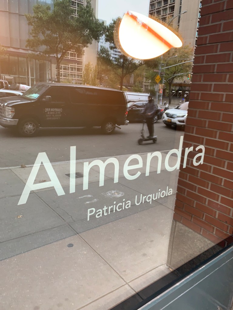
Flos displayed a great finishing technique in their SOHO showroom window. Almendra is a pendant by famed designer, Patricia Urquiola. To soften the often harsh output of the LED, she has painted the INSIDE of the shade a gradated umber near the light source, allowing a much more appealing illumination to be presented. It is a wonderful idea.
Buster + Punch has been a very influential supplier of interior accessories over the last few years. Their lighting certainly reflects the brand’s look. I was especially drawn to a finish I had not yet seen; Burnt Steel brings the fired iridescence to metal that I think could work in many applications. It is also, unquestionably different and could be the statement select interiors need.
The Chimes collection introduced by Sonneman hides the light inside an angle-cut cylinder. The cylinders are arranged in steps, like pipes used in an organ.
As we age, our eyes lose some of their keenness. Many seniors find it difficult to recognize door openings and hallway turns. Recently, there has been an increasing push for lighting that defines these areas of concern. Numera Lighting was at BDNY because they sell custom door/address number lights. In an effort to define their creativity and customization options, their show display, perhaps inadvertently, solved this growing problem. The rest of their offering is nice, too!
Numera Lighting – BDNY 2023 – Lighting flanking a door that can serve as support for those with sight irregularities
We are all aware that Natural Brass is becoming the “go to” finish for most lighting. This has transpired while home furnishings have shifted from neutral grey tones to beige tones. Brass and beige are, and have been a natural fit, so in the greater scheme of things, interiors are being well suited for the future. But what if you don’t want to change EVERYTHING in the home? The CB2 store in SOHO dressed one vignette with the new Brass and some of their grey furniture. I thought this was genius! The brass looked nice with the grey, just different enough to set the area apart. It also subtly told the shopper that they didn’t need to change everything, all at once. For those retailers trying to help people transition into the new reality, take a clue from CB2. Well played.
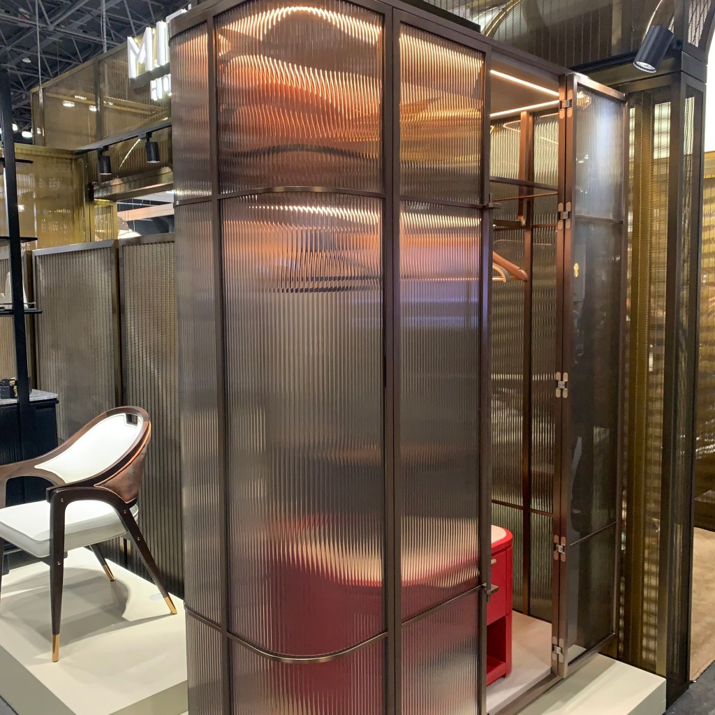
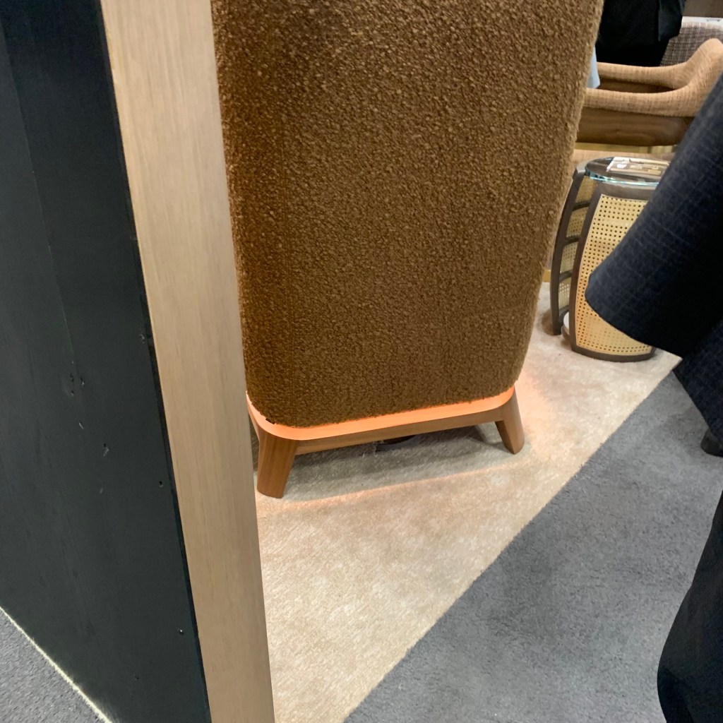
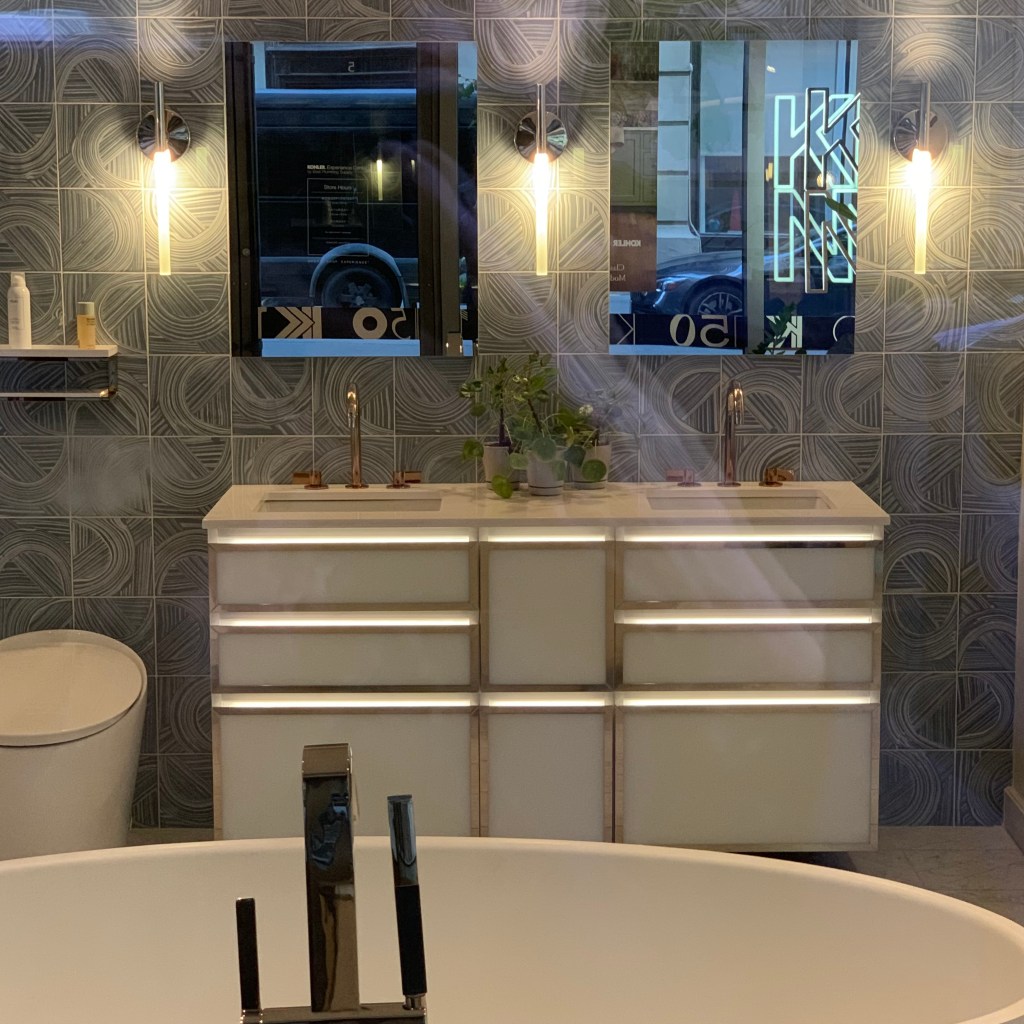
LED Tape is everywhere and it is not being sold by lighting retailers, but instead by all types of different “non-lighting” companies. Because lighting people did not provide the vision beyond what was already conceived, other home furnishings industries grabbed the reins and pushed lighting manufacturers and retailers out of the way. Mittman Hospitality showed a ribbed amber glass freestanding closet with LED Tape wrapped around the interior perimeter. What an exciting look this will provide to a room. The Kohler showroom in the Flatiron District had a vanity with LED Tape used to accent the drawer pulls. One of the furniture manufacturers (I forgot to jot down the name) imbed LED Tape into the base to visually float the chair over the floor.
Mittman Hospitality – BDNY 2023 – Light inside a stand-alone closetBDNY 2023 – LED at base of chairKohler – Light illuminating drawer pulls of a vanity
Each year, designers deliver more, new and interesting product. As we have witnessed, lighting is finding itself in new and different places. We are moving beyond the dining room chandelier to a place where light elevates furniture, plumbing, outdoor living and walls. As users, creators and retailers of light, we need to look beyond, to stay ahead. If we don’t, it is easy to see how other industries might envelop luminaires into their product line.