As usual, lots of comments have been tossed around this week concerning the Pantone choice of “Cloud Dancer” white as the color of the year. Much has been political. In a country where white supremacy is on the rise, DEI hiring is decreasing and disproportionate amounts of Black and Brown people are being targeted by immigration enforcement agencies, it might be easy to assume we are in for an elevation of all things white. Citizens can no longer drift from the centerline path. Keep your eyes pointed forward. Blasé white classicist design and architecture are now mandated by the president and the federal government. No bold hues will be accepted.
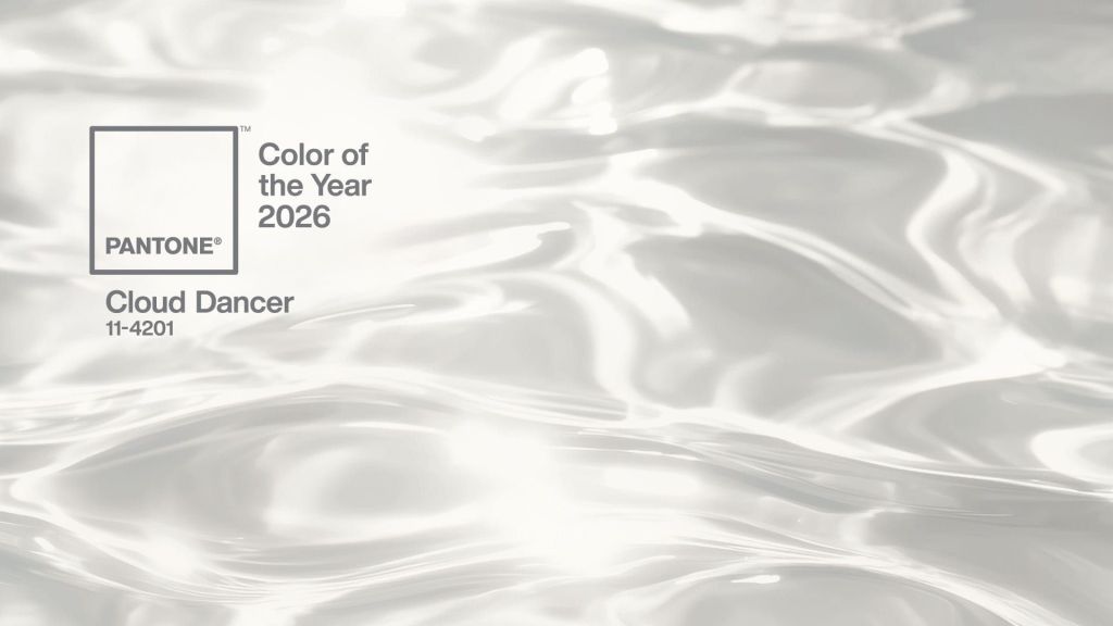
I’m looking instead at the tone of the white selected by Pantone. From my observation, this is a cooler, greyer white. Definitely NOT on the warm side. I’m reading this as a push against the “beige-ification” of style.
If you’ve read my previous post on BDNY 2026, and a few other this years, I have been sharing my observation that beige is EVERYWHERE. Pantone’s color for 2025 was Mocha Mousse, a warm and embracing brown that felt completely at home in the beige world we have. By all accounts, Mocha Mousse was well received and heavily adopted across industries. Both beige and mocha are also well suited for the shift to brass/gold we are seeing in lighting. Cloud Dancer white is Pantone’s antidote from such dominance. I don’t think they want to see beige, “everything, everywhere, all at once.” There should be more variety. Endorsing an alternative is a good way to stir up change.
Why can’t my idea be right? I just read a very thoughtful piece by three highly regarded critics of fashion and they could not agree on the reason or impact of a greyish-white tone of white being named the most important color for the coming year. Why not the opinion of an old lighting guy who has tracked trends for forty years? I could be right.
