I had a designer friend who loved guns and military pageantry. Admittedly, this is not your typical combination of profession and advocacy, but good design comes from many places and he delivered a lifetime of excellent, saleable designs.
One Monday morning, he arrived in the office with a pile of sketches and scraps of paper and quietly got to work. His weekend was spent at an antique armaments show and he became fascinated with the hand-tooling and fine engraving he found on the old firearms. For the next few months he used this inspiration in a wide variety of designs. “See this element, it’s based on a gunstock pattern I saw at the arms show.”
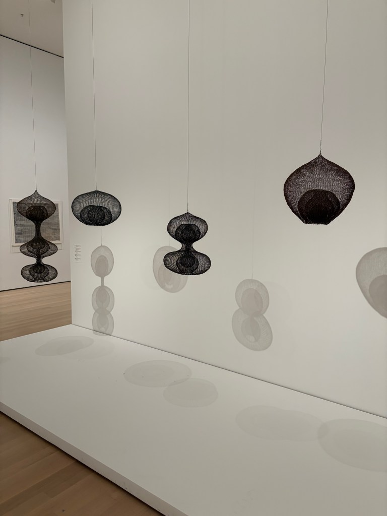
I thought of my late friend while visiting the Ruth Asawa show at the Museum of Modern Art (MOMA) in New York last November. I became aware of Ms. Asawa’s work a few years back at a Museum of Art & Design (MAD) exhibit. I was so intrigued by her single piece in the show, I photographed the museum label. When I learned MOMA would be doing a life retrospective, I could not wait. I was more than amazed at her vision, but also by her prolific and varied output.
The most larcenous takeaway from the Asawa show for a lighting product person is her collection of crocheted wire, hanging forms. Through their creation, Asawa was trying to explore density, form continuity and lines. The idea was born from her teaching art to tribal Indian youth. When not teaching, she spent time with the village women who were master basket weavers. The technique so interested her that she asked one of the women to teach her and she took that skill and wrapped a substantial portion of her creative career around it.
These forms would make wonderful luminaire products. Some shapes are perfect shades, others lend themselves to floor lamp and torchiere bases. The transparency lends themselves to tiny LED and the airiness would allow them to disappear into a designed space and make a statement, all at the same time. They are remarkable.
While walking down Lexington Avenue ten or twelve years ago, I passed a gallery displaying the artwork of a Japanese artist. I couldn’t stop staring. I took a quick photo and went about my trendspotting. The whole day and into the next week, I could not get this idea out of my head. For the next year I began digging the essence of the idea out of my head and into reality. Once I figured out how I could realize the idea, I began making pieces.
If I showed you the Japanese art and what I have been making, you might not make the connection. We are miles away. Nonetheless, without the initial jolt of inspiration, I might not have created these pieces. The same goes for almost every creative person I know. An idea, regardless of how far afield, can shock the system, but you never know in which way.
Why do I frequent art museums? For multiple reasons, but one is without question. You never know what piece or what artist will light a fire that could take multiple years to contain.